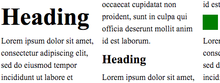
Vertical rhythm kept through pictures and different size of text in a multi-column document.
Title: CSS Rhythmic Sizing
Shortname: css-rhythm
Level: 1
Group: CSSWG
Status: ED
Work Status: exploring
Editor: Koji Ishii, Google, kojiishi@gmail.com
Editor: Elika J. Etemad /fantasai, Invited Expert, http://fantasai.inkedblade.net/contact, w3cid 35400
ED: https://drafts.csswg.org/css-rhythm/
Abstract: This module contains CSS features for aligning content size
  to multiple of unit size.
spec:css21; type:property; text:max-height
spec:css21; type:property; text:max-width
spec:css21; type:property; text:min-width
Introduction {#intro} ===================== This specification provides features to control sizes of CSS objects according to the rules desired by use cases. Controlling sizes of CSS objects to be multiple of a unit is desired in many cases. This level of the specification focuses on following cases. * Adjust heights of line boxes to multiples of the specified length. * Adjust heights of block-level boxes to multiples of the specified length. By controlling heights of line boxes, lines of text in different fonts can create consistent visuals to help readability. Also by stacking such line boxes, authors can align lines across columns, pages, scroll-snapped blocks, or multiple blocks placed absolutely, to produce vertical rhythm.
Vertical rhythm kept through pictures and different size of text in a multi-column document.
Name: line-height-step Value: none | <This property defines the step unit for line box heights. When the step unit is set to a positive <> Initial: none Applies to: block containers Inherited: yes Animatable: no Percentages: N/A Media: visual Computed Value: the absolute length, 0 for none

Rounding up the computed line box height.

			:root {
			  font-size: 12pt;
			  --my-grid: 18pt;
			  line-height-step: var(--my-grid);
			}
			h1 {
			  font-size: 20pt;
			  margin-top: calc(2 * var(--my-grid));
			}
			p {
			  margin: 0;
			}
The line box in <h1> does not fit into one step unit
and thus occupies two,
but it is still centered within the two step unit.
		  $gu: 18px;

		  @function gu($n) {
		    @return $n * $gu;
		  }

		  h1 {
		    font-size: 20pt;
		    margin: gu(1.2) auto gu(1.8);
		  }
Name: block-step-size Value: none | <This property defines the step unit for a block-level box’s block size. When the step unit is set to a positive <> Initial: none Applies to: block-level boxes Inherited: no Animatable: ??? Percentages: N/A Media: visual Computed Value: keyword or absolute length
	Name: block-step-insert
	Value: margin | padding
	Initial: margin
	Applies to: block-level boxes
	Inherited: no
	Animatable: no
	Percentages: N/A
	Media: visual
	Computed Value: as specified
This property specifies whether extra spacing derived from applying 'block-step-size' is inserted inside (like 'padding') or outside (like 'margin') the box’s border. Values have the following meanings:
	Name: block-step-align
	Value: auto | center | start | end
	Initial: auto
	Applies to: block-level boxes
	Inherited: no
	Animatable: no
	Percentages: N/A
	Media: visual
	Computed Value: as specified
This property specifies whether extra spacing derived from applying 'block-step-size' is inserted before, inserted after, or split between both sides of the box. Values have the following meanings:
	Name: block-step-round
	Value: up | down | nearest
	Initial: up
	Applies to: block-level boxes
	Inherited: no
	Animatable: no
	Percentages: N/A
	Media: visual
	Computed Value: as specified
This property specifies whether adjustments due to 'block-step-size' insert positive or negative space. Values have the following meanings:
	Name: block-step
	Value: <'block-step-size'> || <'block-step-insert'> || <'block-step-align'> || <'block-step-round'>
	Initial: See individual properties
	Applies to: block-level boxes
	Inherited: no
	Animatable: See individual properties
	Percentages: N/A
	Media: visual
	Computed Value: See individual properties
This shorthand property allows for setting 'block-step-size', 'block-step-insert', 'block-step-align', and 'block-step-round' in one declaration. Omitted values are set to the property’s initial value. Advisement: Authors are advised to use this shorthand rather than the longhands unless there is a specific need for its individual longhands to cascade independently. Privacy and Security Considerations {#priv-sec} =============================================== This specification introduces no new privacy leaks, or security considerations beyond "implement it correctly". Acknowledgments {#acks} ======================= This specification would not have been possible without the help from: Takao Baba, Chris Eppstein, Shinyu Murakami, Tsutomu Nanjo, Charlie Neely, Florian Rivoal, Hiroshi Sakakibara, Alan Stearns, and the CSS Working Group members.