Abstract
This module describes features often used in printed publications.
Figures and photos are often moved to the top or bottom of columns and
pages, along with their captions. Some elements (e.g., call-outs) push
aside other content in the flow of text, and sometimes one column is given
a different styling than others. This draft describes how to achieve these
effects, both on paper and screens.
Status of this
document
This is a public copy of the editors' draft. It is provided for
discussion only and may change at any moment. Its publication here does
not imply endorsement of its contents by W3C. Don't cite this document
other than as work in progress.
The (archived) public
mailing list
www-style@w3.org (see instructions) is preferred for
discussion of this specification. When sending e-mail, please put the text
“css-page-floats” in the subject, preferably like this:
“[css-page-floats] …summary of comment…”
This document was produced by the CSS Working Group (part of
the Style Activity).
This document was produced by a group operating under the 5 February
2004 W3C Patent Policy. W3C maintains a public list of any patent disclosures made in
connection with the deliverables of the group; that page also includes
instructions for disclosing a patent. An individual who has actual
knowledge of a patent which the individual believes contains Essential
Claim(s) must disclose the information in accordance with section
6 of the W3C Patent Policy.
This WD contains functionality that the CSS WG finds interesting and
useful. The described functionality has been split off from [CSS3GCPM] draft.
Introduction
(This section is not normative.)
This module describes features often used in printed publications.
Figures and photos are often moved to the top or bottom of columns and
pages, along with their captions. Some elements (e.g., call-outs) push
aside other content in the flow of text, and sometimes one column is given
a different styling than others. This draft describes how to achieve these
effects, both on paper and screens.
1. Page floats
In page-based layouts, images and figures are often displayed at the top
or bottom of pages. This specificaton adds new keywords on the ‘float’ property to create page floats. A
page float can float inside its natural column/page, or its placement can
be deferred to a following column/page with the float-defer
properties. Page floats can be set to span several columns, thereby
supporting commonly used newspaper layouts. New values on the ‘clear’ property adds further ways of refining
layouts with page floats.
Not all multicol elements are constrained by the page box.
Therefore, a more accurate term for page floats may be column
floats as all of them are constrained by the column box. However, in
most cases, page floats seems like a better term.
1.1.
Floating to the top/bottom: top, bottom, snap
These new keywords on ‘float’ have been
added:
- top
- The float is floated to the top of the column
- bottom
- The float is floated to the bottom of the column
- snap(<length> <length>? [, top | bottom | near ]?)
-
Makes the element float to the top or bottom if it naturally appears
within a certain distance from the top or bottom. The length value(s)
specifies the maxium distance from the top/bottom that an element must
be within in order to be floated; one length value specifies the
distance from both the top and the bottom, two length values specify the
distance from the top and bottom, respectively.
The optional keyword value specifies where the element is floated:
top, bottom, or the nearest of the two. The initial value is ‘near’. If ‘near’
is in effect and the element is within the specified distance both from
the top and the bottom, bottom wins.
An element is considered to be a float if it has a snap() value, even
if the element does not appear within the specified distance. This way,
it can be determined whether an element is float or not without laying
out the document.
- snap
- same as snap(2em, near)
These new keywords only apply in paged media; in continous media
declarations with these keywords are ignored.
Elements with any of these new keywords are called ‘page floats’. Each page float has a natural
column, which is the column where the element would have started to
appears it it was not a float. Also, each page float has a natural
page, which is the page where the element would have started if the
was not a float. Unless other constrained by lack of space or other
float-* properties, page floats should appear in their natural column on
the natural page.
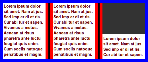
Float figure to top of natural column:
.figure { float: top }

.figure { float: top; width: 50% }

In this example, a figure naturally appears close to a column break.
There is not enough space for the figure in the first column, and it is
therefore placed in the second column, leaving white space at the bottom
of the first column.

To avoid the white space, the image can be floated to the nearest edge
(in the block direction):
.figure { float: snap }
In this example, the figure is already at the nearest edge, so it does
not move. However, page floats allow subsequent content to be displayed
before the page float and the white space can therefore be filled:
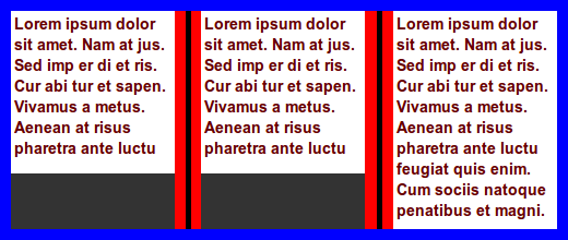
In this example, two figures naturally appear in the text flow:

A typographer would typically try to avoid single lines of text
above/below figures, which can be achieved with:
div.figure { float: snap(1.5em) }
The length value specifies the reach of the snap function; in this
example the second figure is affected, but not the first.
In this example, two figures naturally appear in the text flow:
To make the figures snap to the nearest edges, this code can be
applied:
div.figure { float: snap(2.5em) }
The resultant rendering is:

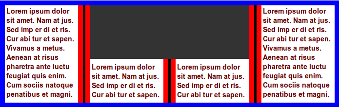
Float figure to top of the natural column, spanning all columns:
.figure { float: top; column-span: all }

In this example, tables will snap to the top/bottom if the top/bottom
of the border box is closer than ‘3em’ from
the top/bottom of the page/column.
table { float: snap }
table { float: snap(3em) }
table { float: snap(3em, bottom) }
table { float: snap(3em 2em, bottom) }
Do numeric values, to represent line numbers, make sense,
like for orphans/widows?
1.2. Spanning columns
The ‘column-span’ property is extended
with integer values so that elements can span several columns. If the
specified integer value is equal to, or larger than the number of columns
in the multicol element, the number of columns spanned will be the same as
if ‘column-span: all’ had been specified.
In this example, a commonly used newspaper layout is easily described:
body { columns: 3 }
img.A { column-span: 2; width: 100% }  /* image spans two columns */
.one { column-span: 2 }                /* lead paragraph spans two columns */

Further, the ‘page’ value is added to
‘column-span’ so that the page (and not
the column or element) becomes the reference.
In this example, the footer is floated to the bottom of the last page
(and not the bottom of the article element):
footer { float: bottom; column-span: page }

<article>
  ...
  <footer>...<.footer>
</article>
An alternative way to express this would be to add a
separate propertye, e.g., float-reference: column | multicol |
page
1.3.
Deferring floats: float-defer-column, float-defer-page
A page float can be deferred to a following column/page with these new
properties:
| Name:
| float-defer-column
|
| Value:
| <integer> | last | none
|
| Initial:
| none
|
| Applies to:
| page floats
|
| Inherited:
| no
|
| Percentages:
| N/A
|
| Media:
| visual
|
| Computed value:
| specified value
|
| Name:
| float-defer-page
|
| Value:
| <integer> | last | none
|
| Initial:
| none
|
| Applies to:
| page floats
|
| Inherited:
| no
|
| Percentages:
| N/A
|
| Media:
| visual
|
| Computed value:
| specified value
|
These properties specify whether page floats should appear in their
natural column/page, or in a following column/page. Values are:
- none
- the page float appears in the natural column/page
- <integer>
- A positive integer value indicates that the page float should be
displayed in a following column/page. A negative integer value indicates
that the page float should be displayed in a following column/page,
counted from the last column/page. When counting columns, the starting
point is the last column of the multicol element on the natural page.
When counting pages, the starting point is the last page of the multicol
element.
Float figure to the top of the column that follows the natural column:
.figure { float: top }
.figure { float-defer-column: 1 }
Float figure to the top of the next-to-last column:
.figure { float: top; float-defer-column: -1 }
Float figure to top of the last column of the multicol element on the
current page:
.figure { float: top; float-defer-column: last }
In combination with ‘column-span’, the
figure is floated to the top corner of the multicol element on that page:
.figure { float: top; column-span: 2; float-defer-column: last; width: 100% }

Float figure to the top of the second column, spanning two columns:
.figure {
  float: top; column-span: 2;
  float-defer-column: 1;
}
Float figure to the top right, leaving one full column:
.figure {
  float: top; column-span: 2;
  float-defer-column: -1;
}
Given that there are four columnn, the same layout would be achived
with this code:
.figure {
  float: top; column-span: 2;
  float-defer-column: 1;
}
Float figure to the top of the first column on the next-to-last page:
.figure { float: top }
.figure { float-defer-page: -1 }
Float figure to the top of the next-to-last column on the next-to-last
page:
.figure { float: top }
.figure { float-defer-column: -1 }
.figure { float-defer-page: -1 }
- last
- The page float should be displayed in the last colum, or on the last
page.
Float figure to the top of the last column on the natural page:
.figure { float: top }
.figure { float-defer-column: last }
Float figure to the last column on the last page:
.figure { float: top }
.figure { float-defer-column: last }
.figure { float-defer-page: last }
- none
- The page floats should appear in their natural column/page, if
possible.
Zero is not a legal value.
1.4. Clearing page
floats
Page floats may request to not be stacked, or to be the only page float
on a page/column through new values on the ‘clear’ property:
- top/bottom
- The page float requests to be the only page float at the top/bottom of
the column. If there is already a page float at the requested position,
the page float is moved to the next column which does not have a page
float in the requested position.
- column
- The page float requests to be the only page float in the column. If
there is already another page float on the page, the page float is moved
to the next page which does not have a page float.
- page
- The page float requests to be the only page float on the page. If
there is already another page float on the page, the page float is moved
to the next page which does not have a page float.
In this example, the two figures may appear in the same column:
.figure { float: bottom; clear: none }

<div class=figure></div>
<div class=figure></div>

In this example, the two figures will appear in different columns:
.figure { float: bottom; clear: column }

<div class=figure></div>
<div class=figure></div>
In this example, the two figures may appear at the bottom of the same
column due to clearing only at the top:
.figure { float: bottom; clear: top }

<div class=figure></div>
<div class=figure></div>
In this example, the two figures will appear in different columns due
to clearing at the bottom:
.figure { float: bottom; clear: bottom }

<div class=figure></div>
<div class=figure></div>
In this example, the two figures end up the top corner of two different
pages:
.figure { float: top; float-defer-column: last; clear: page }

<div class=figure></div>
<div class=figure></div>
In this example, the two figures request different positions, and they
may therefore end up in the same column:
.figure.one { float: top; clear: top }
.figure.two { float: bottom; clear: bottom }

<div class="figure one"></div>
<div class="figure two"></div>
1.5.
Floating inside and outside pages
Two allow content to flow to the inside and outside of a page, these
keywords are added to the ‘float’
property:
- inside
- On a right page, this value is synonymous with ‘
left’. On a left page, this value is synonymous
with ‘right’.
- outside
- On a left page, this value is synonymous with ‘
left’, On a right page, this value is synonymous
with ‘right’.
These new values do not create page floats, the are simply aliases for
‘left’ and ‘right’.
.figure { float: outside }
Should there be a way to combine float: top/bottom with
left/right?
Should there be a way to delete page floats that end up
lonesome on pages?
1.6. Wrapping
around page floats
| Name:
| float-wrap
|
| Value:
| none | wrap
|
| Initial:
| none
|
| Applies to:
| page floats
|
| Inherited:
| no
|
| Percentages:
| N/A
|
| Media:
| visual
|
| Computed value:
| specified value
|
This property indicates whether other content may wrap around a page
float:
- none
- other content may not wrap around the page float
- wrap
- other content may wrap around the page float
The ‘intrude’ value only works in
combination with one of these keywords: ‘left’/‘right’/‘top’/‘bottom’/‘top-corner’/‘bottom-corner’.
img { float: top; column-span: 2; float-wrap: wrap; width: 120%; }
In this example, the image is wider than the column and will therefore
intrude into the neighboring column. At the bottom of the middle column
is a long word that is clipped in the middle of the column gap. 
| Name:
| float-offset
|
| Value:
| <length> <length> ?
|
| Initial:
| 0 0
|
| Applies to:
| floated elements
|
| Inherited:
| no
|
| Percentages:
| see prose
|
| Media:
| visual, paged
|
| Computed value:
| one or two absolute lengths
|
This property pushes a float in opposite direction of the where it has
been floated with ‘float’. If one value is
specified, it is the horizontal offset. If two values are specified, the
first is the horizontal and the second is the vertical offset. If no
vertical value has been specified, the vertical offset is set to zero.
This property can only influence a float along an axis it has been
floated.
img {
  float: left;
  float-offset: 2em 3em;
}
In this example, the image is floated to the left. Therefore, ‘float-offset’ may
only push the element in the horizontal direction, and the vertical value
is ignored.
Negative values are allowed; a negative values will push the float in
the same direction as it has been floated with ‘float’
This property may move floats into other column than where they
naturally appear.
img {
  float: right;
  float-offset: 5px;
}

Percentage values are computed according to this formula:
  (containing-block-width - float-width) * percentage
  (containing-block-height - float-height) * percentage
Pull quotes are often centered in a column. In this
example, the pull quote is floated to the right, and then pushed back into
the center.

.pullquote {
  float: right;
  float-offset: 50%; /* 50% centers the box */
}
When negative values are set on this property, the column gap is also
part of the calculation:
((containing-block-width + 2 * column-gap) - float-width) * percentage
img {
  float: top right;
  float-offset: -50% 3em;  /* 50% centers the box */
  width: 120%;
}

img {
  float: top right;
  float-offset: -80% 2em;
  width: 100%;
}

1.8.
Overconstrained page floats
In many cases, the specified values on these properties cannot be
honored.
The number of columns is limited, and high values
therefore cannot be honored:
.figure { float: top; float-defer-column: 1000 }
A narrow screen may only have room for one column, in
which case this request cannot be honored:
.figure { float: top; float-defer-column: -5 }
In long documents, all content cannot fit on the last
page, and this rule therefore cannot be honored:
p { float: top; float-defer-page: last }
Page floats are processed in the order they appear in the source.
However, the visual order of page floats may not ne the same as the source
order.
Consider this code:
.one { float: top; float-defer-page: last; column-span: all }
.two { float: top; clear: column }

<div class=one></div>
<div class=two></div>
In this example, the first element requests to appear on the last page,
while the second element requests to appear in the natural column. If the
natural column of the second element appears on a page before the last
page, the second element will appear visually before the first.
Consider this code:
.one { float: top; float-defer-page: last; column-span: all }
.two { float: top; clear: column }

<div class=one></div>
<div class=two></div>
If all content can fit on one page, the first page will also be the
last page. The first element is processed first and is placed on top of
the first page. Then the second element is processed. It reqests a clear
top, somthing which is not possible on the first page. Therefore, a
second page is created and the first element is moved there. Even if the
first element requests to be on the last page, it will not appear there.
When resolving over-constrained layouts, the order of importance for
defined goals are:
- honor basic multi-column layout (‘
columns’, ‘column-span:
all’, ‘column-gap’ etc)
- honor ‘
column-span: <integer>’
- honor ‘
clear: top/bottom/pcolumn/page’
- honor ‘
float-defer-page’
- honor ‘
float-defer-column’
- honor ‘
float: top/bottom’
- display all content (as described by other CSS properties)
- keep the number of pages to a minimum
2. Exclusions
| Name:
| clear-side
|
| Value:
| auto | both
|
| Initial:
| auto
|
| Applies to:
| floated elements
|
| Inherited:
| no
|
| Percentages:
| N/A
|
| Media:
| visual, paged
|
| Computed value:
| as specified
|
This property declares if the side of a float should be cleared of
content. Values have the following meaning:
- auto
- if the float is left-floated, there should be no content to the left;
if the float is right-floated, there should be no content to the right
!_-
- left
- there should be no content to the left of the float
- right
- there should be no content to the left of the float -->
- none
- there may be content on either side of the float

.pullquote {
float: left;
float-offset: 50%;
clear-side: none;
}
2.2. Exclusions
based on images
Exclusions are often based on shapes found in images. In this
specification, background image can carry the shape, around which text is
wrapped. The new property ‘background-exclude-level’ indicates a level in the
alpha channel of the background image(s) that defines the shape.
Here is an example that uses the background of the multicol element as
a template for exclusions. 
article {
padding: 4em;
columns: 15em;
background: url(nicecar.jpg);
background-exclude-level: 0.5;
}
article h1 { column-span: all } /* Bonneville Speedway */
This example is the same as the above, just with changed column widths.

article {
padding: 4em;
columns: 6em;
background: url(nicecar.jpg);
background-exclude-level: 0.5;
}
article h1 { column-span: all } /* Bonneville Speedway */
Background images can be repeated. Therefore exclusions based on images
can be repeated.

article {
background: repeat-y url(zigzag.png);
background-exclude-level: 0.5;
}
article h1 {
column-span: all;
}
2.3.
Exclusions based on rendered content
A new property. ‘exclude-level’, is
introduced to allow wraps around the rendered content of the element.

#dropcaps {
  font-size: 3em;
  float: left;
  exclude-level: 0.5;
  margin-top: -0.2em;
}
<p><span id="dropcaps">Many</span> instances ...</p>
    <p>The text ....</p>
Define behavior if both ‘exclude-level’ and ‘background-exclude-level’ is set.
Some kind of spacing behavior must be defined; ‘exclude-margin’ may be an option.
Define behavior if both ‘exclude-level’ and ‘background-exclude-level’ is set.
2.4. Exclusions
based on shapes
I suggest not having exclusions based in shapes in the first
generation of exclusions; we may want to definde shapes for CSS in general
(e.g., for borders), so we may want to wait until we have a holistic
approach.

article::column(1) {
  content-inside: circle(50%, 50%, 30%);
}

article::column(2) {
  content-outside: polygon(x1, y1, x2, y2, x3, y3, ... xn, yn);
  color: red;
}

article::column(1) {
  content-outside: circle(x, y, z);
}
article::column(2) {
  content-inside: polygon(x1, y1, x2, y2, x3, y3, ... xn, yn);
}
3. Regions
Regions are series of stylable boxes into which content can be poured.
Columns are regions that are automatically generated to contain all the
content of the the multicol element. By adding selectors for columns,
columns can be styled and positioned and thereby escape the rigid patterns
that columns naturally live in.
div.chapter::column(3)       /* the 3rd column of the element */
div.chapter::column(2n)      /* all even columns of the element */
div.chapter::column(3+)      /* all columns but the 1st and 2nd */
div.chapter::column(2,2)     /* second column on second page */
div.chapter::column(*,2)     /* all columns on the second page */
div.chapter::column(1,*)     /* the first column on all pages */
To underline the fact that columns are regions, the "region" keyword can
be used as a substitute for "column".
div.chapter::region(3)       /* the 3rd region of the element */
div.chapter::region(2n)      /* all even regions of the element */
div.chapter::region(3+)      /* all regions but the 1st and 2nd */
div.chapter::region(2,2)     /* second region on second page */
div.chapter::region(*,2)     /* all regions on the second page */
div.chapter::region(1,*)     /* the first column on all pages */
In this example, the multicol layout is changed so that the image
(which appears first in the markup) spans two columns and is floated to
the top, thereby escaping its natural column. The first column, which
holds the start of the textual content is also floated to the top,
spanning two columns, and therefore ends up just under the image. When
the first column/region is floated away, the second column will move into
its space.
article { columns: 3 }
img { column-span: 2; width: 100%; float: top }
article::region(1) {    /* selects column 1 */
  column-span: 2;
  float: top;
  height: 3em;          /* sets preferred height of region */
}

<article>
  <img ...>
  <p>...  <p>...  <p>...
</article>
div.chapter::region(1) {
  transform: rotate(6.5deg);
}
div.chapter::region(2) {
  transform: rotate(-5.5deg) translate(0, 40px);
}
4. Regions
and Exclusions examples

article {
  columns: 15em;
}
article::region(1-3) {
  width: 15em;
  height: 15em;
}
article::region(2-3) {
  margin: 4em 0 0 -4em;
}

article {
  columns: 15em;
}
acticle::region(1-3) {
  height: 15em;
}
acticle::region(2-3) {
  margin: 4em 0 0 -4em;
}
acticle::region(2) {
  z-index: 1;
}
TBD
Acknowledgments
This document has been improved by Bert Bos, Michael Day, Melinda Grant,
David Baron, Markus Mielke, Steve Zilles, Ian Hickson, Elika Etemad,
Laurens Holst, Mike Bremford, Allan Sandfeld Jensen, Kelly Miller, Werner
Donné, Tarquin (Mark) Wilton-Jones, Michel Fortin, Christian Roth, Brady
Duga, Del Merritt, Ladd Van Tol, Tab Atkins Jr., Jacob Grundtvig Refstrup,
James Elmore, Ian Tindale, Murakami Shinyu, Paul E. Merrell, Philip
Taylor, Brad Kemper, Peter Linss, Daniel Glazman, Tantek Çelik, Florian
Rivoal, Alex Mogilevsky, Simon Sapin, Cameron McCormack, Liam R E Quin,
Peter Moulder, Morten Stenshorne, Rune Lillesveen, Lars Erik Bolstad,
Anton Prowse, Michel Onoff
References
Normative references
-
Other references
-
- [CSS3GCPM]
- Håkon Wium Lie. CSS
Generated Content for Paged Media Module. 29 November 2011.
W3C Working Draft. (Work in progress.) URL: http://www.w3.org/TR/2011/WD-css3-gcpm-20111129/
Index
Property index
| Property
| Values
| Initial
| Applies to
| Inh.
| Percentages
| Media
|
| clear-side
| auto | both
| auto
| floated elements
| no
| N/A
| visual, paged
|
| float-defer-column
| <integer> | last | none
| none
| page floats
| no
| N/A
| visual
|
| float-defer-page
| <integer> | last | none
| none
| page floats
| no
| N/A
| visual
|
| float-offset
| <length> <length> ?
| 0 0
| floated elements
| no
| see prose
| visual, paged
|
| float-wrap
| none | wrap
| none
| page floats
| no
| N/A
| visual
|