div {
transform: translate(100px, 100px);
}
This transform moves the element by 100 pixels in both the X and Y directions.

Title: CSS Transforms Module Level 1
Status: ED
Work Status: Refining
ED: https://drafts.csswg.org/css-transforms/
TR: https://www.w3.org/TR/css-transforms-1/
Previous Version: https://www.w3.org/TR/2012/WD-css3-transforms-20120911/
Previous Version: https://www.w3.org/TR/2012/WD-css3-transforms-20120403/
Shortname: css-transforms
Link Defaults: svg (property) to/stroke/fill, css-masking-1 (property) clip/clip-path, filters-1 (property) filter, css-backgrounds-3 (value) fixed, html (element) a
Level: 1
Group: fxtf
Editor: Simon Fraser, Apple Inc http://www.apple.com/, simon.fraser@apple.com
Editor: Dean Jackson, Apple Inc http://www.apple.com/, dino@apple.com
Editor: Theresa O'Connor, Apple Inc http://www.apple.com/, eoconnor@apple.com
Editor: Dirk Schulze, Adobe Systems Inc http://www.adobe.com/, dschulze@adobe.com
Former Editor: David Hyatt, Apple Inc http://www.apple.com/, hyatt@apple.com
Former Editor: Chris Marrin, Apple Inc http://www.apple.com/, cmarrin@apple.com
Former Editor: Aryeh Gregor, Mozilla http://www.mozilla.org/, ayg@aryeh.name
Abstract: CSS transforms allows elements styled with CSS to be transformed in two-dimensional space. This specification is the convergence of the CSS 2D transforms and SVG transforms specifications.
!Issues List: in GitHub
Ignored terms: calcMode, viewBox, baseVal, animVal
text: transform; type: element-attr; for: ; spec: svg1.1; url: https://www.w3.org/TR/SVG11/coords.html#TransformAttribute
text: patternTransform; type: element-attr; for: pattern; spec: svg1.1; url: https://www.w3.org/TR/SVG11/pservers.html#PatternElementPatternTransformAttribute
text: patternUnits; type: element-attr; for: pattern; spec: svg1.1; url: https://www.w3.org/TR/SVG/pservers.html#PatternElementPatternUnitsAttribute
text: gradientTransform; type: element-attr; for: linearGradient; spec: svg1.1; url: https://www.w3.org/TR/SVG11/pservers.html#LinearGradientElementGradientTransformAttribute
text: gradientUnits; type: element-attr; for: linearGradient; spec: svg1.1; url: https://www.w3.org/TR/SVG/pservers.html#LinearGradientElementGradientUnitsAttribute
spec: css-text-3; type: property
	text: text-align
	text: letter-spacing
	text: word-spacing

spec:css-display-3; type:property
	text: display

spec:css-display-3; type:value; for:display
	text: table-row
	text: table-row-group
	text: table-header-group
	text: table-footer-group
	text: table-cell
	text: table-caption

spec:css-overflow-4; type:property;
	text:overflow

spec:css-backgrounds-3; type:property
	text: background-attachment
Introduction {#intro} ===================== This section is not normative. The CSS visual formatting model describes a coordinate system within each element is positioned. Positions and sizes in this coordinate space can be thought of as being expressed in pixels, starting in the origin of point with positive values proceeding to the right and down. This coordinate space can be modified with the 'transform' property. Using transform, elements can be translated, rotated and scaled. Module Interactions {#module-interactions} ------------------------------------------ This module defines a set of CSS properties that affect the visual rendering of elements to which those properties are applied; these effects are applied after elements have been sized and positioned according to the visual formatting model from [[!CSS2]]. Some values of these properties result in the creation of a containing block, and/or the creation of a stacking context. Transforms affect the rendering of backgrounds on elements with a value of ''fixed'' for the 'background-attachment' property, which is specified in [[!CSS3BG]]. Transforms affect the client rectangles returned by the Element Interface Extensions getClientRects() and getBoundingClientRect(), which are specified in [[CSSOM-VIEW]]. CSS Values {#css-values} ------------------------ This specification follows the CSS property definition conventions from [[!CSS2]]. Value types not defined in this specification are defined in CSS Values & Units [[!CSS-VALUES-3]]. Other CSS modules may expand the definitions of these value types. In addition to the property-specific values listed in their definitions, all properties defined in this specification also accept the CSS-wide keywords keywords as their property value. For readability they have not been repeated explicitly. Terminology {#terminology} ========================== When used in this specification, terms have the meanings assigned in this section. : transformable element :: A transformable element is an element in one of these categories: * an element whose layout is governed by the CSS box model which is either a block-level or atomic inline-level element, or whose 'display' property computes to ''table-row'', ''table-row-group'', ''table-header-group'', ''table-footer-group'', ''table-cell'', or ''table-caption'' [[!CSS2]] * an element in the SVG namespace and not governed by the CSS box model which has the attributes transform, <{pattern/patternTransform}> or <{linearGradient/gradientTransform}> [[!SVG11]]. : transformed element :: An element with a computed value other than ''transform/none'' for the 'transform' property. : user coordinate system : local coordinate system :: In general, a coordinate system defines locations and distances on the current canvas. The current local coordinate system (also user coordinate system) is the coordinate system that is currently active and which is used to define how coordinates and lengths are located and computed, respectively, on the current canvas. The current user coordinate system has its origin at the top-left of a [=reference box=] specified by the 'transform-box' property. Percentage values are relative to the dimension of this reference box. One unit equals one CSS pixel. : transformation matrix :: A matrix that defines the mathematical mapping from one coordinate system into another. It is computed from the values of the 'transform' and 'transform-origin' properties as described below. : current transformation matrix (CTM) :: A matrix that defines the mapping from the [=local coordinate system=] into the [=viewport coordinate system=]. : 2D matrix :: A 3x2 transformation matrix with 6 items or a 4x4 matrix with 16 items, where the items m31, m32, m13, m23, m43, m14, m24, m34 are equal to ''0'' and m33, m44 are equal to ''1''. Issue: should this spec mention 4x4 matrices? : identity transform function :: A transform function that is equivalent to a identity 4x4 matrix (see Mathematical Description of Transform Functions). Examples for identity transform functions are ''translate(0)'', ''translateX(0)'', ''translateY(0)'', ''scale(1)'', ''scaleX(1)'', ''scaleY(1)'', ''rotate(0)'', ''skew(0, 0)'', ''skewX(0)'', ''skewY(0)'' and ''matrix(1, 0, 0, 1, 0, 0)''. The Transform Rendering Model {#transform-rendering} ==================================================== This section is normative. Specifying a value other than ''transform/none'' for the 'transform' property establishes a new [=local coordinate system=] at the element that it is applied to. The mapping from where the element would have rendered into that local coordinate system is given by the element's [=transformation matrix=]. Transformations are cumulative. That is, elements establish their local coordinate system within the coordinate system of their parent. From the perspective of the user, an element effectively accumulates all the 'transform' properties of its ancestors as well as any local transform applied to it. The accumulation of these transforms defines a [=current transformation matrix=] for the element. The coordinate space is a coordinate system with two axes: the X axis increases horizontally to the right; the Y axis increases vertically downwards.
The [=transformation matrix=] is computed from the 'transform' and 'transform-origin' properties as follows: 1. Start with the identity matrix. 2. Translate by the computed X and Y of 'transform-origin' 3. Multiply by each of the transform functions in 'transform' property from left to right 4. Translate by the negated computed X and Y values of 'transform-origin' Transforms apply to [=transformable elements=]. Note: Transformations do affect the visual rendering, but have no affect on the CSS layout other than affecting overflow. Transforms are also taken into account when computing client rectangles exposed via the Element Interface Extensions, namely getClientRects() and getBoundingClientRect(), which are specified in [[CSSOM-VIEW]].
div {
    transform: translate(100px, 100px);
}
This transform moves the element by 100 pixels in both the X and Y directions.
  div {
    height: 100px; width: 100px;
    transform-origin: 50px 50px;
    transform: rotate(45deg);
  }
The 'transform-origin' property moves the point of origin by 50 pixels in both the X and Y directions. The transform rotates the element clockwise by 45° about the point of origin. After all transform functions were applied, the translation of the origin gets translated back by -50 pixels in both the X and Y directions.

  div {
    height: 100px; width: 100px;
    transform: translate(80px, 80px) scale(1.5, 1.5) rotate(45deg);
  }
This transformation translates the local coordinate system by 80 pixels in both the X and Y directions, then applies a 150% scale, then a 45° clockwise rotation about the Z axis. The impact on the rendering of the element can be intepreted as an application of these transforms in reverse order: the elements is rotated, then scaled, then translated.

  <div style="transform: translate(80px, 80px)">
      <div style="transform: scale(1.5, 1.5)">
          <div style="transform: rotate(45deg)"></div>
      </div>
  </div>
Name: transform Value: none | <Any computed value other than ''transform/none'' for the transform affects containing block and stacking context, as described in [[#transform-rendering]].> Initial: none Applies to: [=transformable elements=] Inherited: no Percentages: refer to the size of [=reference box=] Computed value: As specified, but with relative lengths converted into absolute lengths. Media: visual Animatable: as transform
<transform-list> = <Serialization of <>+
Name: transform-origin Value: [ left | center | right | top | bottom | <The initial [=used value=] for SVG elements without associated CSS layout box is ''0 0''. The values of the 'transform' and 'transform-origin' properties are used to compute the [=transformation matrix=], as described above. If only one value is specified, the second value is assumed to be center. If one or two values are specified, the third value is assumed to be ''0px''. If two or more values are defined and either no value is a keyword, or the only used keyword is center, then the first value represents the horizontal position (or offset) and the second represents the vertical position (or offset). A third value always represents the Z position (or offset) and must be of type <> ]
|
[ left | center | right | <> ]
[ top | center | bottom | <> ] < >?
|
[[ center | left | right ] && [ center | top | bottom ]] <>? Initial: 50% 50% Applies to: [=transformable elements=] Inherited: no Percentages: refer to the size of [=reference box=] Computed value: For < > the absolute value, otherwise a percentage Media: visual Animatable: as simple list of length, percentage, or calc
Name: transform-box
Value: border-box | fill-box | view-box
Initial: border-box
Applies to: [=transformable elements=]
Inherited: no
Percentages: N/A
Computed value: Same as specified value.
Media: visual
Animatable: no
All transformations defined by the 'transform' and 'transform-origin' property are relative to the position and dimensions of the reference box of the element. The [=reference box=] is specified by one of the following:
  <svg xmlns="http://www.w3.org/2000/svg">
    <style>
    .container {
      transform: translate(100px, 100px);
    }
    </style>

    <g class="container" transform="translate(200 200)">
      <rect width="100" height="100" fill="blue" />
    </g>
  </svg>

''rotate()'' = rotate( <> [, < >, < >]? )
  <svg xmlns="http://www.w3.org/2000/svg">
    <style>
    pattern {
      transform: rotate(45deg);
      transform-origin: 50% 50%;
    }
    </style>

    <defs>
    <pattern id="pattern-1">
      <rect id="rect1" width="100" height="100" fill="blue" />
    </pattern>
    </defs>

    <rect width="200" height="200" fill="url(#pattern-1)" />
  </svg>
An SVG <{pattern}> element doesn't have a bounding box. The [=reference box=] of the referencing <{rect}> element is used instead to solve the relative values of the 'transform-origin' property. Therefore the point of origin will get translated by 100 pixels temporarily to rotate the user space of the <{pattern}> elements content.
| Data type | Additive? | <{animate}> | <{set}> | <{animateColor}> | <{animateTransform}> | Notes |
|---|---|---|---|---|---|---|
<| yes
| yes
| yes
| no
| yes
| Additive for <{animateTransform}> means that a transformation is post-multiplied to the base set of
transformations.
| |
  <rect width="100" height="100">
  <animateTransform attributeName="transform" attributeType="XML"
  type="scale" by="1" dur="5s" fill="freeze"/>
  </rect>
The neutral element for addition when performing a by animation with ''type="scale"'' is the value 0. Thus, performing the animation of the example above causes the rectangle to be invisible at time 0s (since the animated transform list value is ''scale(0)''), and be scaled back to its original size at time 5s (since the animated transform list value is ''scale(1)'').
<linearGradient gradientTransform="scale(2)">
<animate attributeName="gradientTransform" from="scale(2)" to="scale(4)"
dur="3s" additive="sum"/>
<animate attributeName="transform" from="translate(0, 0)" to="translate(100px, 100px)"
dur="3s" additive="sum"/>
</linearGradient>
The <{linearGradient}> element specifies the <{linearGradient/gradientTransform}> presentation attribute. The two <{animate}> elements address the target attribute <{linearGradient/gradientTransform}> and 'transform'. Even so all animations apply to the same gradient transformation by taking the value of the <{linearGradient/gradientTransform}> presentation attribute, applying the scaling of the first animation and applying the translation of the second animation one after the other.
<div style="transform:translate(-10px,-20px) scale(2) rotate(45deg) translate(5px,10px)"/>is functionally equivalent to:
<div style="transform:translate(-10px,-20px)">
  <div style="transform:scale(2)">
    <div style="transform:rotate(45deg)">
      <div style="transform:translate(5px,10px)">
      </div>
    </div>
  </div>
</div>
That is, in the absence of other styling that affects position and dimensions, a nested set of transforms is equivalent to a single list of transform functions, applied from the outside in. The resulting transform is the matrix multiplication of the list of transforms.
If a transform function causes the [=current transformation matrix=] of an object to be non-invertible, the object and its content do not get displayed.
  <style>
  .box {
    transform: scale(0);
  }
  </style>

  <div class="box">
    Not visible
  </div>
The scaling causes a non-invertible CTM for the coordinate space of the div box. Therefore neither the div box, nor the text in it get displayed.
For derived transform functions that have a two-dimensional primitive and a three-dimensional primitive, the context decides about the used primitive. See Interpolation of primitives and derived transform functions. Interpolation of primitives and derived transform functions {#interpolation-of-transform-functions} =================================================================================================== Two transform functions with the same name and the same number of arguments are interpolated numerically without a former conversion. The calculated value will be of the same transform function type with the same number of arguments. Special rules apply to ''matrix()''.
  div {
    transform: translateX(100px);
  }

  div:hover {
    transform: translateY(100px);
    transition: transform 3s;
  }
For the time of the transition both transform functions get transformed to the common primitive. ''translateX(100px)'' gets converted to ''translate(100px, 0)'' and ''translateY(100px)'' gets converted to ''translate(0, 100px)''. Both transform functions can then get interpolated numerically.
  div {
    transform: translateX(100px);
  }

  div:hover {
    transform: translateZ(100px);
    transition: transform 3s;
  }
First ''translateX(100px)'' gets converted to ''translate3d(100px, 0, 0)'' and ''translateZ(100px)'' to ''translate3d(0, 0, 100px)'' respectively. Then both converted transform functions get interpolated numerically.
  <style>
  div {
    transform: rotate(45deg);
  }
  div:hover {
    transform: translate(100px, 100px) rotate(1215deg);
    transition: transform 3s;
  }
  </style>

  <div></div>
Supporting functions (point is a 3 component vector, matrix is a 4x4 matrix, vector is a 4 component vector):
  double  determinant(matrix)          returns the 4x4 determinant of the matrix
  matrix  inverse(matrix)              returns the inverse of the passed matrix
  matrix  transpose(matrix)            returns the transpose of the passed matrix
  point   multVecMatrix(point, matrix) multiplies the passed point by the passed matrix
                                       and returns the transformed point
  double  length(point)                returns the length of the passed vector
  point   normalize(point)             normalizes the length of the passed point to 1
  double  dot(point, point)            returns the dot product of the passed points
  double  sqrt(double)                 returns the root square of passed value
  double  max(double y, double x)      returns the bigger value of the two passed values
  double  dot(vector, vector)         returns the dot product of the passed vectors
  vector  multVector(vector, vector)  multiplies the passed vectors
  double  sqrt(double)                returns the root square of passed value
  double  max(double y, double x)     returns the bigger value of the two passed values
  double  min(double y, double x)     returns the smaller value of the two passed values
  double  cos(double)                 returns the cosines of passed value
  double  sin(double)                 returns the sine of passed value
  double  acos(double)                returns the inverse cosine of passed value
  double  abs(double)                  returns the absolute value of the passed value
  double  rad2deg(double)              transforms a value in radian to degree and returns it
  double  deg2rad(double)              transforms a value in degree to radian and returns it

Decomposition also makes use of the following function:
  point combine(point a, point b, double ascl, double bscl)
      result[0] = (ascl * a[0]) + (bscl * b[0])
      result[1] = (ascl * a[1]) + (bscl * b[1])
      result[2] = (ascl * a[2]) + (bscl * b[2])
      return result
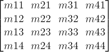
Input:  matrix      ; a 4x4 matrix
Output: translation ; a 2 component vector
        scale       ; a 2 component vector
        angle       ; rotation
        m11         ; 1,1 coordinate of 2x2 matrix
        m12         ; 1,2 coordinate of 2x2 matrix
        m21         ; 2,1 coordinate of 2x2 matrix
        m22         ; 2,2 coordinate of 2x2 matrix
Returns false if the matrix cannot be decomposed, true if it can


double row0x = matrix[0][0]
double row0y = matrix[0][1]
double row1x = matrix[1][0]
double row1y = matrix[1][1]

translate[0] = matrix[3][0]
translate[1] = matrix[3][1]

scale[0] = sqrt(row0x * row0x + row0y * row0y)
scale[1] = sqrt(row1x * row1x + row1y * row1y)

// If determinant is negative, one axis was flipped.
double determinant = row0x * row1y - row0y * row1x
if (determinant < 0)
    // Flip axis with minimum unit vector dot product.
    if (row0x < row1y)
        scale[0] = -scale[0]
    else
        scale[1] = -scale[1]

// Renormalize matrix to remove scale.
if (scale[0])
    row0x *= 1 / scale[0]
    row0y *= 1 / scale[0]
if (scale[1])
    row1x *= 1 / scale[1]
    row1y *= 1 / scale[1]

// Compute rotation and renormalize matrix.
angle = atan2(row0y, row0x);

if (angle)
    // Rotate(-angle) = [cos(angle), sin(angle), -sin(angle), cos(angle)]
    //                = [row0x, -row0y, row0y, row0x]
    // Thanks to the normalization above.
    double sn = -row0y
    double cs = row0x
    double m11 = row0x
    double m12 = row0y
    double m21 = row1x
    double m22 = row1y
    row0x = cs * m11 + sn * m21
    row0y = cs * m12 + sn * m22
    row1x = -sn * m11 + cs * m21
    row1y = -sn * m12 + cs * m22

m11 = row0x
m12 = row0y
m21 = row1x
m22 = row1y

// Convert into degrees because our rotation functions expect it.
angle = rad2deg(angle)

return true
Input: translationA ; a 2 component vector
       scaleA       ; a 2 component vector
       angleA       ; rotation
       m11A         ; 1,1 coordinate of 2x2 matrix
       m12A         ; 1,2 coordinate of 2x2 matrix
       m21A         ; 2,1 coordinate of 2x2 matrix
       m22A         ; 2,2 coordinate of 2x2 matrix
       translationB ; a 2 component vector
       scaleB       ; a 2 component vector
       angleB       ; rotation
       m11B         ; 1,1 coordinate of 2x2 matrix
       m12B         ; 1,2 coordinate of 2x2 matrix
       m21B         ; 2,1 coordinate of 2x2 matrix
       m22B         ; 2,2 coordinate of 2x2 matrix


// If x-axis of one is flipped, and y-axis of the other,
// convert to an unflipped rotation.
if ((scaleA[0] < 0 && scaleB[1] < 0) || (scaleA[1] < 0 && scaleB[0] < 0))
    scaleA[0] = -scaleA[0]
    scaleA[1] = -scaleA[1]
    angleA += angleA < 0 ? 180 : -180

// Don't rotate the long way around.
if (!angleA)
    angleA = 360
if (!angleB)
    angleB = 360

if (abs(angleA - angleB) > 180)
    if (angleA > angleB)
        angleA -= 360
    else
        angleB -= 360
Afterwards, each component of the decomposed values translation, scale, angle, m11 to m22 of the source matrix get linearly interpolated with each corresponding component of the destination matrix.
Input:  translation ; a 2 component vector
        scale       ; a 2 component vector
        angle       ; rotation
        m11         ; 1,1 coordinate of 2x2 matrix
        m12         ; 1,2 coordinate of 2x2 matrix
        m21         ; 2,1 coordinate of 2x2 matrix
        m22         ; 2,2 coordinate of 2x2 matrix
Output: matrix      ; a 4x4 matrix initialized to identity matrix


matrix[0][0] = m11
matrix[0][1] = m12
matrix[1][0] = m21
matrix[1][1] = m22

// Translate matrix.
matrix[3][0] = translate[0] * m11 + translate[1] * m21
matrix[3][1] = translate[0] * m12 + translate[1] * m22

// Rotate matrix.
angle = deg2rad(angle);
double cosAngle = cos(angle);
double sinAngle = sin(angle);

// New temporary, identity initialized, 4x4 matrix rotateMatrix
rotateMatrix[0][0] = cosAngle
rotateMatrix[0][1] = sinAngle
rotateMatrix[1][0] = -sinAngle
rotateMatrix[1][1] = cosAngle

matrix = multiply(matrix, rotateMatrix)

// Scale matrix.
matrix[0][0] *= scale[0]
matrix[0][1] *= scale[0]
matrix[1][0] *= scale[1]
matrix[1][1] *= scale[1]
Mathematical Description of Transform Functions {#mathematical-description}
===========================================================================
Mathematically, all transform functions can be represented as 4x4 transformation matrices of the following form:
 One translation unit on a matrix is equivalent to 1 pixel in the local coordinate system of the element.
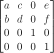
A 2D 3x2 matrix with six parameters a, b, c, d, e and f is equivalent to the matrix:
A 2D translation with the parameters tx and ty is equivalent to a 3D translation where tz has zero as a value.
A 2D scaling with the parameters sx and sy is equivalent to a 3D scale where sz has one as a value.
A 2D rotation with the parameter alpha is equivalent to a 3D rotation with vector [0,0,1] and parameter alpha.
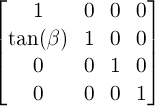
A 2D skew like transformation with the parameters alpha and beta is equivalent to the matrix:
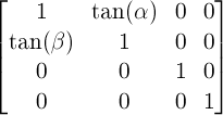
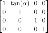
A 2D skew transformation along the X axis with the parameter alpha is equivalent to the matrix:
A 2D skew transformation along the Y axis with the parameter beta is equivalent to the matrix: