 The page sheet is one surface of the physical
medium. The illustration to the right shows a representation of the upper-left
corner of a page sheet.
The page sheet is one surface of the physical
medium. The illustration to the right shows a representation of the upper-left
corner of a page sheet.
Shortname: css-page
Level: 3
Status: ED
Work Status: Revising
Group: csswg
ED: https://drafts.csswg.org/css-page/
TR: https://www.w3.org/TR/css3-page/
Previous Version: https://www.w3.org/TR/2013/WD-css3-page-20130314/
Issue Tracking: Tracker http://www.w3.org/Style/CSS/Tracker/products/13
Editor: Elika J. Etemad / fantasai, Invited Expert, formerly Mozilla, http://fantasai.inkedblade.net/contact, w3cid 35400
Editor: Simon Sapin, Mozilla, formerly Kozea, http://exyr.org/about/
Ignored terms: fit, fit-position, stacking context
Link defaults: css-break (property) break-after, css21 (property) display, css21 (property) min-height, css21 (property) max-height, css21 (property) min-width, css21 (property) max-width, css21 (property) margin, css21 (property) counter-increment, css21 (property) counter-reset
Abstract: This CSS module specifies how pages are generated and laid out to hold fragmented content in a paged presentation. It adds functionality for controlling page margins, page size and orientation, and headers and footers, and extends generated content to enable page numbering and running headers / footers. The process of paginating a flow into such generated pages is covered in [[!CSS3-BREAK]].
The page sheet is one surface of the physical
medium. The illustration to the right shows a representation of the upper-left
corner of a page sheet.
 As with other CSS boxes, a page box
consists of margin, border, padding, and content areas. The content and
margin areas of a page box have special functions:
Issue: In CSS 2.1, both the page box and page area are simple rectangles.
Neither is a CSS box with margins, borders, and padding.
This CSS box should be distinct from the page box and page area,
which would be its margin area and content area, respectively.
Naming ideas?
As with other CSS boxes, a page box
consists of margin, border, padding, and content areas. The content and
margin areas of a page box have special functions:
Issue: In CSS 2.1, both the page box and page area are simple rectangles.
Neither is a CSS box with margins, borders, and padding.
This CSS box should be distinct from the page box and page area,
which would be its margin area and content area, respectively.
Naming ideas?
z-index value of ''0''
that establishes a
stacking context
[[!CSS21]]:
the page-margin boxes never interleave with parts of the document content
or between the content and the canvas.
They may only paint in front of the document content
or behind the document canvas.
The page background is always painted underneath everything else.
The 'z-index' property applies to page-margin boxes.
Since the 'position' property does not apply to page-margin boxes,
'z-index' always affects page-margin boxes as if they were positioned elements
regardless of the 'position' property's value.
Each page-margin boxes always establishes a stacking context.
The default painting order,
or CSS2.1 Appendix E "tree order",
of page-margin boxes with respect to each other is as follows:
Start with ''@top-left-corner'', then go clockwise. This order is arbitrary but can be overridden with 'z-index'. It only has a visible effect when page-margin boxes overlap, which should not happen in most cases.
Note, however, that generating a small number of empty page boxes is sometimes necessary to honor the forced-break values for 'page-break-before'/'break-before' and 'page-break-after'/'break-after'. [[!CSS21]] [[!CSS3-BREAK]]
:left and :right pseudo-classes.
Whether the first page of a document is a left page or a right page
depends on the page progression of the document.
The page progression
is the direction in which the printed pages of a document would be sequenced
when laid out side-to-side.
For example, English and horizontally-set Japanese typically progress from left to right,
whereas Arabic and vertically-set Japanese pages typically progress from right to left.
The page progression direction is determined as follows:
:first pseudo-class matches the first printed page).
html { break-before: always }
For an HTML document with a left-to-right page progression,
the above style rule will cause the first page of the document
to print on a ':left' page
html { break-before: left }
For an HTML document,
the above style rule will cause the first page of the document
to print on a ':left' page,
regardless of the page progression.
All pages are automatically classified by user agents as either left pages or right pages, based on page progression. The :left and :right pseudo-classes only match left or right pages, respectively.
@page :left {
margin-left: 3cm;
margin-right: 4cm;
}

@page :right {
margin-left: 4cm;
margin-right: 3cm;
}
@page { margin: 2cm } /* All margins set to 2cm */

@page :first {
margin-top: 10cm /* Top margin on first page 10cm */
}
h1 elements.
h1 { break-before: left }

@page :blank {
	@top-center { content: "This page is intentionally left blank" }
}
:blank
and :right. Therefore, margin boxes set on right pages
will have to be removed unless they are wanted on blank pages. Here is
an example where the top center header is removed from blank pages,
while the page number remains:
h1 { break-before: left }

@page :blank {
	@top-center { content: none }
}

@page :right {
	@top-center { content: "Preliminary edition" }
	@bottom-center { content: counter(page) }
}
Due to the higher specificity of :blank
over :right, the top center header is removed even
if content: none comes before content: "Preliminary
edition".
@page = @page <In addition, the following rules apply: * No whitespace is allowed between the productions in <>? { < > } < > = <># < > = [ <>? < >* ]! < > = ':' [ left | right | first | blank ] /* Margin rules */ @top-left-corner = @top-left-corner { <> }; @top-left = @top-left { < > }; @top-center = @top-center { < > }; @top-right = @top-right { < > }; @top-right-corner = @top-right-corner { < > }; @bottom-left-corner = @bottom-left-corner { < > }; @bottom-left = @bottom-left { < > }; @bottom-center = @bottom-center { < > }; @bottom-right = @bottom-right { < > }; @bottom-right-corner = @bottom-right-corner { < > }; @left-top = @left-top { < > }; @left-middle = @left-middle { < > }; @left-bottom = @left-bottom { < > }; @right-top = @right-top { < > }; @right-middle = @right-middle { < > }; @right-bottom = @right-bottom { < > };
@page { ... }
@page :left { ... }
@page :right { ... }
@page LandscapeTable { ... }
@page CompanyLetterHead:first { ... } /*  identifier and pseudo page. */
@page:first { ... }
@page toc, index { ... }
@page :blank:first { ... }
The following are examples of page-margin boxes
where the declaration blocks are intentionally left blank.
@page {
 @top-left { ... /* document name */ }
 @bottom-center { ... /* page number */}
}
@page :left { @left-middle { ... /* page number in left margin */ }}
@page :right{ @right-middle { ... /* page number in right margins of right pages */}}

@page :left { @bottom-left-corner { ... /* left page numbers */ }}
@page :right { @bottom-right-corner { ... /* right page numbers */ }}
@page :first { @bottom-left-corner { ... /* empty footer on 1st page */ }
@bottom-right-corner { ... /* empty footer */ } }
Given the syntax of page selectors, f can only ever be 0 or 1.
Note: Repeated occurrences of the same pseudo-classes are allowed and do increase specificity. Due to storage limitations, implementations may have limitations on the size of f, g, or h. If so, values higher than the limit must be clamped to that limit, and not overflow. Specificities are compared by comparing the three components in order (f, g, h): the specificity with a larger f value is more specific; if the two f values are tied, then the two g values are compared, etc. If all the values are tied, the two specificities are equal.
@page { } /* specificity = (0,0,0) */
@page :left { } /* specificity = (0,0,1) */
@page :first { } /* specificity = (0,1,0) */
@page :blank:left { } /* specificity = (0,1,1) */
@page artsy { } /* specificity = (1,0,0) */
@page artsy:left { } /* specificity = (1,0,1) */
@page artsy:first { } /* specificity = (1,1,0) */
@page :left {
	margin-left: 4cm;
}

@page {
	margin-left: 3cm;
}
Due to the higher specificity of the pseudo-class selector,
the left margin on left pages will be 4cm and all other pages
(the right-facing pages) will have a left margin of 3cm.
@page :first {
	color: green;

	@top-left {
		content: "foo";
		color: blue;
	}
	@top-right {
		content: "bar";
	}
}

@page { color: red;
	@top-center {
		content: "Page " counter(page);
	}
}
@page { margin: 25mm;}
@page { font-size: 14pt;}
| Box | Description | Placement |
|---|---|---|
| top-left-corner | a fixed-size box defined by the intersection of the top and left margins of the page box | 
|
| top-left | a variable-width box filling the top page margin between the top-left-corner and top-center page-margin boxes | 
|
| top-center | a variable-width box centered horizontally between the page's left and right border edges and filling the page top margin between the top-left and top-right page-margin boxes | 
|
| top-right | a variable-width box filling the top page margin between the top-center and top-right-corner page-margin boxes | 
|
| top-right-corner | a fixed-size box defined by the intersection of the top and right margins of the page box | 
|
| left-top | a variable-height box filling the left page margin between the top-left-corner and left-middle page-margin boxes | 
|
| left-middle | a variable-height box centered vertically between the page's top and bottom border edges and filling the left page margin between the left-top and left-bottom page-margin boxes | |
| left-bottom | a variable-height box filling the left page margin between the left-middle and bottom-left-corner page-margin boxes | |
| right-top | a variable-height box filling the right page margin between the top-right-corner and right-middle page-margin boxes | 
|
| right-middle | a variable-height box centered vertically between the page's top and bottom border edges and filling the right page margin between the right-top and right-bottom page-margin boxes | |
| right-bottom | a variable-height box filling the right page margin between the right-middle and bottom-right-corner page-margin boxes | |
| bottom-left-corner | a fixed-size box defined by the intersection of the bottom and left margins of the page box | 
|
| bottom-left | a variable-width box filling the bottom page margin between the bottom-left-corner and bottom-center page-margin boxes | 
|
| bottom-center | a variable-width box centered horizontally between the page's left and right border edges and filling the bottom page margin between the bottom-left and bottom-right page-margin boxes | 
|
| bottom-right | a variable-width box filling the bottom page margin between the bottom-center and bottom-right-corner page-margin boxes | 
|
| bottom-right-corner | a fixed-size box defined by the intersection of the bottom and right margins of the page box | 
|
@page {
	size: 8.5in 11in;
	margin: 10%;

	@top-left {
		content: "Hamlet";
	}
	@top-right {
		content: "Page " counter(page);
	}
}
The 'display' property does not apply to page-margin boxes.
	@page {
		@top-left-corner { content: " "; border: solid green; }
		@top-right-corner { content: url(foo.png); border: solid green; }
		@bottom-right-corner { content: counter(page); border: solid green; }
		@bottom-left-corner { content: normal; border: solid green; }
	}
Note: The high-level goals are (in order of priority) to center the middle box (B) if it is generated, to minimize overflow and overlap, and to distribute space proportionally to the amount of content. If the middle box (B) is not generated, distribute the available width to A and C as follows:
max-content width + flex space × flex factor ÷ ∑flex factors
min-content width + flex space × flex factor ÷ ∑flex factors
(available width − used outer widths of B) ÷ 2
		@page {
			@top-left { content: "Header in Left Cell (top-left)" }
		}
Because there are no contents defined for the top-center or the top-right
page-margin boxes, the extent of the top-left page-margin box
is allowed to cross the center of the page box.

		@page {
			@top-center { content: "Header in Center Cell (top-center)" }
		}

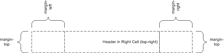
		@page {
			@top-right { content: "Header in Right Cell (top-right)" }
		}
Because the content of the center cell is empty, the extent of the top-right
page-margin box is allowed to cross the center of the page box.
		@page {
			@top-left { content: "Left Cell (top-left)" }
			@top-center { content: "Header in Center Cell (top-center)" }
		}

		@page {
			@top-center { content: "Header in Center Cell (top-center)" }
			@top-right { content: "Right Cell (top-right)" }
		}
margin: 10%;

		@page {
			@top-left { content: "Header in top-left with approx. twice as many words as right cell." }
			@top-right { content: "Right cell (top-right)" }
		}
Because there are no center cell contents, the extent of the top-left is
allowed to cross the center of the page box.

		@page {
			margin: 10%;

			@top-center {
				font-family: sans-serif;
				font-weight: bold;
				font-size: 2em;
				content: counter(page);
			}
		}
Adding the following rule will make all pages even-numbered.
		@page {
			counter-increment: page 2;
		}
| Page-margin box | 'text-align' | 'vertical-align' |
|---|---|---|
| top-left-corner | right | middle |
| top-left | left | middle |
| top-center | center | middle |
| top-right | right | middle |
| top-right-corner | left | middle |
| left-top | center | top |
| left-middle | center | middle |
| left-bottom | center | bottom |
| right-top | center | top |
| right-middle | center | middle |
| right-bottom | center | bottom |
| bottom-left-corner | right | middle |
| bottom-left | left | middle |
| bottom-center | center | middle |
| bottom-right | right | middle |
| bottom-right-corner | left | middle |
		body {counter-reset: chapter;}
		div.chapter {counter-increment: chapter;}
		@page {
			margin: 10%;
			@top-center { content: "Chapter" counter(chapter) }
		}
Name: size For: @page Value: <This property specifies the target size and orientation of the page box’s containing block. In the general case, where one page box is rendered onto one page sheet, the 'size' property also indicates the size of the destination page sheet. The size of a page box can either be "absolute" (fixed size) or "scalable" (i.e., fitting available sheet sizes). The first three values in the table below can be used to create scalable page boxes. Other values define a fixed-size page box, and thereby indicate the preferred output media size. When possible, output should be rendered on the media size indicated. If the specified size is not available, the rules for transposing a page box to a different size apply. If a 'size' property declaration is qualified by a ''width'', ''height'', ''device-width'', ''device-height'', ''aspect-ratio'', ''device-aspect-ratio'' or ''orientation'' media query [[!MEDIAQ]] (or other conditional on the size of the paper), then the declaration must be ignored. Media queries do not honor 'size': they assume the paper size that would be chosen if no ''@page'' rules were specified.>{1,2} | auto | [ < > || [ portrait | landscape ] ] Initial: auto Computed value: specified value, with < >s made absolute.
		@page {
			size: 4in 6in;
		}

		@media (max-width: 6in) {
			@page {
				size: letter;
			}
		}
The second size declaration is ignored, i.e. the specified value
of the size property is 4in 6in.
		@page {
		size: A4 landscape;
		}
The above example sets the width of the page box to be 297mm and the height to
be 210mm. The page box in this example should be rendered on a page sheet size
of 210 mm by 297 mm.
	@page {
	size: auto;/* auto is the initial value */
	margin: 10%;
	}
	@page {
	size: 8.5in 11in;/* width height */
	}
The above example sets the width of the page box to be 8.5 inches and the
height to be 11 inches. This indicates that the page sheet size should be
8.5"x11" and the orientation ''portrait''.
		/* style sheet for "A4" printing */
		@media print and (width: 21cm) and (height: 29.7cm) {
			@page {
				 margin: 3cm;
			}
		 }

		/* style sheet for "letter" printing */
		@media print and (width: 8.5in) and (height: 11in) {
			@page {
			margin: 1in;
			}
		}
	Name: marks
	For: @page
	Value: none | [ crop || cross ]
	Initial: none
	Computed Value: as specified
This property adds crop and/or registration marks to the document. These are printed outside the page box to facilitate the trimming and alignment of sheets of paper. Values have the following meanings:
@page { marks: crop cross }
Name: bleed For: @page Value: auto | <This property specifies the extent of the bleed area outside the page box; in other words the extent beyond the page box at which the page rendering is clipped. Values have the following meanings:> Initial: auto Computed Value: as specified
Name: page Value: auto | <The 'page' property is used to specify a particular type of page (called a named page) on which an element must be displayed. If necessary, a forced page break is introduced and a new page generated of the specified type. Note: This page can be styled by using the same type name in a page selector. Page type names are case-sensitive identifiers. However the ''page/auto'' value, being a CSS keyword, is ASCII case-insensitive. The 'page' property does not inherit. However, if the 'page' value on an element is ''page/auto'', then its used value is the value specified on its nearest ancestor with a non-auto value. When specified on the root element, the used value for ''page/auto'' is the empty string. Because a previous version of this specification indicated that the 'page' property is inherited, an implementation that inherits the 'page' property and treats ''page/auto'' as always naming the empty string remains conformant to CSS Paged Media Level 3. Note that this exception will be removed in Level 4. Therefore authors should not explicitly specify the ''page/auto'' value on a descendant of an element with a non-''page/auto'' value, as the resulting behavior will be unpredictable. The 'page' property works as follows:> Initial: auto Applies to: boxes that create class A break points Inherited: no (but see prose) Percentages: n/a Media: paged Computed value: specified value
		@page narrow { size: 9cm 18cm }
		@page rotated { size: landscape }
		div { page: narrow }
		table { page: rotated }
with this document:
		<div>
		<table>...</table>
		<table>...</table>
		<p>This text is rendered on a 'narrow' page</p>
		</div>
		<!DOCTYPE html>
		<html lang="ja">
			<style>
				html   {
					writing-mode: vertical-rl;
					line-height: 1.6;
				}
				.main  {
					page: main;
					columns: 2;
					column-gap: 1rem;
				}
				.index {
					page: index;
					columns: 3;
					column-gap: 1rem;
				}
				@page {
					margin: auto;  /* center kihon hanmen on page */
					width:  40rem; /* 1.6 × 25 lines        */
				}
				@page main  { height: 61rem; } /* 2 × 30 chars + 1 × gap */
				@page index { height: 62rem; } /* 3 × 20 chars + 2 × gap */
			</style>
			<section class="main"> ... </section>
			<section class="index"> ... </section>
		</html>
| bidi properties | direction |
| background properties | background-color |
| background-image | |
| background-repeat | |
| background-attachment | |
| background-position | |
| background | |
| border properties | border-top-width |
| border-right-width | |
| border-bottom-width | |
| border-left-width | |
| border-width | |
| border-top-color | |
| border-right-color | |
| border-bottom-color | |
| border-left-color | |
| border-color | |
| border-top-style | |
| border-right-style | |
| border-bottom-style | |
| border-left-style | |
| border-short-style | |
| border-top | |
| border-right | |
| border-bottom | |
| border-left | |
| border | |
| counter properties | counter-reset |
| counter-increment | |
| color | |
| font properties | font-family |
| font-size | |
| font-style | |
| font-variant | |
| font-weight | |
| font | |
| height properties | height |
| min-height | |
| max-height | |
| line-height | |
| margin properties | margin-top |
| margin-right | |
| margin-bottom | |
| margin-left | |
| margin | |
| outline properties | outline-width |
| outline-style | |
| outline-color | |
| outline | |
| padding properties | padding-top |
| padding-right | |
| padding-bottom | |
| padding-left | |
| padding | |
| quotes | |
| text properties | letter-spacing |
| text-align | |
| text-decoration | |
| text-indent | |
| text-transform | |
| white-space | |
| word-spacing | |
| visibility | |
| width properties | width |
| min-width | |
| max-width | |
| bidi properties | direction |
| unicode-bidi | |
| background properties | background-color |
| background-image | |
| background-repeat | |
| background-attachment | |
| background-position | |
| background | |
| border properties | border-top-width |
| border-right-width | |
| border-bottom-width | |
| border-left-width | |
| border-width | |
| border-top-color | |
| border-right-color | |
| border-bottom-color | |
| border-left-color | |
| border-color | |
| border-top-style | |
| border-right-style | |
| border-bottom-style | |
| border-left-style | |
| border-short-style | |
| border-top | |
| border-right | |
| border-bottom | |
| border-left | |
| border | |
| counter properties | counter-reset |
| counter-increment | |
| content | |
| color | |
| font properties | font-family |
| font-size | |
| font-style | |
| font-variant | |
| font-weight | |
| font | |
| height properties | height |
| min-height | |
| max-height | |
| line-height | |
| margin properties | margin-top |
| margin-right | |
| margin-bottom | |
| margin-left | |
| margin | |
| outline properties | outline-width |
| outline-style | |
| outline-color | |
| outline | |
| overflow | |
| padding properties | padding-top |
| padding-right | |
| padding-bottom | |
| padding-left | |
| padding | |
| quotes | |
| text properties | letter-spacing |
| text-align | |
| text-decoration | |
| text-indent | |
| text-transform | |
| white-space | |
| word-spacing | |
| vertical-align | |
| visibility | |
| width properties | width |
| min-width | |
| max-width | |
| z-index | |