Abstract
CSS Shapes control the geometric shapes used
for wrapping inline flow content outside an element.
For Level 1, CSS Shapes can be applied to floats.
A circle shape on a float will cause inline content
to wrap around the circle shape
instead of the float's bounding box.
Future levels of CSS Shapes will allow use of shapes
on elements other than floats
Status of this document
A previous version of this draft has been published as part of the
Working Draft “CSS Exclusions and Shapes” dated 3 May 2012.
Table of contents
Introduction
This section is not normative.
This specification defines properties to control the geometry of
an element's float area.
Definitions
Float area
The area used for wrapping content around a float element. By default, the
float area is the float element's
margin box.
This specification's
'shape-outside' property can be used to define arbitrary, non-rectangular float
areas.
Shapes
Shapes define arbitrary geometric contours around which inline
content flows. The shape-outside property defines the float area for a float.
If a user agent implements both CSS Shapes and CSS Exclusions,
the shape-outside property defines
the exclusion area for an exclusion.
A future level of CSS Shapes will define a shape-inside property,
which will define a shape to wrap content within the element.
Relation to the box model and float behavior
While the boundaries used
for wrapping inline flow content
outside a float
can be defined using shapes,
the actual box model does not change.
If the element has specified
margins, borders or padding
they will be computed and rendered
according to the [[!CSS3BOX]] module.
When a shape is used to define
a float area,
the shape is clipped
to the float's margin box.
In other words,
a shape can only ever reduce
a float area,
not increase it.
When a shape reduces
a float area such that
a line box that would be normally
be affected by the float
would not intersect
the float area at all,
the available space
for the line box is constrained
by the farthest margin edge
of the float.
For a left float this would be
the left margin edge,
and for a right float this would be
the right margin edge.
In the following example
the left and right floating
div elements
specify a triangular shape
using the 'shape-outside' property.
<div style="text-align:center;">
      <div id="float-left"></div>
      <div id="float-right"></div>
      <div>
      Sometimes a web page's text content appears to be
      funneling your attention towards a spot on the page
      to drive you to follow a particular link.  Sometimes
      you don't notice.
      </div>
</div>

<style type="text/css">
#float-left {
      shape-outside: polygon(0 0, 100% 100%, 0 100%);
      float: left;
      width: 40%;
      height: 12ex;
  }

#float-right {
      shape-outside: polygon(100% 0, 100% 100%, 0 100%);
      float: right;
      width: 40%;
      height: 12ex;
  }
  </style>
</div>

Since shapes are clipped to the float's margin box,
adding this shape to the left float above
would result in the same rendering.
shape-outside: polygon(0 0, 500% 500%, 0 500%);
A shape with no extent will create
a float area with no extent.
The shape below applied to a left float
will allow inline content
to flow through the float's box,
but the line boxes
will be constrained
by the float's left margin edge.
shape-outside: rectangle(0,0,0%,0%);
The following styling creates a shape much smaller than the float's content area, and adds a margin-top to the float. In the picture, the shape is rendered in blue, the content area in mauve, and the margin area in yellow. The inline content only wraps around the shape.
.float-left {
      shape-outside: polygon(0% 50%, 50% 100%, 0 100%);
      float: left;
      width: 100px;
      height: 100px;
      margin-top: 20px;
}

The next picture shows a possible result if two of these floats were stacked next to each other.

Basic Shapes
Shapes can be specified using
syntax similar to SVG's basic shapes.
The definitions use
<length> type and the
<percentage>
types [[!CSS3VAL]].
When using this syntax
to define shapes,
the relevant box is determined
by the computed value of the
'box-sizing'
property.
The coordinate system for the shape
has its origin on the top-left corner of the
relevant box with the x-axis
running to the right
and the y-axis running downwards.
All the lengths expressed in percentages
are resolved from the relevant box.
For the radius r of the circle shape,
a percentage value is resolved as
specified
in the SVG recommendation [[!SVG11]].
If the relevant box of the element
is dependent on auto sizing
(i.e., the element's 'width' or 'height' property is 'auto'),
then the percentage values
resolve to 0.
Supported Shapes
The following basic shapes are supported.
- rectangle([<length>|<percentage>]{4} [ curve [<length>|<percentage>]{1,2} ]? )
-
-
The four values represent
x, y, width and
height.
They define the bounding box
of the rectangle.
Negative values for width and height are invalid.
-
The two 'curve' values represent
rx and ry.
For rounded rectangles they define
the x-axis radius and y-axis radius
of the ellipse used to round off
the corners of the rectangle.
Negative values for rx and ry are invalid.
See notes below on edge cases for these values.
- inset-rectangle([<length>|<percentage>]{4} [ curve [<length>|<percentage>]{1,2} ]? )
-
-
The four values represent the
top, right, bottom and
left insets that
define the bounding box
of the inset rectangle.
Negative values for any of these insets are invalid.
-
The two 'curve' values represent
rx and ry.
For rounded inset rectangles they define
the x-axis radius and y-axis radius
of the ellipse used to round off
the corners of the inset rectangle.
Negative values for rx and ry are invalid.
See notes below on edge cases for these values.
- circle([<length>|<percentage>]{3})
-
-
The three values values represent
cx,
cy,
and r.
They define the x-axis and y-axis coordinates
of the center of the circle
and the radius of the circle.
A negative value for r is invalid.
- ellipse([<length>|<percentage>]{4})
-
-
The four values represent
cx,
cy,
rx, and
ry.
They define the x-axis and y-axis coordinates
of the center of the ellipse
and the x-axis and y-axis radius
of the ellipse.
Negative values for rx and ry are invalid.
- polygon([<fill-rule>,]? [<length>|<percentage>]{2}#)
-
- fill-rule - The filling rule used to determine the interior of the
polygon. See fill-rule property in SVG for details. Possible values are nonzero
or evenodd. Default value when omitted is nonzero.
-
The two length values represent xi and yi -
the x and y axis coordinates of the i-th vertex of the polygon.
The UA will close a polygon
by connecting the last vertex
with the first vertex of the list.
The values for corner radii
on rectangle or inset-rectangle
are determined implicitly
if either the rx or ry values
are not specified,
or are specified but with invalid values.
If neither rx nor ry are properly specified,
the values are 0 for both.
If only one value is properly specified,
that value is used for both.
And if the values cause any
of the curves to overlap,
the solution for
overlapping curves
from CSS Backgrounds and Borders [[!CSS3BG]]
is used to avoid the overlap.
Interpolation of Basic Shapes
For interpolating between
one basic shape and a second,
the rules described below are applied.
- If both basic shapes are of the same type and not of type polygon:
- Interpolate between each value.
- If one basic shape is of type rectangle and the second of type circle or ellipse:
- Replace the circle/ellipse with a temporary rectangle of equal dimension.
- Set the values for rx and ry on the temporary rectangle to ‘50%’.
- Interpolate between the two rectangles as above.
- If one basic shape is an inset-rectangle and the second is of type rectangle, circle or ellipse:
- Replace the inset-rectangle with a temporary rectangle of equal dimension.
- Interpolate between the basic shapes as above.
- If both basic shapes are of type polygon and if both polygons have the same number of vertices:
- Interpolate between each value.
- In all other cases:
- No interpolation is specified.
Shapes from Image
Issue-16112
Address security concern with automatic shape extractions for images
Another way of defining shapes
is by specifying a source image
whose alpha channel is used
to compute the shape.
The shape is computed to be the path
that encloses the area
where the opacity of the specified image
is greater than the 'shape-image-threshold' value.
If the 'shape-image-threshold' is not specified,
the initial value to be considered is 0.0.
For animated raster image formats
(such as GIF),
the first frame of the animation sequence is used.
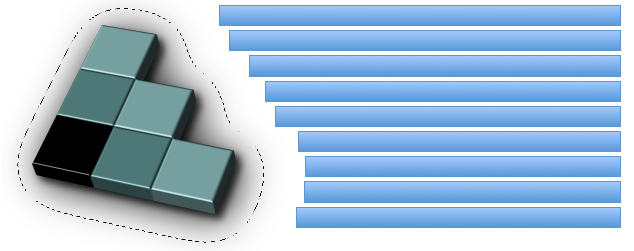
An image is floating to the left of a paragraph. The image shows the 3D version of the
CSS logo over a transparent background. The logo has a shadow using an alpha-channel.
The image defines its float area through the 'shape-outside' property and
specifies a value of 35 pixels for the 'shape-margin' property.
<p>
  <img id="CSSlogo" src="CSS-logo1s.png"/>
  blah blah blah blah...
</p>

<style>
  #CSSlogo {
    float: left;
    shape-outside: url("CSS-logo1s.png");
    shape-image-threshold: 0.1;
    shape-margin: 35px;
  }
</style>
The image needs two references to the image because this example uses the same image
- to render it
- as a shape defining the float area of the image
It is perfectly possible to display an image and use a different image for its
float area.
In the figure below, the alpha-channel threshold is represented by the dotted line around
the CSS logo and the 35px shape-margin is visible between that line and the edges of
each individual line of the paragraph.
It's then possible to affect where the lines of the paragraph start in three ways:
- Changing the value of the 'shape-margin' property
- Changing the value of the 'shape-image-threshold' property
- Modifying the alpha channel in the image
Declaring Shapes
Shapes are declared with
the 'shape-outside' property,
with possible modifications
from the 'shape-margin' property.
The shape defined by
the 'shape-outside'
and 'shape-margin' properties
changes the geometry
of a float element's
float area.
The 'shape-outside' Property
| Name: |
shape-outside |
| Value: |
auto | <basic-shape> | <uri> |
| Initial: |
auto |
| Applies to: |
floats |
| Inherited: |
no |
| Percentages: |
N/A |
| Media: |
visual |
| Computed value: |
computed lengths for <basic-shape>, the absolute URI for <uri>, otherwise as specified |
The values of this property have the following meanings:
- auto
- The float area uses the margin box as normal.
- <basic-shape>
-
The shape is computed based on the values of one of 'rectangle', 'inset-rectangle', 'circle', 'ellipse'
or 'polygon'.
- <uri>
-
If the <uri> references
an image,
which is
CORS-same-origin,
the shape is extracted
and computed based
on the alpha channel
of the specified image.
If the <uri> does not reference
an image or if it references an image
which is not
CORS-same-origin,
the effect is as if
the value 'auto' had been specified.
The 'shape-image-threshold' Property
The 'shape-image-threshold'
defines the alpha channel threshold
used to extract the shape
using an image.
A value of 0.5 means that
the shape will enclose
all the pixels
that are more than 50% opaque.
| Name: |
shape-image-threshold |
| Value: |
<alphavalue> |
| Initial: |
0.0 |
| Applies to: |
floats |
| Inherited: |
no |
| Percentages: |
alpha channel of the image specified by <uri> |
| Media: |
visual |
| Computed value: |
The same as the specified value after clipping the <alphavalue> to the range [0.0,1.0]. |
The values of this property have the following meanings:
- <alphavalue>
-
A <number> value used to set the threshold used for extracting a shape from
an image. Any values outside the range 0.0 (fully transparent) to 1.0 (fully opaque)
will be clamped to this range.
The 'shape-margin' property
The 'shape-margin' property adds a margin to a shape-outside.
This defines a new shape where every point
is the specified distance from the shape-outside.
This property takes on positive values only.
| Name: |
shape-margin |
| Value: |
<length> |
| Initial: |
0 |
| Applies to: |
floats |
| Inherited: |
no |
| Percentages: |
N/A |
| Media: |
visual |
| Computed value: |
the absolute length |
A 'shape-margin' creating an offset
from a circlular shape-outside.
The blue rectangles represent
inline content affected
by the shape created
by the margin.

Acknowledgments
This specification is made possible by input from
Andrei Bucur,
Alexandru Chiculita,
Arron Eicholz,
Daniel Glazman,
Arno Gourdol,
Zoltan Horvath,
Chris Jones,
Bem Jones-Bey,
Marcus Mielke,
Alex Mogilevsky,
Hans Muller,
Mihnea Ovidenie,
Virgil Palanciuc,
Dirk Schulze,
Peter Sorotokin,
Bear Travis,
Eugene Veselov,
Stephen Zilles
and the CSS Working Group members.
References
Normative references
Other references
Index
Property index
Change Log
- Change initial value of shape-image-threshold to 0.0
- Change float positioning to be unaffected by shape-outside
- Shapes on floats clipped to float's margin box
- Inline content constrained to at least the float's farthest margin edge
- Postpone shapes from SVG elements to a future Shapes level
- Postpone shape-inside to a future Shapes level
- split exclusions from shapes into separate modules
- added inset-rectangle() to basic shapes
- Changed shape-inside overflow diagrams to show exclusion behavior
- Changed shape-inside to contribute to the wrapping context
- Defined exclusion edges relative to wrapping content's writing mode
- Made use of start, end, before and after consistent
- Added interpolation for basic shapes
- Changed basic shapes to depend on box specified with box-sizing
- Added overflow behavior for shape-inside.
- Added wrap-flow:minimum.
- Clarified processing model.
- Changed wrap-margin and wrap-padding to shape-margin and shape-padding.
- Removed wrap shorthand.
- Clarified processing model.
- Clarified interaction with floats.
- Clarified that an exclusion element establishes a new block formatting context.