
Title: CSS Table Module Level 3
Shortname: css-tables
Level: 3
Status: ED
Work Status: Exploring
Group: csswg
ED: https://drafts.csswg.org/css-tables-3/
TR: https://www.w3.org/TR/css-tables-3/
Previous Version: https://www.w3.org/TR/2016/WD-css-tables-3-20161025/
Previous Version: https://www.w3.org/TR/CSS2/tables.html
Repository: w3c/csswg-drafts
Warning: not ready
Editor: Francois Remy, Microsoft
Editor: Greg Whitworth, Microsoft, w3cid 69511
Former editor: Bert Bos, W3C
Former editor: L. David Baron, Mozilla https://www.mozilla.org/, https://dbaron.org/, w3cid 15393
Former editor: Markus Mielke, Microsoft
Former editor: Saloni Mira Rai, Microsoft
Abstract: This CSS module defines a two-dimensional grid-based layout system, optimized for tabular data rendering. In the table layout model, each display node is assigned to an intersection between a set of consecutive rows and a set of consecutive columns, themselves generated from the table structure and sized according to their content.
Ignored Terms: block-level box
spec:css22; type:property; text:min-width
spec:css22; type:property; text:max-width
spec:css22; type:property; text:top
spec:css22; type:property; text:right
spec:css22; type:property; text:bottom
spec:css22; type:property; text:background
spec:css22; type:property; text:border-style
spec:css22; type:property; text:border-width
spec:css22; type:property; text:overflow
spec:css22; type:property; text:white-space
spec:css22; type:property; text:display
spec:filter-effects-1; type:property; text:filter
spec:css-sizing-3; type:property; text:box-sizing
display: table-header-group boxes,
only the first is treated as a header;
the others are treated as if they had display: table-row-group.
display: table-footer-group boxes,
only the first is treated as a footer;
the others are treated as if they had display: table-row-group.
Authors should not assign a display type from the previous list to replaced elements (eg: input fields or images).
When the 'display' property of a replaced element computes to one of these values,
it is handled instead as though the author had declared either
block (for table display) or
inline (for all other values).
Whitespace collapsing and box generation must happen around those replaced elements
like if they never had any table-internal display value applied to them,
and had always been block or inline.
(r,c) is an available space created
by the intersection of a row r and a column c in the table grid.
Each slot of the table grid is covered by at least one table-cell (some of them anonymous), and at most two.
Each table-cell of a table-root covers at least one slot.
Table-cells which cover more than one slot do so densely,
meaning the set of slots they cover can always be described as a set of four strictly-positive integers (rowStart, colStart, rowSpan, colSpan)
such that a slot (r,c) is covered by the table-cell
if and only if r lies in the interval between rowStart (included) and rowStart+rowSpan (exculded),
and c lies in the interval between colStart (included) and colStart+colSpan (exculded);
Such table-cell is said to originate from row rowStart and column colStart.
Also:
r and columns c matching the above condition.
Also:
display:none:
inline-block for inline-table boxes and block for table boxes.
The table wrapper box establishes a block formatting context.
The table-root box (not the table-wrapper box) is used when doing baseline vertical alignment for an inline-table.
The width of the table-wrapper box is the border-edge width of the table box inside it.
Percentages which would depend on the 'width' and 'height' on the table-wrapper box's size are relative to the table-wrapper box's containing block instead, not the table-wrapper box itself.
block instead.
This transformation happen before the table fixup.
					.row { display: table-row }
					.cell { display: table-cell }
After fixup, this will produce layout boxes as though this was the initial HTML:
display: table-row are encapsulated in anonymous inline boxes, as explained in
visual formatting model:
					.inline-table { display: inline-table; }
					.row { display: table-row; }
This will produce layout boxes as though this was the initial HTML:
auto, they behave as if they had fit-content specified instead.
This is different from most block-level boxes, which behave as if they had stretch instead.
The min-content width of a table is
the width required to fit all of its columns min-content widths and its undistributable spaces.
The max-content width of a table is
the width required to fit all of its columns max-content widths and its undistributable spaces.
If the width assigned to a table is larger than its min-content width,
the Available Width Distribution algorithm
will adjust column widths in consequence.
This section overrides the general-purpose rules that apply to calculating widths described in other specifications.
In particular, if the margins of a table are set to 0 and the width to auto,
the table will not automatically size to fill its containing block.
However, once the used value of width for the table is found (using the algorithms given below)
then the other parts of those rules do apply.
Therefore, a table can be centered using left and right auto margins, for instance.
The following schema describes the algorithm in a different way, to make it easier to understand.

CSS Boxes that do not originate from an HTML table element equivalent to their display type need to be converted to their HTML equivalent before we can apply this algorithm, see below. There is no way to specify the span of a cell in css only in this level of the spec, the use of an HTML td element is required to do so. Apply the HTML5 Table Formatting algorithm, where boxes act like the HTML element equivalent to their display type, and use the attributes of their originating element if and only if it is an HTML element of the same type (otherwise, they act like if they didnt't have any attribute).
<!-- built using dom api, as this would be fixed by the html parser -->
The HTML Table Formatting algorithm sometimes generates more tracks than necessary to layout the table properly. Those tracks have historically been ignored by user agents, so the next step just gets rid of them entirely to avoid dealing with them as exceptions later in the spec. We have tried to maintain the functionality with this change, but if you happen to find any issues due to this change please file an issue. Modify iteratively the obtained grid by merging consecutive tracks as follows: As long as there exists an eligible track in the obtained row/column grid such that there is no table-column/table-row box defining the said track explicitly, and both the said track and the previous one are spanned by the exact same set of cells, those two tracks must be merged into one single track for the purpose of computing the layout of the table. Reduce the span of the cells that spanned the deleted track by one to compensate, and shift similarly the tracks from which cells originate when needed. (see spanning-ghost-rows test cases) For tables in auto mode, every track is an eligible track for the purpose of the track-merging algorithm. For tables in fixed mode, only rows are eligible to be merged that way; which means that every column is preserved. Finally, assign to the table-root grid its correct number of rows and columns (from its mapped element), and to each table-cell its accurate rowStart/colStart/rowSpan/colSpan (from its mapped element).
The following section clarifies and extends the CSS 2.1 statement saying that missing cells are rendered as if an anonymous table-cell box occupied their position in the grid (a "missing cell" is a slot in the row/column grid that is not covered yet by any table-cell box). Once the amount of columns in a table is known, any table-row box must be modified such that it owns enough cells to fill all the columns of the table, when taking spans into account. New table-cell anonymous boxes must be appended to its rows content until this condition is met.
				Name: table-layout
				Value: auto | fixed
				Initial: auto
				Applies To: table-root boxes
				Inherited: yes
A table-root is said to be laid out in fixed mode whenever the computed value of the 'table-layout' property is equal to
fixed,
and the specified width of the table root is either
a <length-percentage>,
min-content or
fit-content.
When the specified width is not one of those values,
or if the computed value of the 'table-layout' property is auto,
then the table-root is said to be laid out in auto mode.
When a table-root is laid out in fixed mode,
the content of its table-cells is ignored for the purpose of width computation,
the aggregation algorithm for column sizing considers only table-cells belonging to the first row track,
such that layout only depends on the values explicitly specified for the table-columns or cells of the first row of the table;
columns with indefinite widths are attributed their fair share of the remaining space
after the columns with a definite width have been considered, or 0px if there is no remaining space
(see [[#computing-column-measures]]).
				Name: border-collapse
				Value: separate | collapse
				Initial: separate
				Applies To: table-root boxes
				Inherited: yes
When the 'border-collapse' property has
collapse as its value,
the borders of adjacent cells are merged together such that each cell draws only half of the shared border.
As a result, some other properties like 'border-spacing' will not applied in this case (see [[#collapsed-style-overrides]]),
(see [[#border-collapsing]]).
A table-root is said to be laid out in collapsed-borders mode in this case.
Otherwhise, the table-root is said to be laid out in separated-borders mode.
Name: border-spacing
Value: <length>{1,2}
Initial: 0px 0px
Applies To: table-root boxes when 'border-collapse' is separate
Inherited: yes
Computed Value: two absolute lengths
Media: visual
Animatable: yes
The lengths specify the distance that separates adjoining cell borders in separated-borders mode,
and must not be strictly negative.
If one length is specified, it gives both the horizontal and vertical spacing.
If two are specified, the first gives the horizontal spacing and the second the vertical spacing.
See [[#computing-undistributable-space]] for details on how this affects the table layout.
				Name: caption-side
				Value: top | bottom
				Initial: top
				Applies to: table-caption boxes
				Inherited: yes
				Media: visual
This property specifies the position of the caption box with respect to the table box. Values have the following meanings:
top-outside and bottom-outside.
#REF
					caption {
						caption-side: bottom;
		  				width: auto;
		  				text-align: left
					}
flat and their shorthands/longhands relatives:
this list currently includes 'overflow', 'opacity', 'filter', 'clip', 'clip-path', 'isolation', 'mask'-*, 'mix-blend-mode', 'transform'-* and 'perspective'.
visible or hidden,
is ignored and treated as if its value was visible.
double, solid, dashed, dotted, ridge, outset, groove, inset, none
The margins are not included in the table intrinsic offsets because handling of margins depends on the 'caption-side' property. ISSUE(608): Handling of intrinsic offsets when in border collapsing mode
max('min-width', min-content width)
adjusted by the cell intrinsic offsets.
max('min-width', 'width').
max('min-width', 'width', min-content width, min('max-width', max-content width))
adjusted by the cell intrinsic offsets.
max('min-width', 'width', min-content width, min('max-width', 'width'))
adjusted by the cell intrinsic offsets.
max('min-width', min('max-width', 'width')).
min(percentage 'width', percentage 'max-width').0% is used for 'width', and
an infinite percentage is used for 'max-width'.
To compute these values, an iterative algorithm is used. First, these values are computed ignoring any cell spanning more than one column. Then, these values are updated by taking into account cells spanning incrementally more columns. When cells that spanned all columns of the table have been considered, this algorithm ends and the values are then finalized.
For the purpose of measuring a column when laid out in fixed mode, only cells which originate in the first row of the table (after reordering the header and footer) will be considered, if any. In addition, the min-content and max-content width of cells is considered zero unless they are directly specified as a length-percentage, in which case they are resolved based on the table width (if it is definite, otherwise use 0). For the purpose of calculating the outer min-content width of cells, descendants of table cells whose width depends on percentages of their parent cell' width are considered to have an auto width. Testcase Testcase
The clamping of the total of the intrinsic percentage widths of columns to a maximum of 100% means that the table layout algorithm is not invariant under switching of columns.
As noted before, this would usually be the sum of preferred width of all columns, plus any extra. In this case, the width distribution will result in giving each column its preferred width. There are however a few cases where the author asks for some other width explicitly, as well as a few cases where the table cannot be given the width it requires. The caption width minimum (CAPMIN) is the largest of the table captions min-content contribution. The row/column-grid width minimum (GRIDMIN) width is the sum of the min-content width of all the columns plus cell spacing or borders. The row/column-grid width maximum (GRIDMAX) width is the sum of the max-content width of all the columns plus cell spacing or borders. The used width of a table depends on the columns and captions widths as follows:
auto,
the used width is the greater of
W,
CAPMIN, and
GRIDMIN.
This section is not normative.
Rule 0: In fixed mode, auto and percentages columns are assigned a minimum width of zero pixels, and percentage resolution follows a different set of rules, whose goal is to ensure pixel columns always get assigned their preferred width.
Rule 1: When assigning preferred widths, specified percent columns have a higher priority than specified unit value columns, which have a higher priority than auto columns.
Rule 2:
Columns using the same sizing type (percent columns, pixel columns, or auto columns) follow the same distribution method.
For example, they all get their min-content width or they all get their max-content width.
There is one exception to this rule.
When giving its preferred percent width to a percent-column,
if that would result in a size smaller than its min-content width,
the column will be assigned its min-content width instead
though the percent-columns group as a whole is still regarded
as being assigned the preferred percent widths.
Rule 3: The sum of width assgined to all columns should be equal to the assignable table width.
The following schema describes the algorithm in a different way, to make it easier to understand.

?Testcase ?Testcase ?Testcase The height of a table is the sum of the row heights plus any cell spacing or borders. If the table has a 'height' property with a value other than auto, it is treated as a minimum height for the table grid, and will eventually be distributed to the height of the rows. The minimum height of a row is the maximum of:
| --table-cell-height | --table-height | result |
|---|---|---|
| <length> | <any> |  |
| <any> | <length> | |
| <any> | <percentage> | |
| auto | auto |  |
| <percentage> | auto | |
--other-table-cell-height nor --wrapper-height do influence the algorithm's outcome.
A previous version of this specification incorrectly stated that --wrapper-height was taken into account when the table had a percentage height,
but compat issues appeared when an implementation landed, and the behavior was then special-cased.
visible or hidden
or if they are replaced elements,
and a 0px height if they have not.
Testcase
!!Testcase
The 
For the purposes of finding a baseline, in-flow boxes with a scrolling mechanisms (see the 'overflow' property) must be considered as if scrolled to their origin position.
The baseline of a cell may end up below its bottom border, see the example below.
| baseline | The baseline of the cell is aligned with the baseline of the other cells of the first row it spans (see the definition of baselines of cells and rows). |
|---|---|
| top | The top of the cell box is aligned with the top of the first row it spans. |
| bottom | The bottom of the cell box is aligned with the bottom of the last row it spans. |
| middle | The center of the cell is aligned with the center of the rows it spans. |
| ... | Other values do not apply to cells; the cell is aligned at the baseline instead. |

collapse.

			Name: empty-cells
			Value: show | hide
			Initial: show
			Applies to: table-cell boxes
			Inherited: yes
			Media: visual
In collapsed-borders mode, this property has no effect. In separated-borders mode, when this property has the value
hide,
no borders or backgrounds are drawn around/behind empty cells.
An empty cell is a table-cell containing neither:
The rules for background and borders painting defined in [[#drawing-backgrounds-and-borders]] still apply if they are not overriden. Borders of a non-empty table-root are not painted in collapsed-borders mode, except if the 'border-image' property is set. In this latter case, the border is drawn as if the table border was twice as big as its used value specify, and as if that excess was rendered inside the padding area of the table-root.
Even if they are not drawn by the table, the table borders still occupy their space in the layout. Cells will render those shared borders.
Anonymous table-cells added by the missing cells fixup step
do not render any of their backgrounds.
In addition to its own 'background', table-cell boxes also
render the backgrounds of the table-track and table-track-group boxes in which they belong.
This is actually different from simply inheriting their background
because the 'background-origin' and 'background-size' computations will actually be done
on the bounds of the grouping boxes, and not on those of the cell.
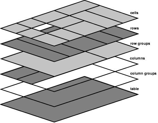
For the purposes of finding the background of each table cell,
the different table boxes may be thought of as being on six superimposed layers.
The background set in one of the layers will only be visible
if the layers above it have a transparent background.
hide,
these empty cells are not rendered at all,
as if visibility: hidden was specified on them,
letting the table background show through.
none, but also inhibits any other border (see [[#border-specificity]]).
: inset
:: Same as ridge.
: outset
:: Same as groove.


User agents may decide to extend this behavior to more fragmentation contexts, for instance repeat headers/rows across columns in addition to pages. User-agents that are rendering static documents are more likely to adopt this behavior, though this is not required per spec.
This section is not normative.
	table    { display: table }
	thead    { display: table-header-group }
	tbody    { display: table-row-group }
	tfoot    { display: table-footer-group }
	tr       { display: table-row }
	td, th   { display: table-cell }
	colgroup { display: table-column-group }
	col      { display: table-column }
	caption  { display: table-caption }
	table, thead, tbody, tfoot, tr, td, th, colgroup, col, caption { box-sizing: border-box; }
	thead, tfoot { break-inside: avoid }


	table {
		box-sizing: border-box;
		border-spacing: 2px;
		border-collapse: separate;
		text-indent: initial;
	}

	thead, tbody, tfoot, table > tr { vertical-align: middle; }
	tr, td, th { vertical-align: inherit; }

	td, th { padding: 1px; }
	th { font-weight: bold;	}

	table, td, th { border-color: gray; }
	thead, tbody, tfoot, tr { border-color: inherit; }


	table[frame=box i], table[frame=border i], table[frame=hsides i], table[frame=above i], table[frame=below i], table[frame=vsides i], table[frame=lhs i], table[frame=rhs i] {
		border: 1px solid inset;
	}


	table:matches([rules=all i], [rules=rows i], [rules=cols i], [rules=groups i], [rules=none i]) {
		border-collapse: collapse;
		border-style: hidden;
	}

	table:matches([rules=all i], [rules=rows i], [rules=cols i], [rules=groups i], [rules=none i]),
	table:matches([rules=all i], [rules=rows i], [rules=cols i], [rules=groups i], [rules=none i]) > :matches(thead,tbody,tfoot) > tr > :matches(th,td) {
		border-color: black;
	}


	table[border=$border] /* if(parseInt($border) > 0) */ {
		border: /*(parseInt($border) * 1px)*/ outset rgb(128, 128, 128);
	}
	table[border=$border] > :matches(thead,tbody,tfoot) > tr > :matches(th,td) /* if(parseInt($border) > 0) */ {
		border: 1px inset rgb(128, 128, 128);
	}


	table[rules=all i] > :matches(thead,tbody,tfoot) > tr > :matches(th,td) {
		border: 1px solid grey;
	}
	table[rules=rows i] > :matches(thead,tbody,tfoot) > tr > :matches(th,td) {
		border: 1px solid grey;
		border-left: none;
		border-right: none;
	}
	table[rules=cols i] > :matches(thead,tbody,tfoot) > tr > :matches(th,td) {
		border: 1px solid grey;
		border-top: none;
		border-bottom: none;
	}
	table[rules=none i] > :matches(thead,tbody,tfoot) > tr > :matches(th,td) {
		border: none;
	}


	table[rules=groups i] > :matches(thead,tbody,tfoot) {
		border-top-width: 1px; border-top-style: solid;
		border-bottom-width: 1px; border-bottom-style: solid;
	}
	table[rules=groups i] > colgroup {
		border-left-width: 1px; border-left-style: solid;
		border-right-width: 1px; border-right-style: solid;
	}


	table[frame=box i], table[frame=border i], table[frame=hsides i], table[frame=above i], table[frame=below i], table[frame=vsides i], table[frame=lhs i], table[frame=rhs i] {
		border-style: outset;
	}
	table[frame=below i], table[frame=vsides i], table[frame=lhs i], table[frame=rhs i] {
		border-top-style: hidden;
	}
	table[frame=above i], table[frame=vsides i], table[frame=lhs i], table[frame=rhs i] {
		border-bottom-style: hidden;
	}
	table[frame=hsides i], table[frame=above i], table[frame=below i], table[frame=rhs i] {
		border-left-style: hidden;
	}
	table[frame=hsides i], table[frame=above i], table[frame=below i], table[frame=rhs i] {
		border-right-style: hidden;
	}


	table[cellpadding=$x] > :matches(thead,tbody,tfoot) > tr > :matches(th,td) /* if(parseInt($x)>0) */ {
		padding: /*(parseInt($x) * 1px)*/;
	}
	table[cellspacing=$x] /* if(parseInt($x)>0) */ {
		border-spacing: /*(parseInt($x) * 1px)*/;
	}


	table[width=$w] /* if(parseInt($w) > 0) */ {
		width: /*(parseInt($w) * 1px)*/;
	}
	table[width=$w] /* if($w matches /(+|-|)([0-9]+([.][0-9]+|)|([.][0-9]+))[%]/) */ {
		width: /*(parseInt($w) * 1px)*/;
	}
	table[height=$h] /* if(parseInt($h) > 0) {
		height: /*(parseInt($h) * 1px)*/;
	}
	table[height=$h] /* if($h matches /(+|-|)([0-9]+([.][0-9]+|)|([.][0-9]+))[%]/) */ {
		height: /*(parseInt($h) * 1px)*/;
	}


	table[bordercolor=$color] {
		border-color: /*parseHTMLColor($color)*/;
	}
	table[bordercolor] > :matches(tbody, thead, tfoot, tr, colgroup, col),
	table[bordercolor] > :matches(tbody, thead, tfoot) > tr,
	table[bordercolor] > :matches(tbody, thead, tfoot) > tr > :matches(td, th),
	table[bordercolor] > tr > :matches(td, th)
	table[bordercolor] > colgroup > col
	) {
		border-color: inherit;
	}
	table[bgcolor=$color] {
		background-color: /*parseHTMLColor($color)*/;
	}
	table[align=left i] {
		float: left;
	}
	table[align=right i] {
		float: right;
	}
	table[align=center i] {
		margin-left: auto;
		margin-right: auto;
	}


	caption[align=bottom i] { caption-side: bottom; }
	:matches(thead,tbody,tfoot,tr,td,th)[valign=top i] {
		vertical-align: top;
	}
	:matches(thead,tbody,tfoot,tr,td,th)[valign=middle i] {
		vertical-align: middle;
	}
	:matches(thead,tbody,tfoot,tr,td,th)[valign=bottom i] {
		vertical-align: bottom;
	}
	:matches(thead,tbody,tfoot,tr,td,th)[valign=baseline i] {
		vertical-align: baseline;
	}

	:matches(thead,tbody,tfoot,tr,td,th)[align=absmiddle i] {
		text-align: center;
	}

	:matches(colgroup,col,thead,tbody,tfoot,tr,td,th)[hidden] {
		visibility: collapse;
	}

	:matches(td,th)[nowrap] { white-space: nowrap; }
	:matches(td,th)[nowrap][width=$w] /* if(quirksMode && parseInt($w) > 0) */ {
		white-space: normal;
	}