Download as PDF, PPTX


The document provides an introduction to CSS and SASS including definitions of HTML, CSS, CSS syntax, selectors, properties, and other CSS concepts. It defines HTML as a markup language and CSS as used to style and lay out HTML elements. It describes common CSS concepts like selectors, properties, values, and ways to attach CSS like inline, embedded and external stylesheets.
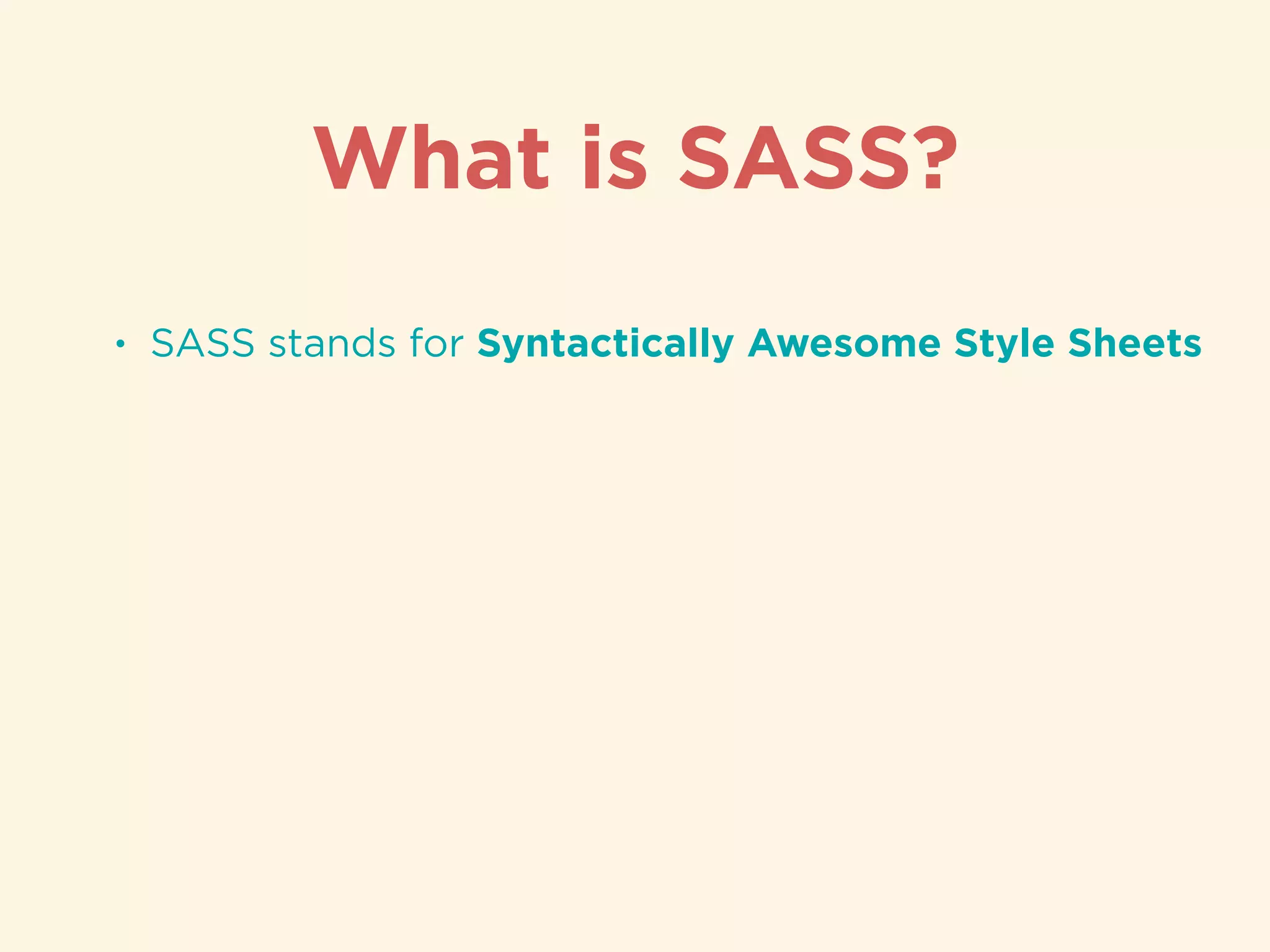
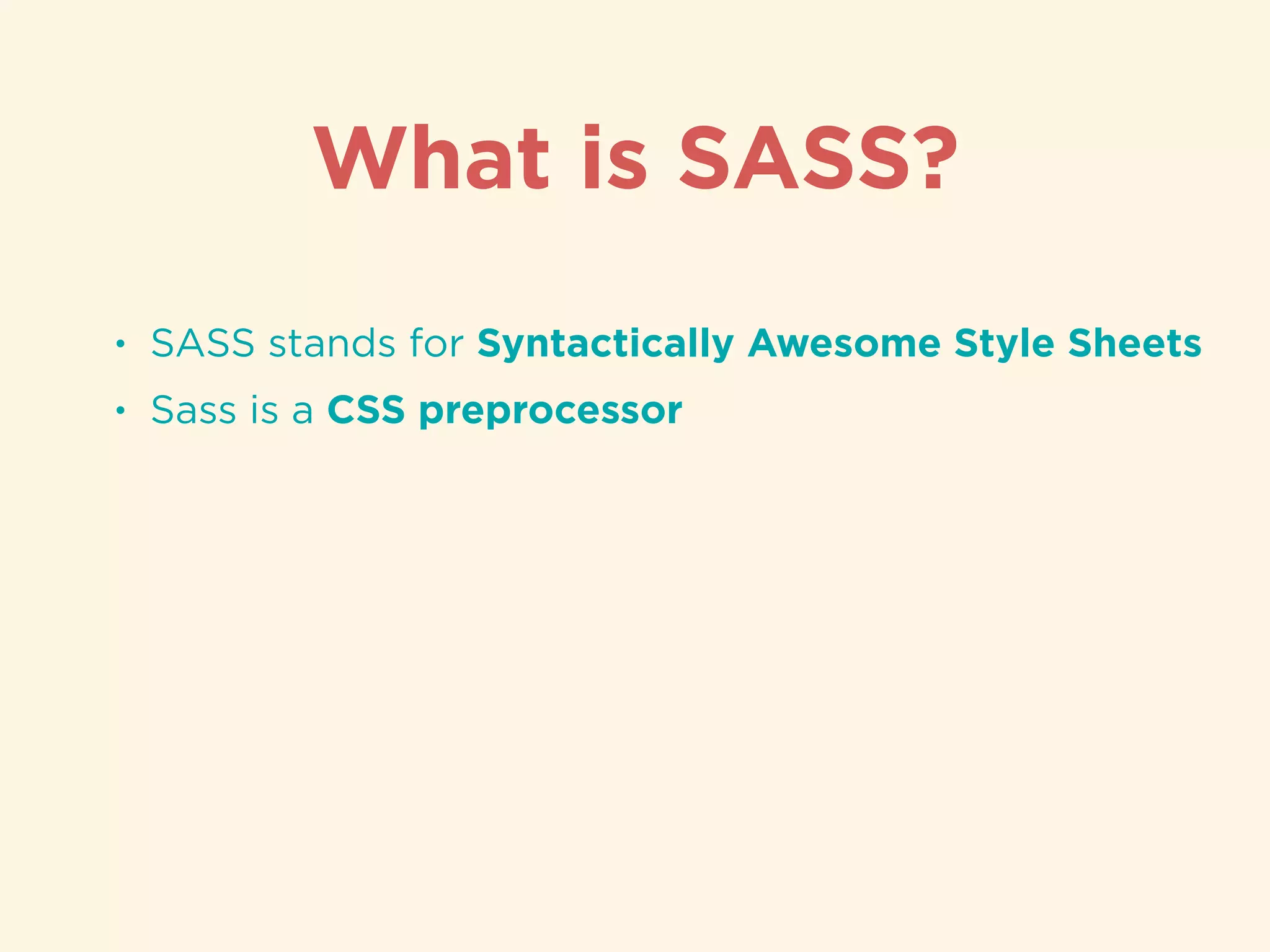
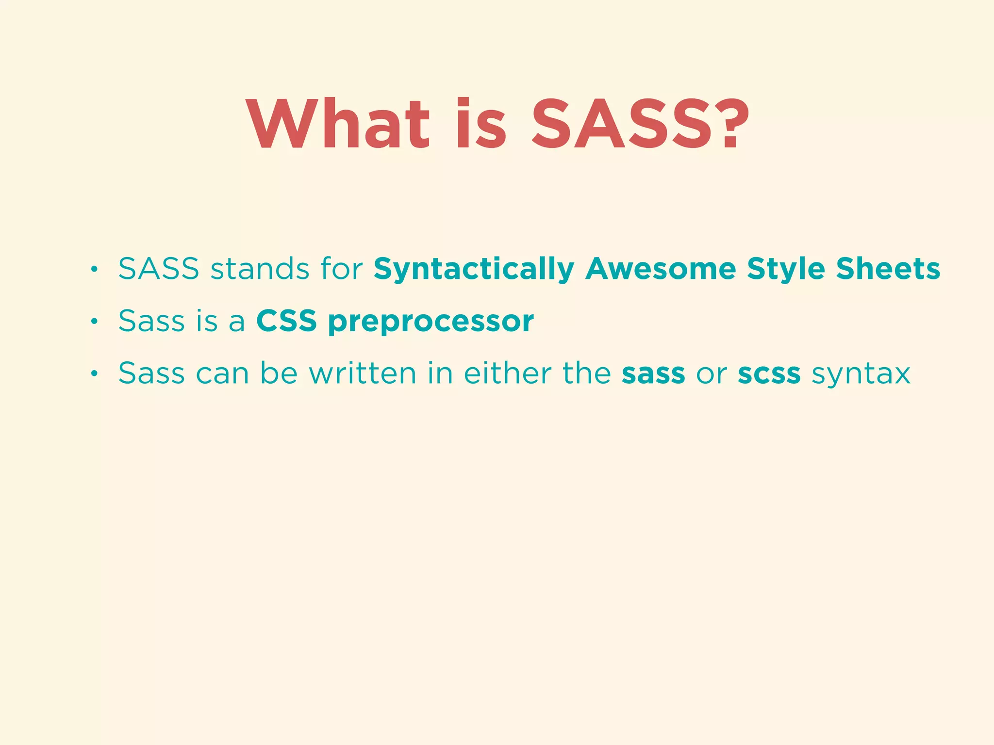
Overview of CSS (Cascading Style Sheets) and SASS (Syntactically Awesome Style Sheets) as styling tools.
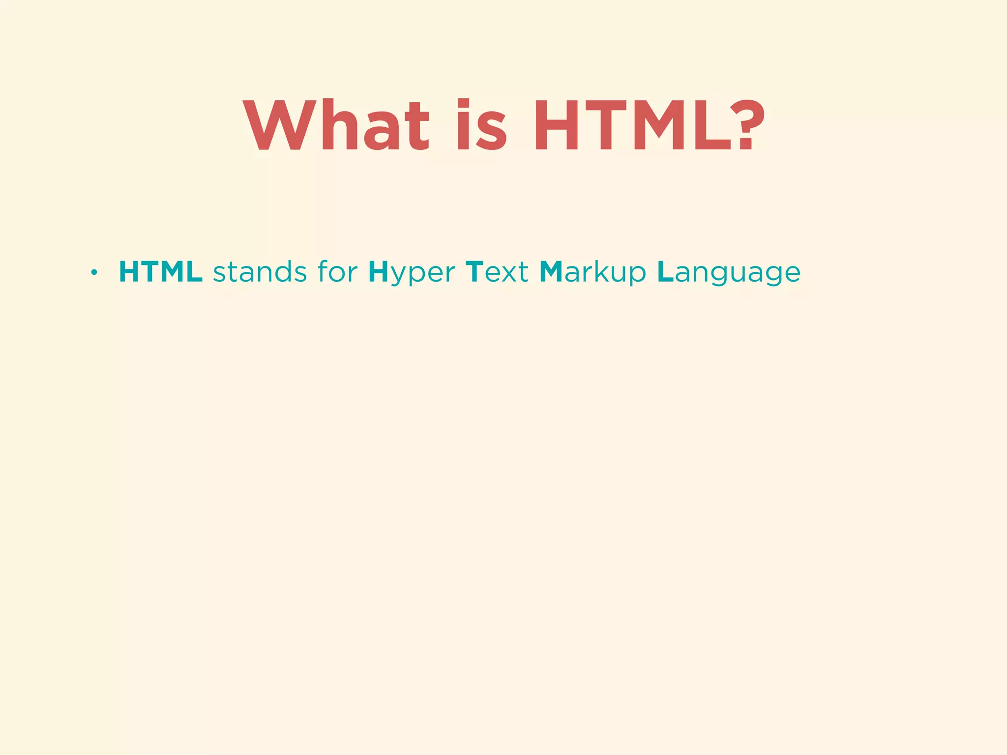
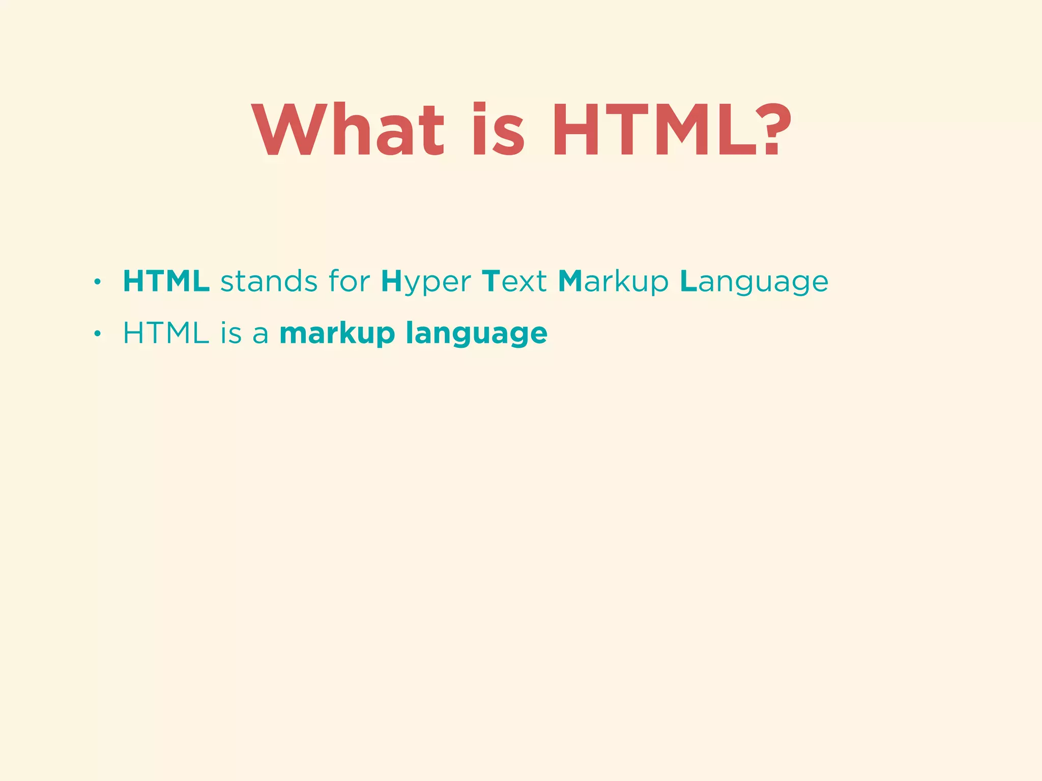
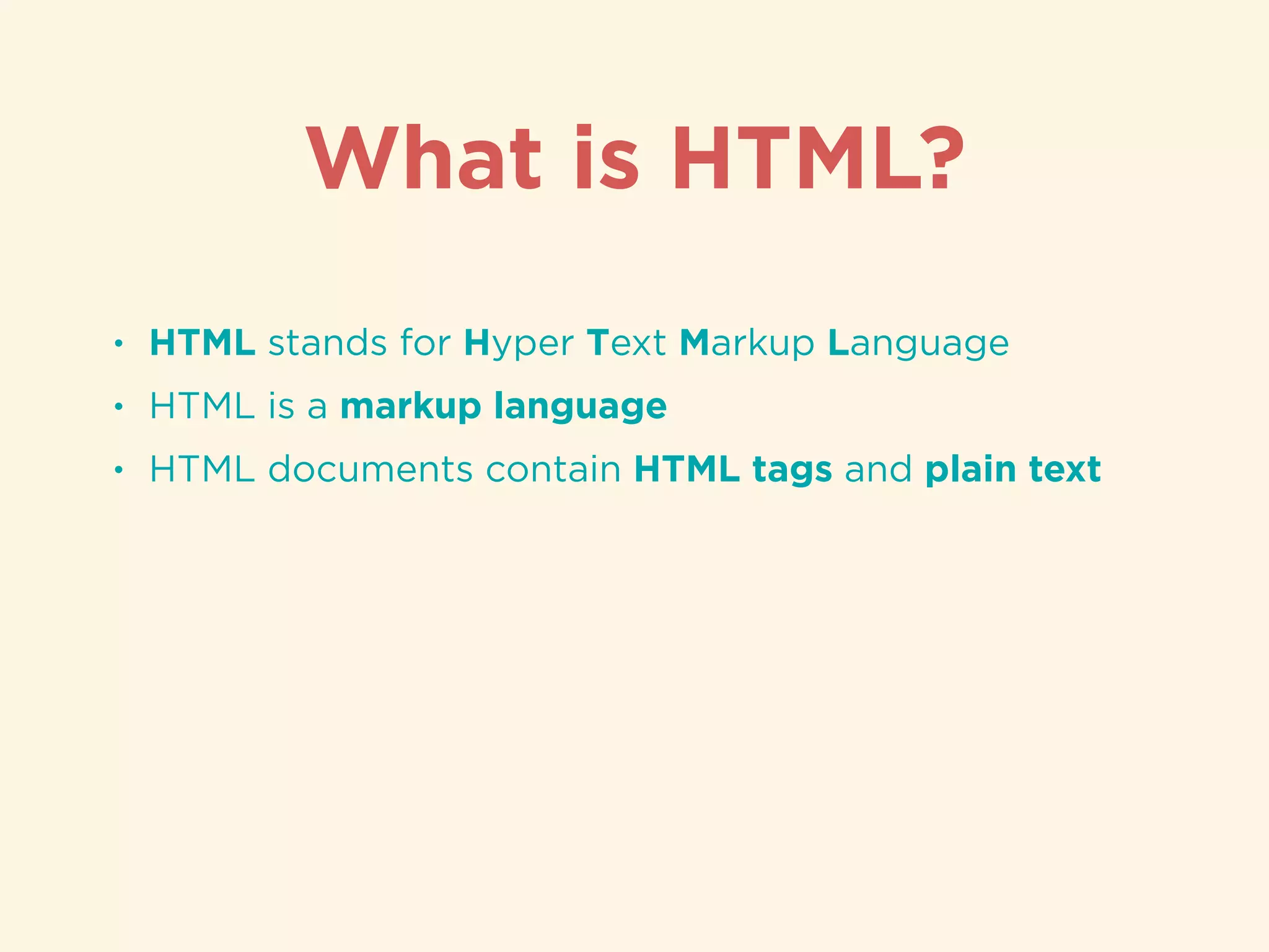
Definition and function of HTML (Hyper Text Markup Language) as a markup language for web content.
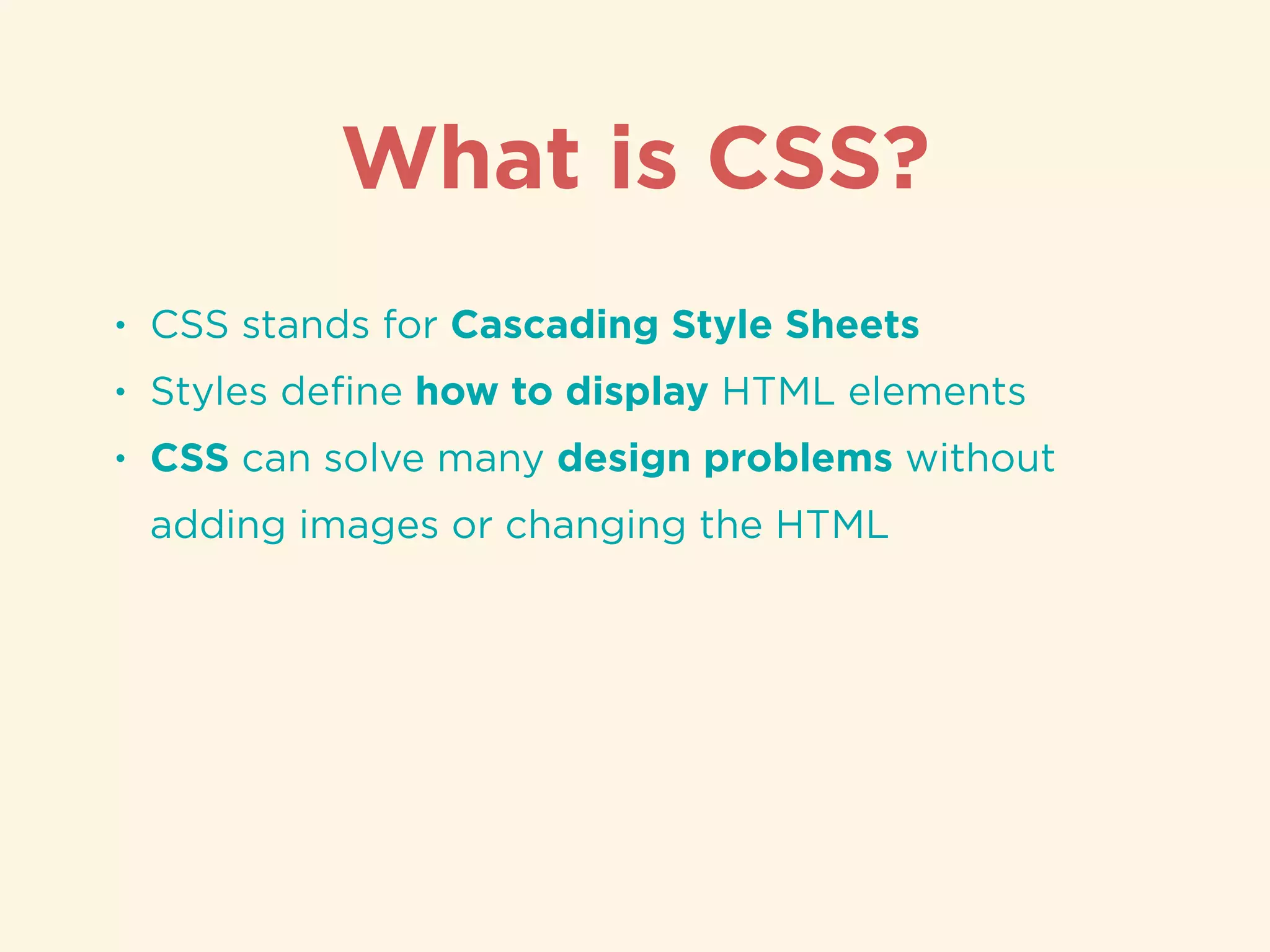
Explanation of CSS (Cascading Style Sheets) and its purpose in styling HTML elements.
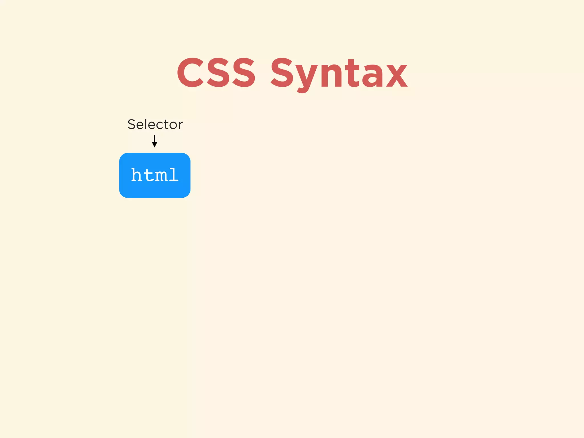
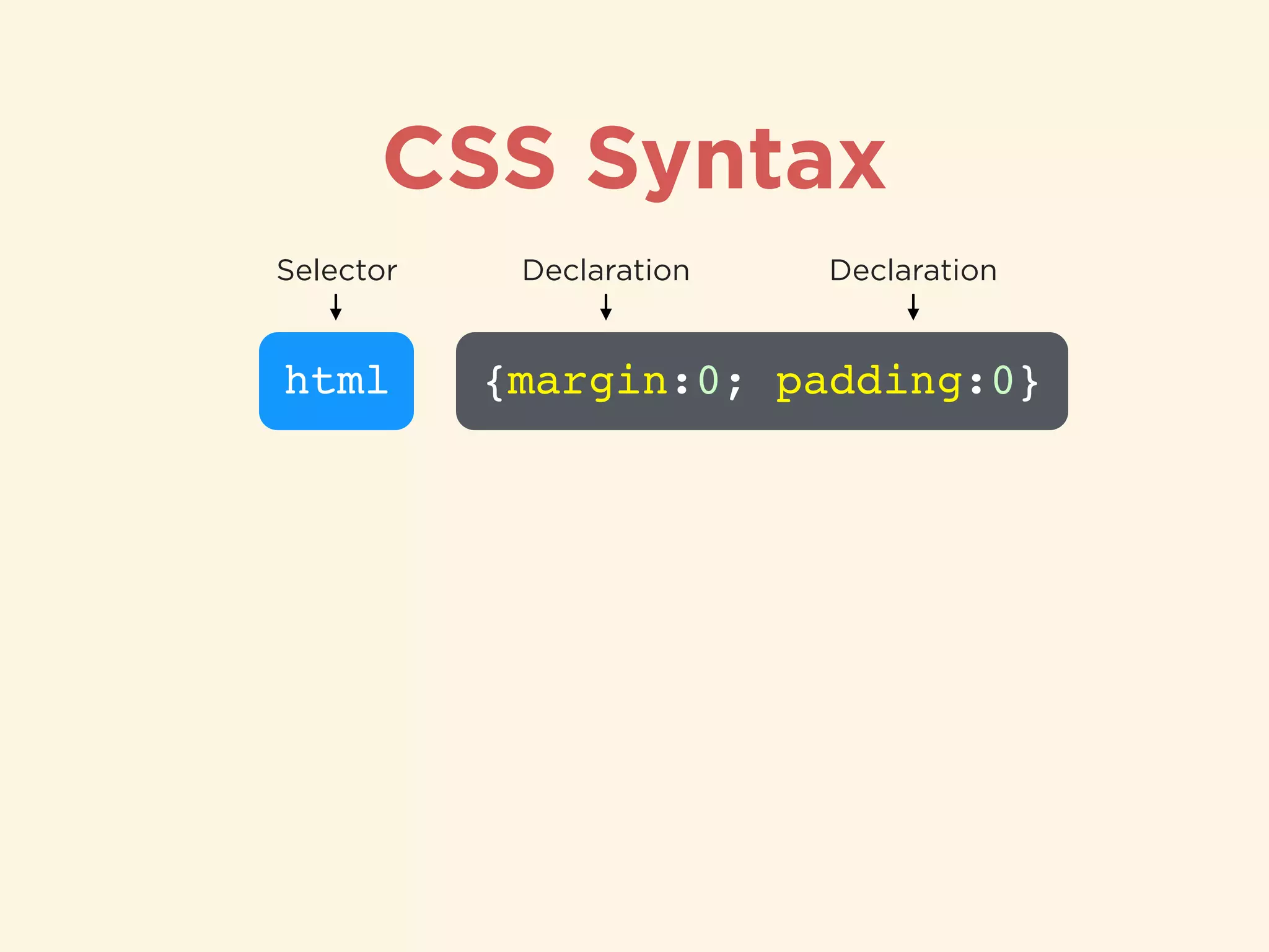
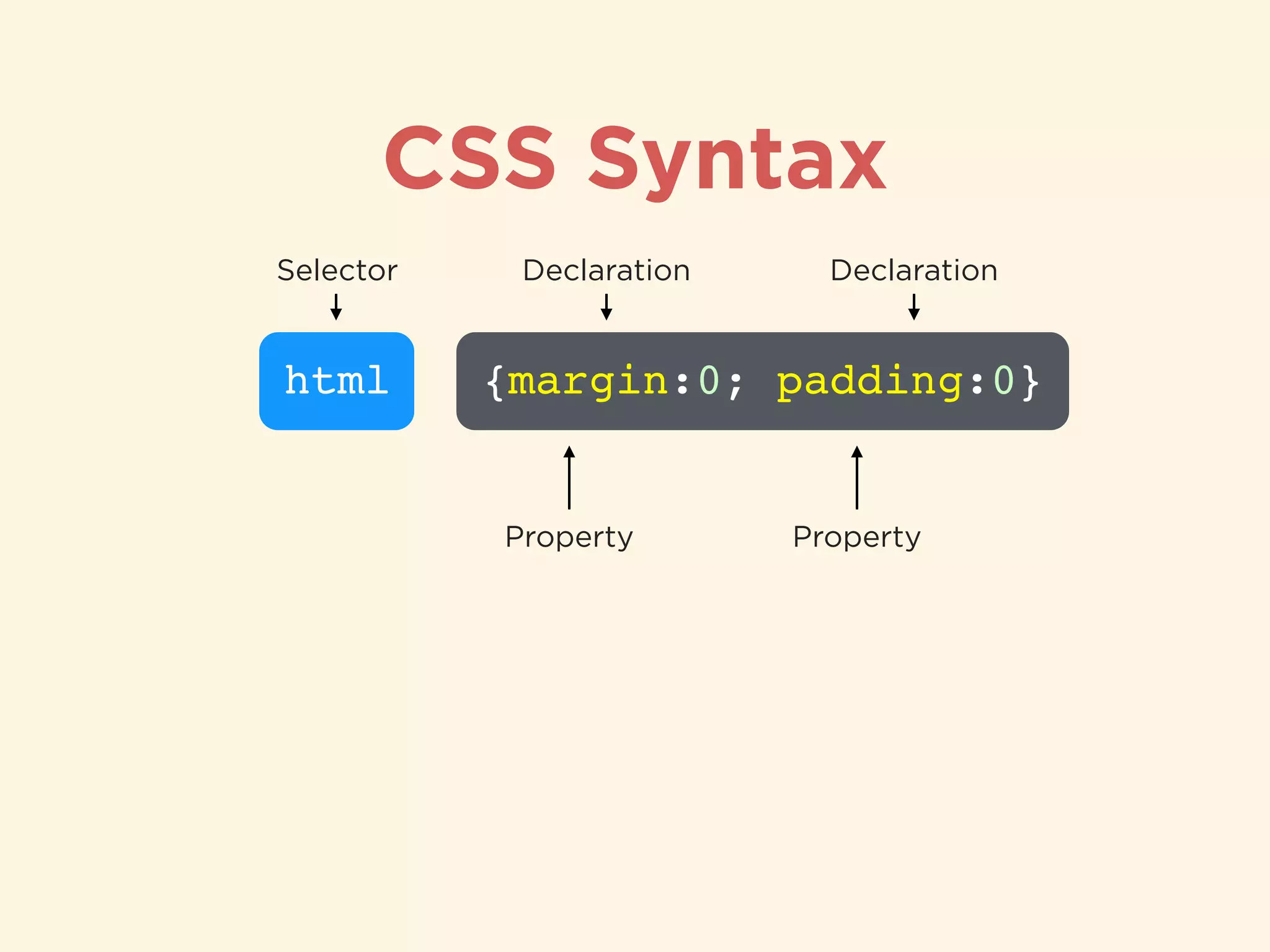
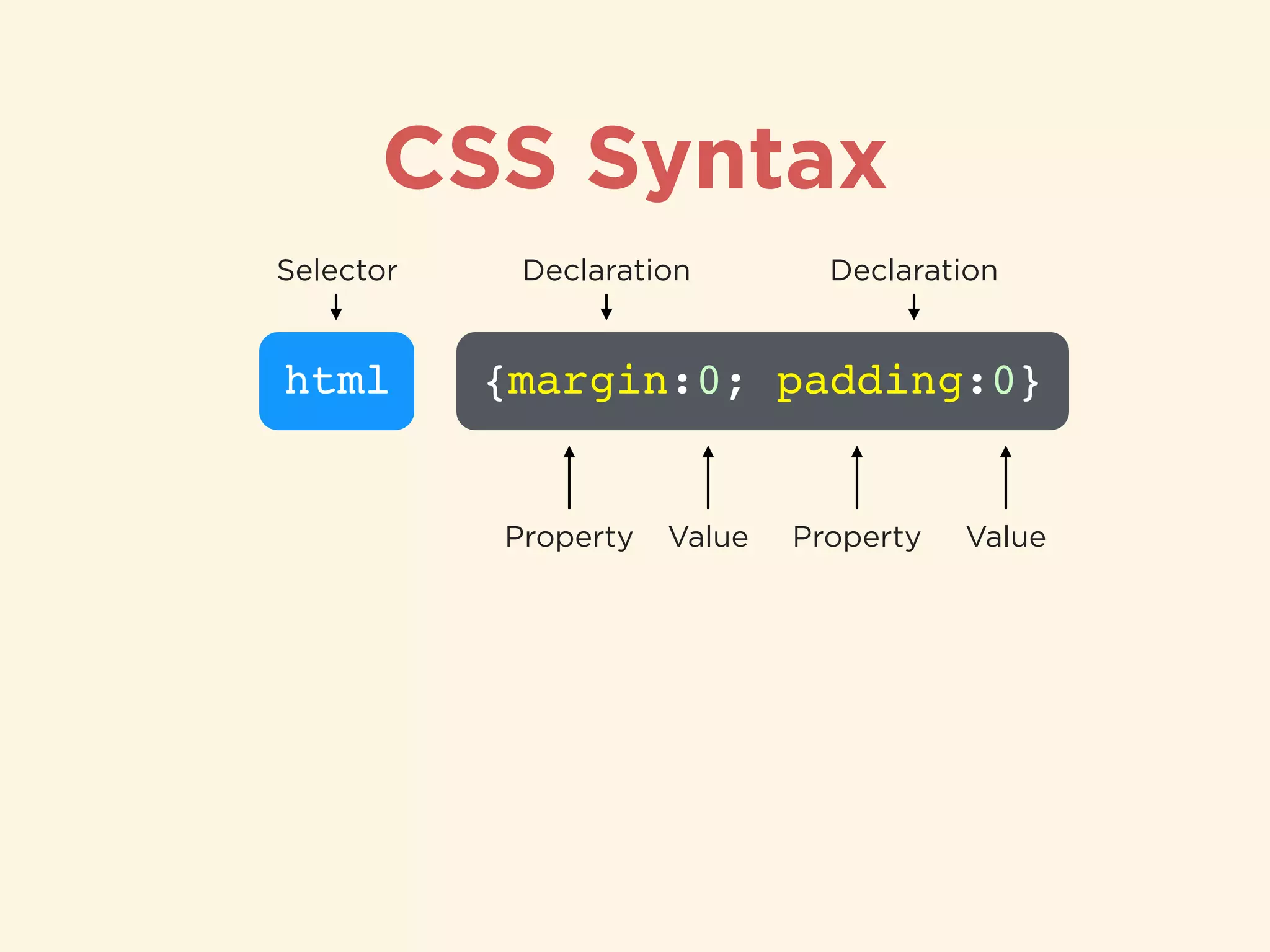
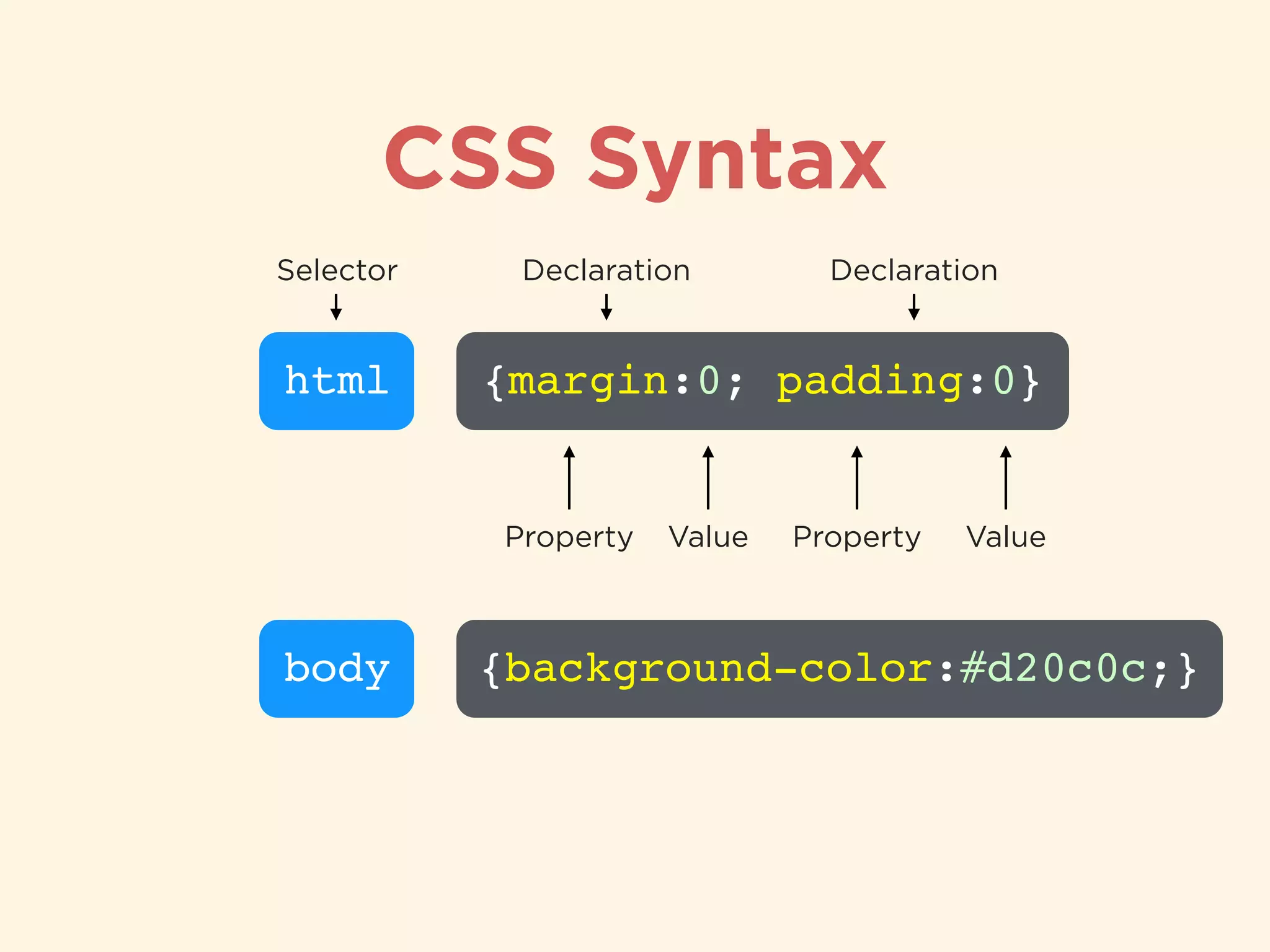
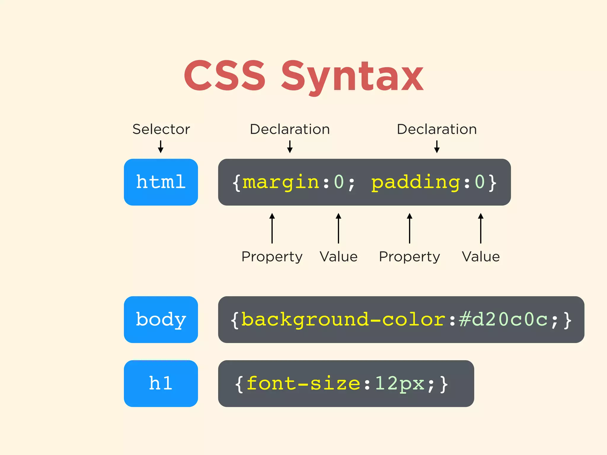
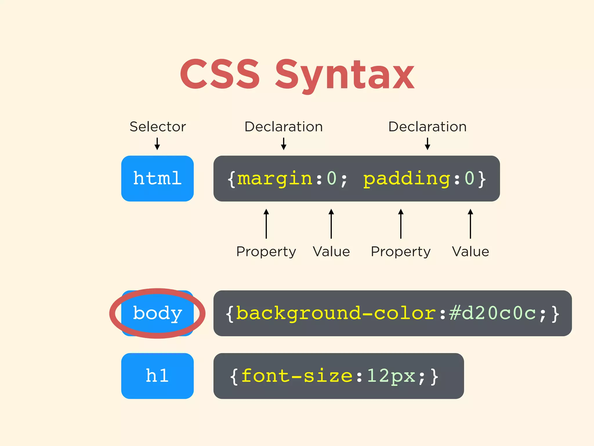
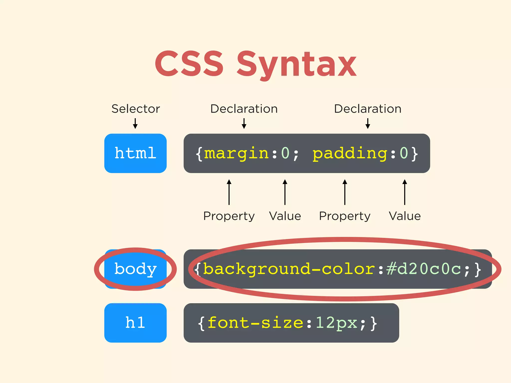
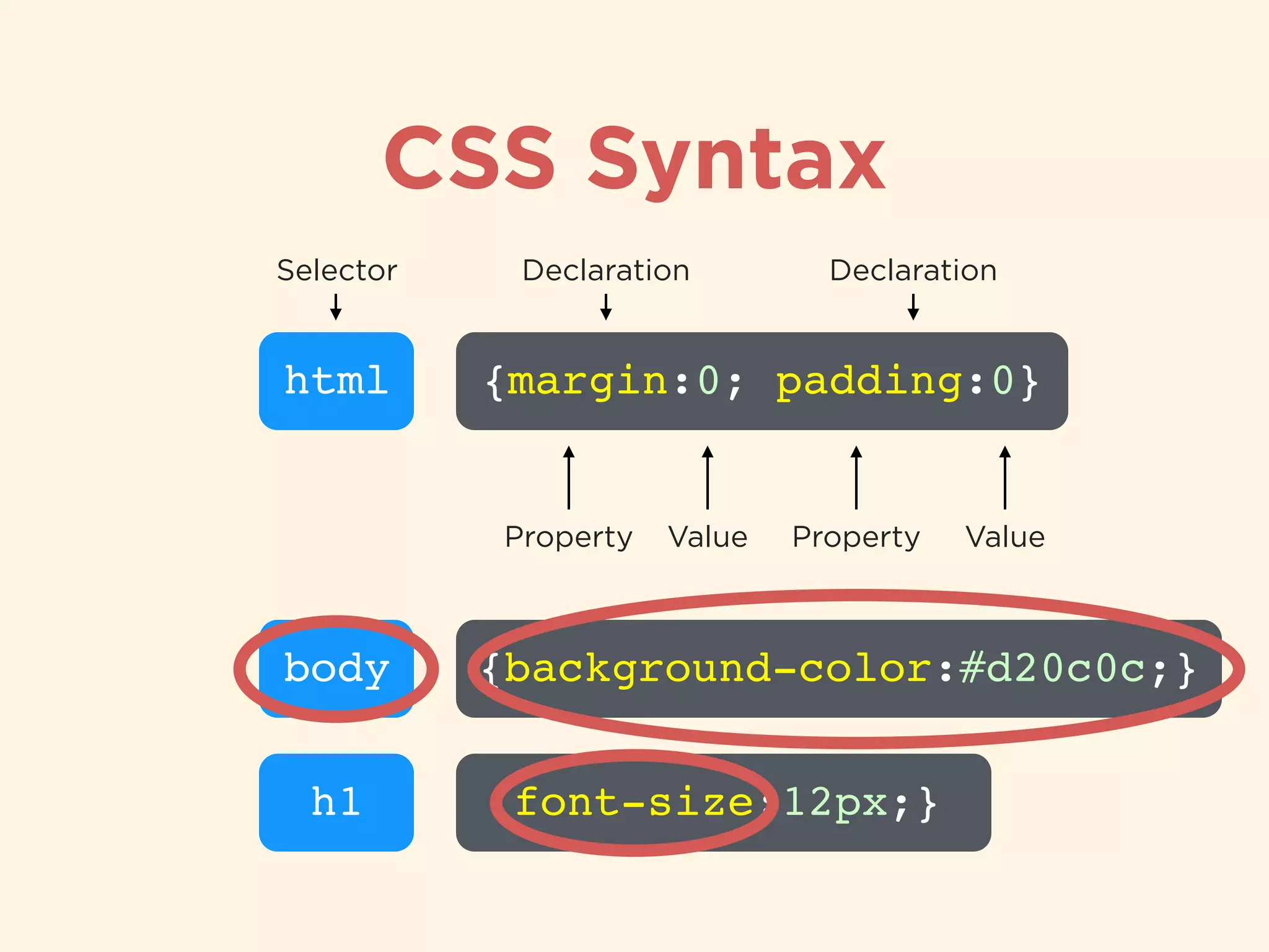
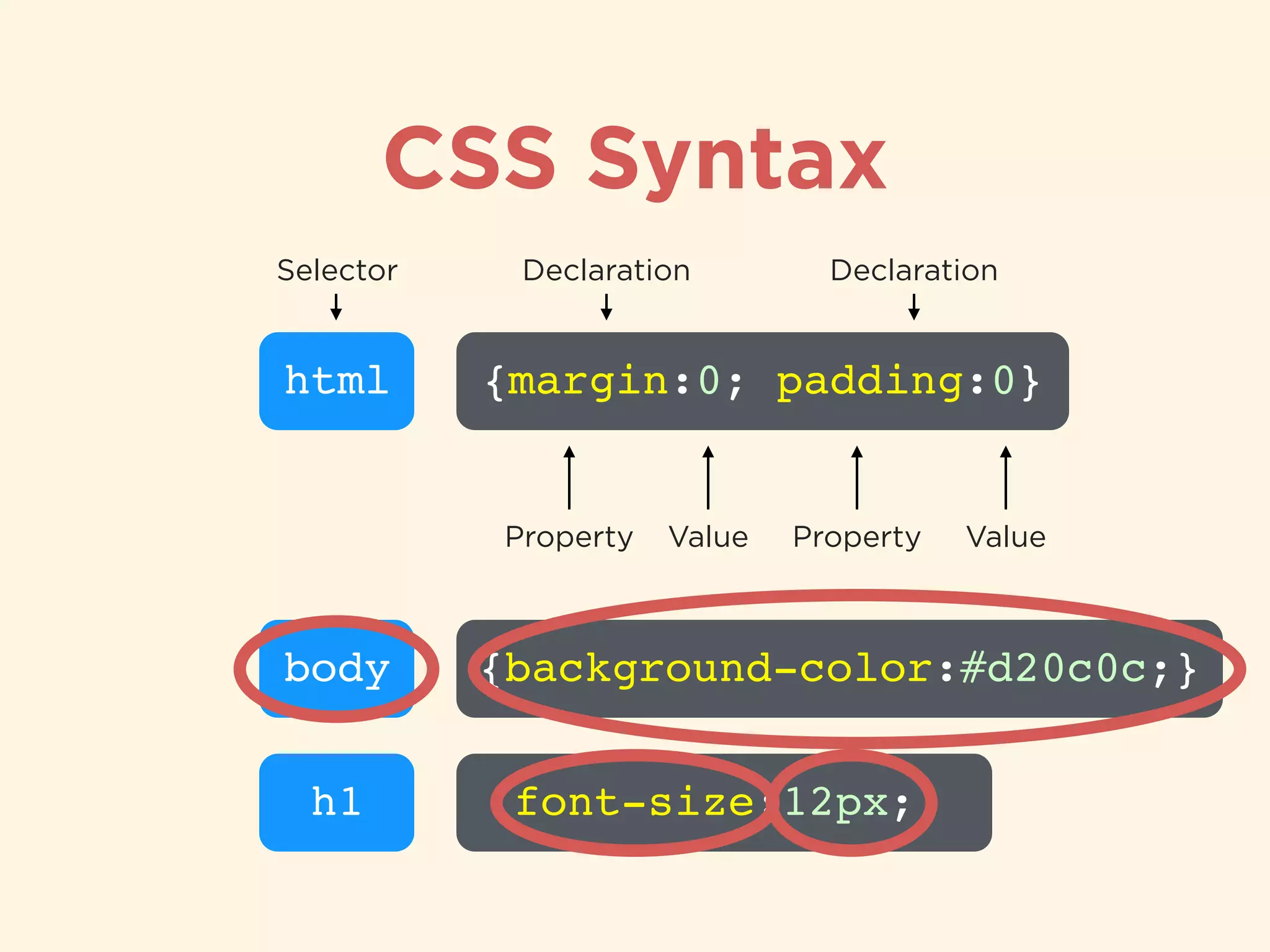
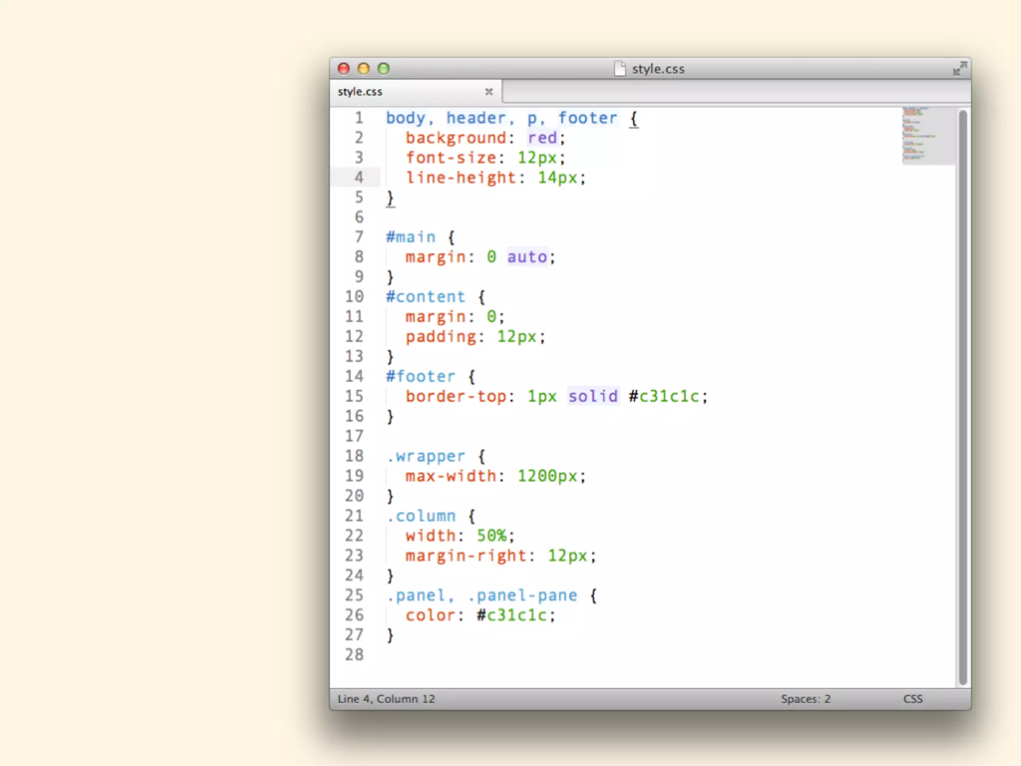
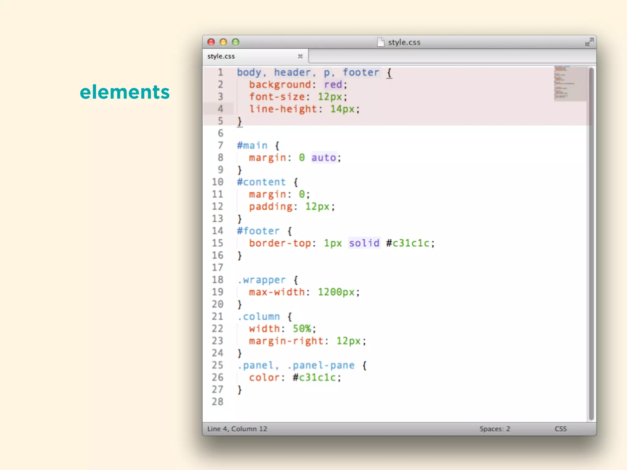
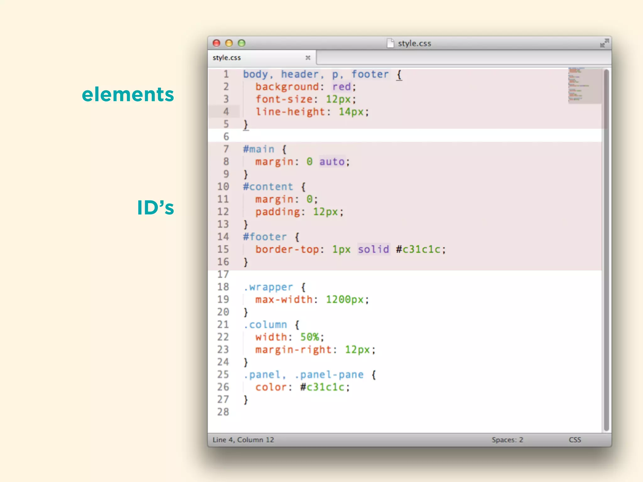
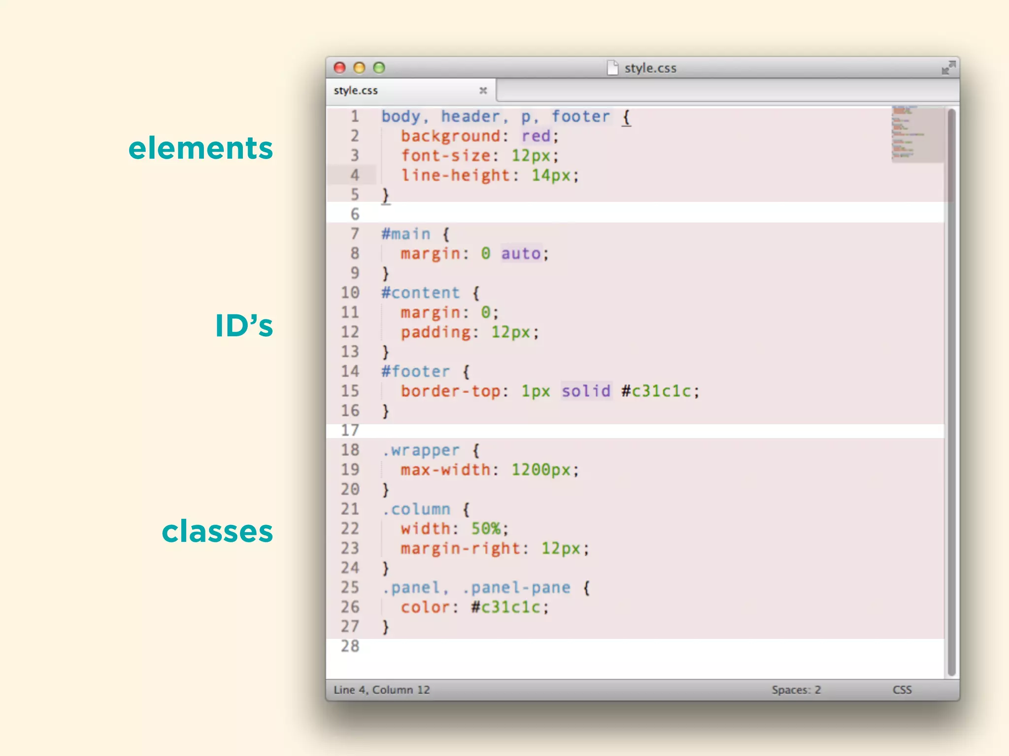
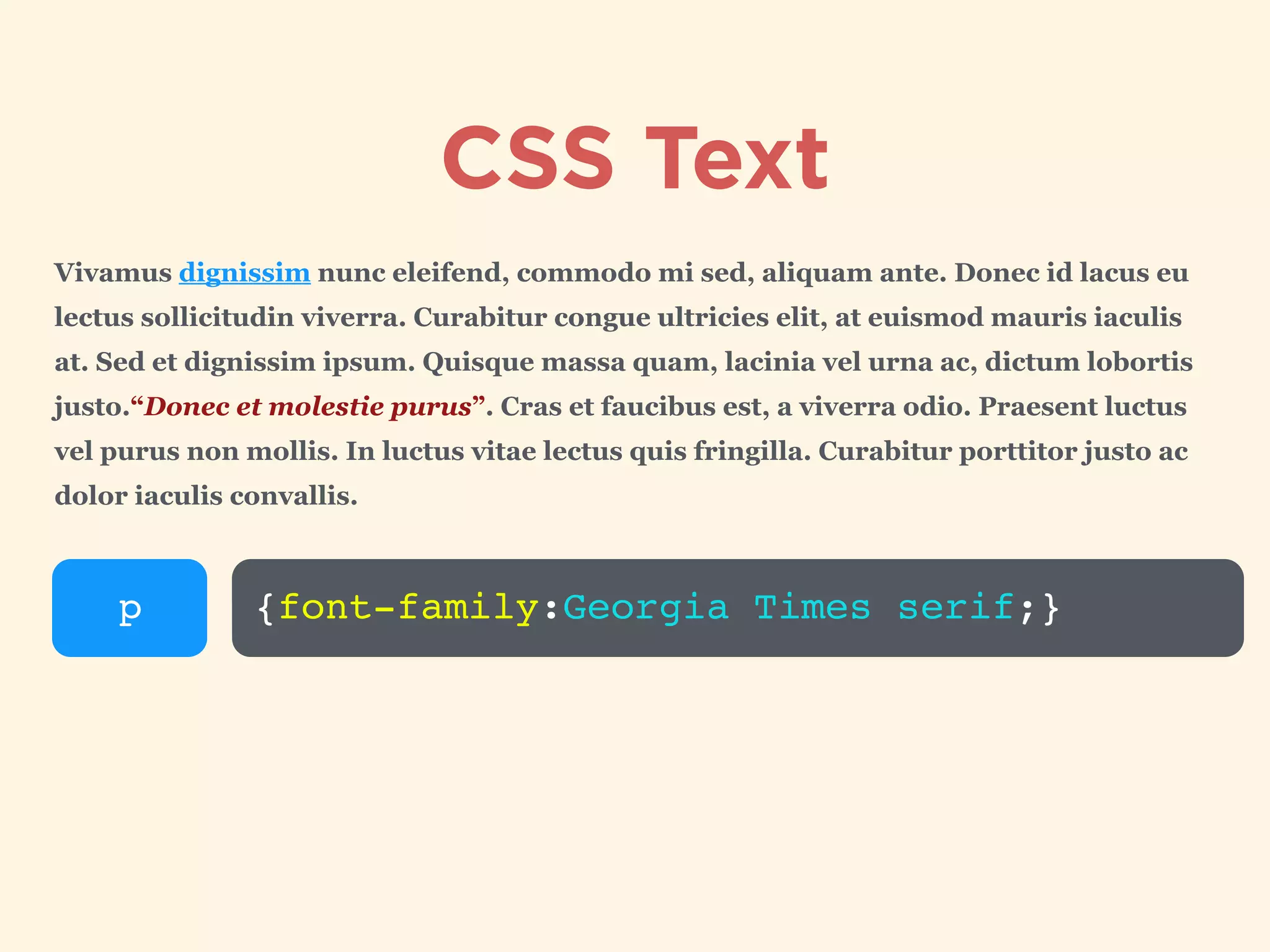
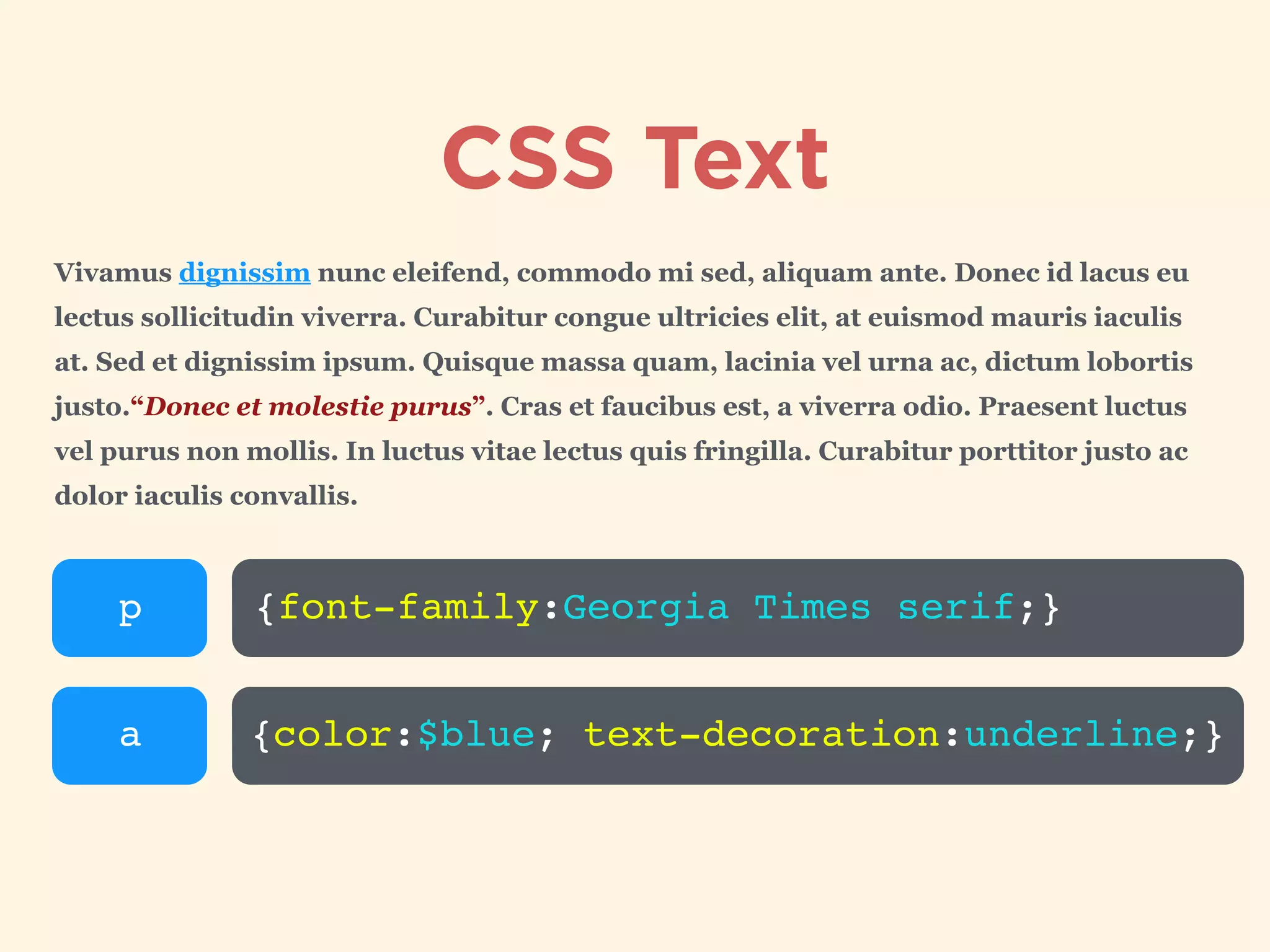
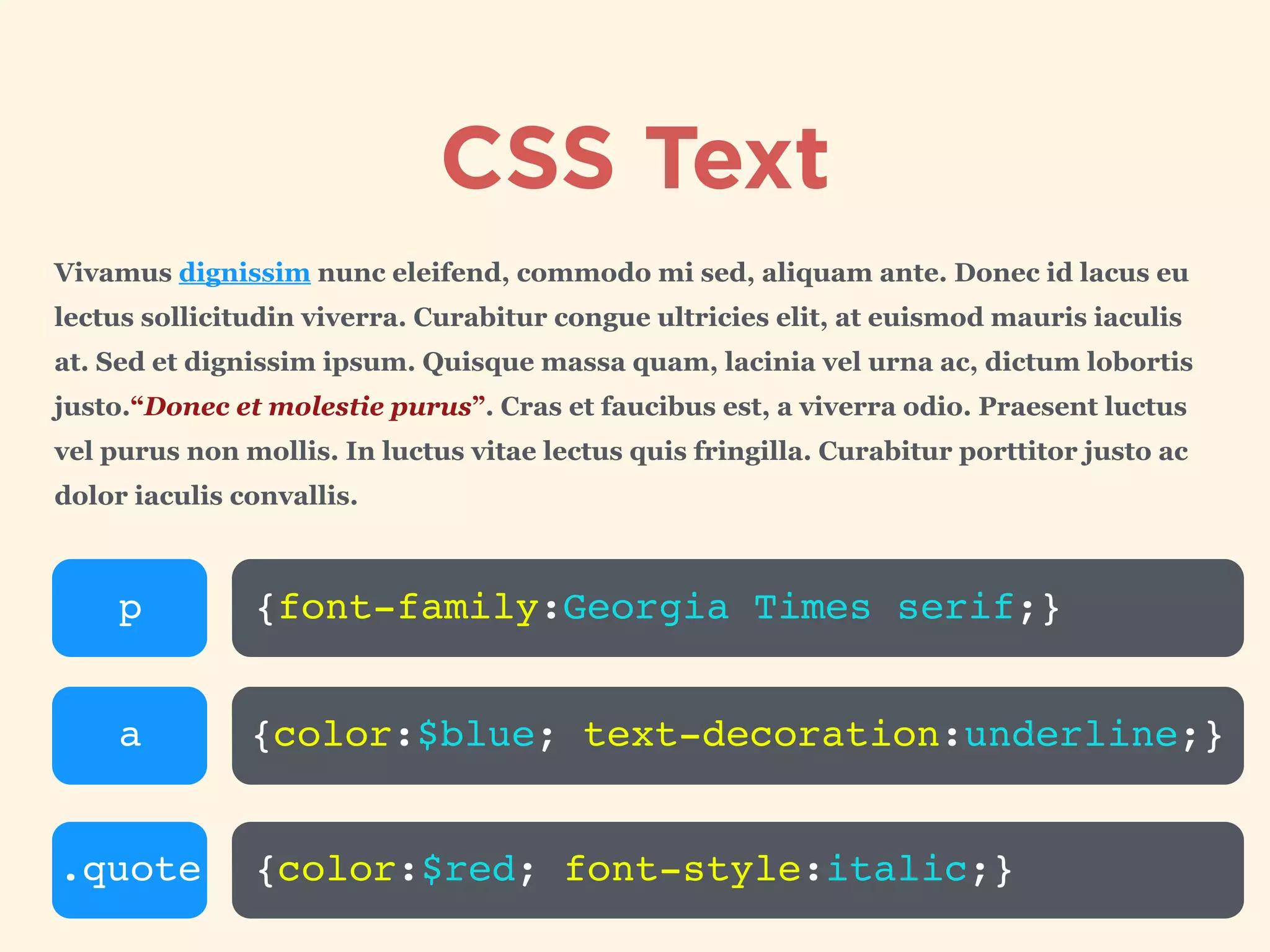
Detailed exploration of CSS syntax, including selectors, properties, and declarations with examples.
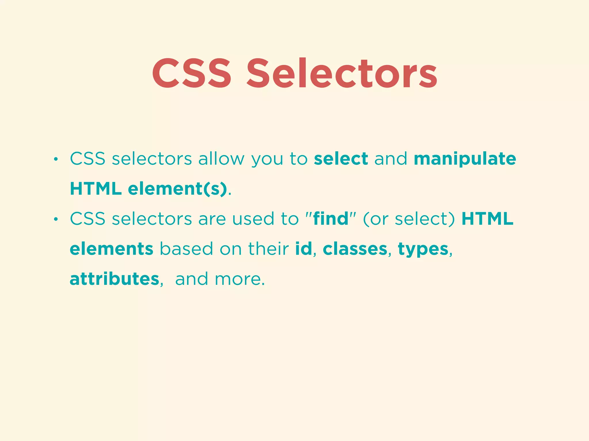
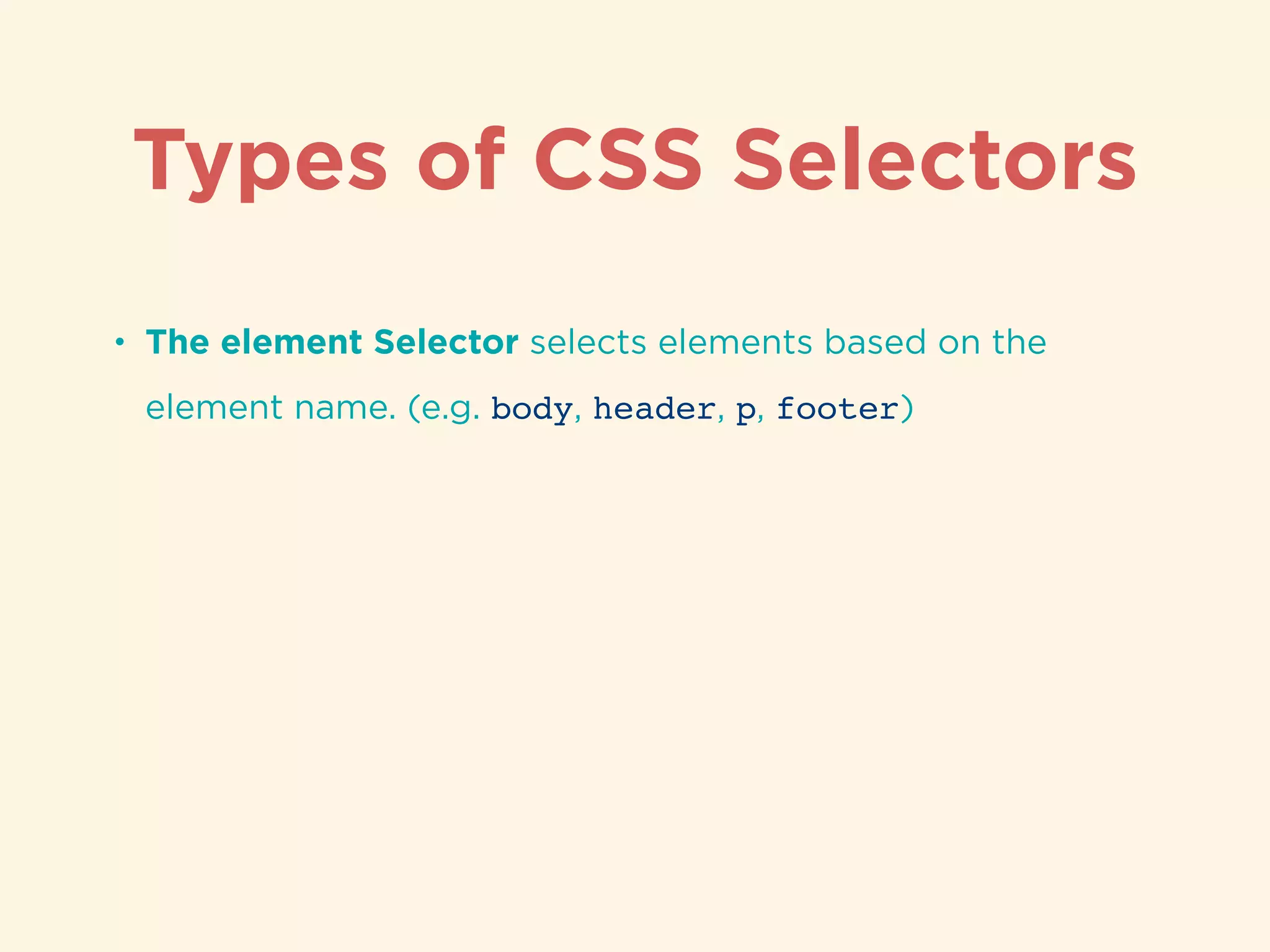
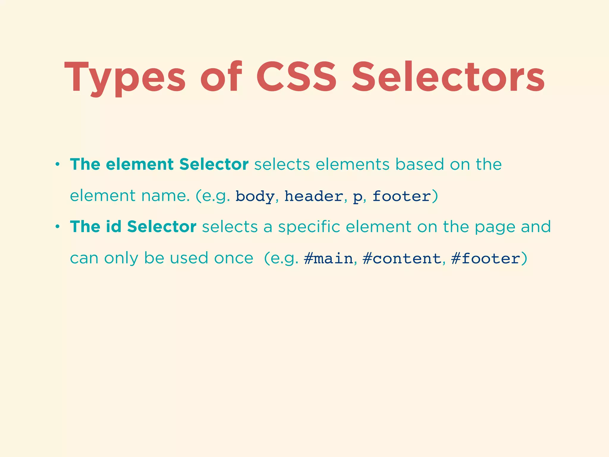
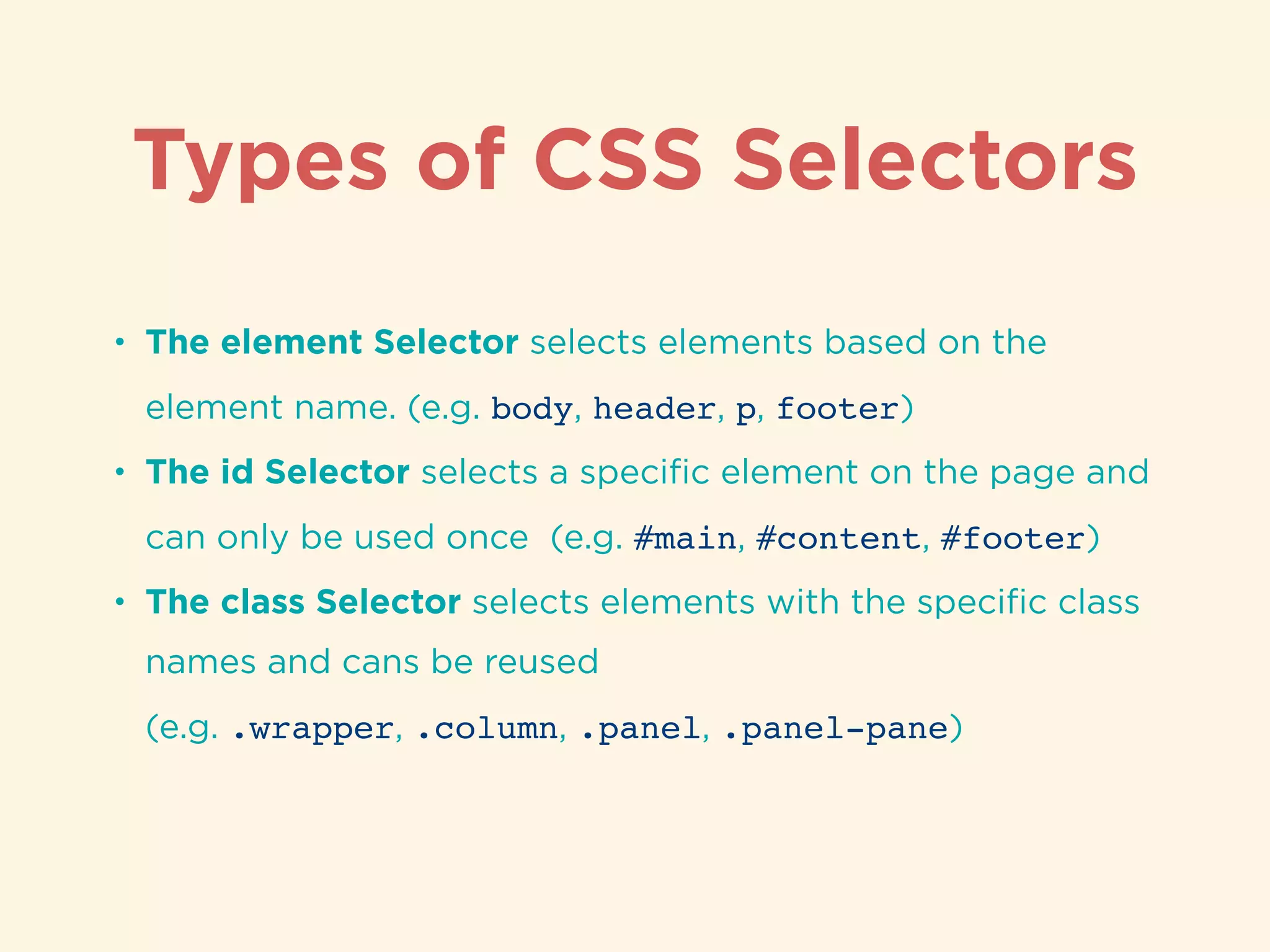
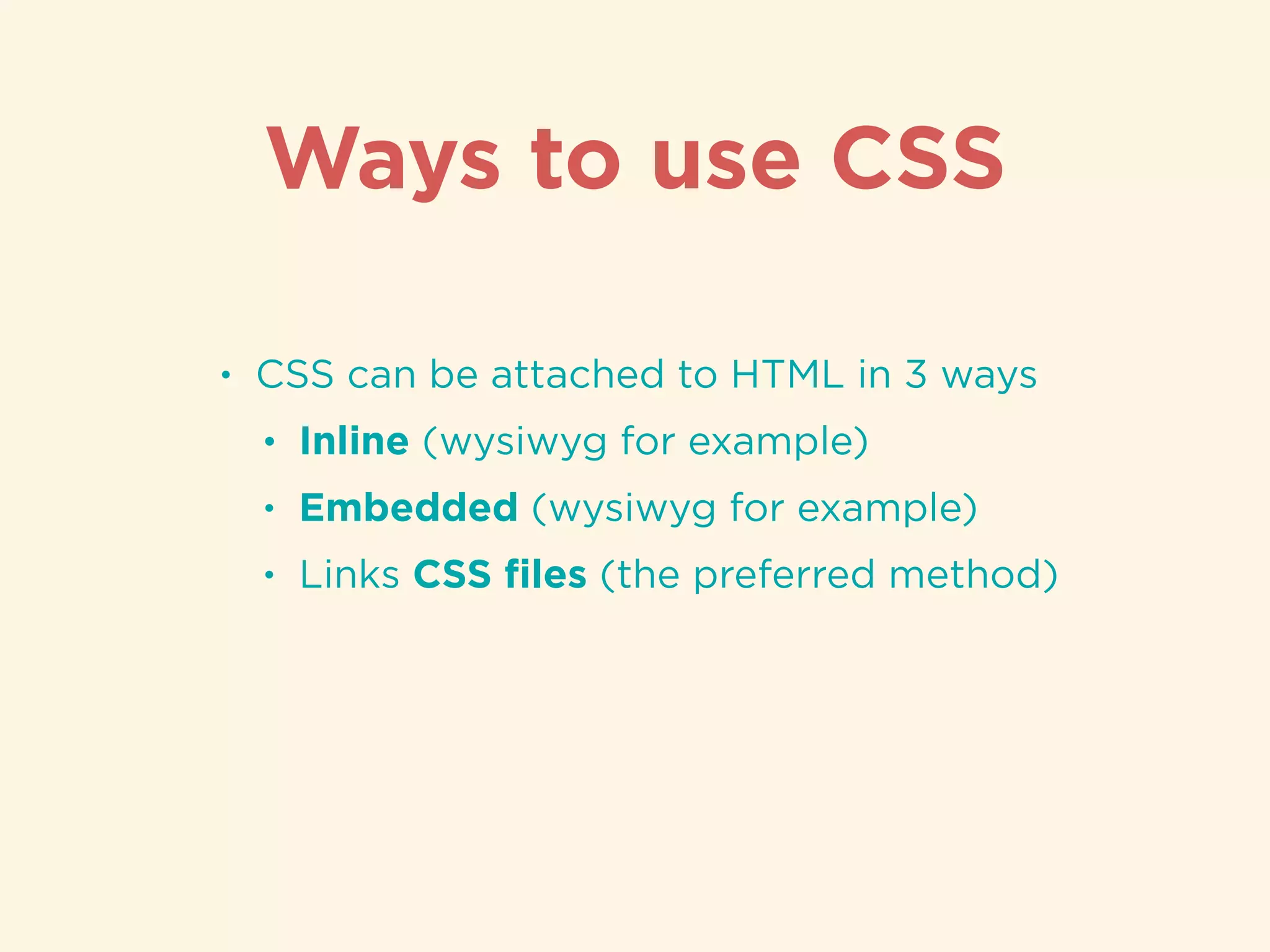
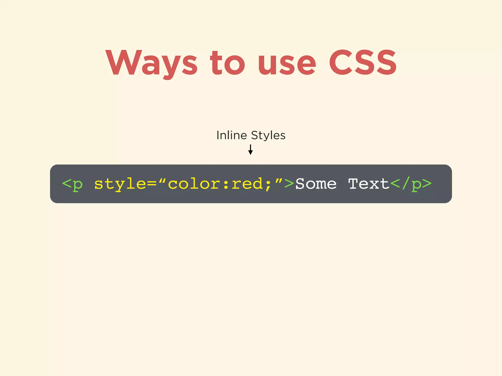
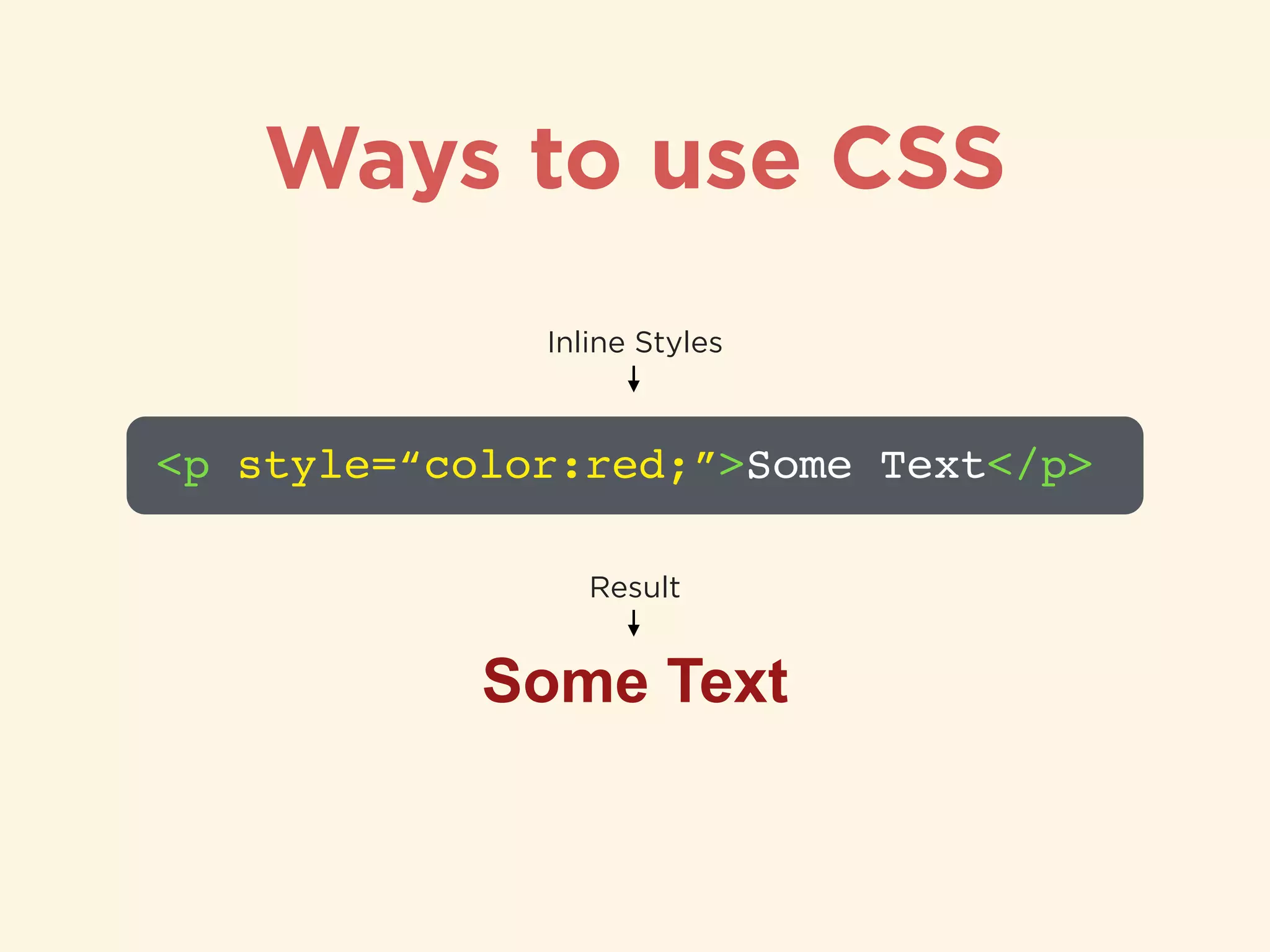
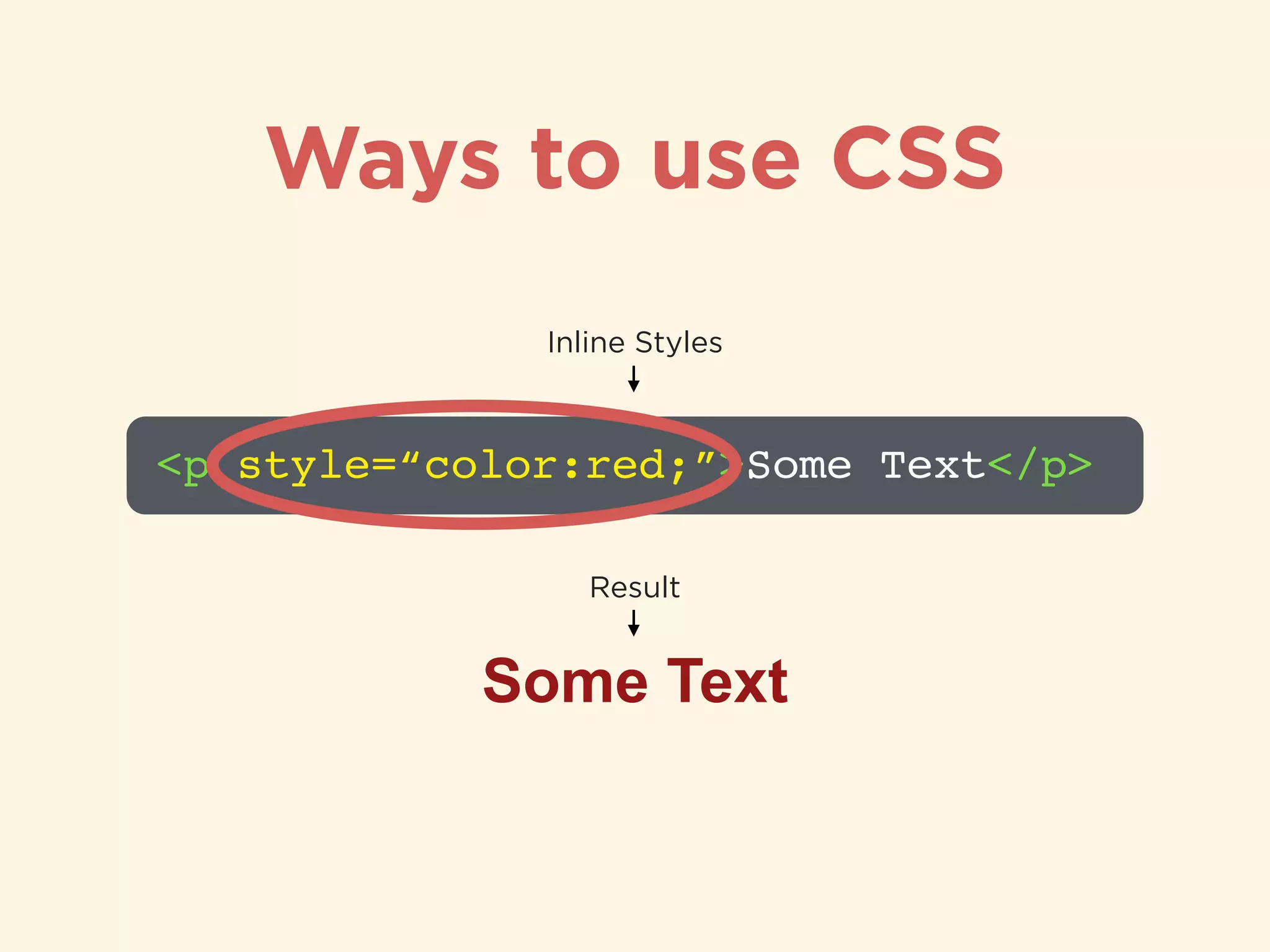
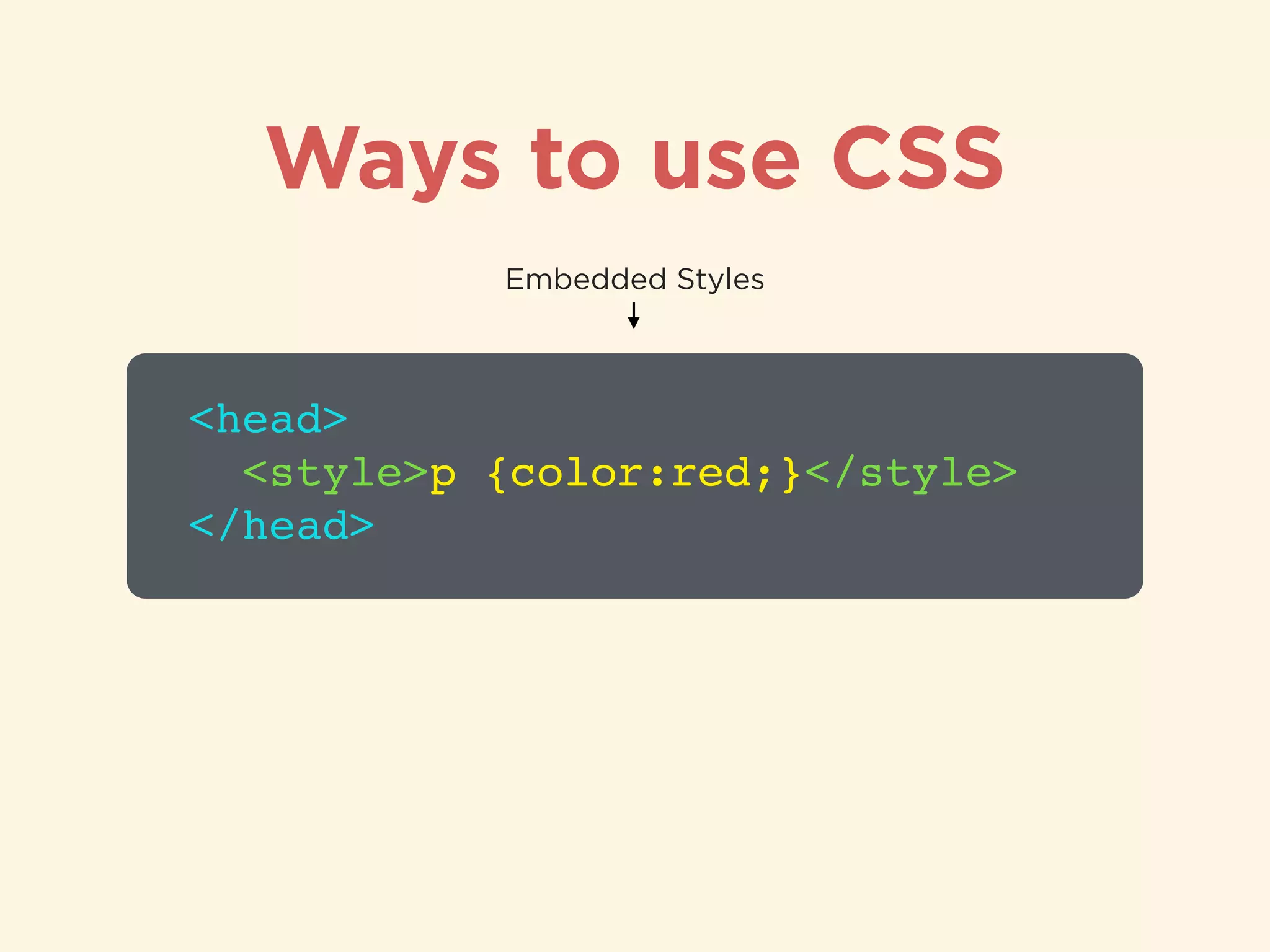
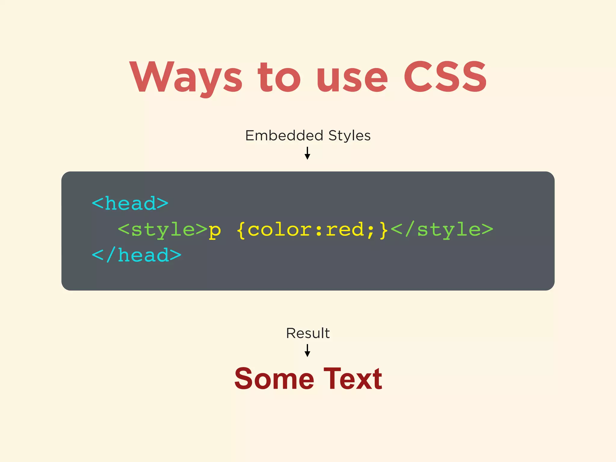
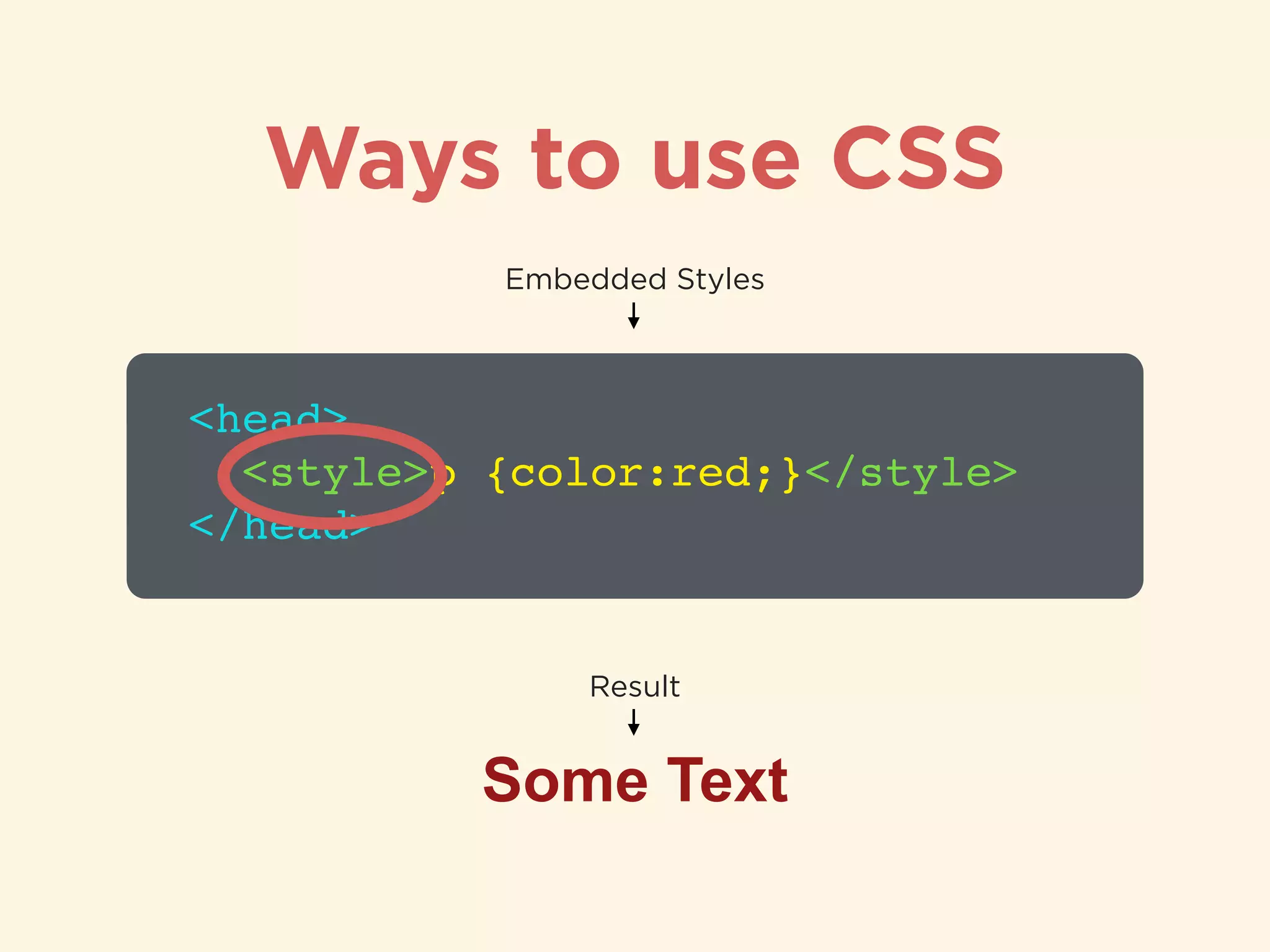
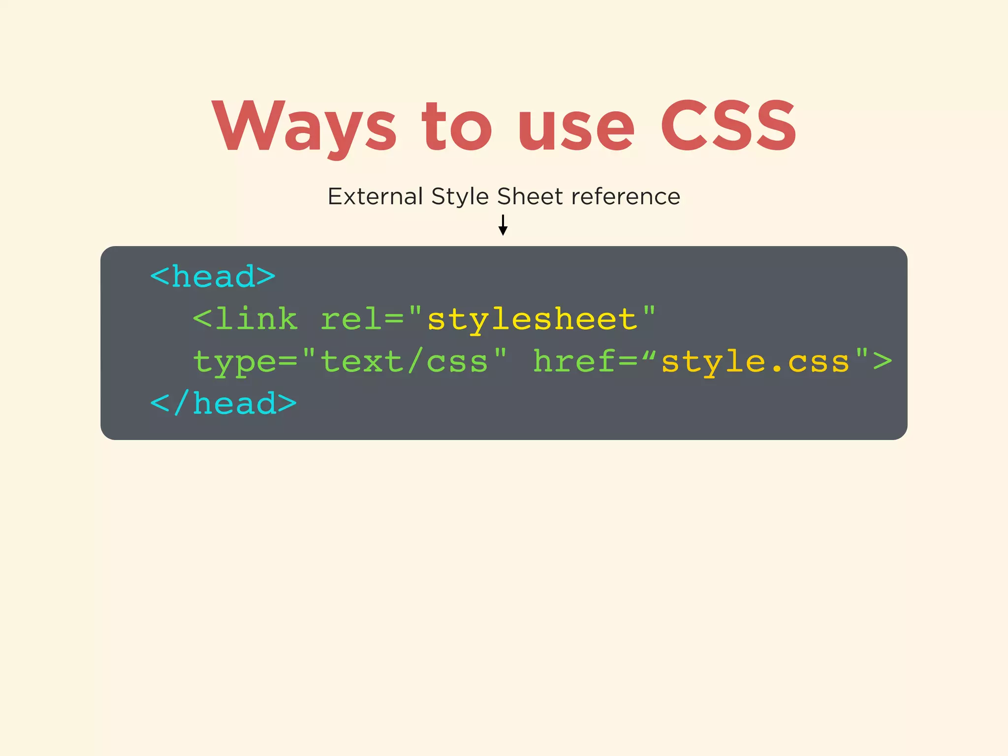
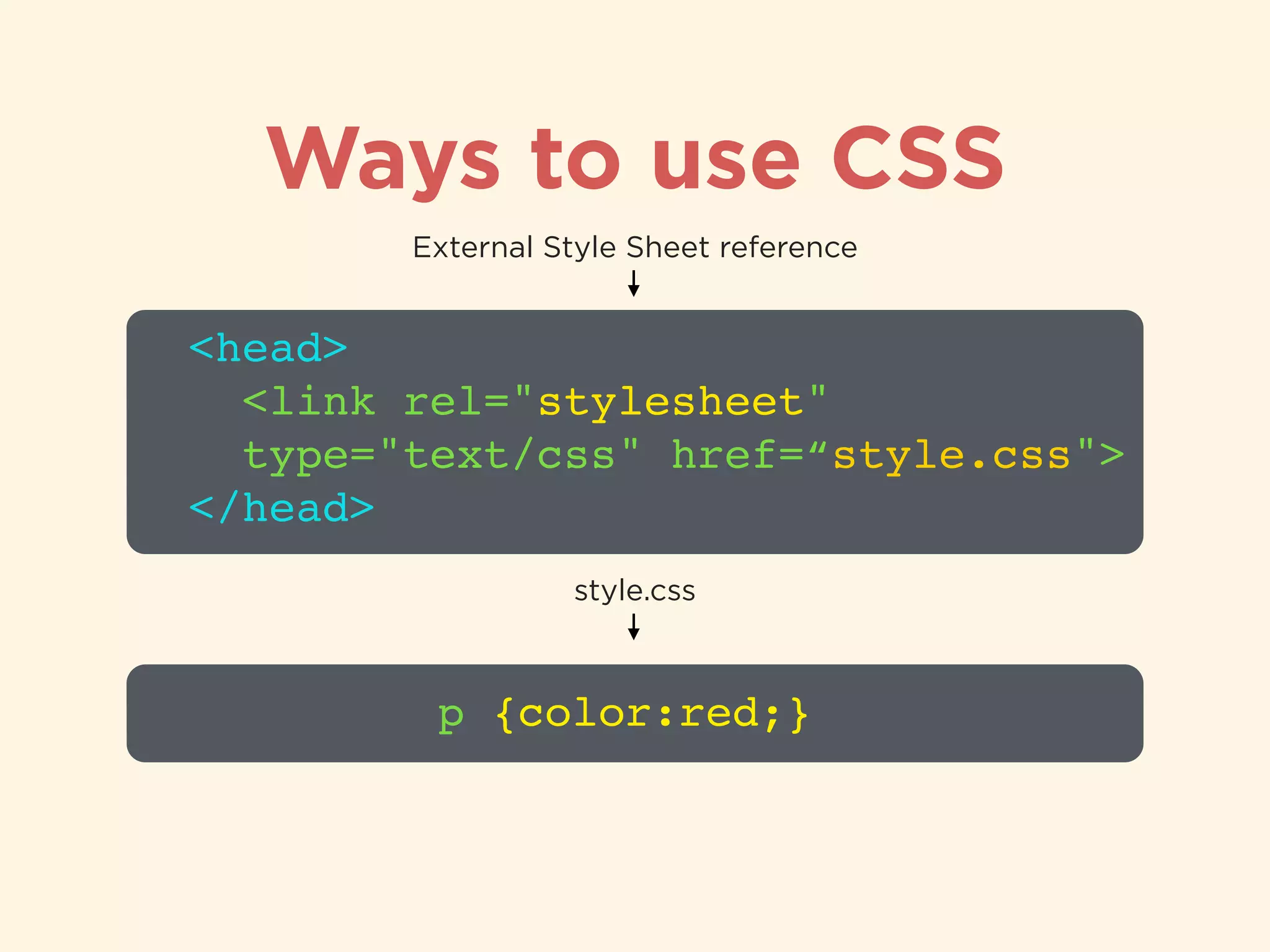
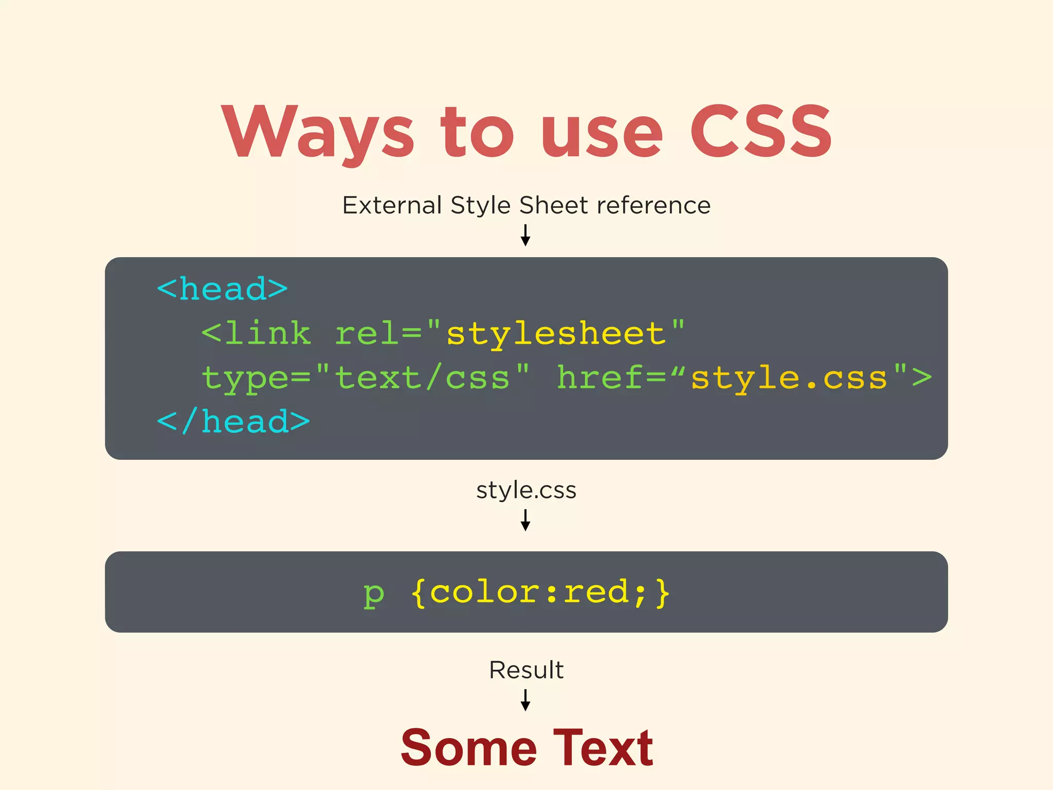
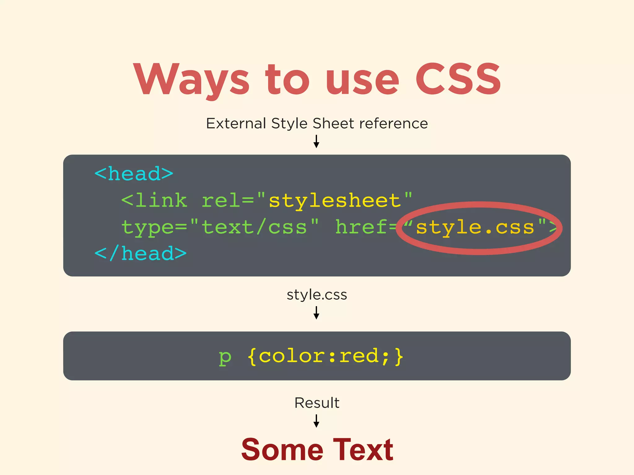
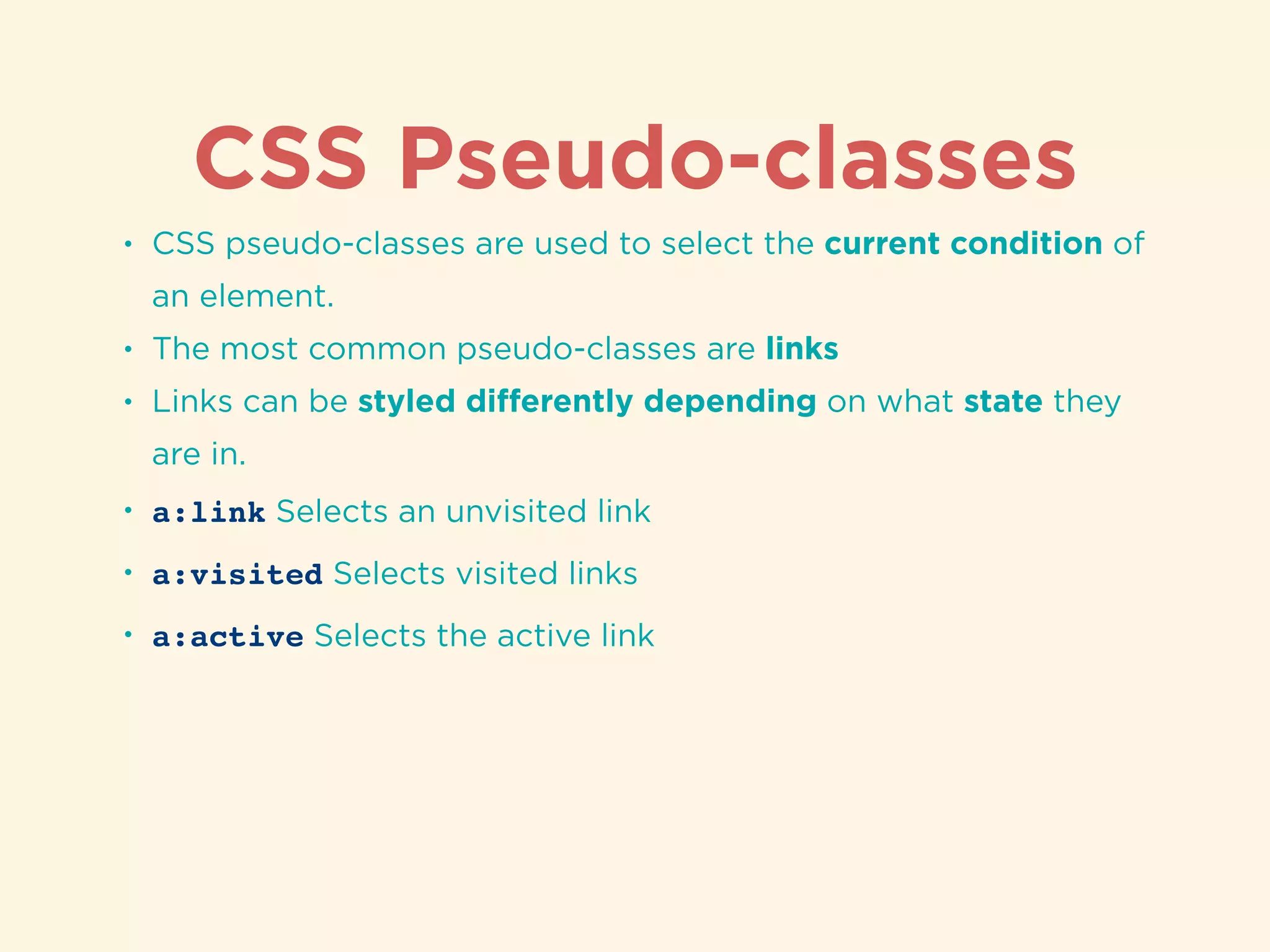
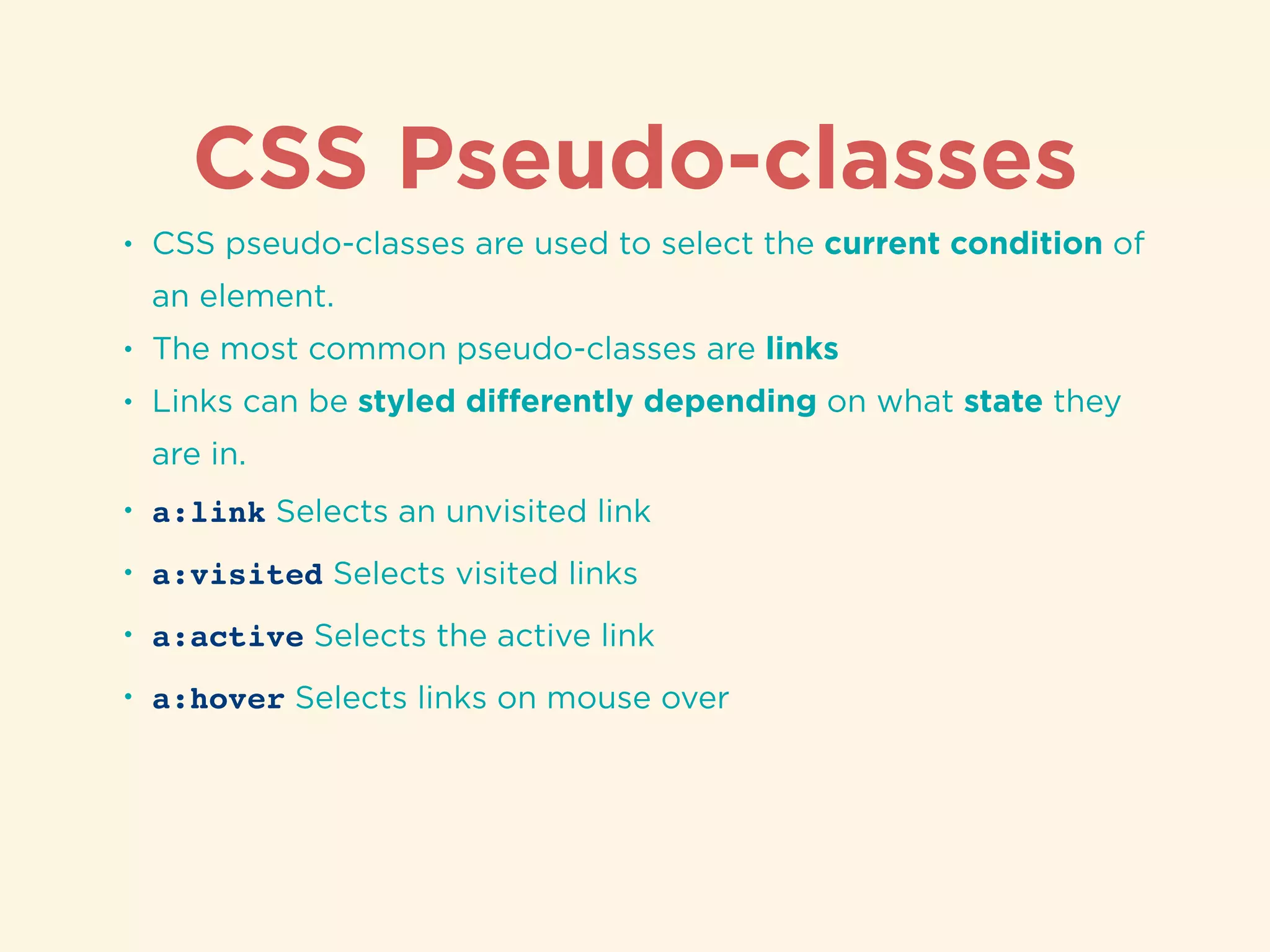
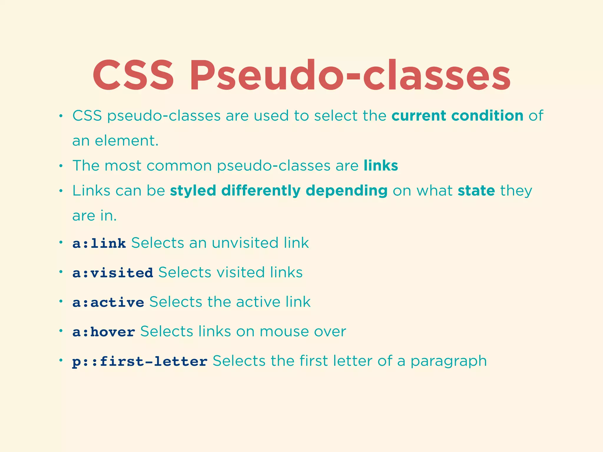
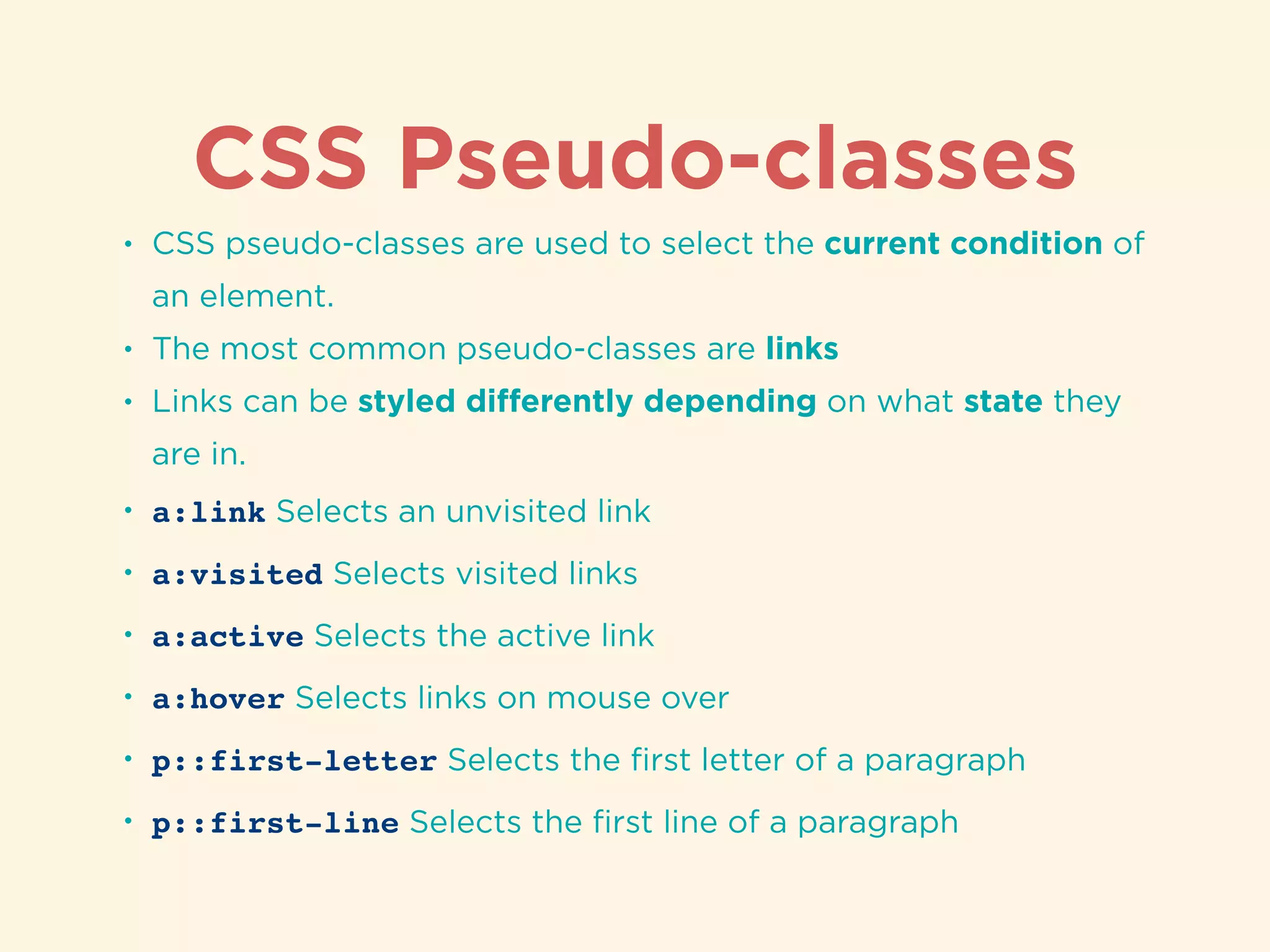
Definition of CSS selectors and their types for selecting HTML elements, including id and class selectors.Methods to integrate CSS into HTML: Inline styles, embedded styles, and linking external stylesheets.
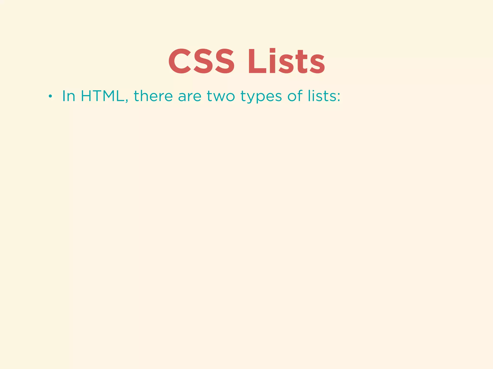
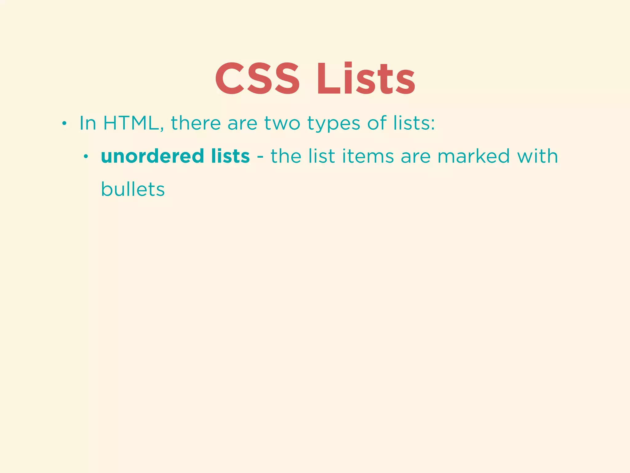
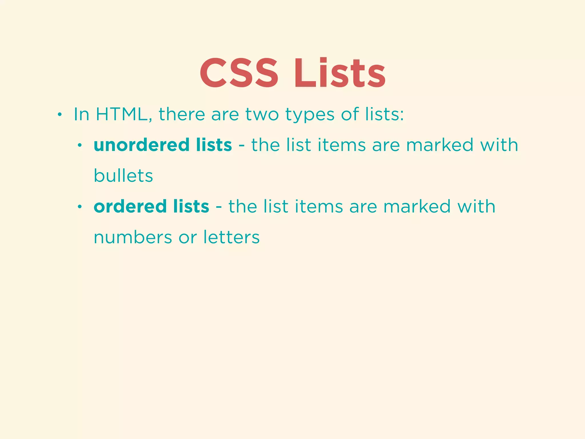
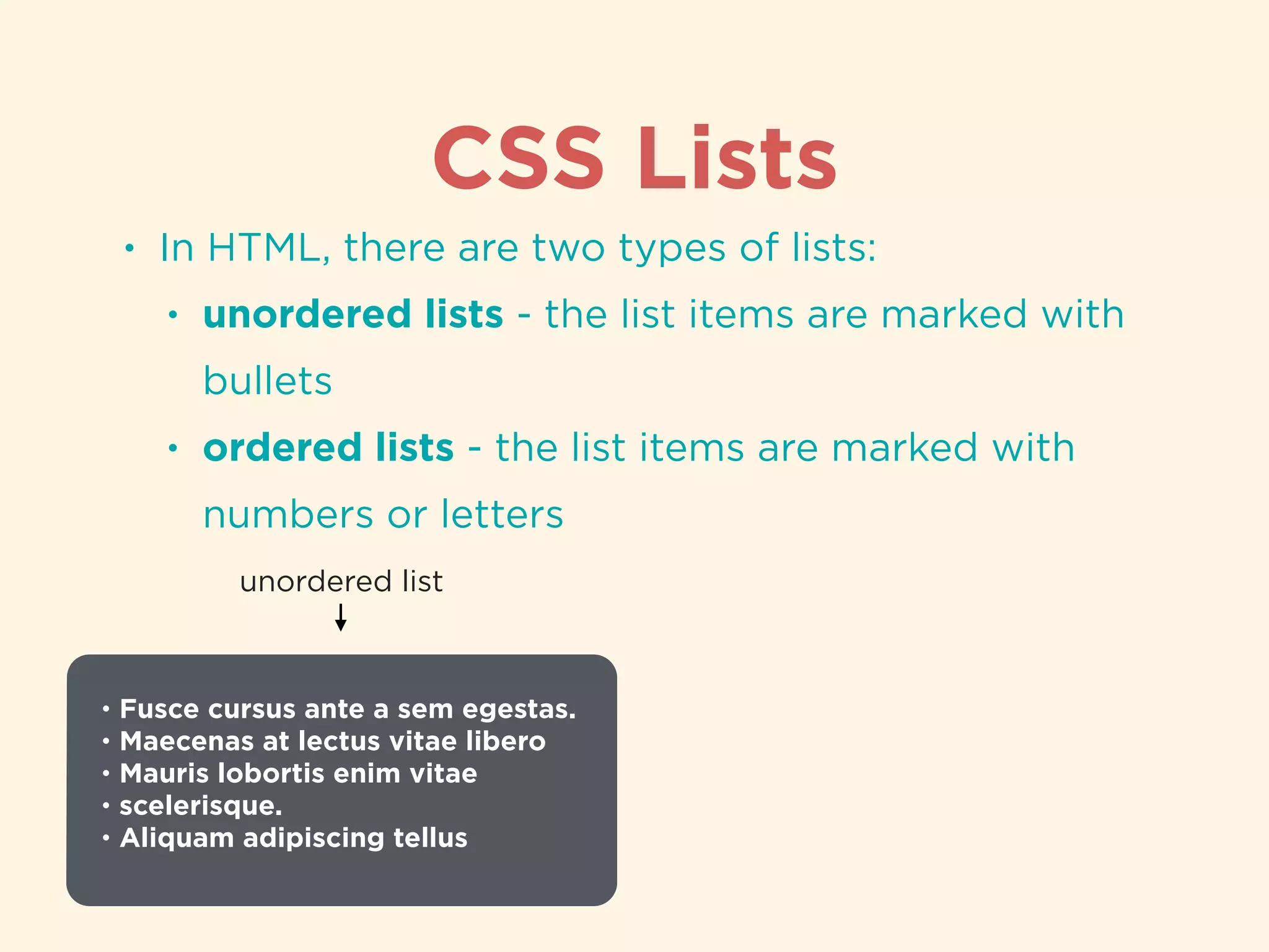
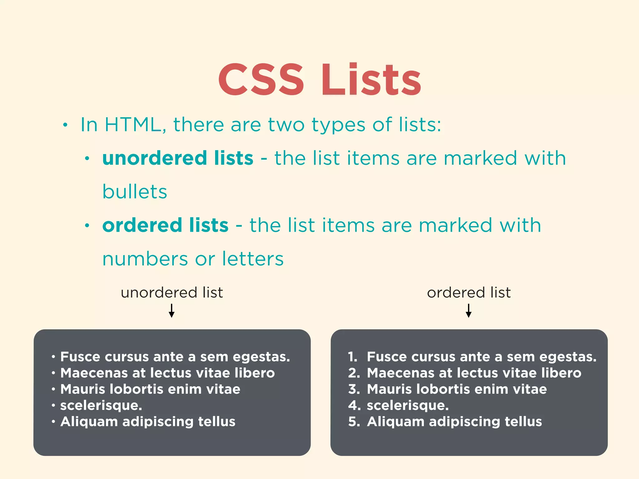
Discussion of list types in HTML, including ordered and unordered lists with examples.
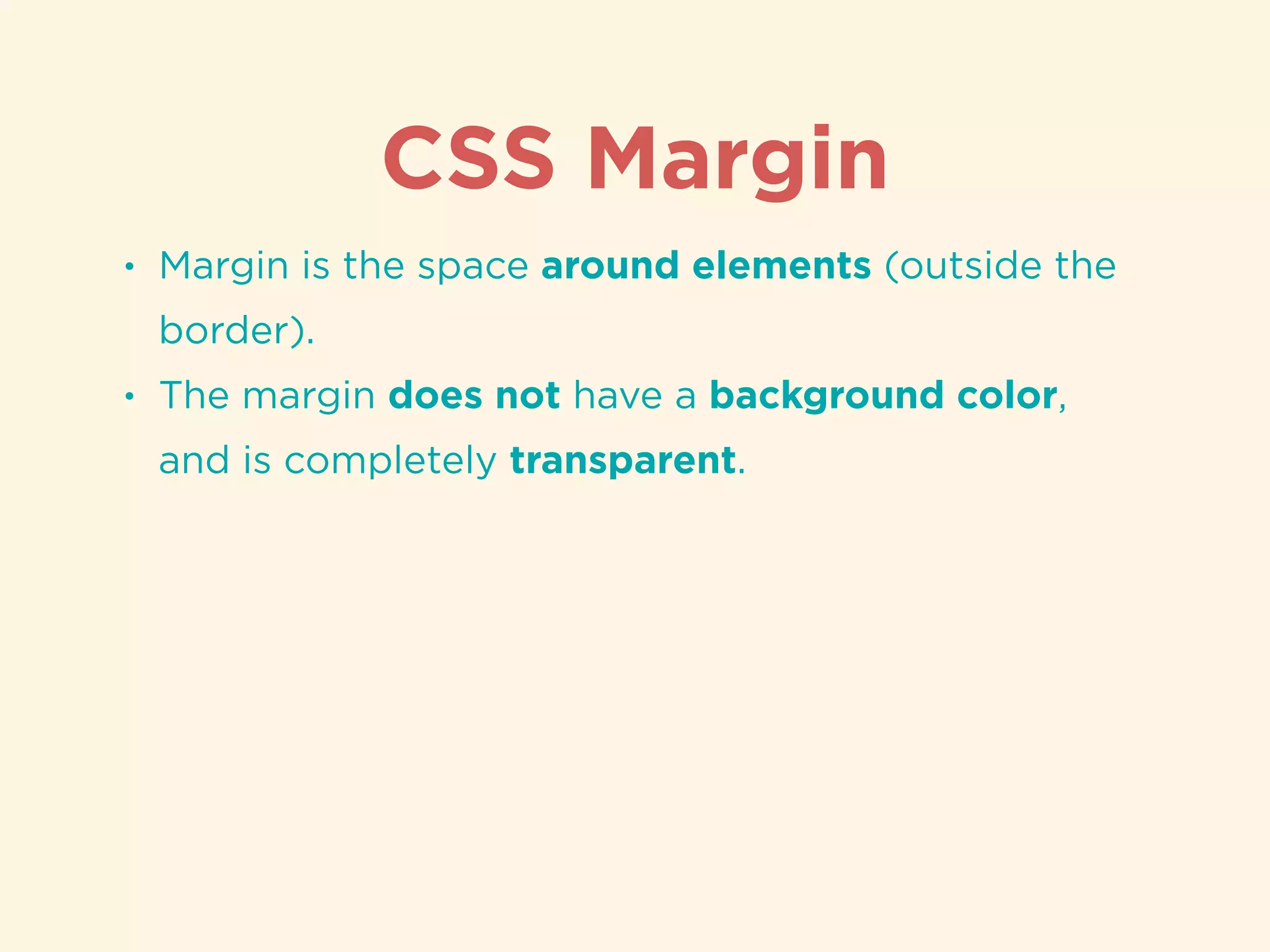
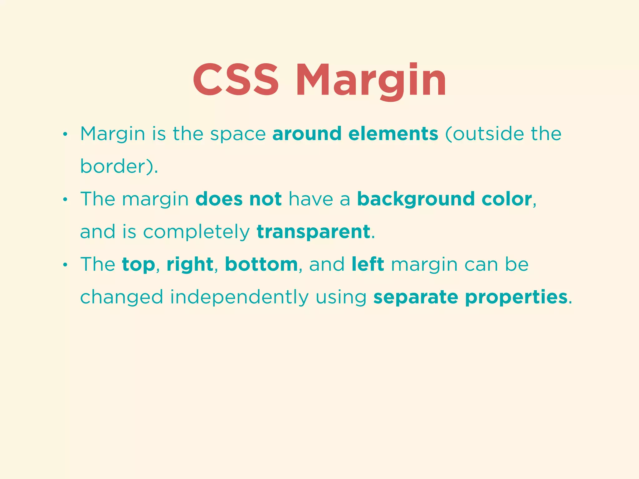
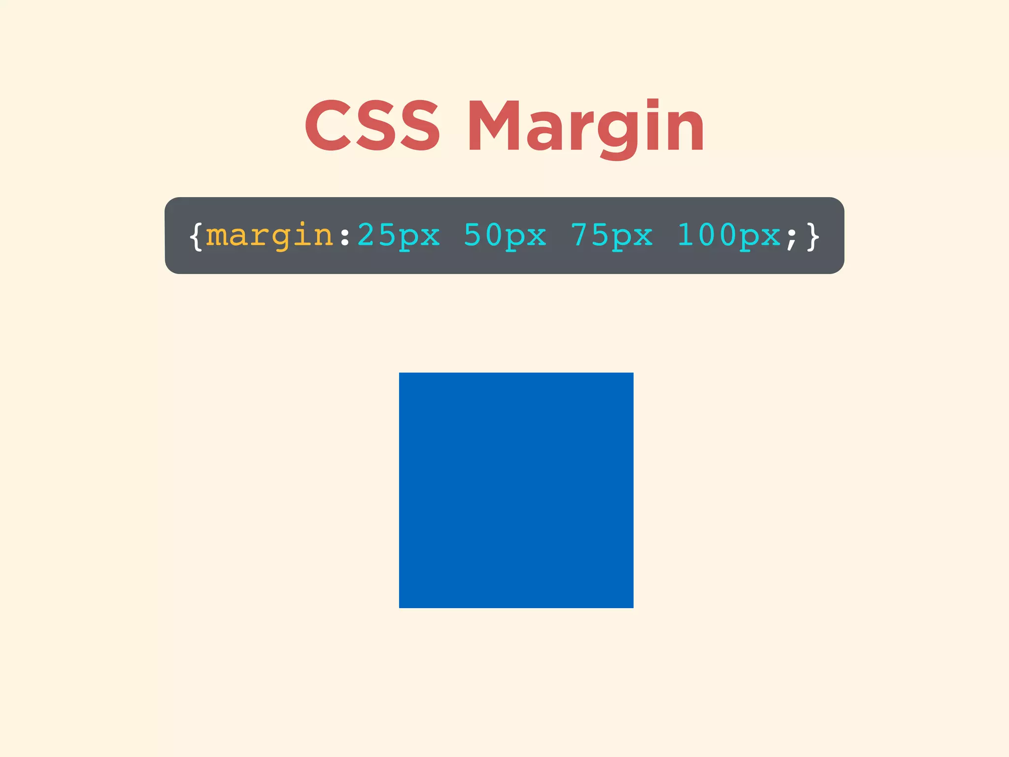
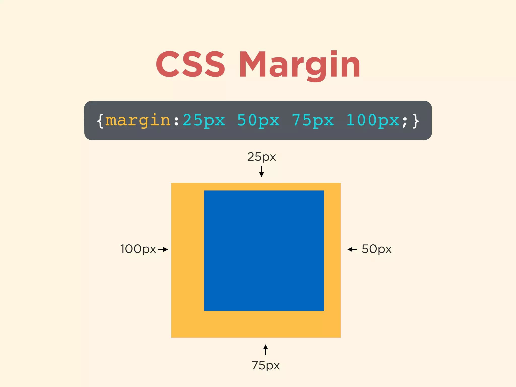
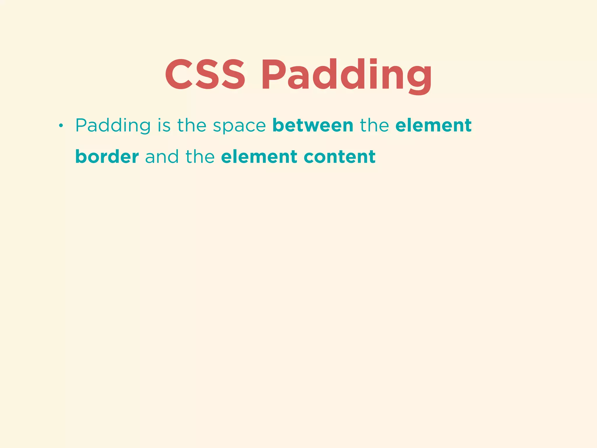
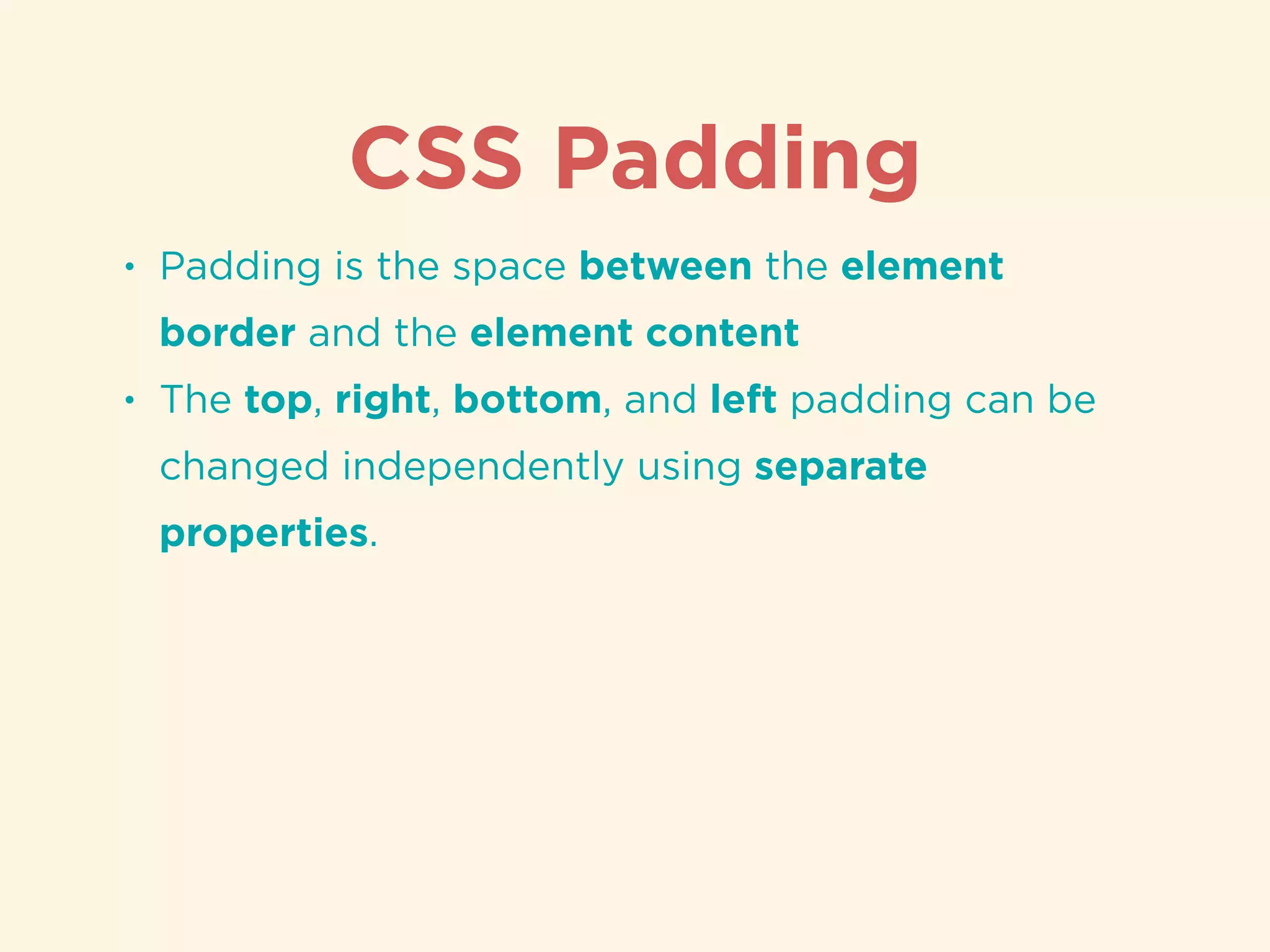
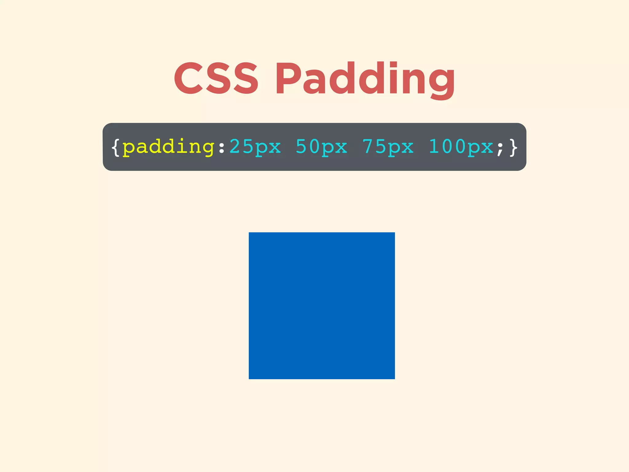
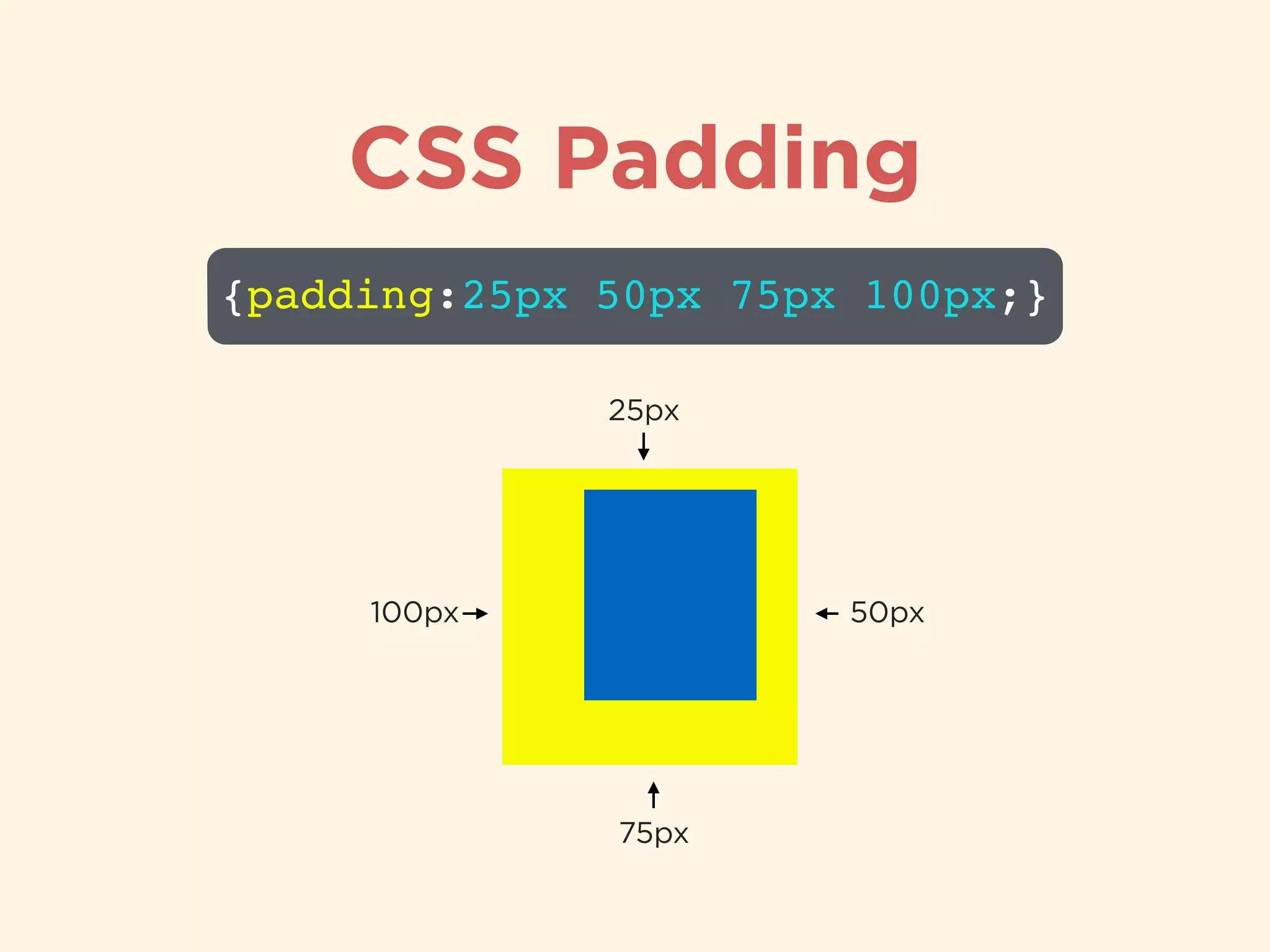
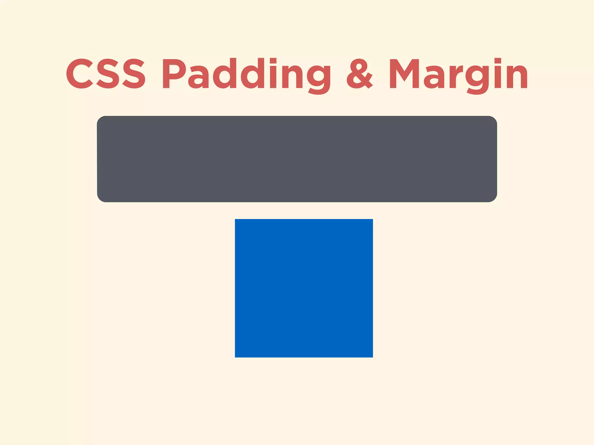
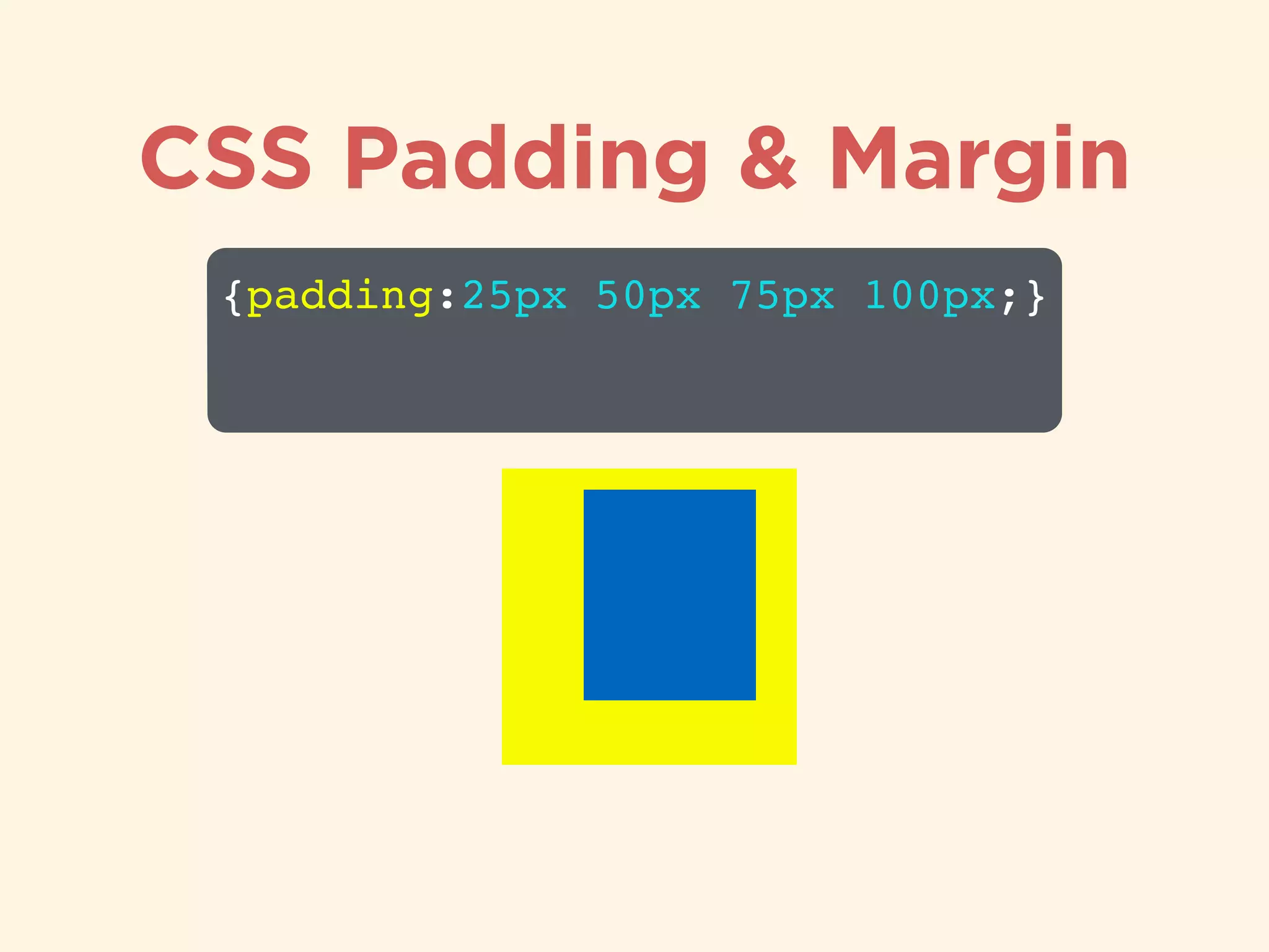
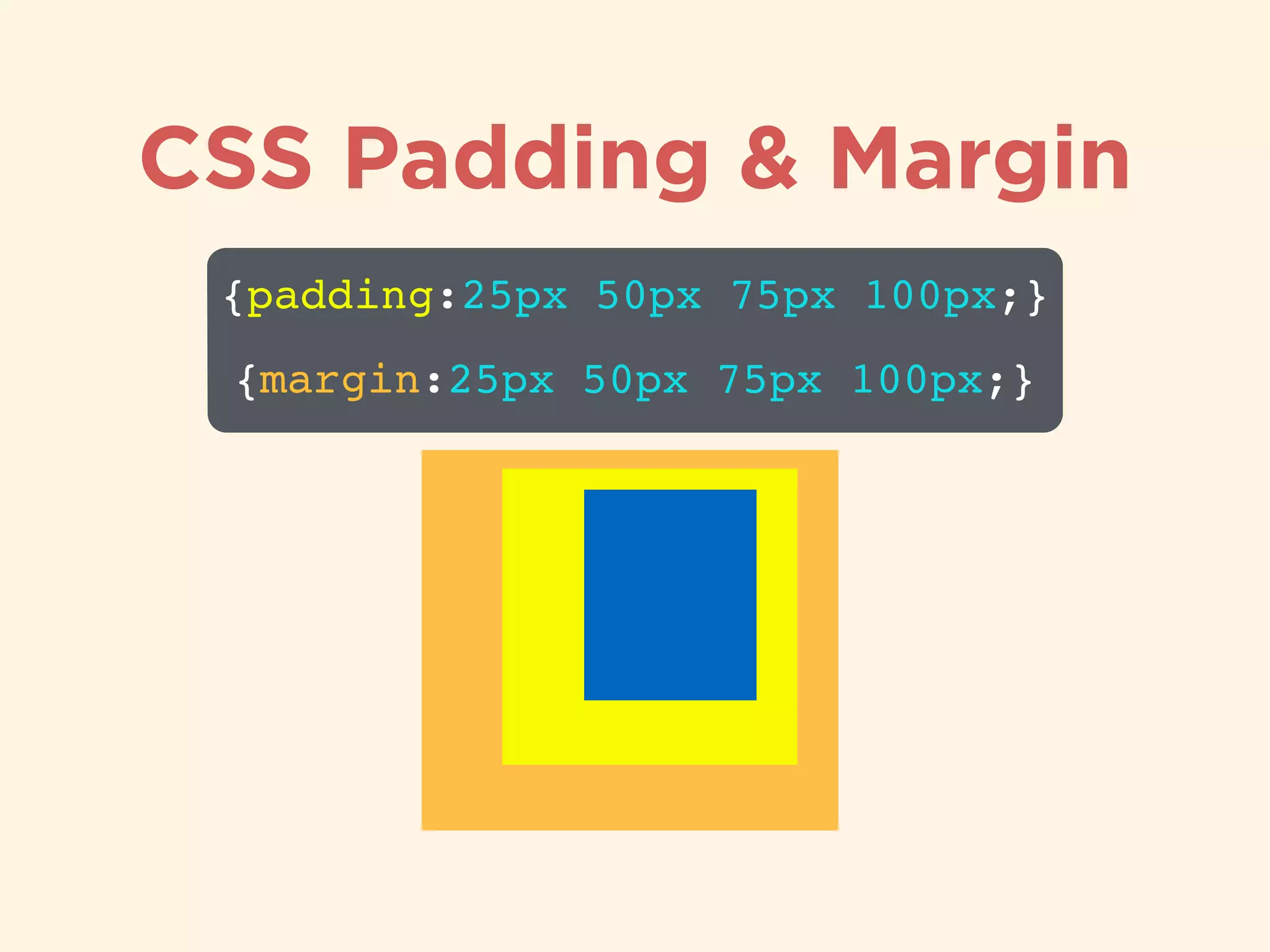
Explanation of CSS margin properties and their effect on element spacing.Description of padding properties, defining the space between element borders and content.
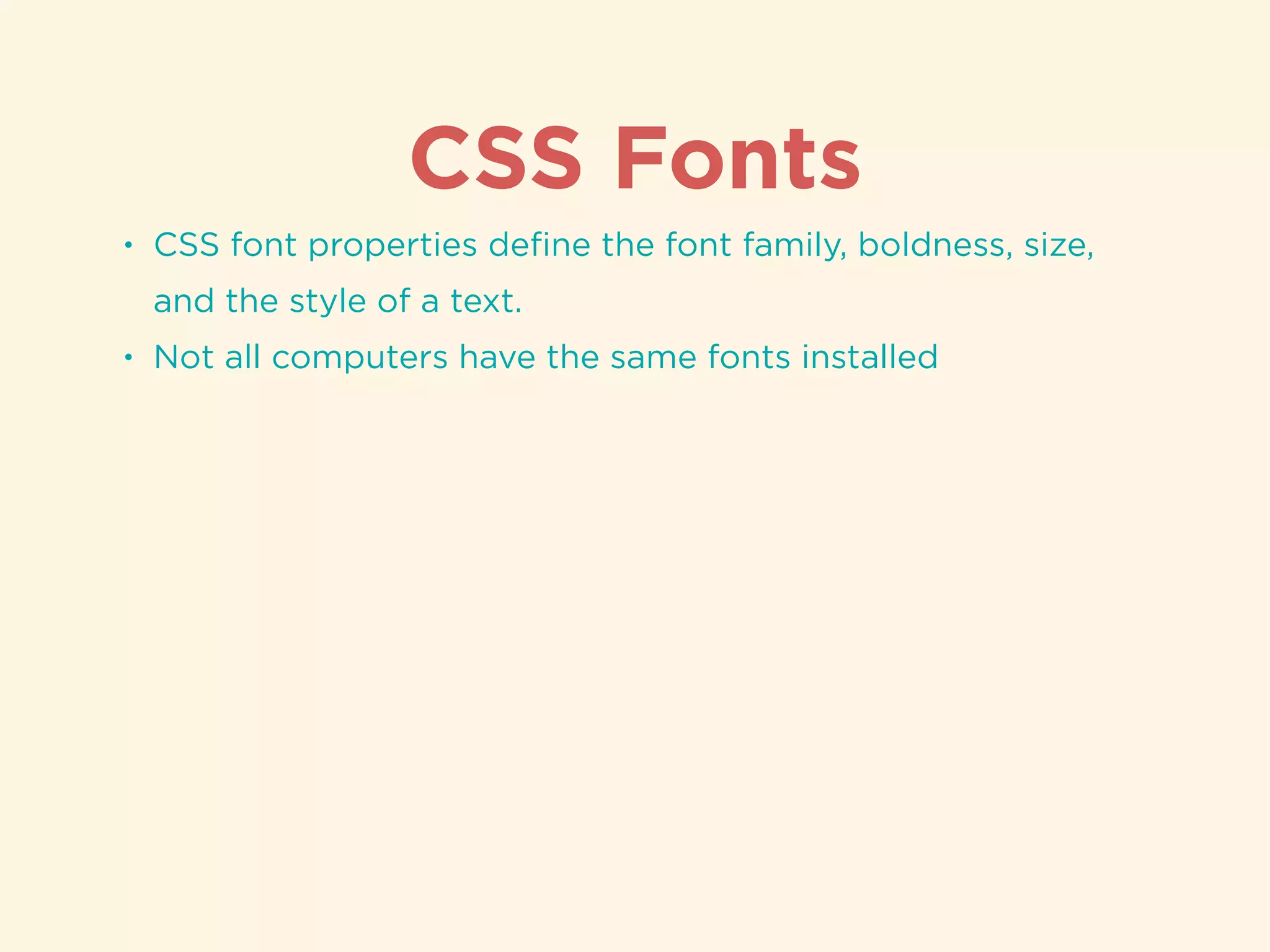
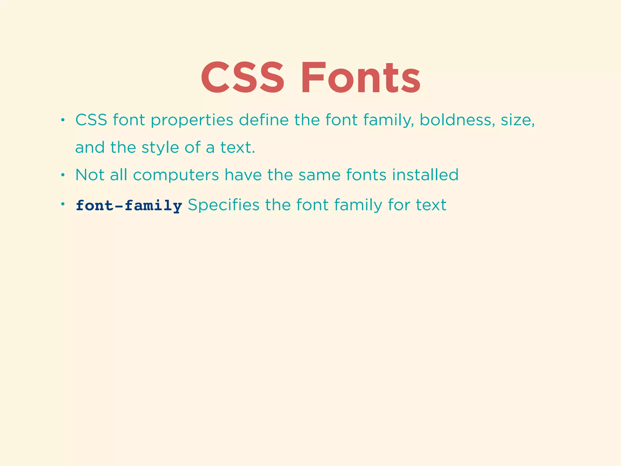
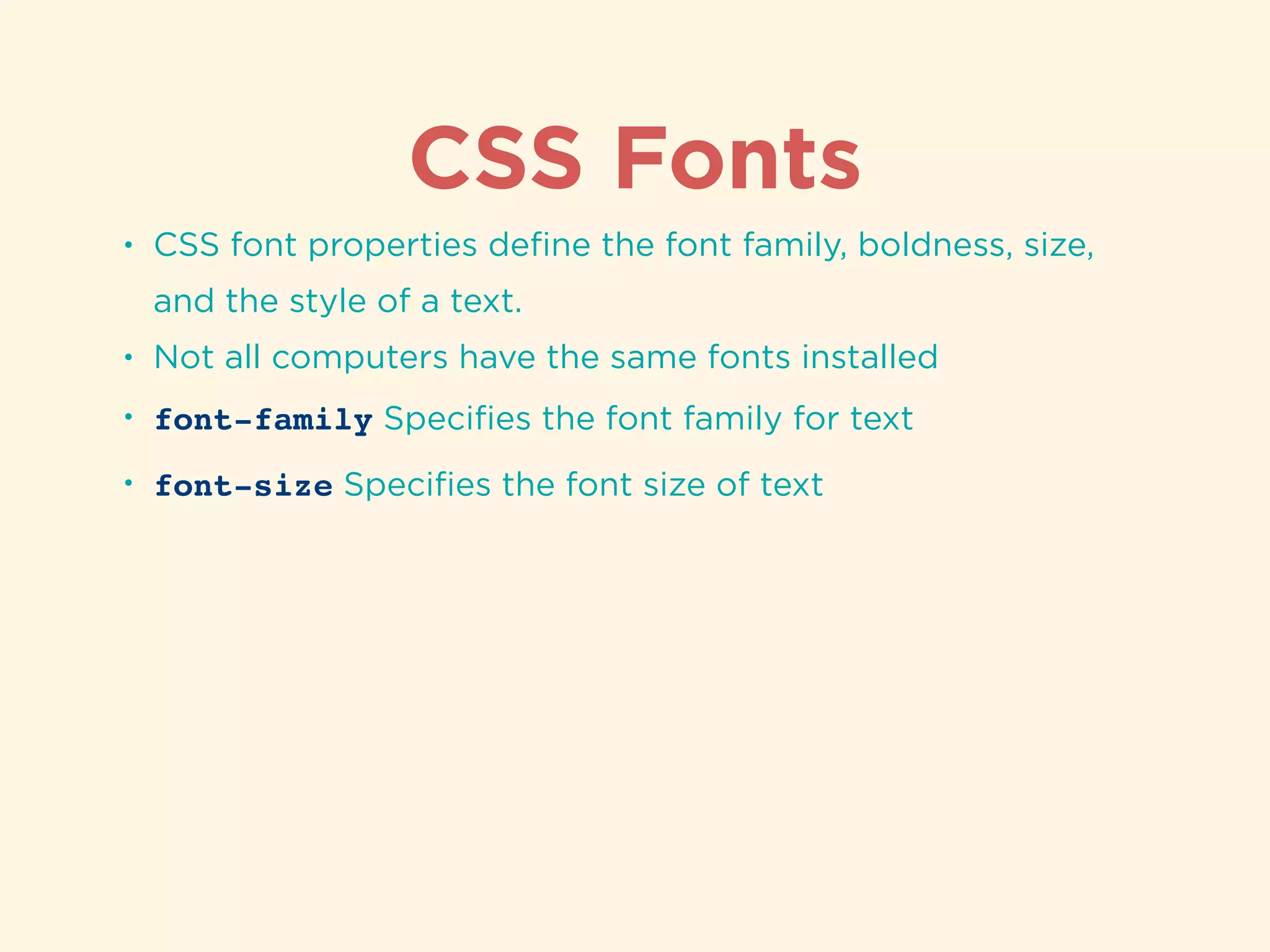
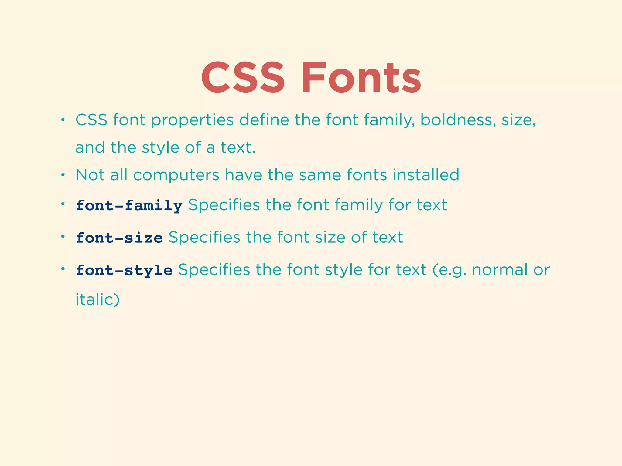
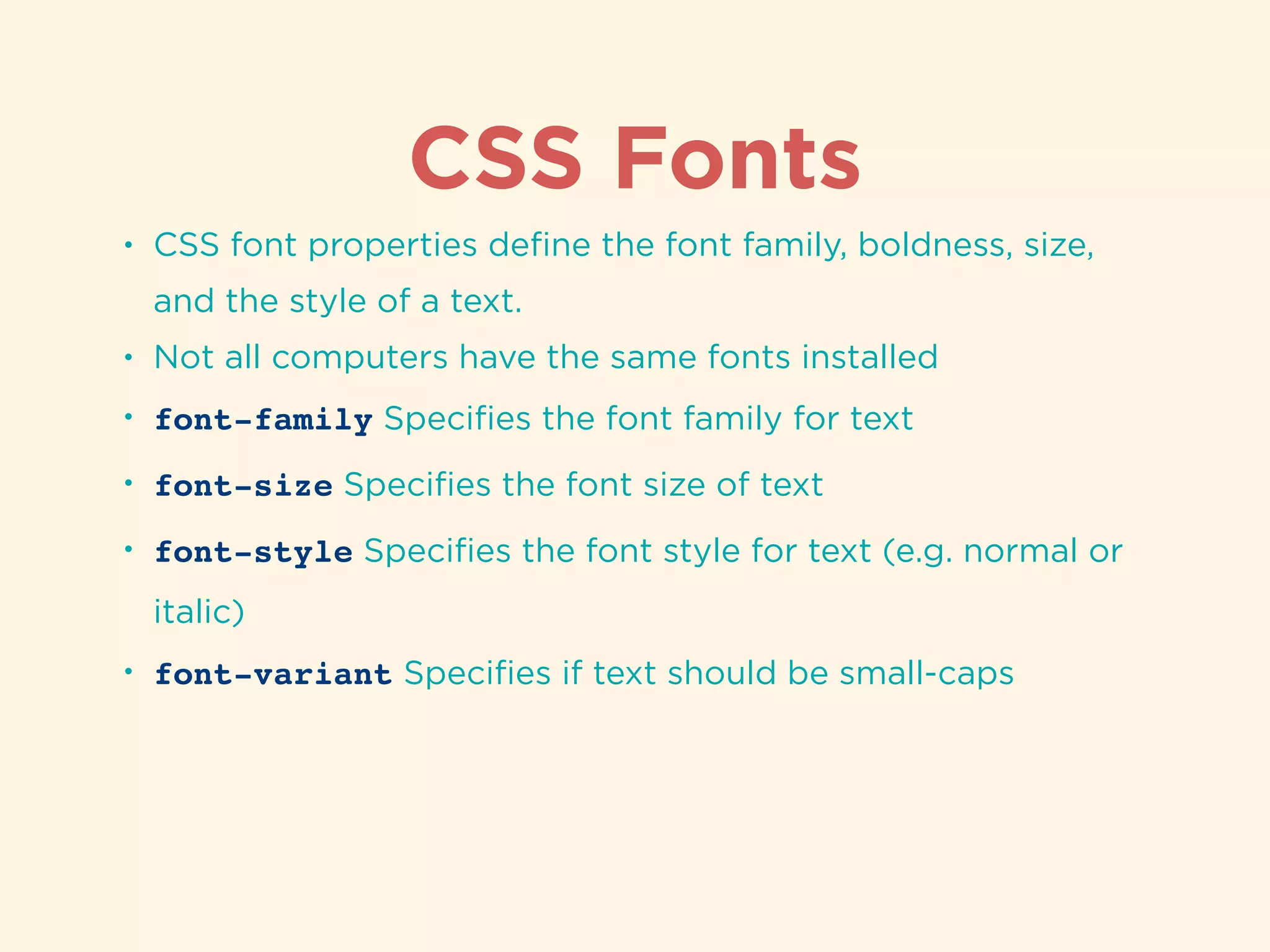
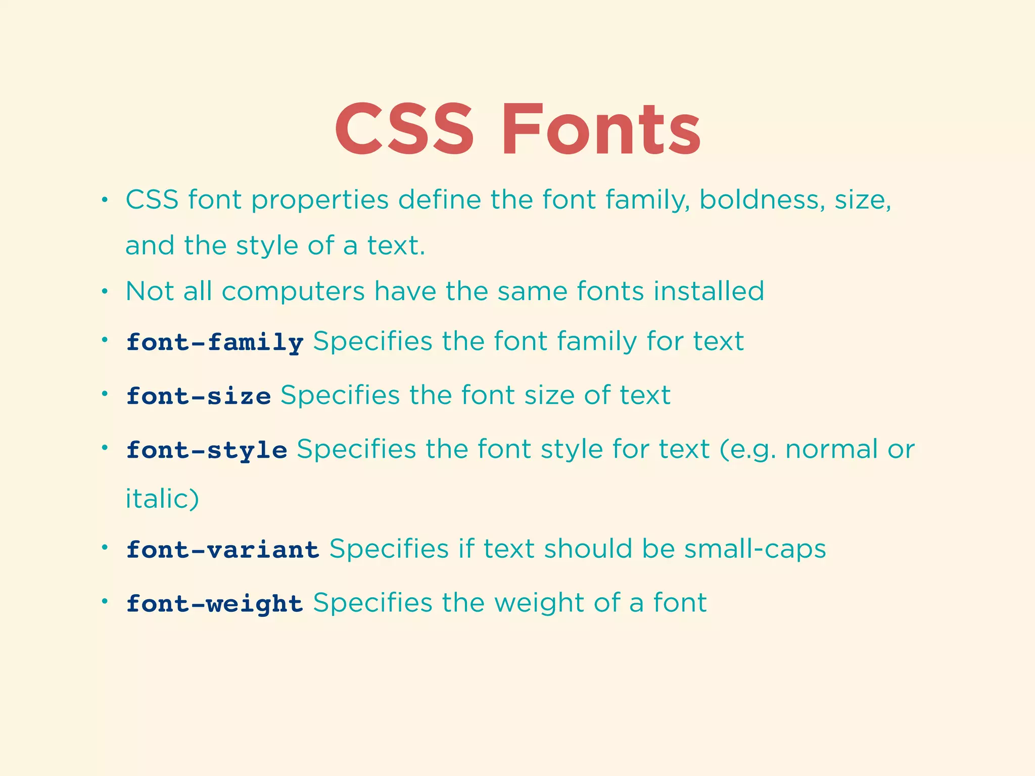
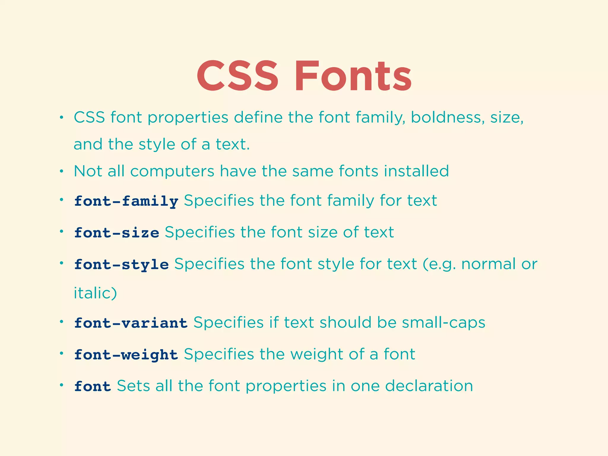
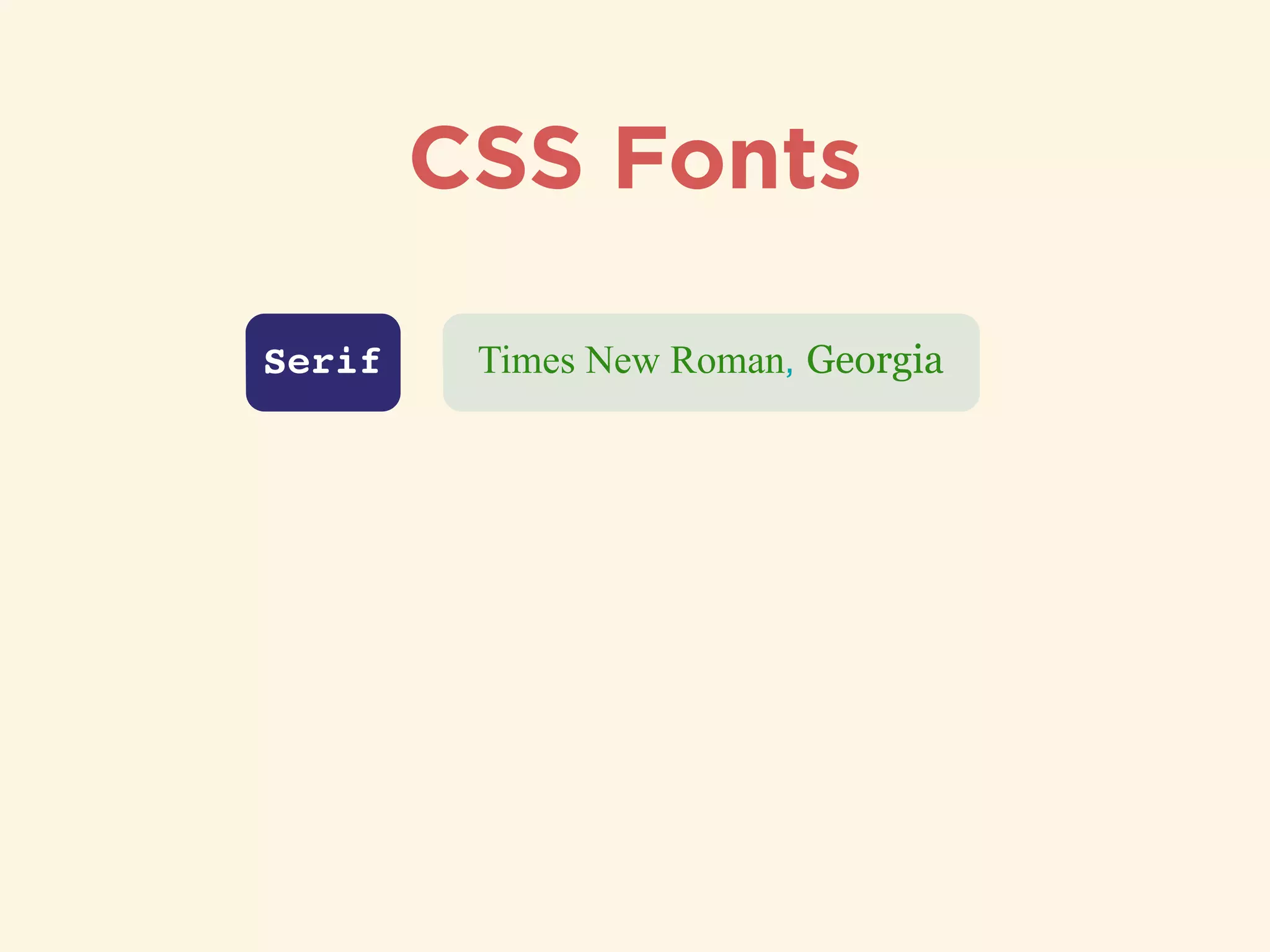
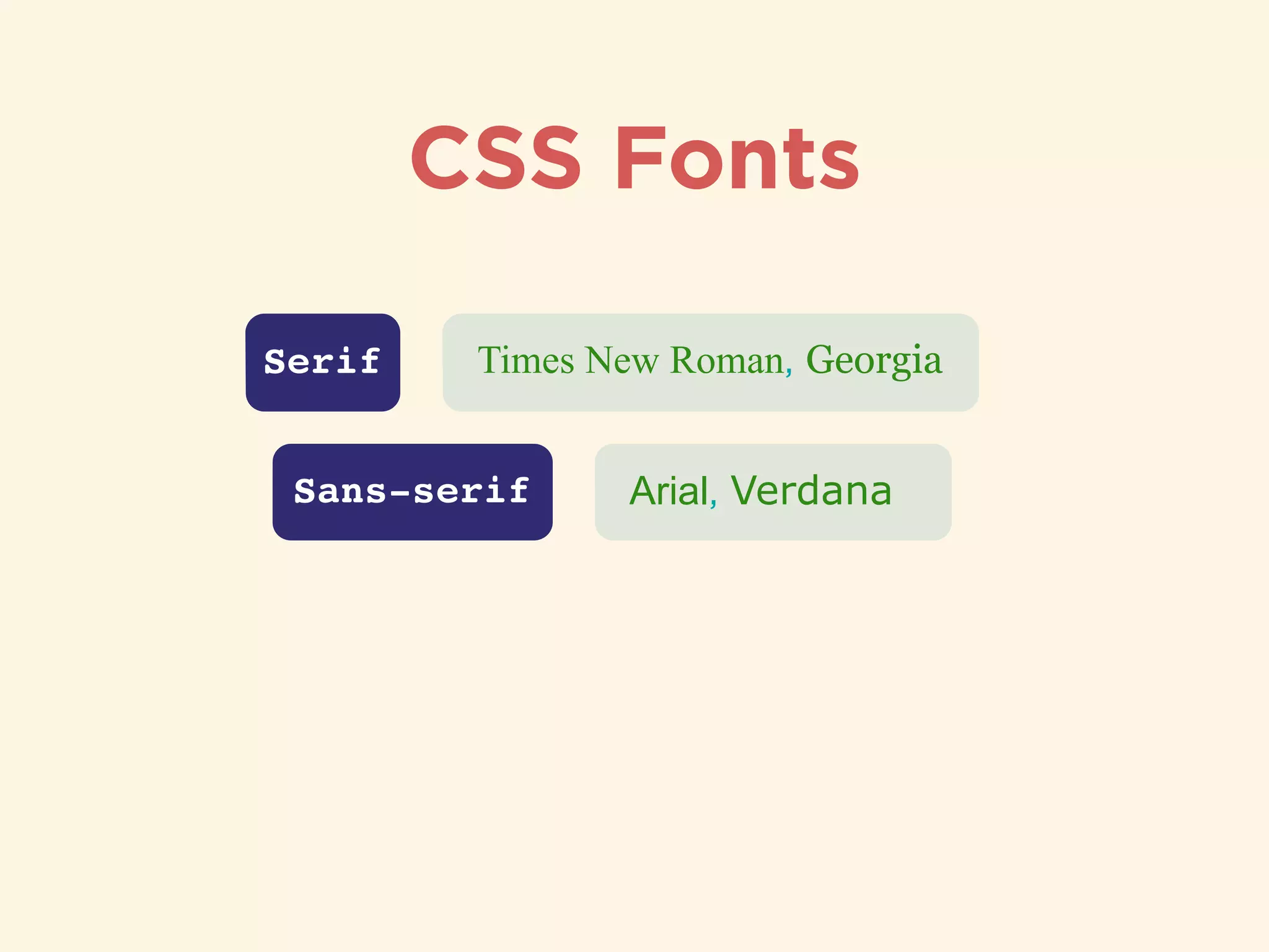
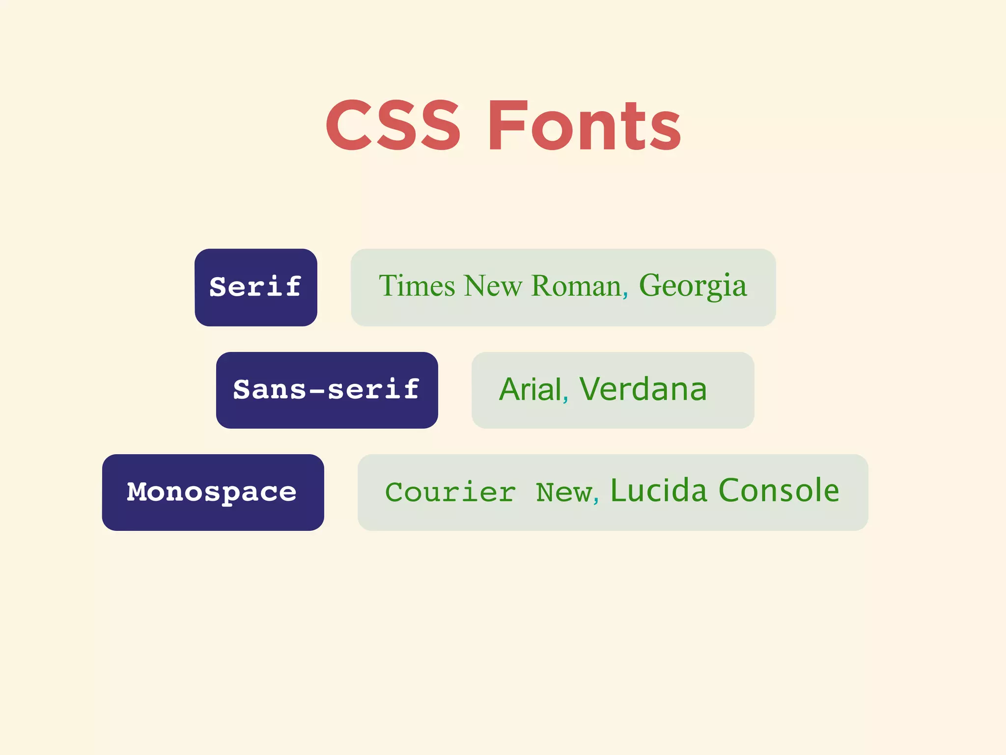
Usage and distinctions of CSS padding and margin with practical examples.Overview of CSS font properties defining font styles like family, weight, and size.
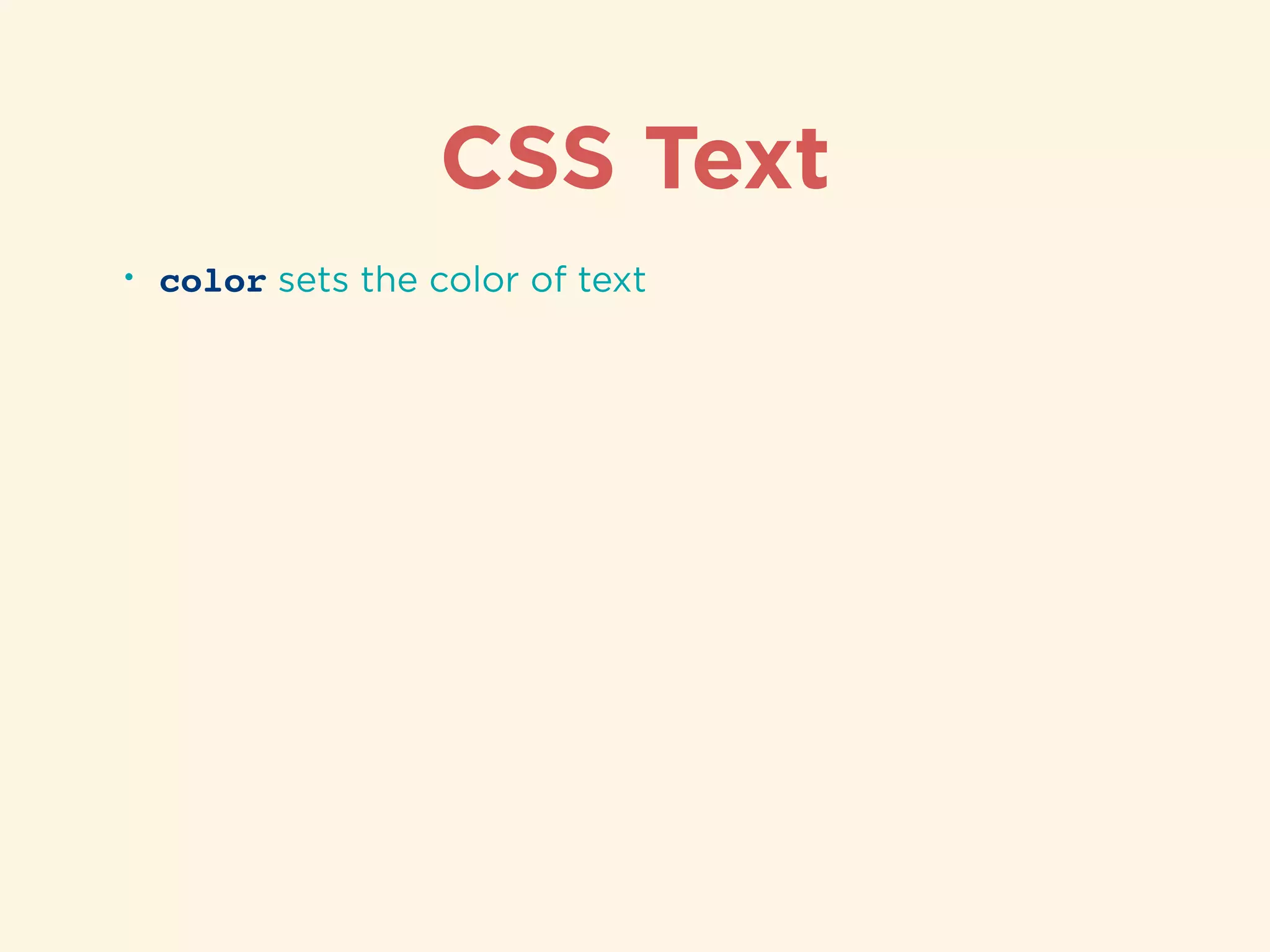
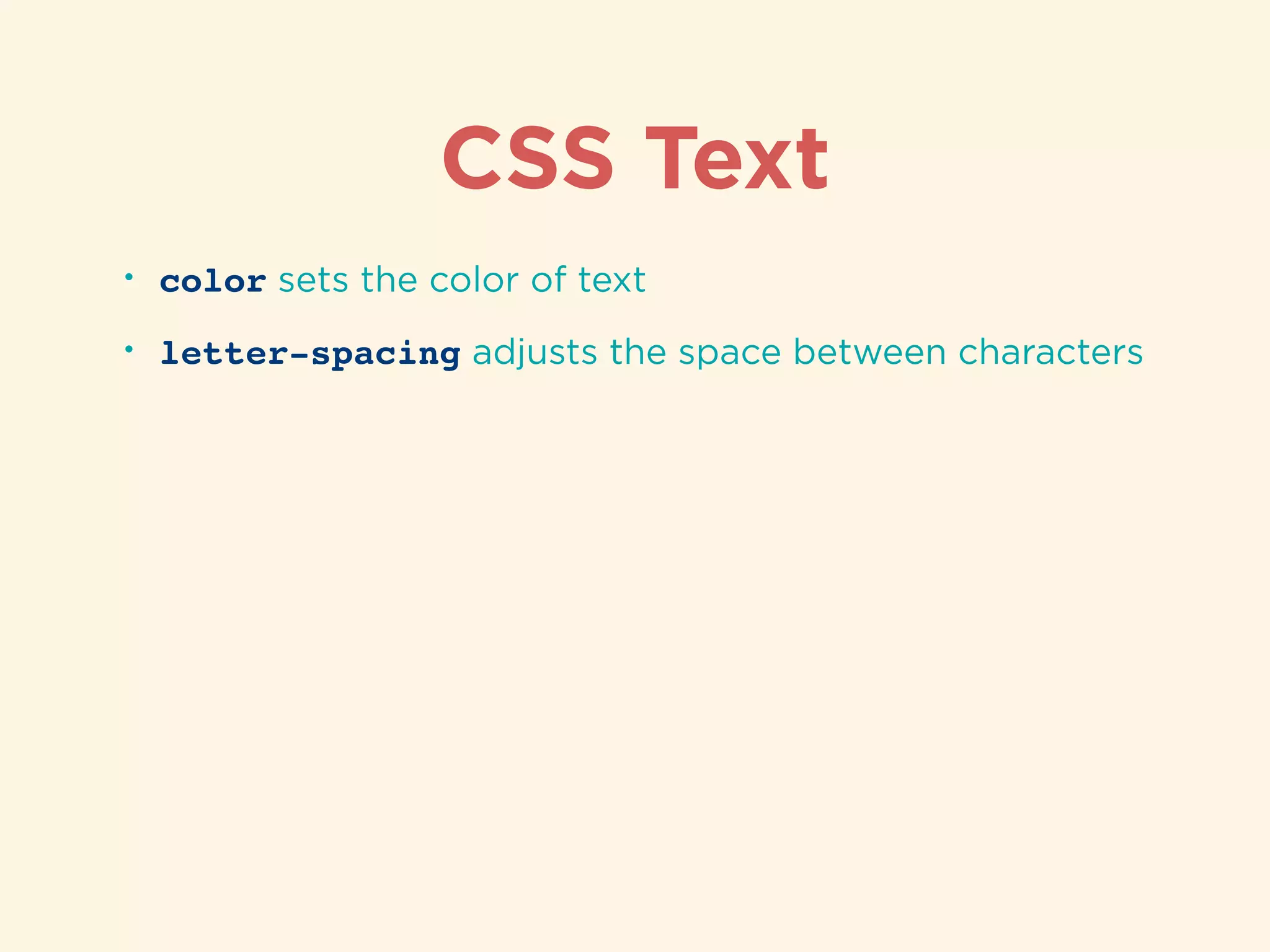
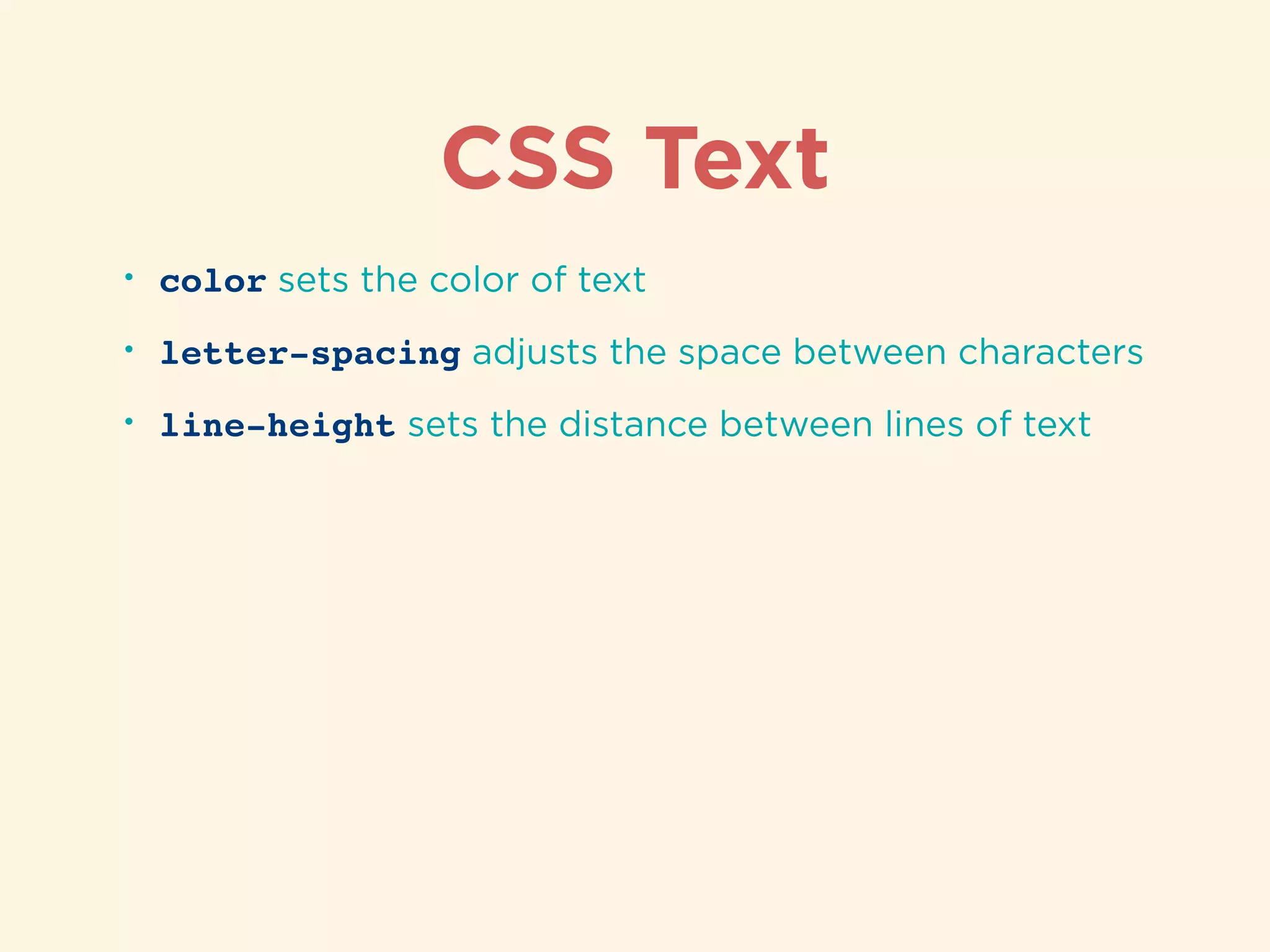
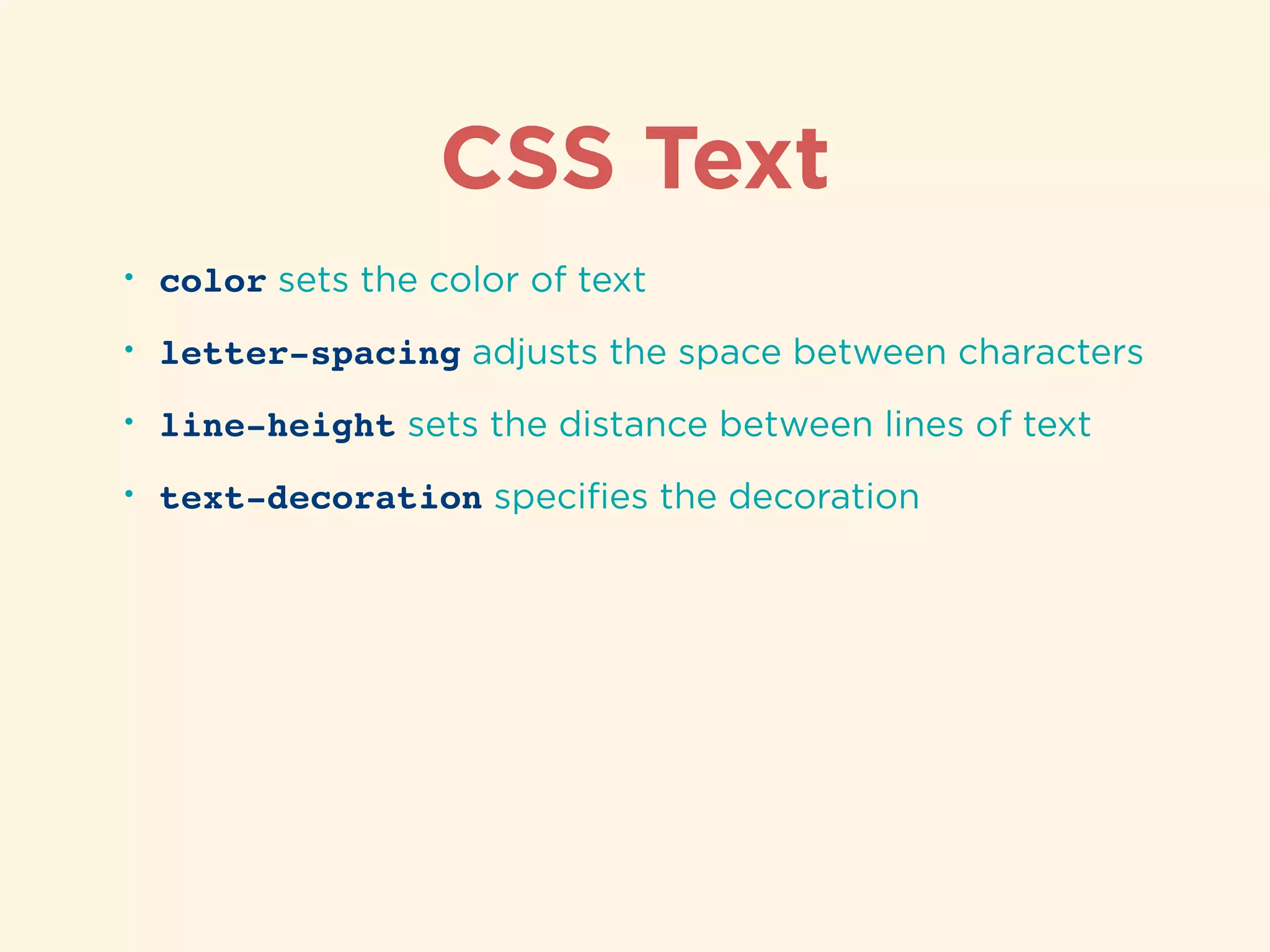
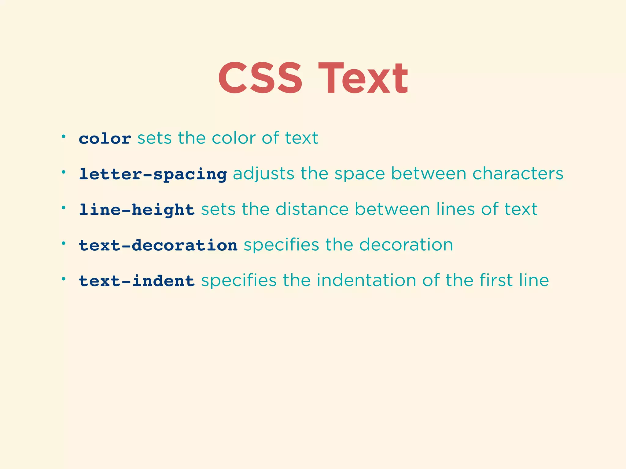
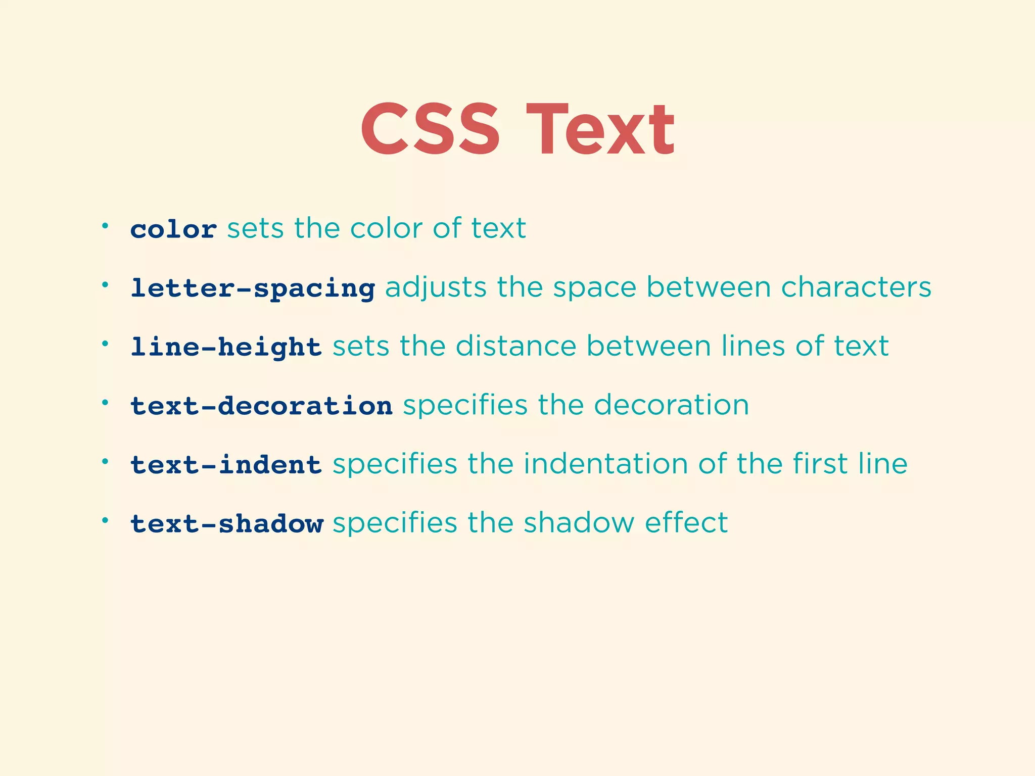
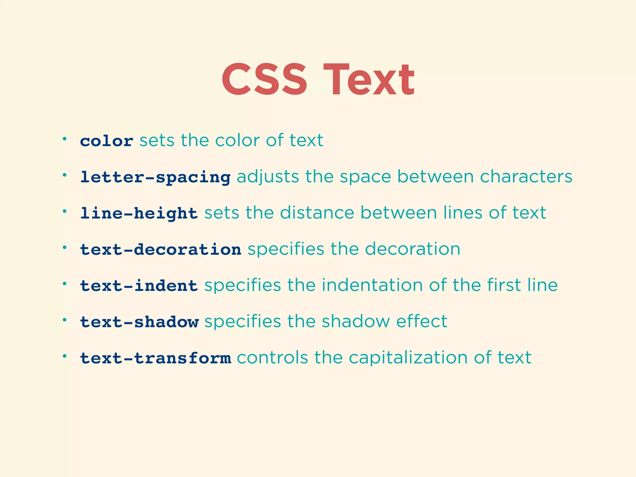
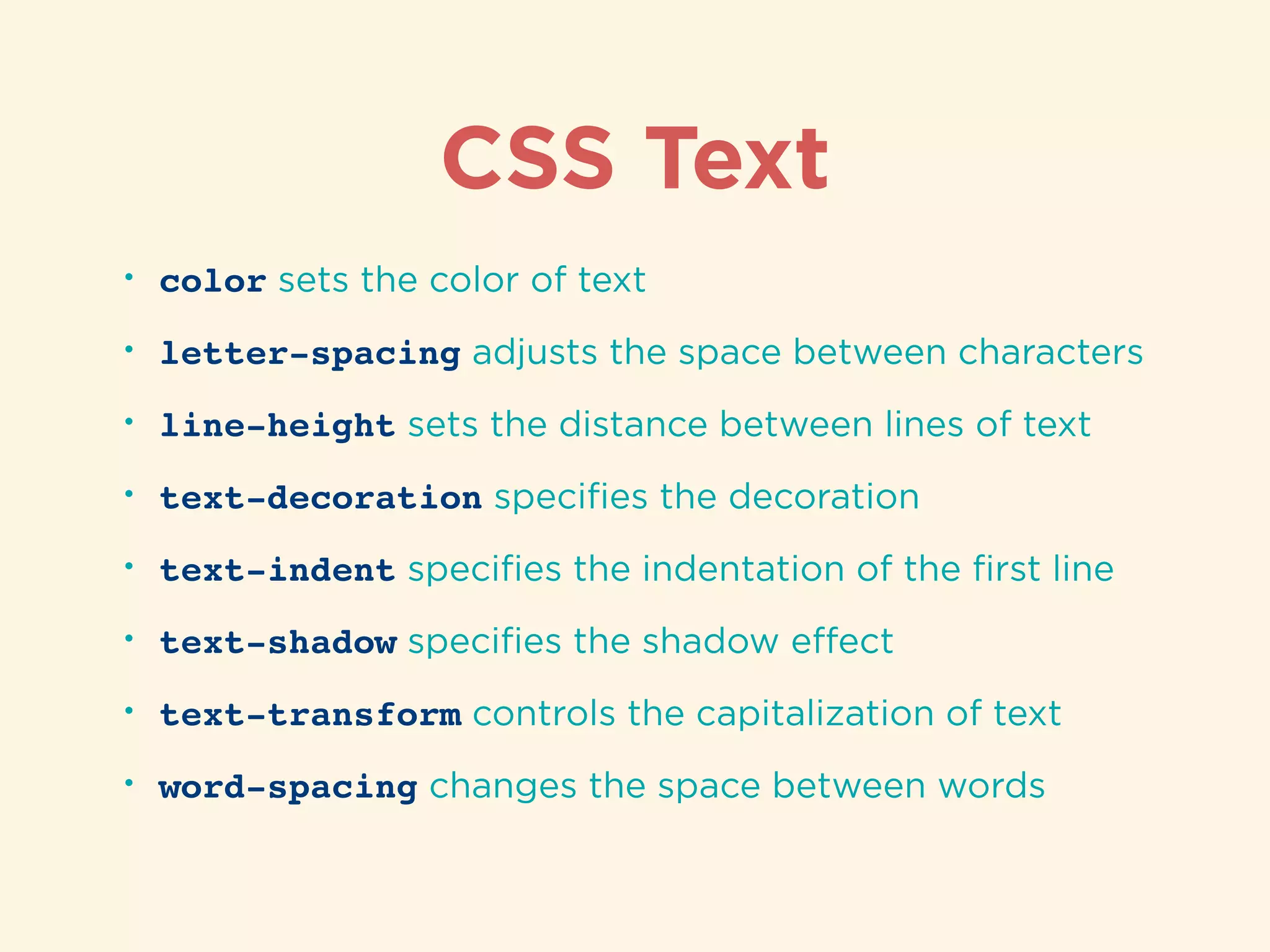
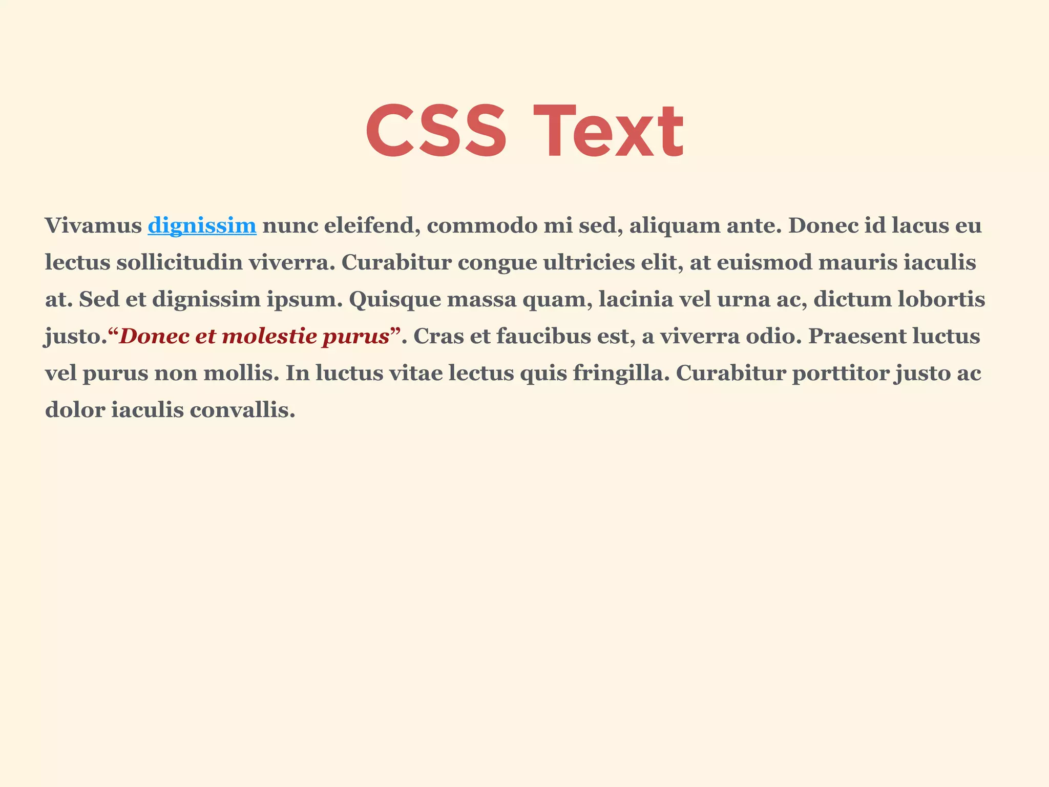
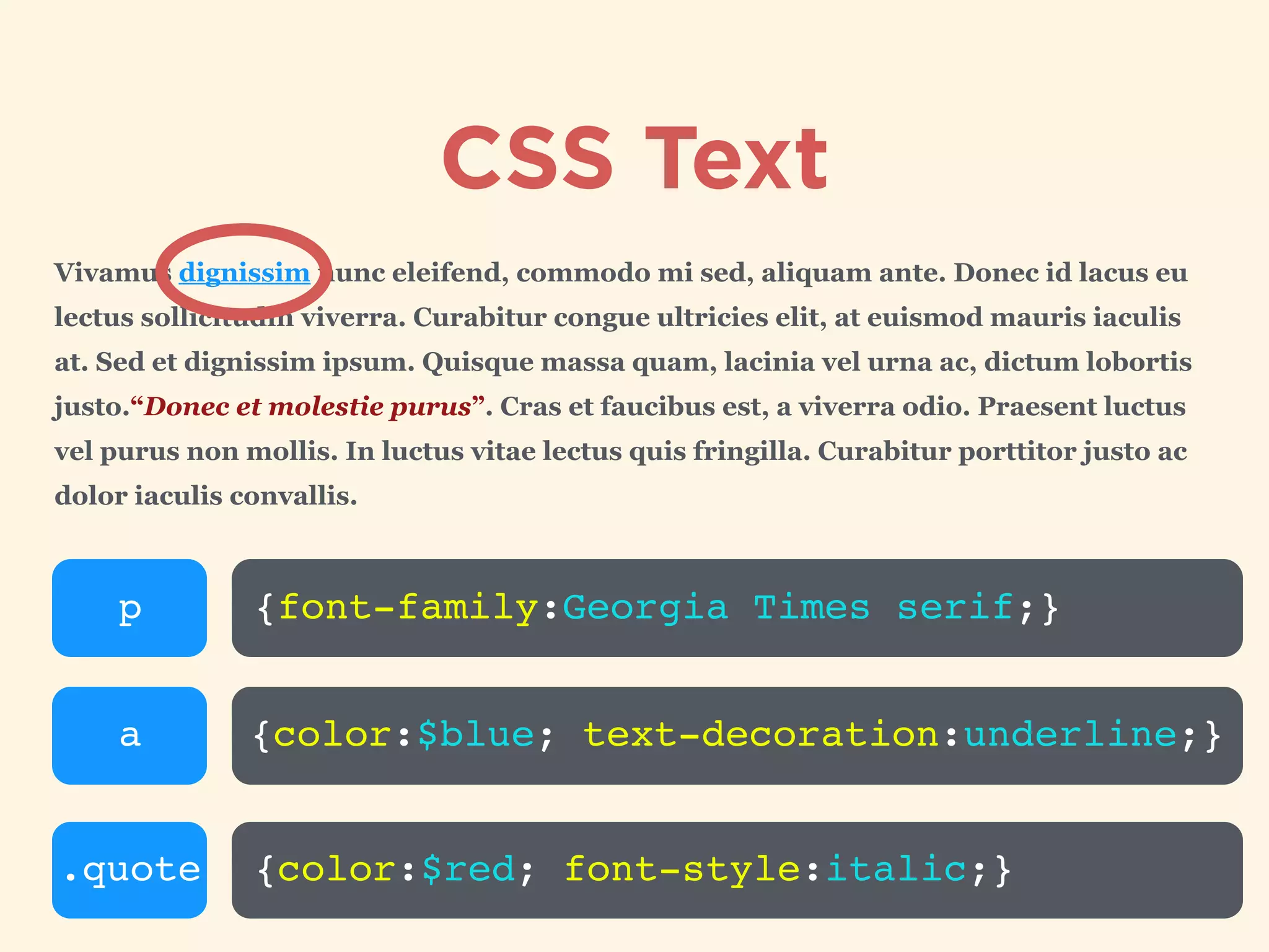
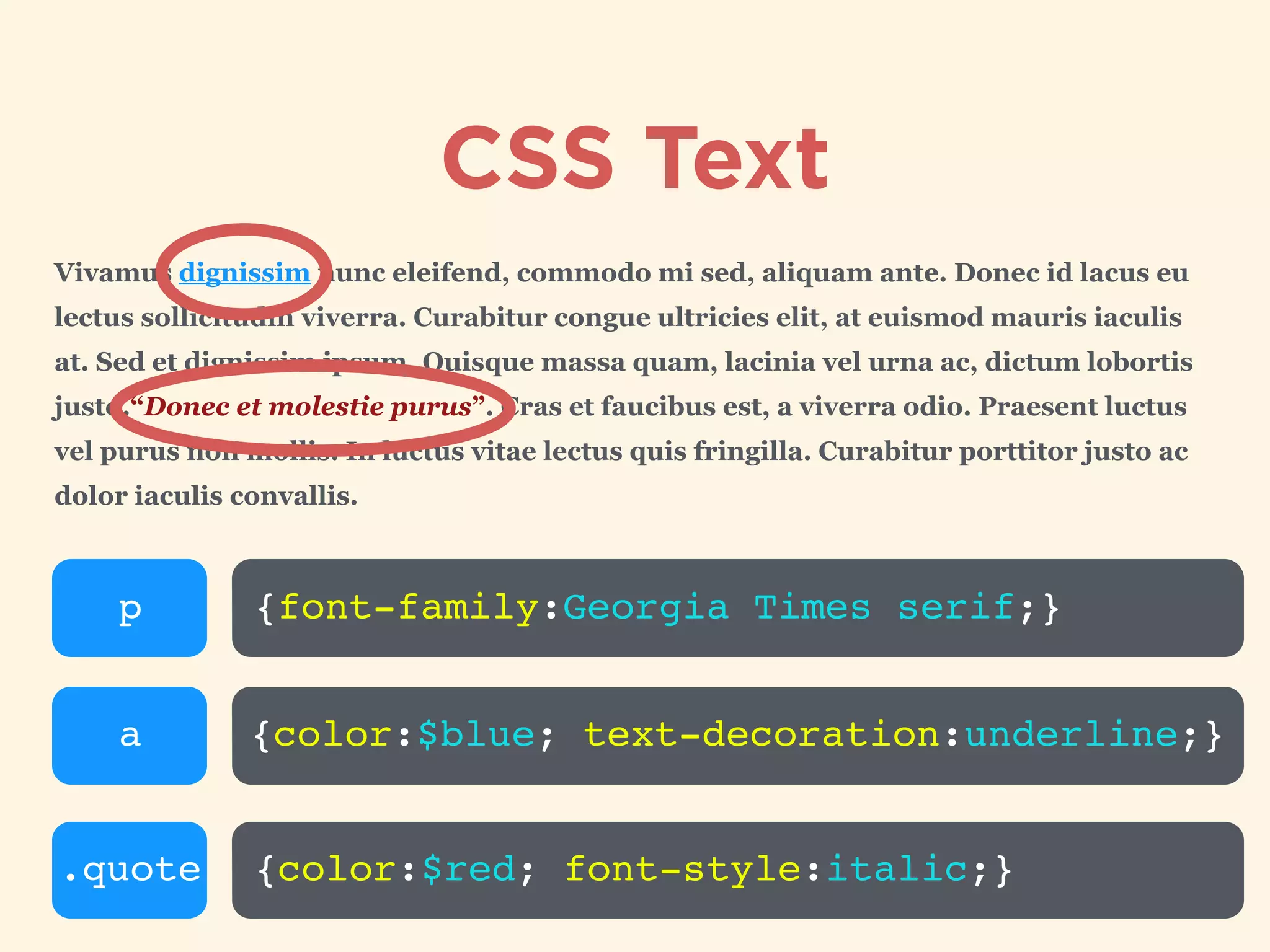
Text styling properties in CSS including color, spacing, decoration, and shadows.
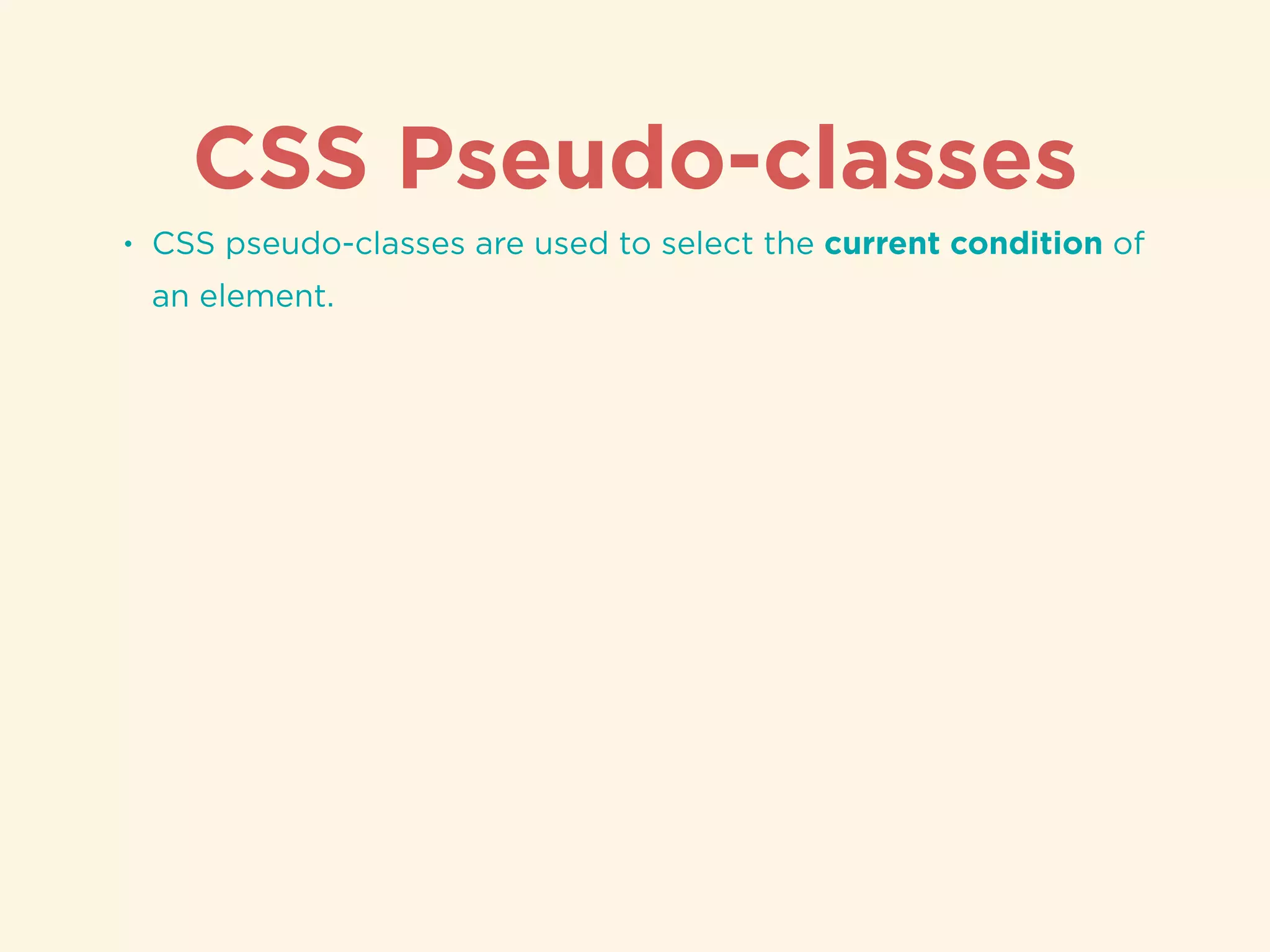
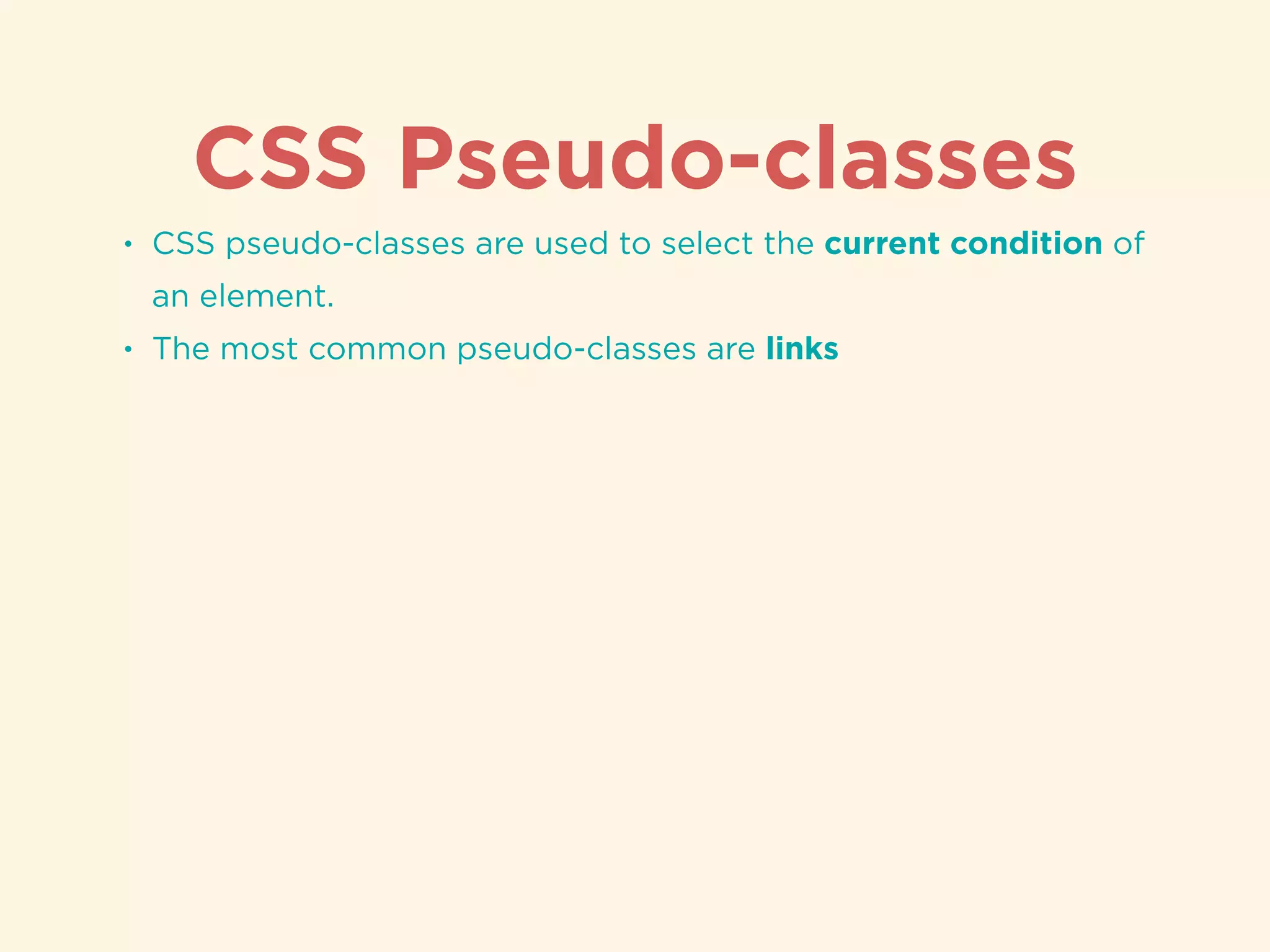
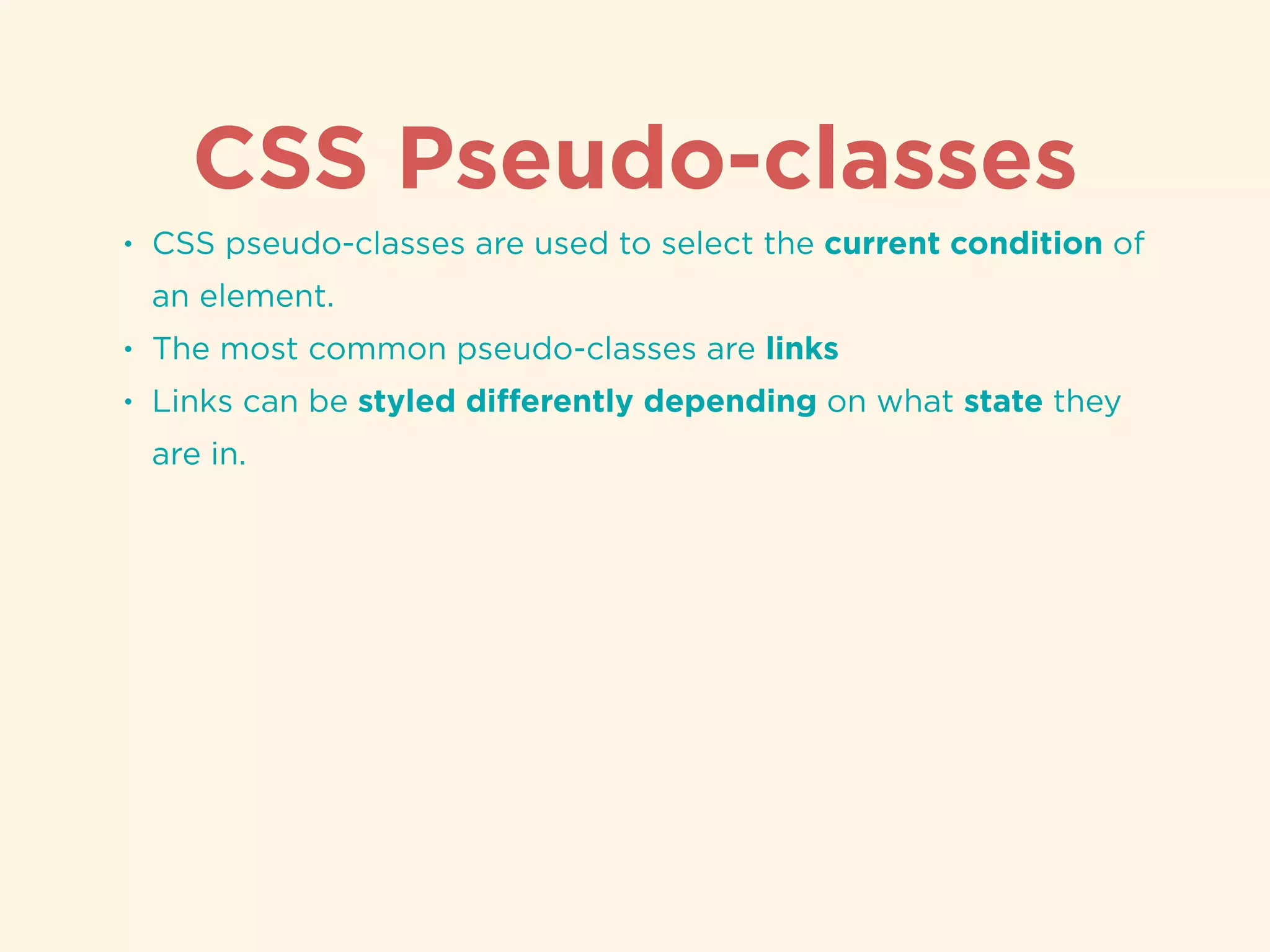
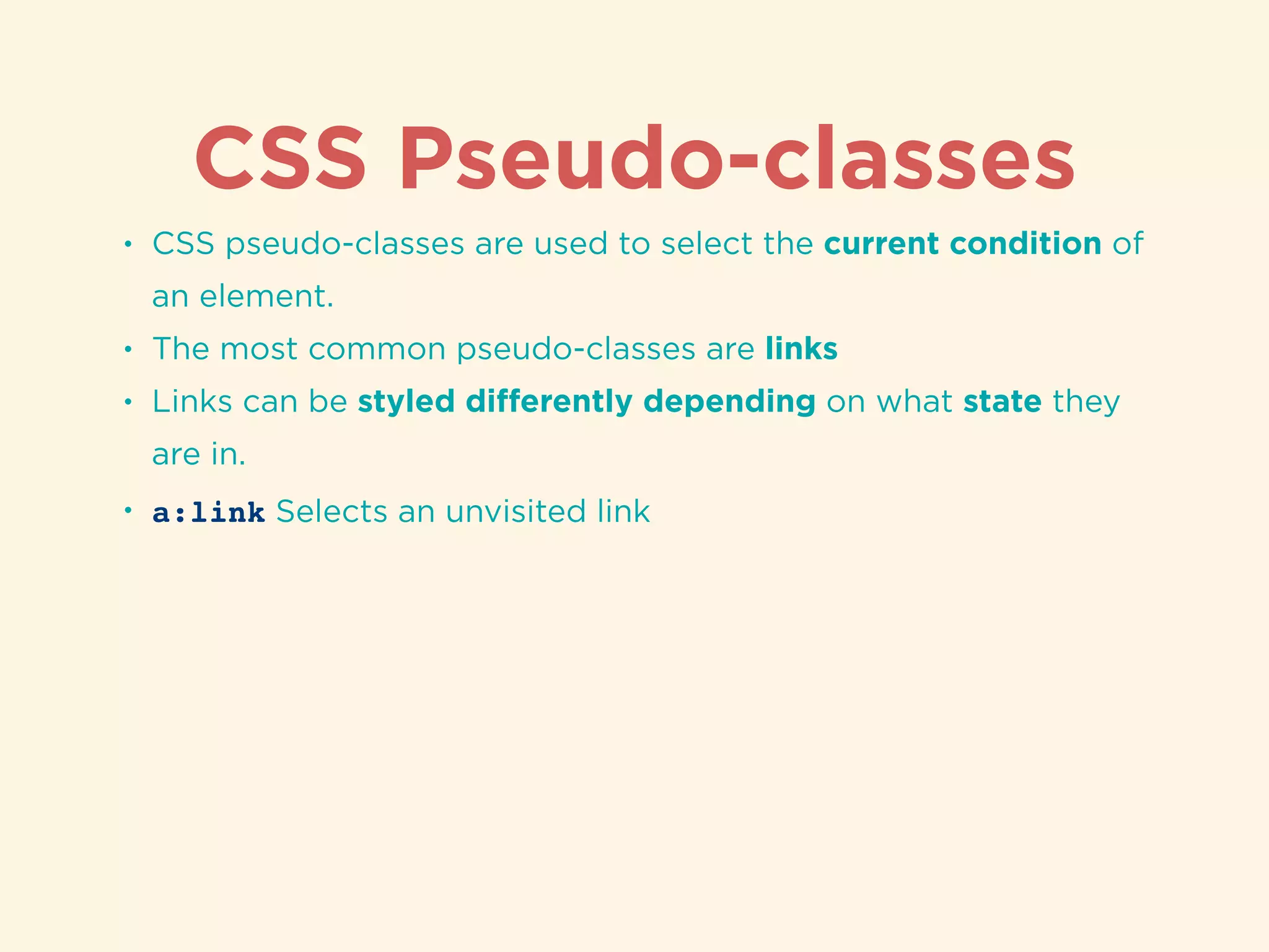
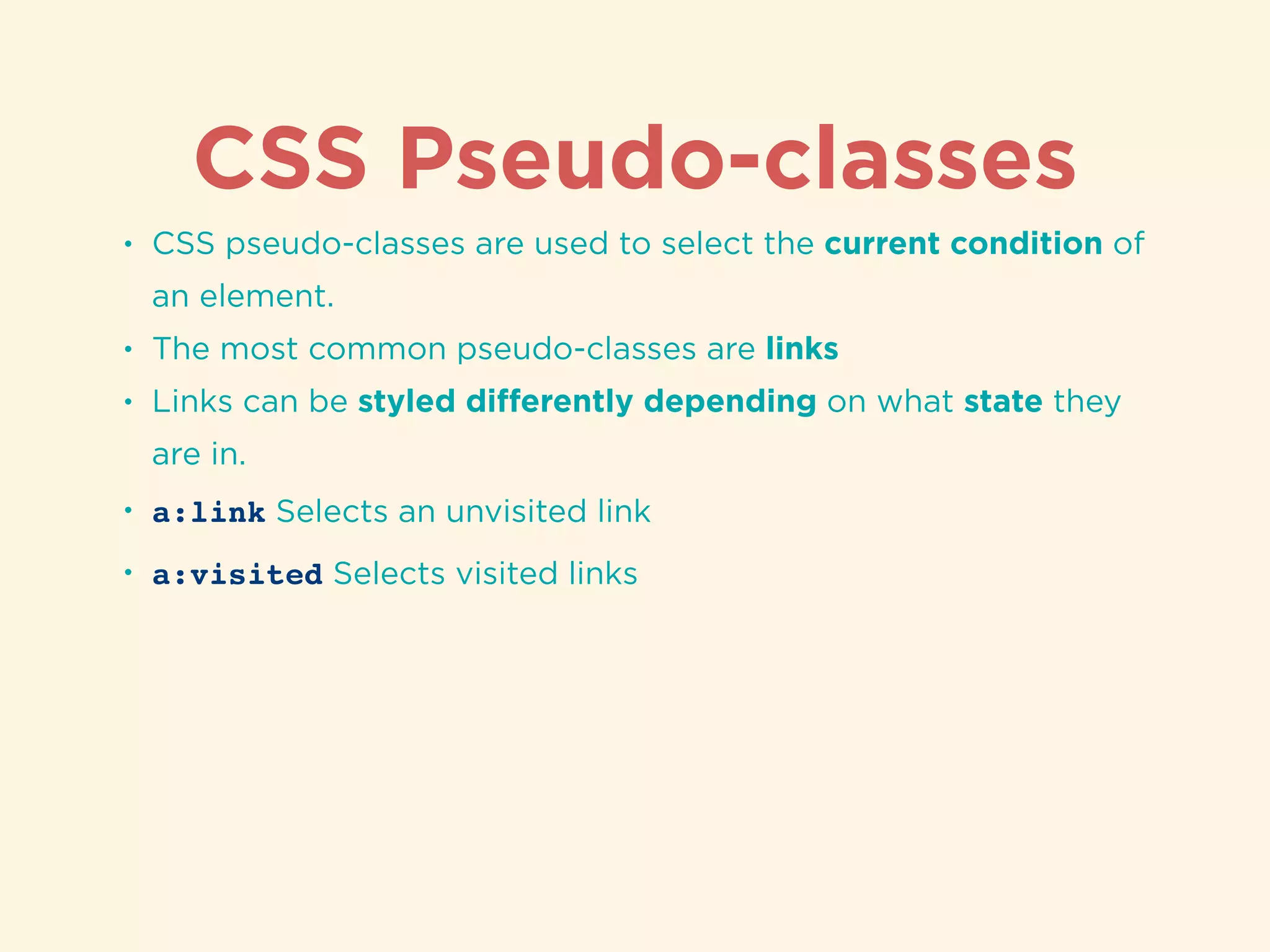
Introduction to CSS pseudo-classes for styling elements based on their states.
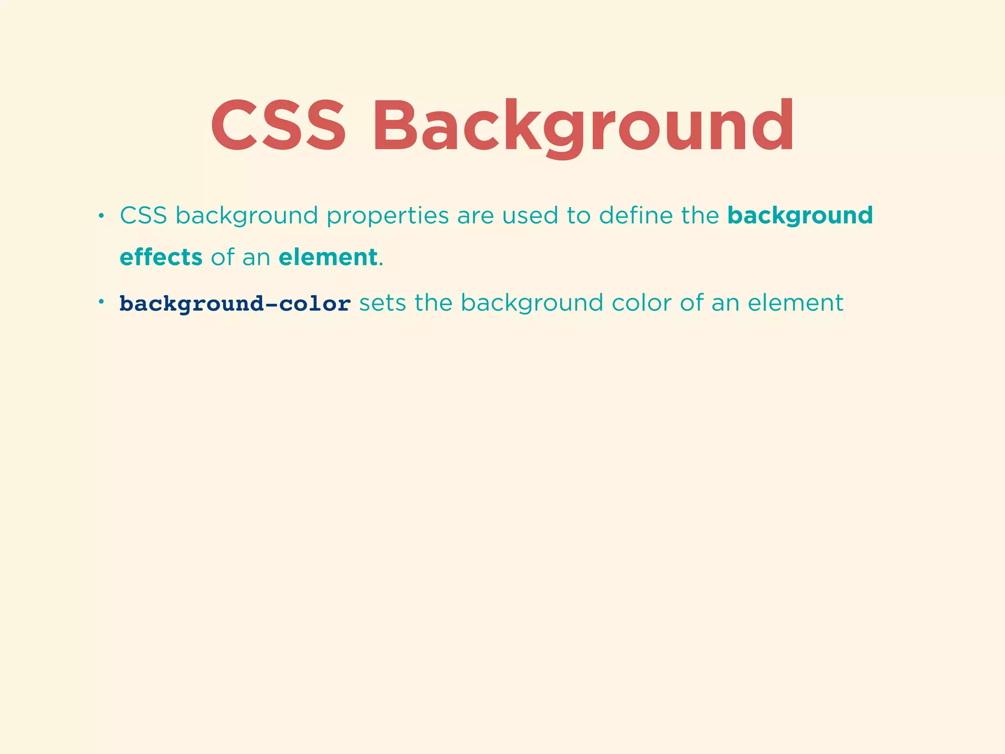
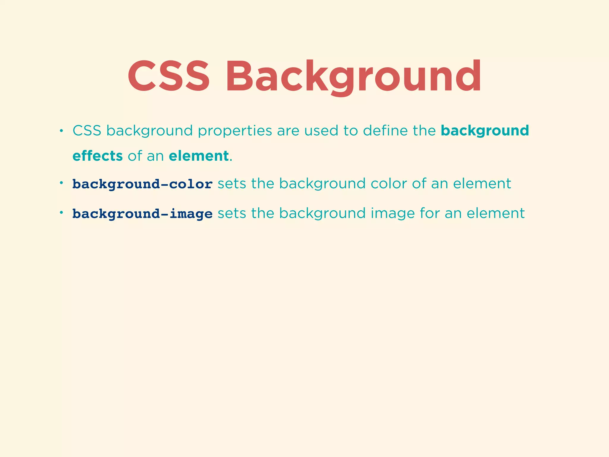
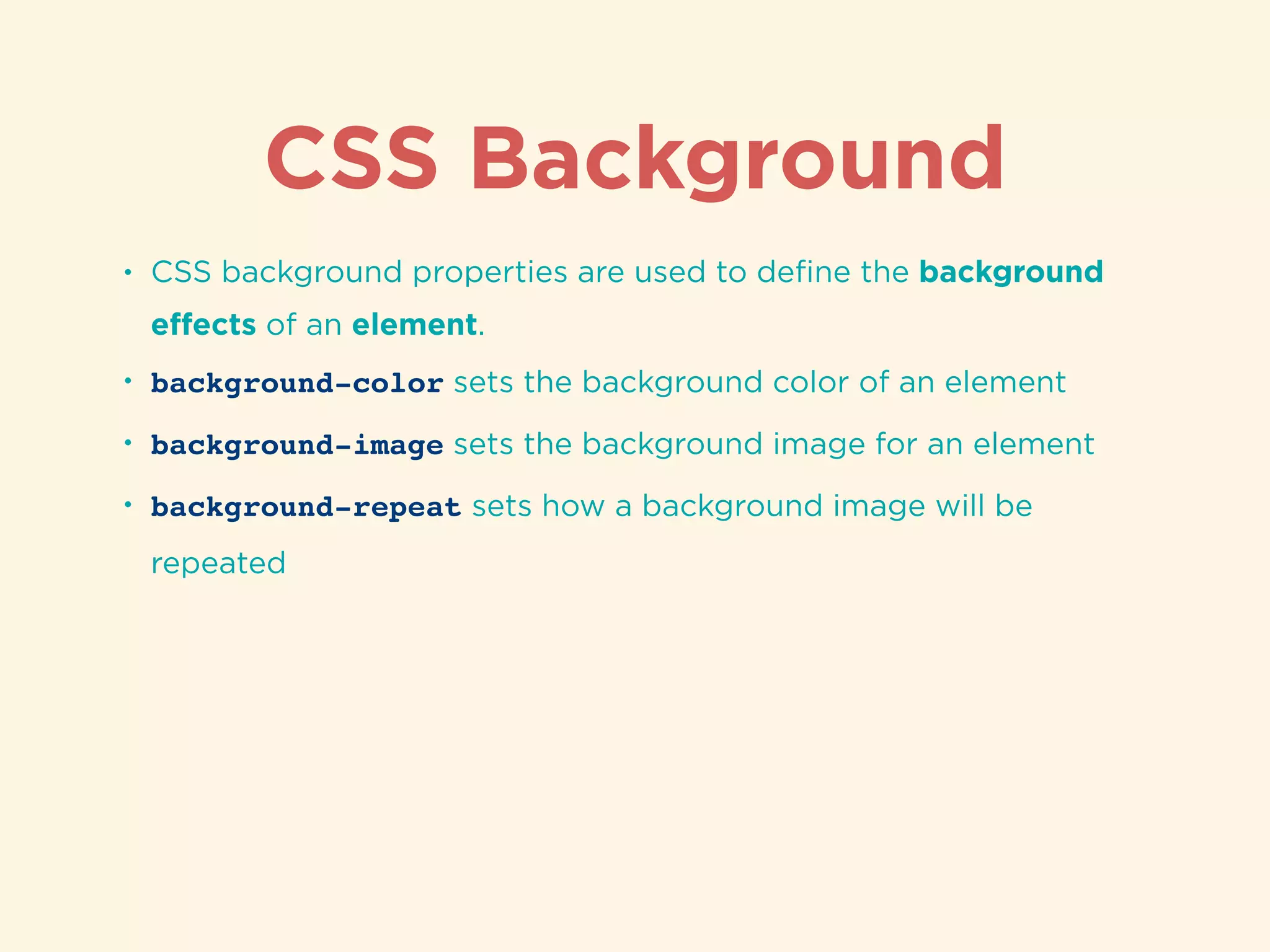
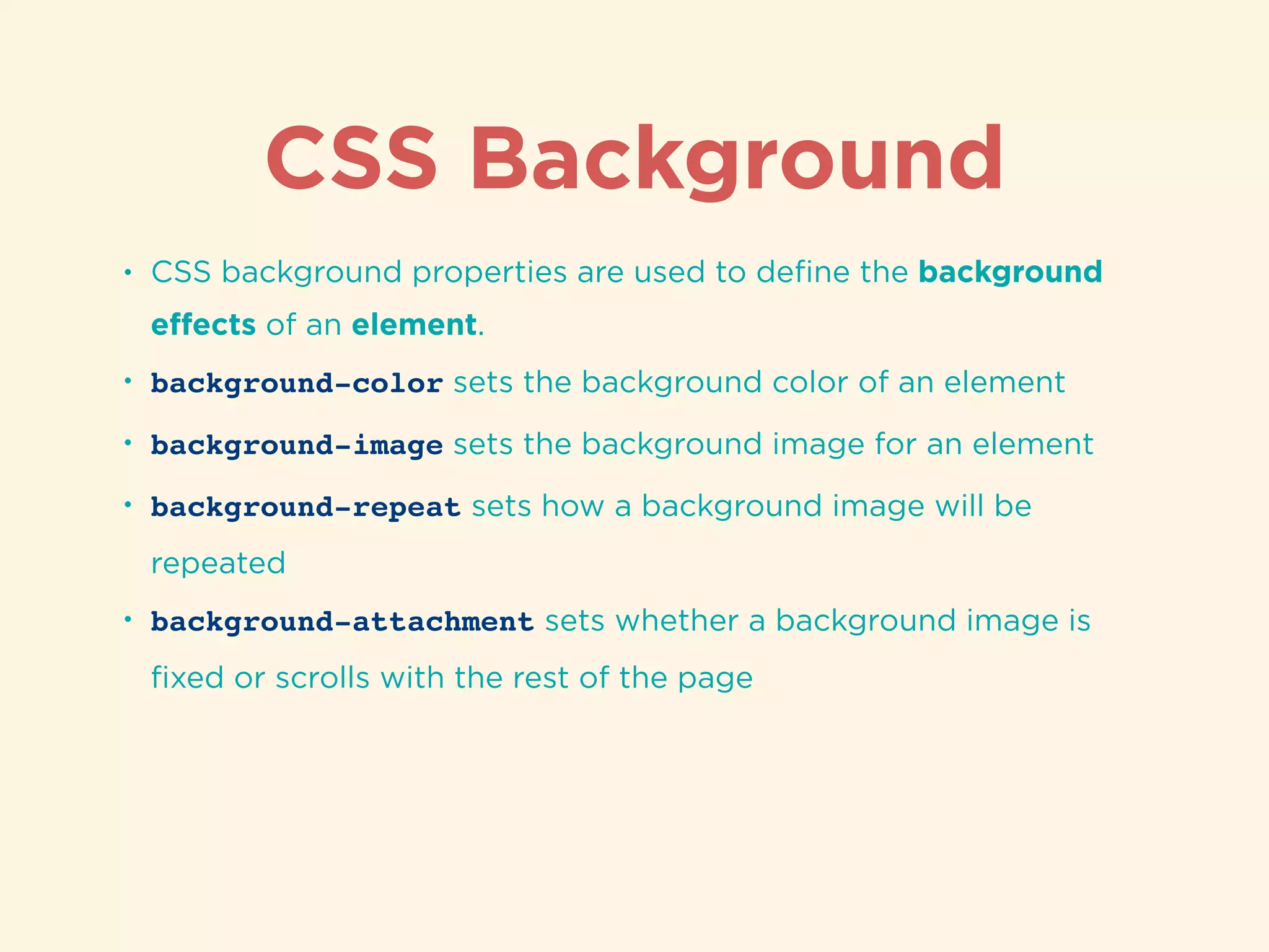
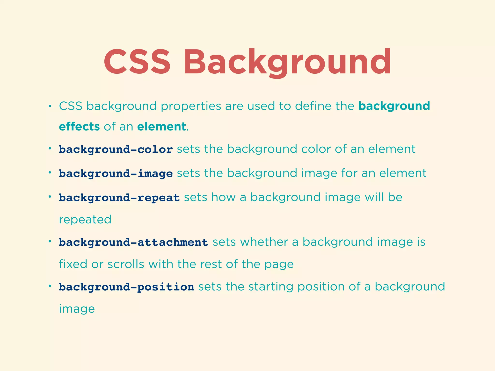
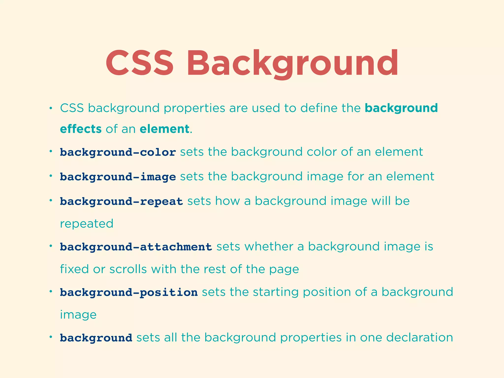
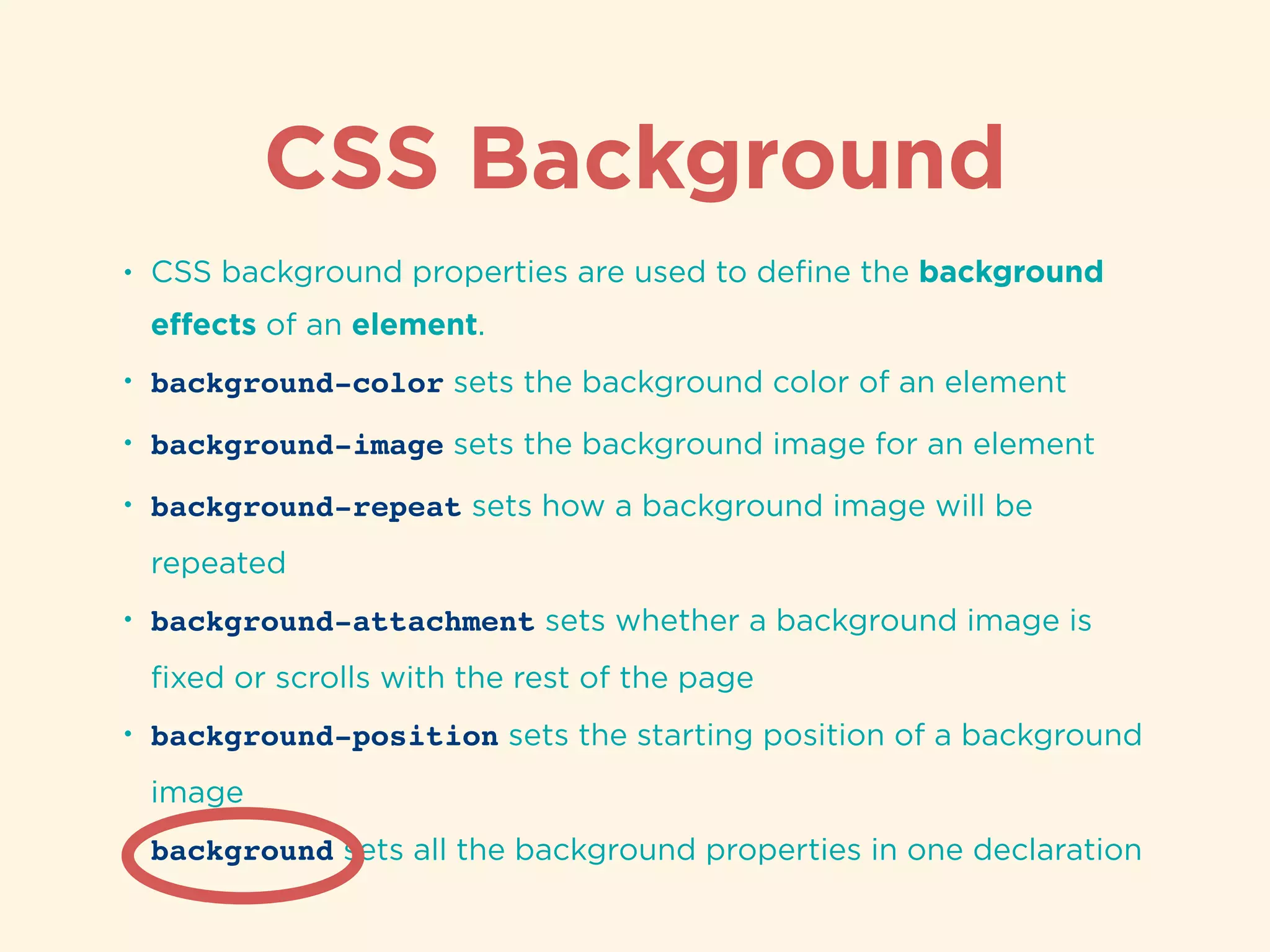
CSS background properties that define colors, images, repeats, attachments, and positioning.
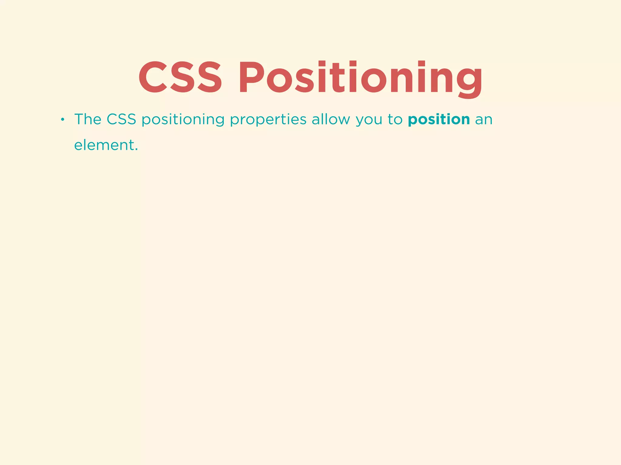
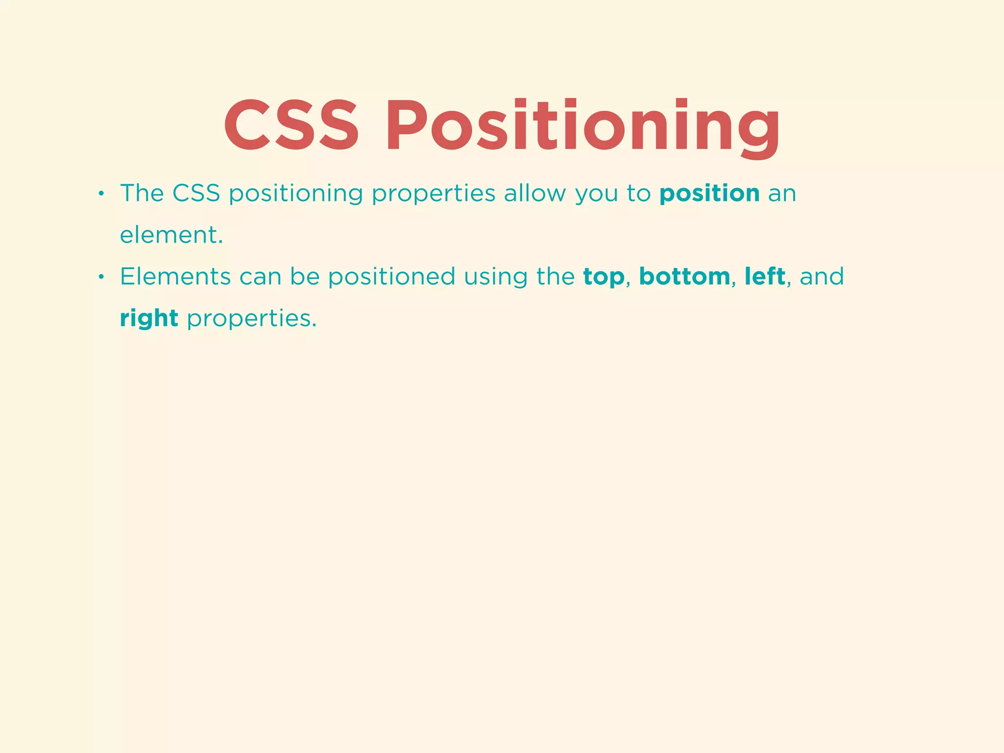
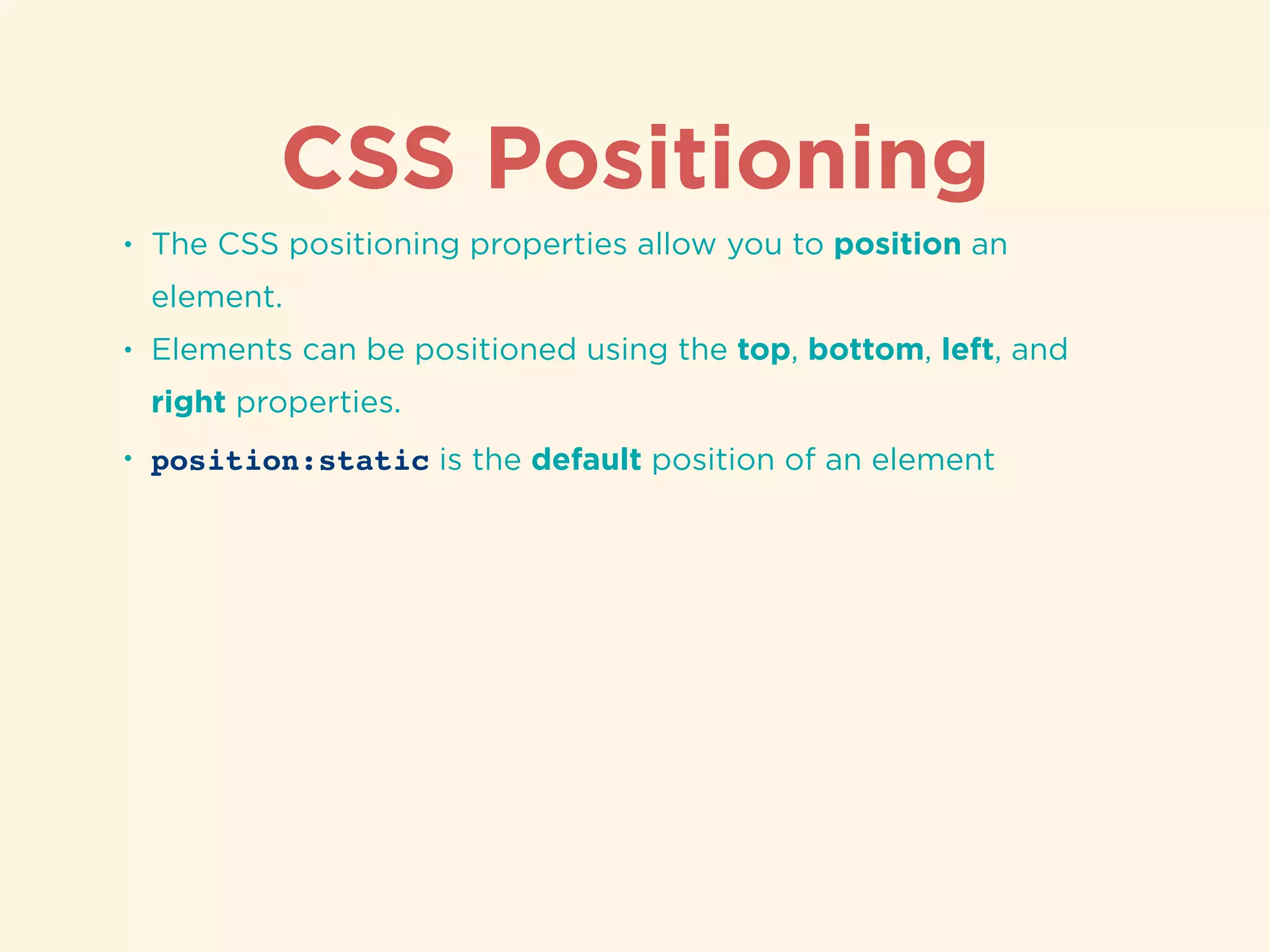
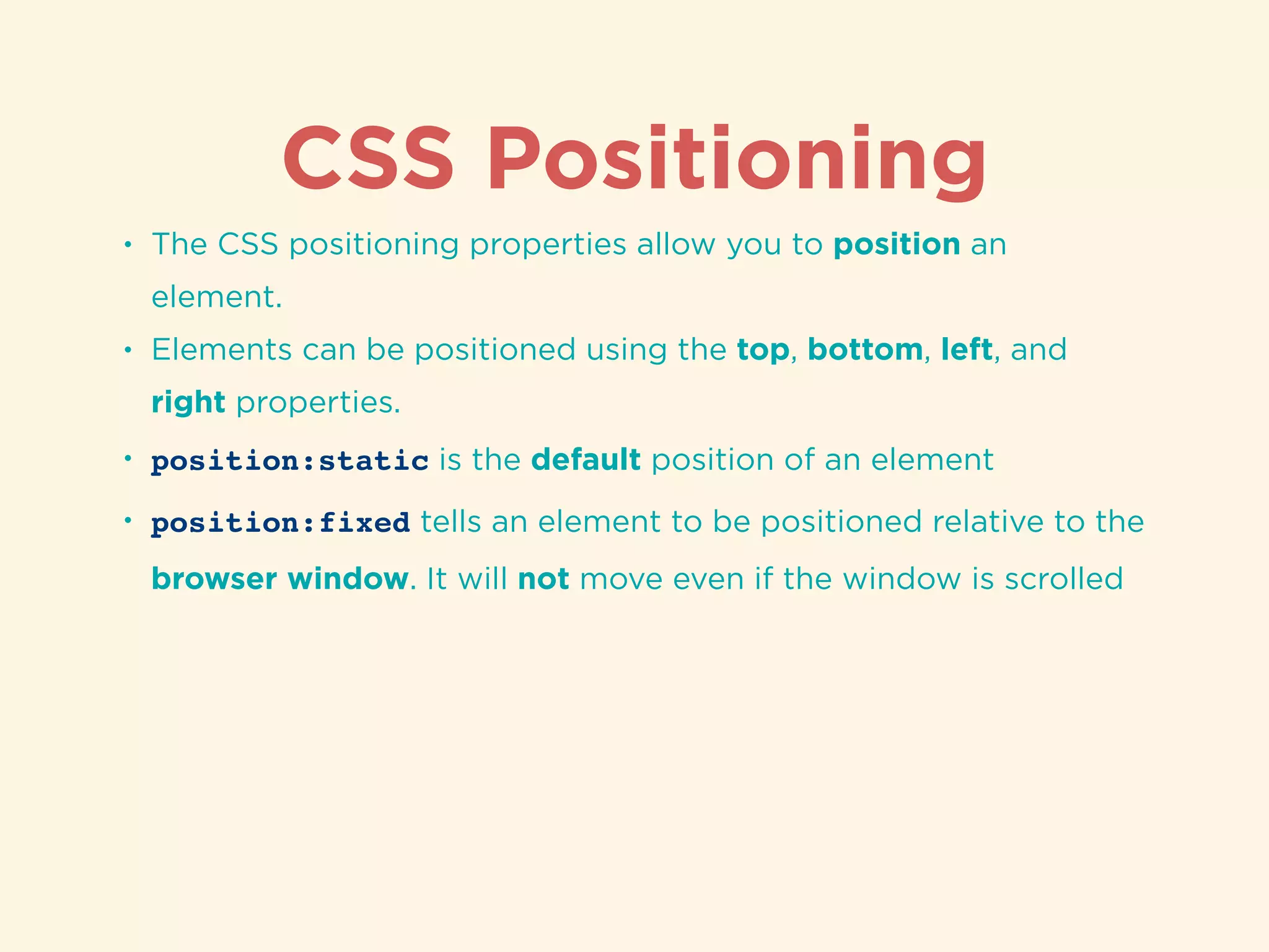
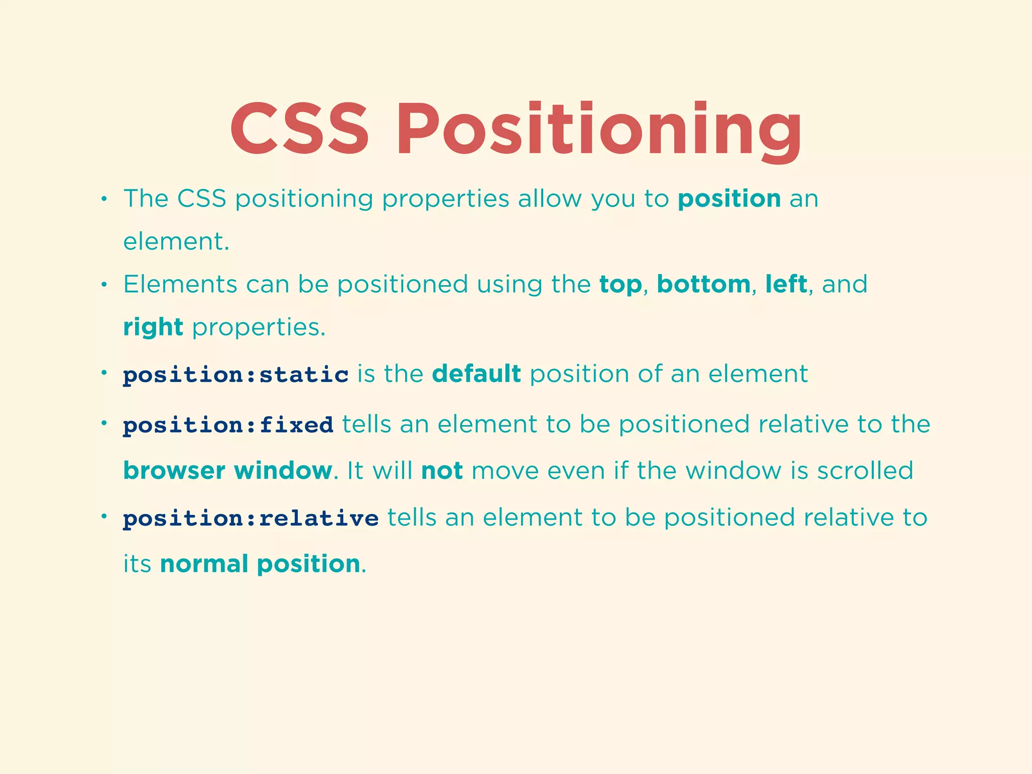
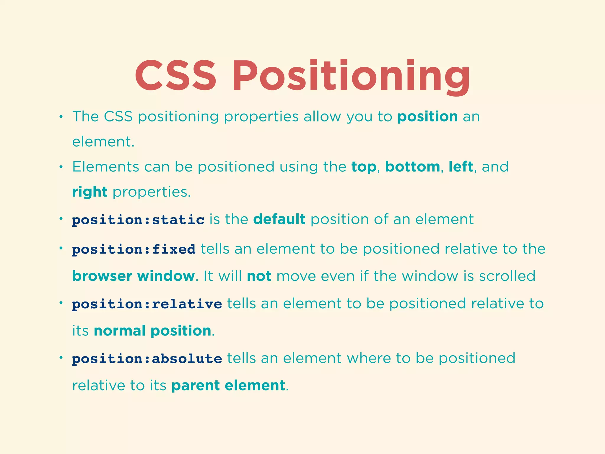
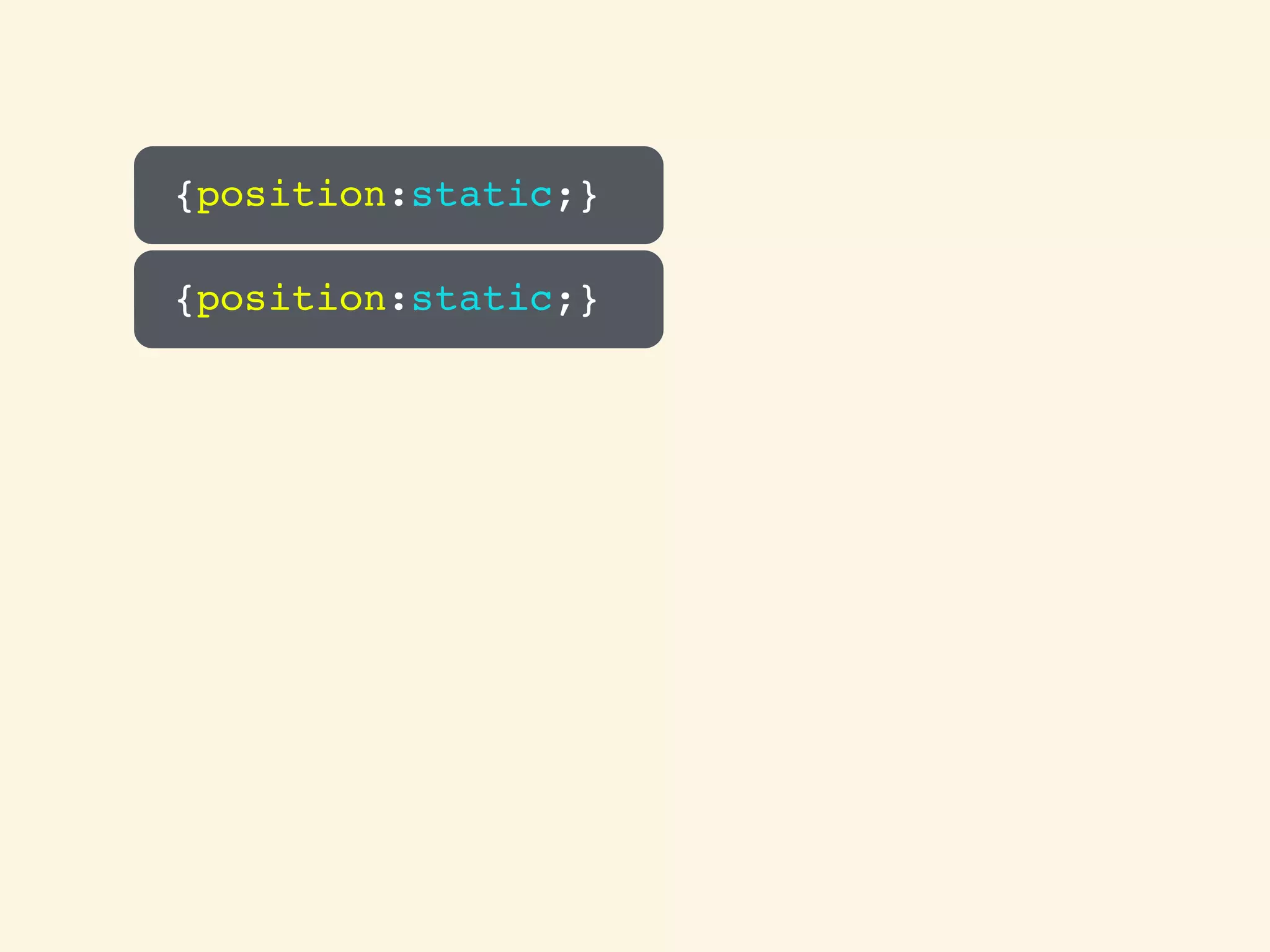
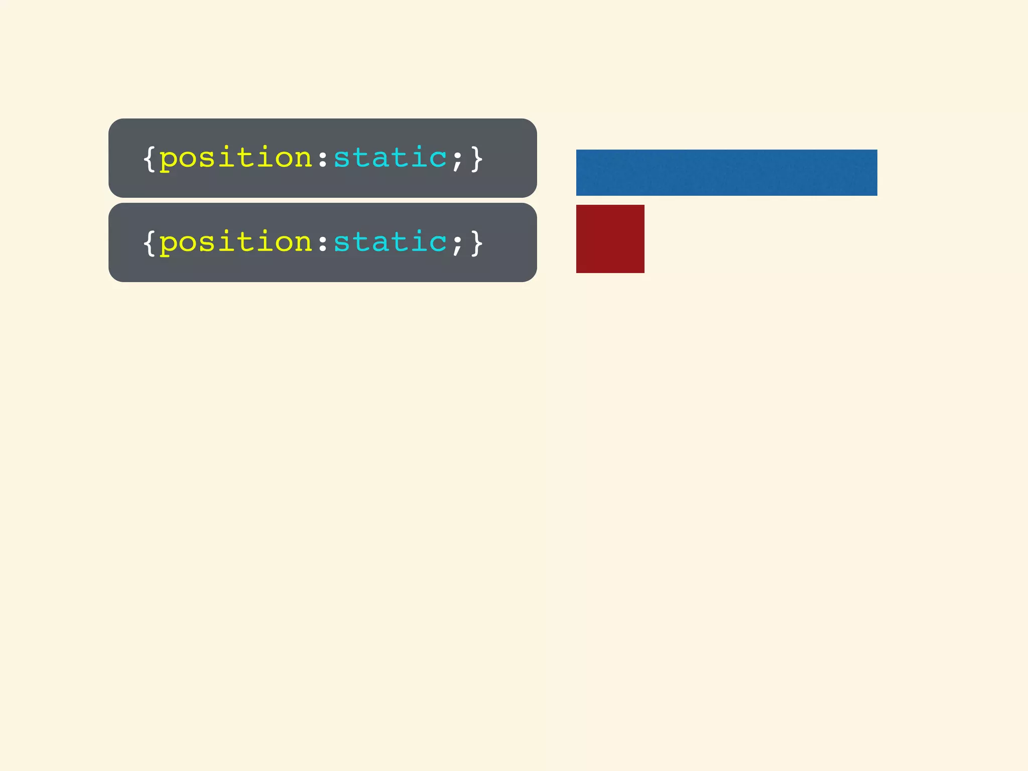
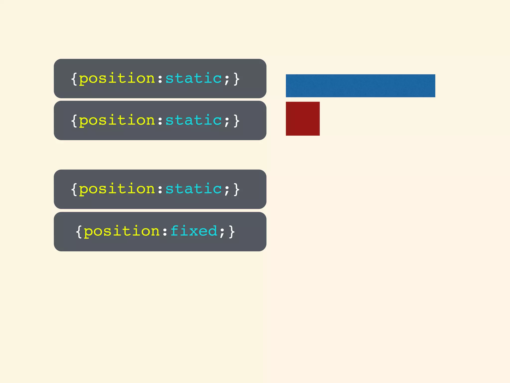
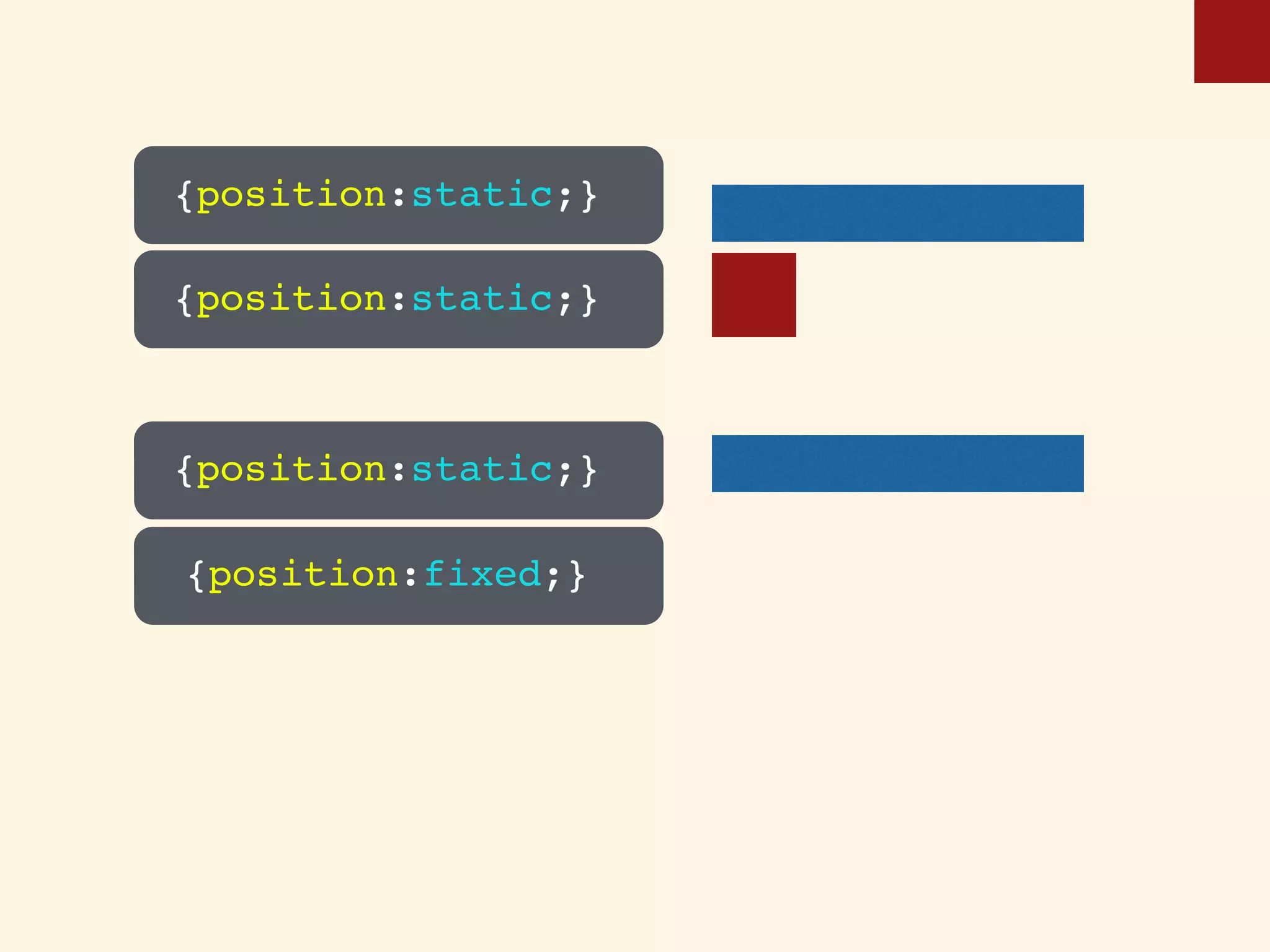
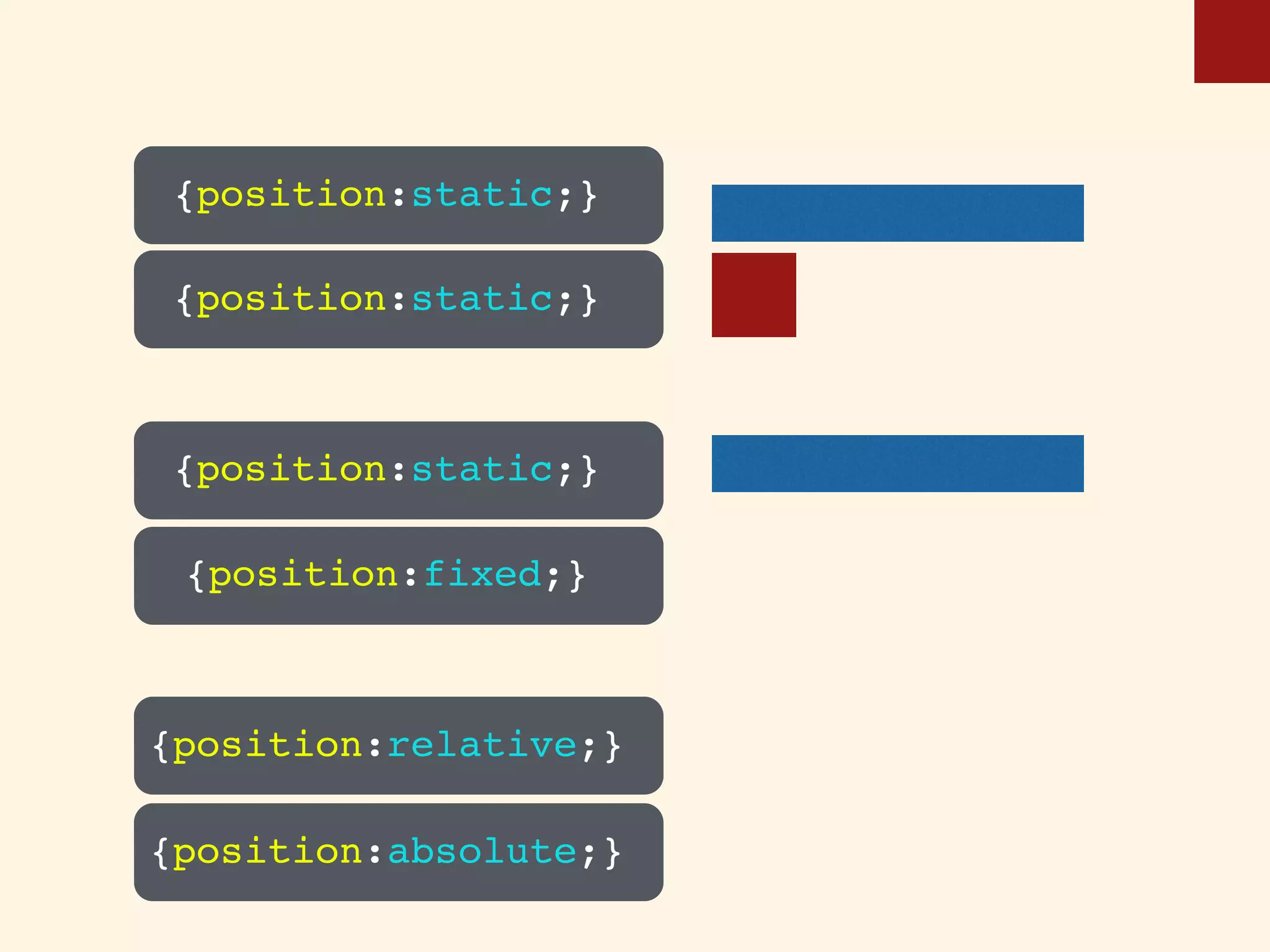
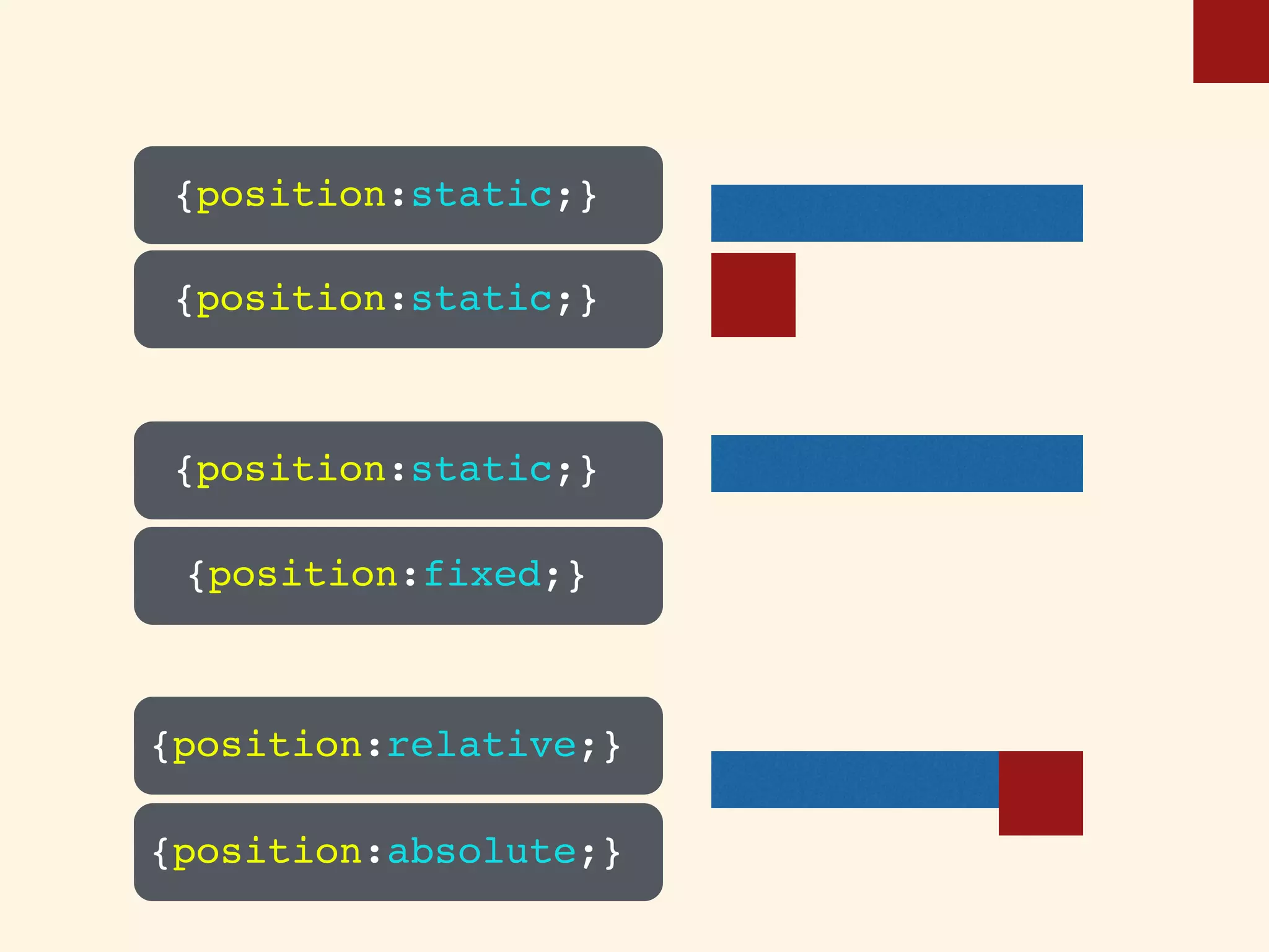
Overview of CSS positioning methods including static, fixed, relative, and absolute.
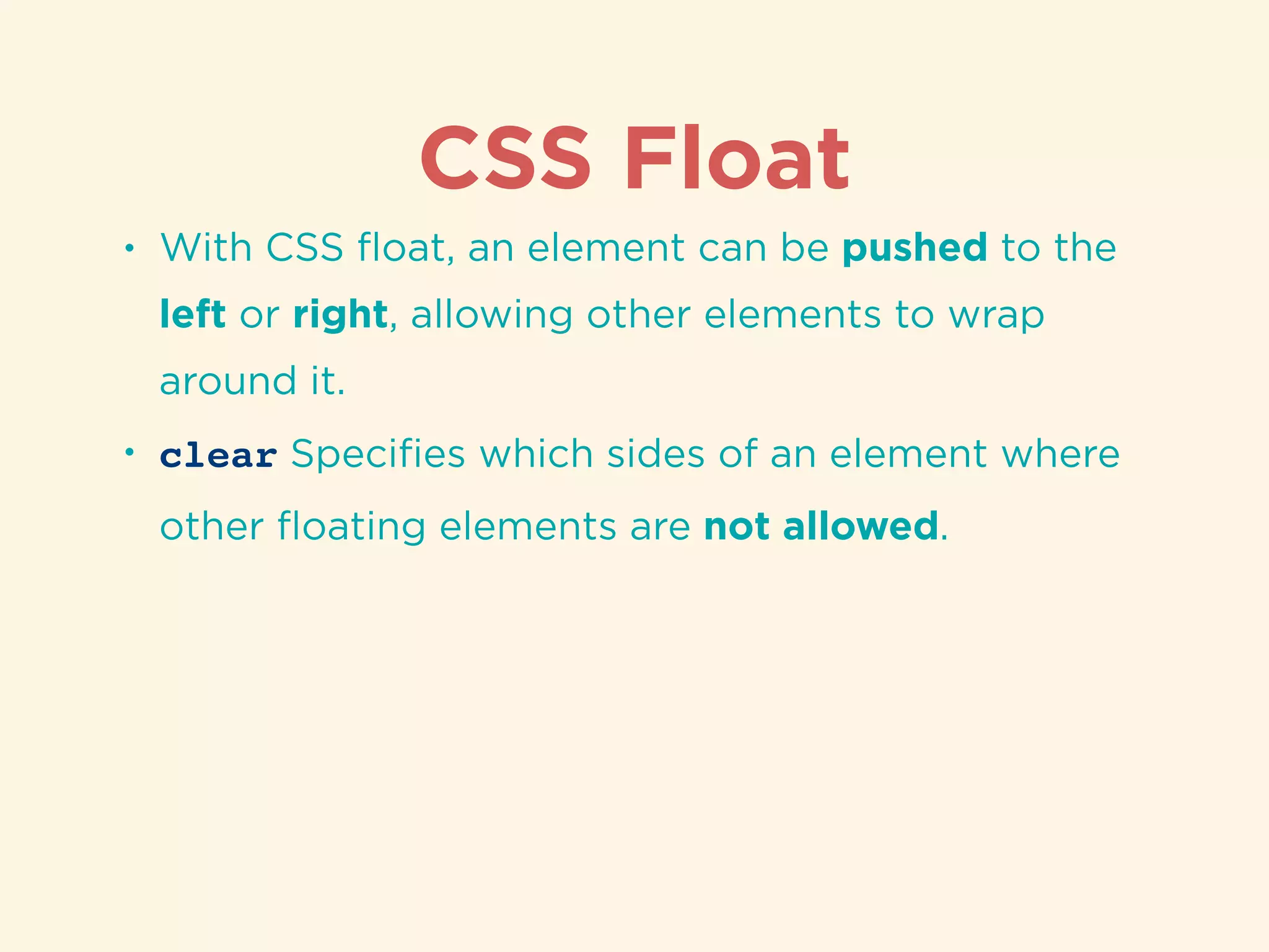
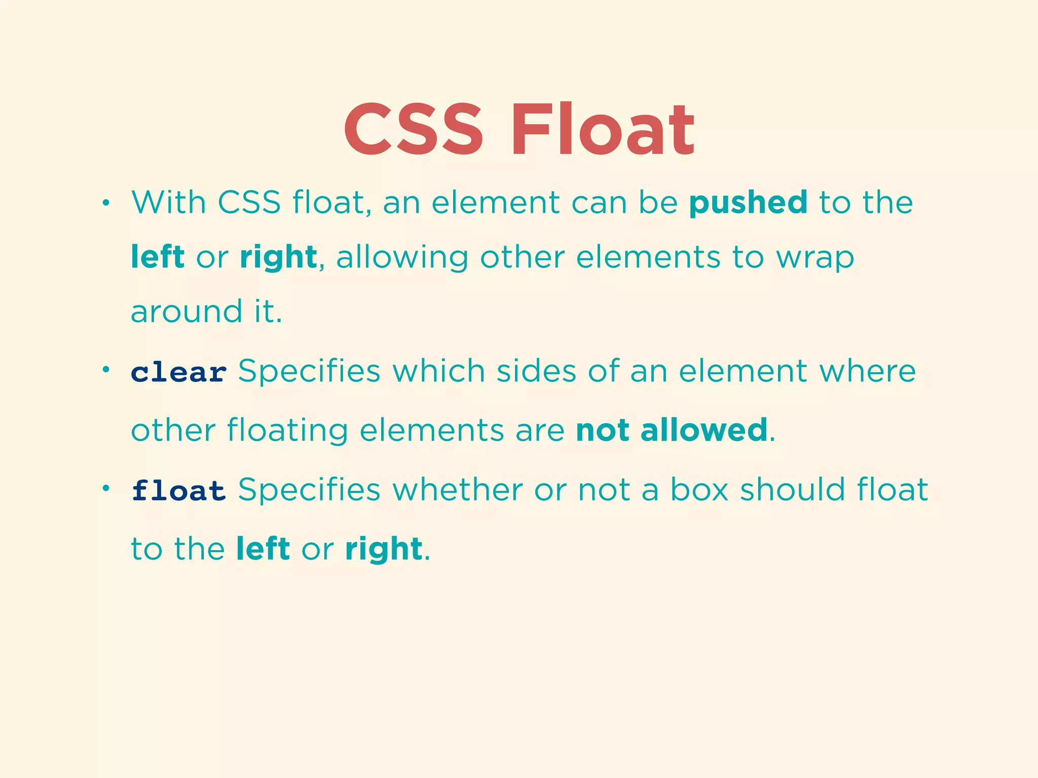
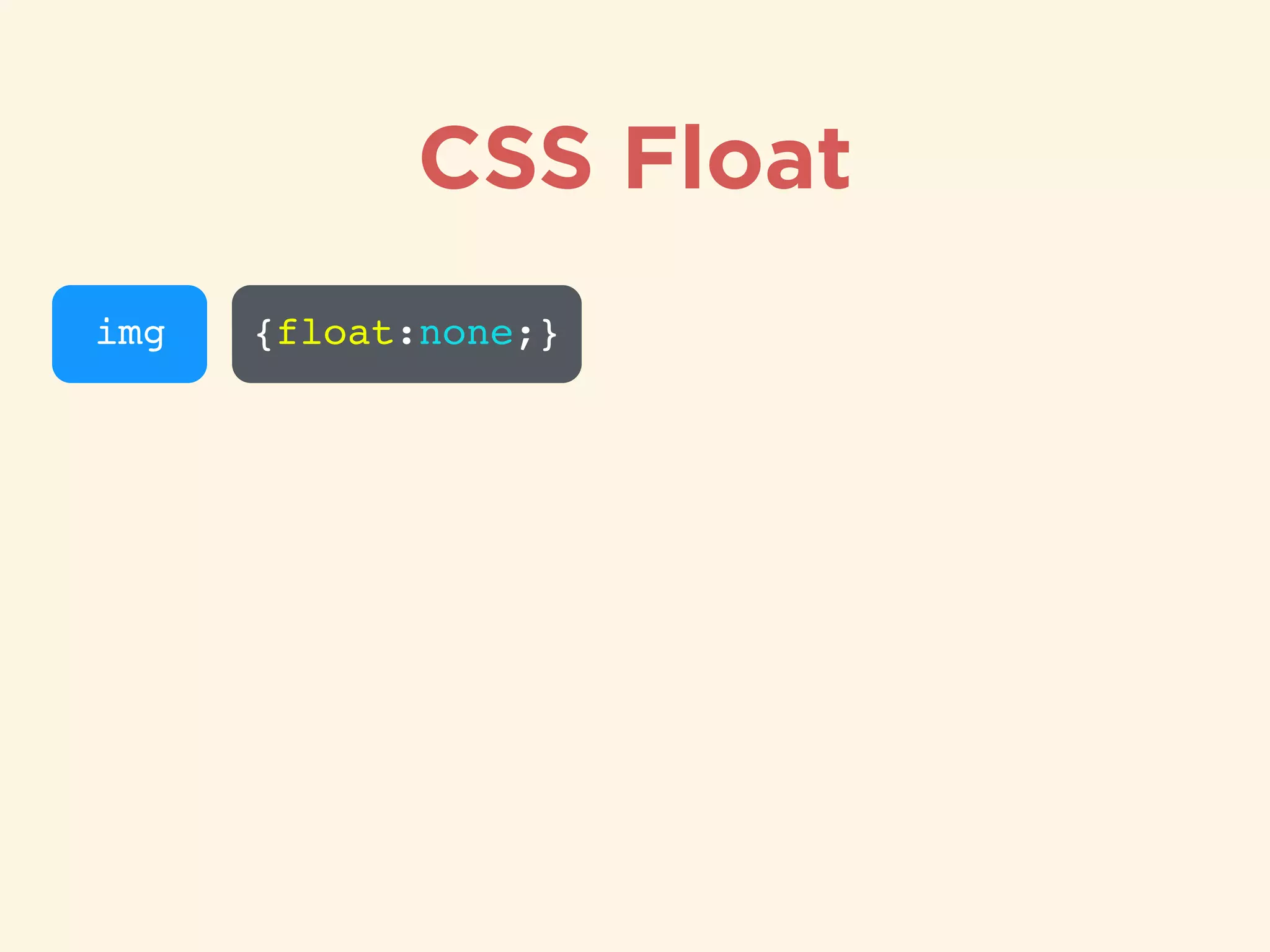
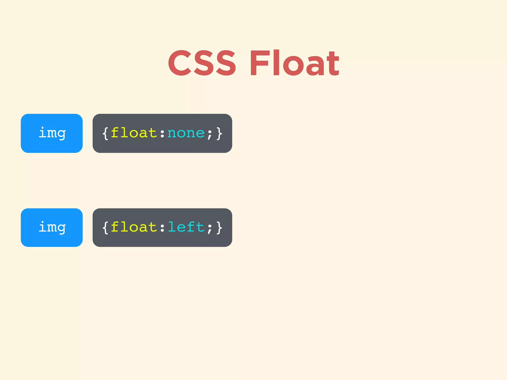
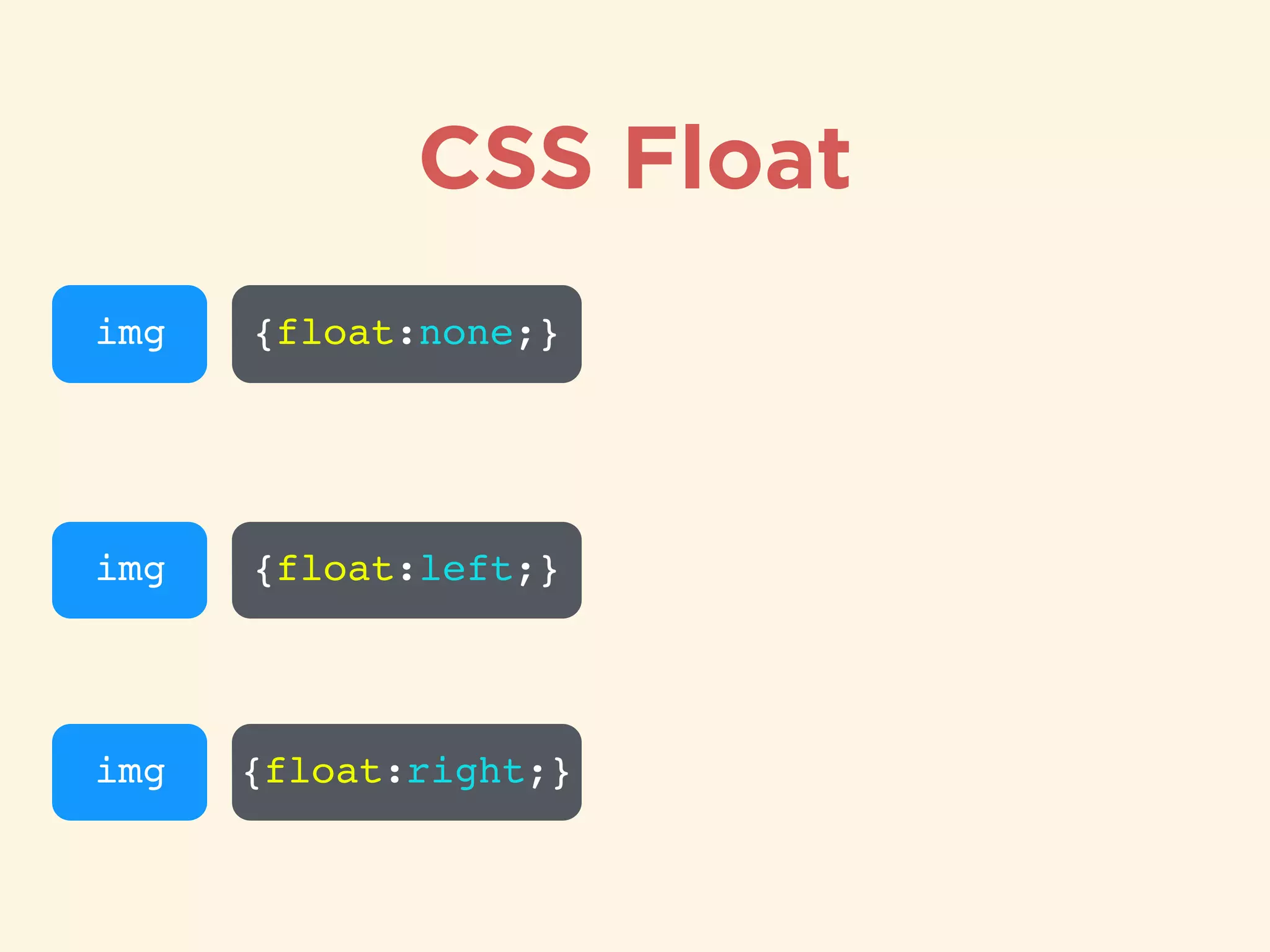
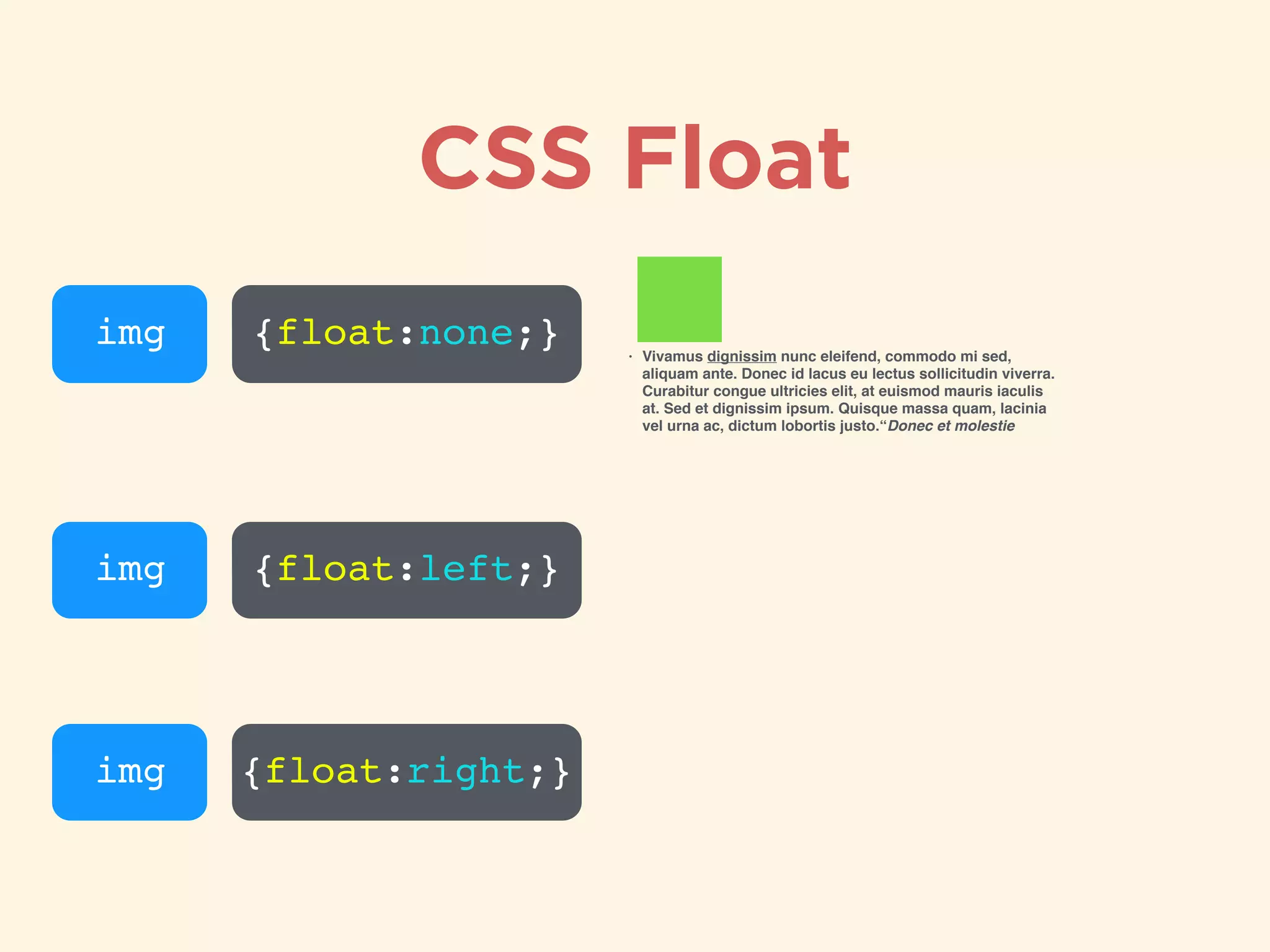
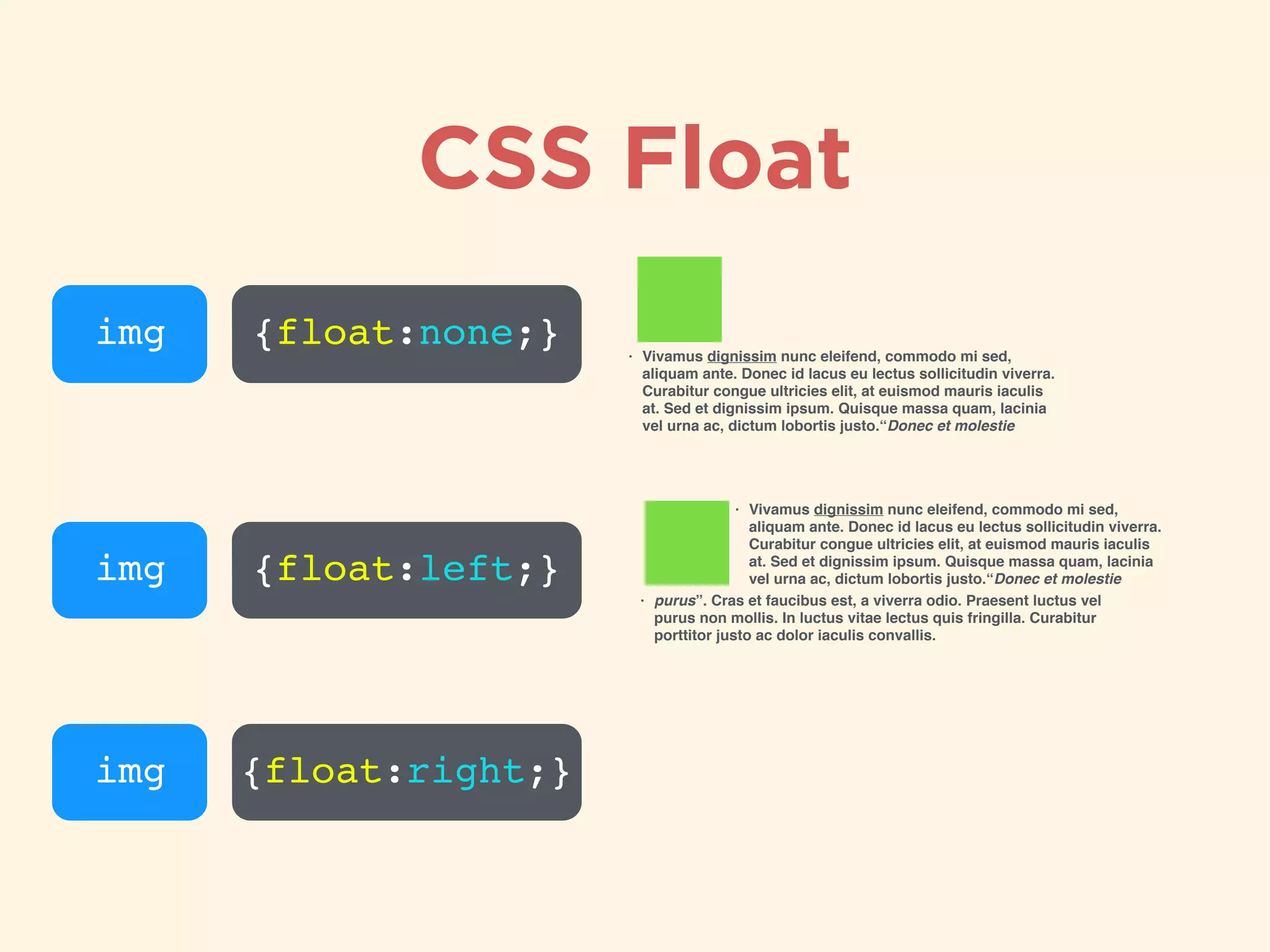
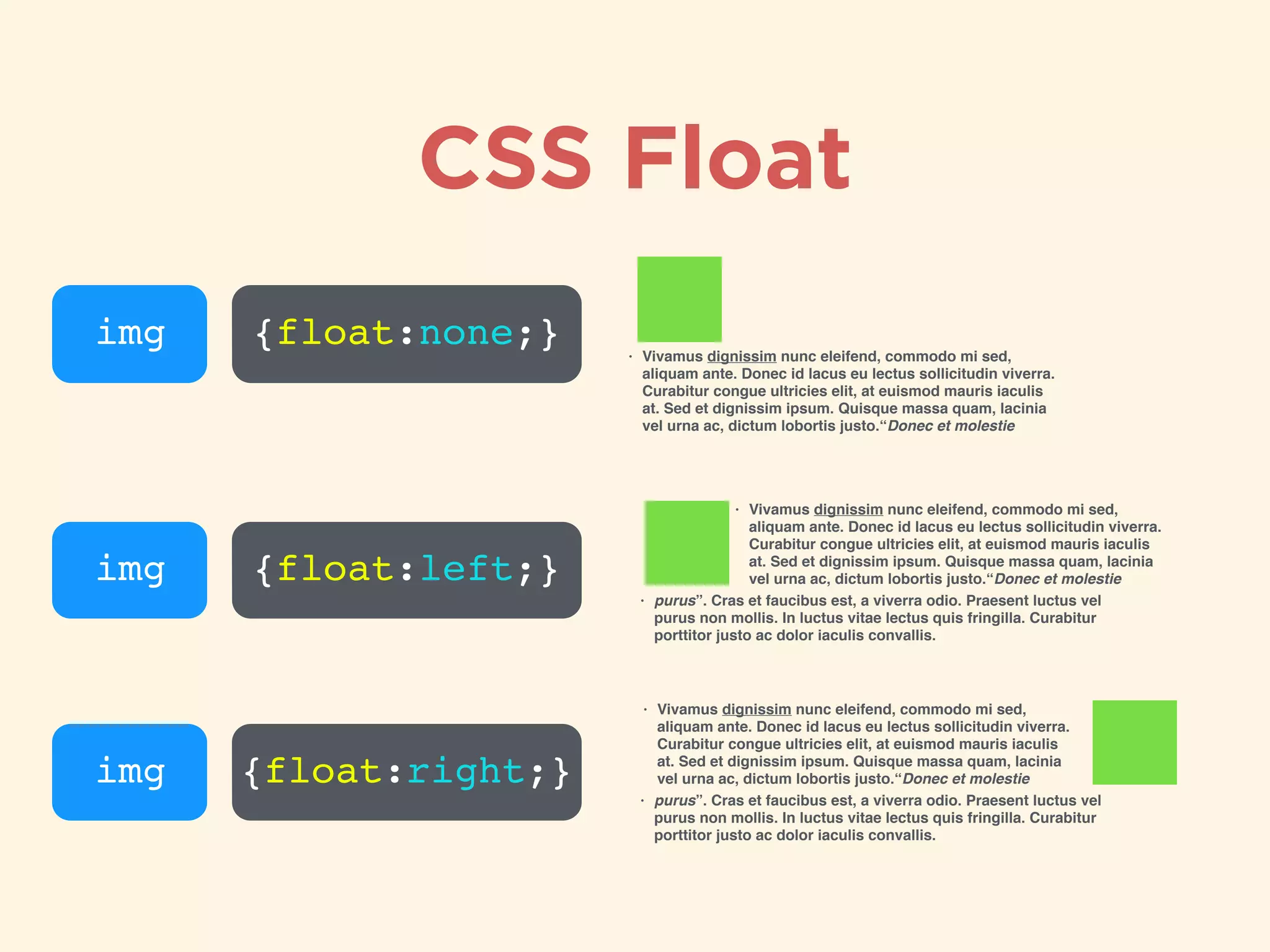
Introduction to CSS float property for element positioning and flow control.
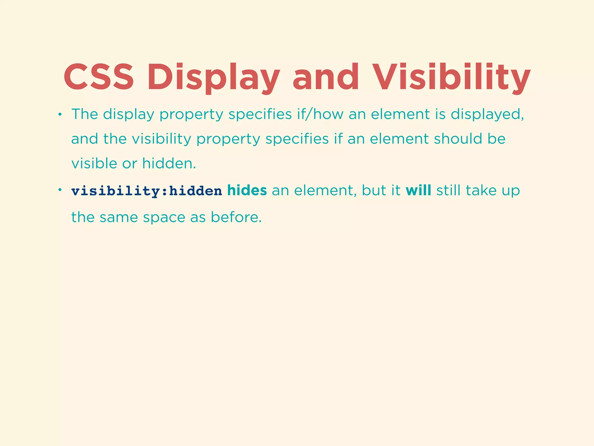
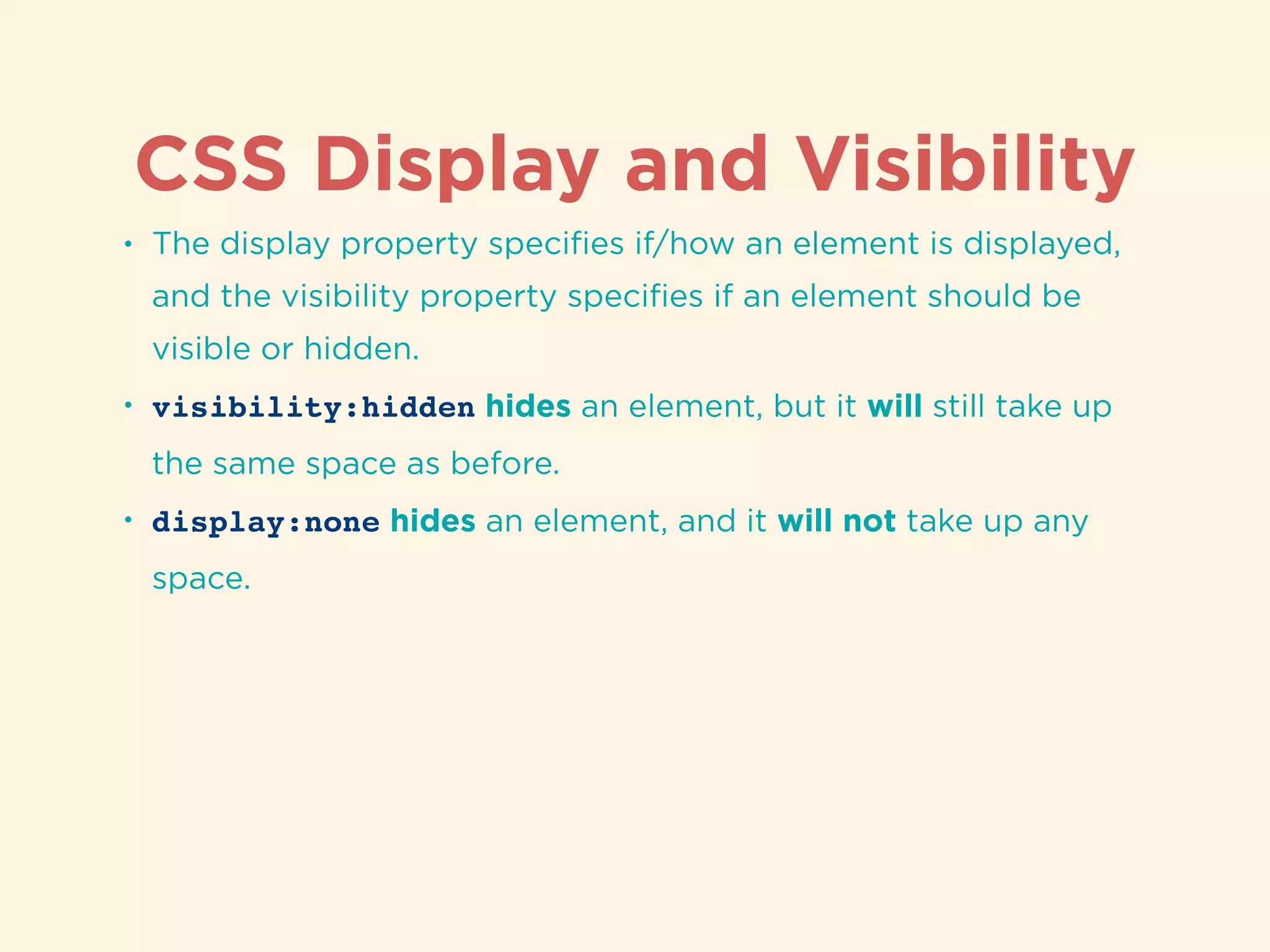
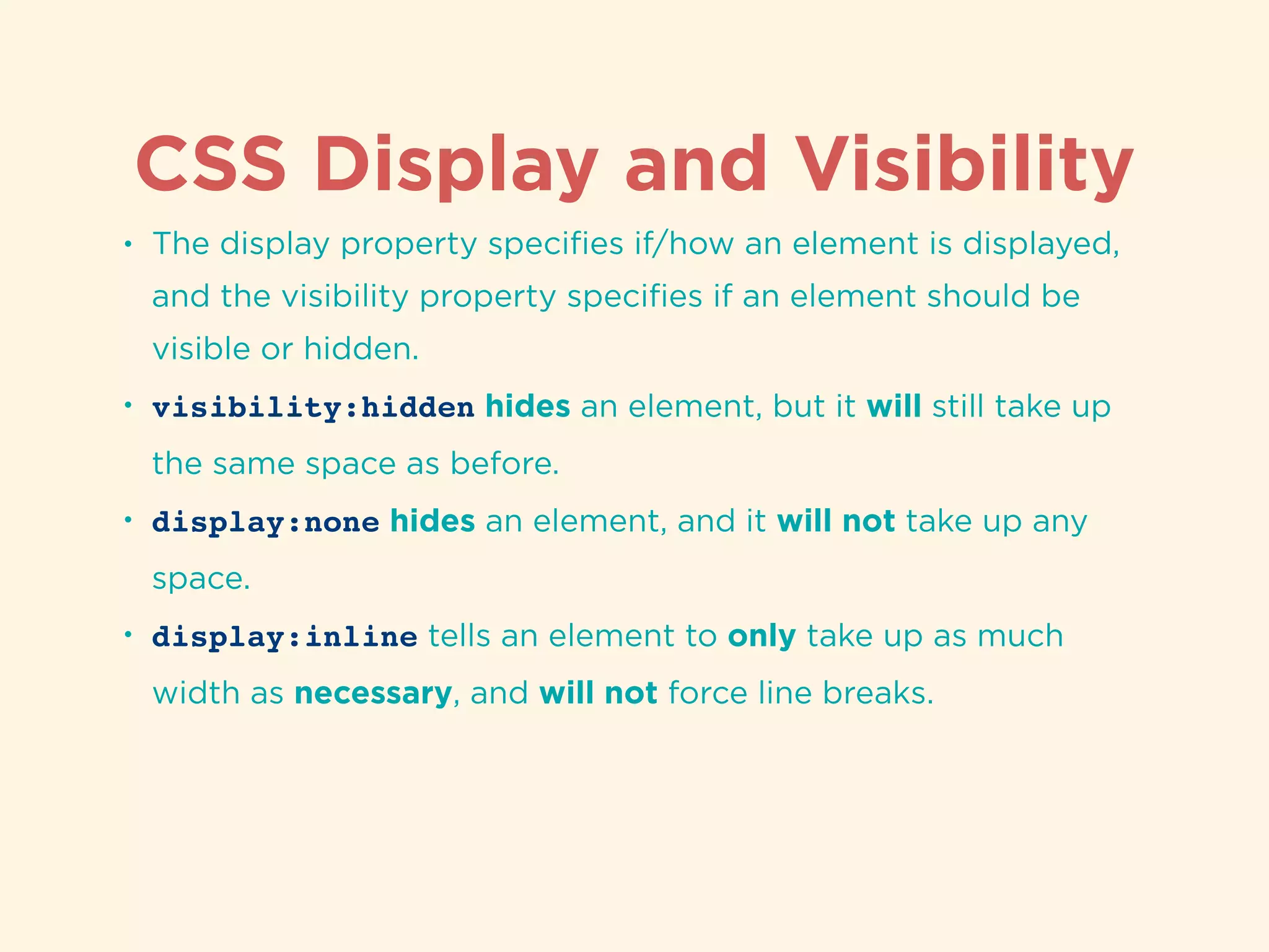
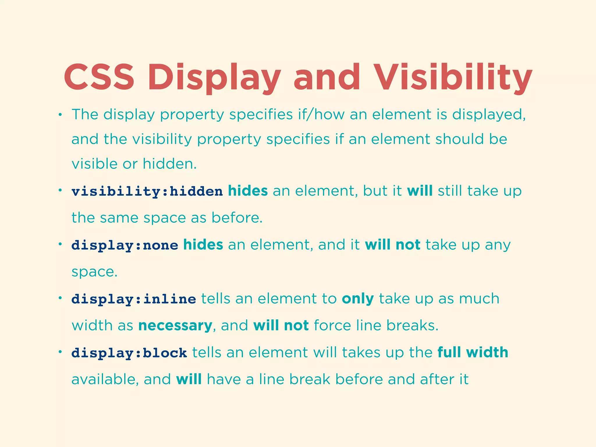
Discussion on display and visibility properties for managing element presentation in CSS.
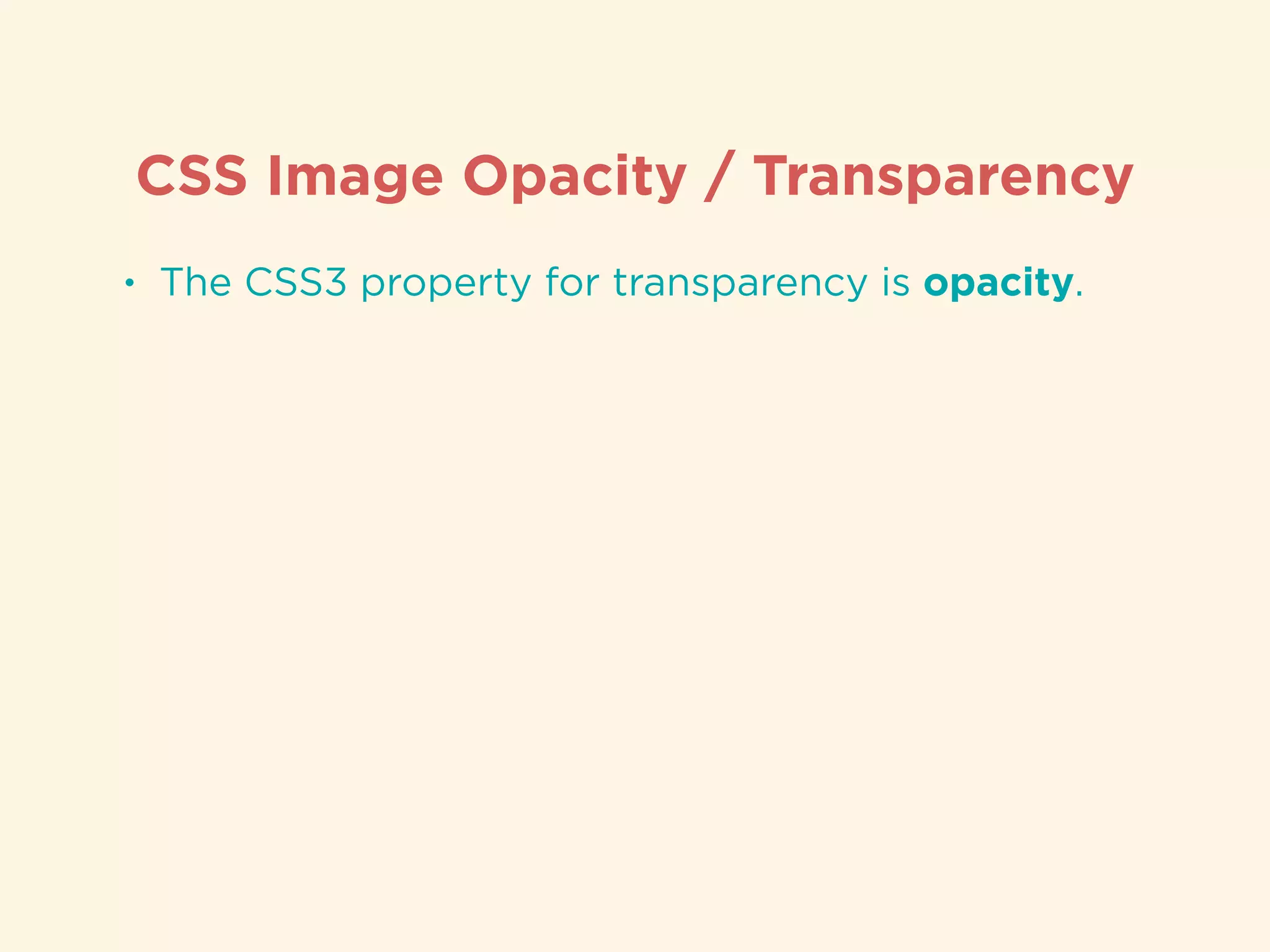
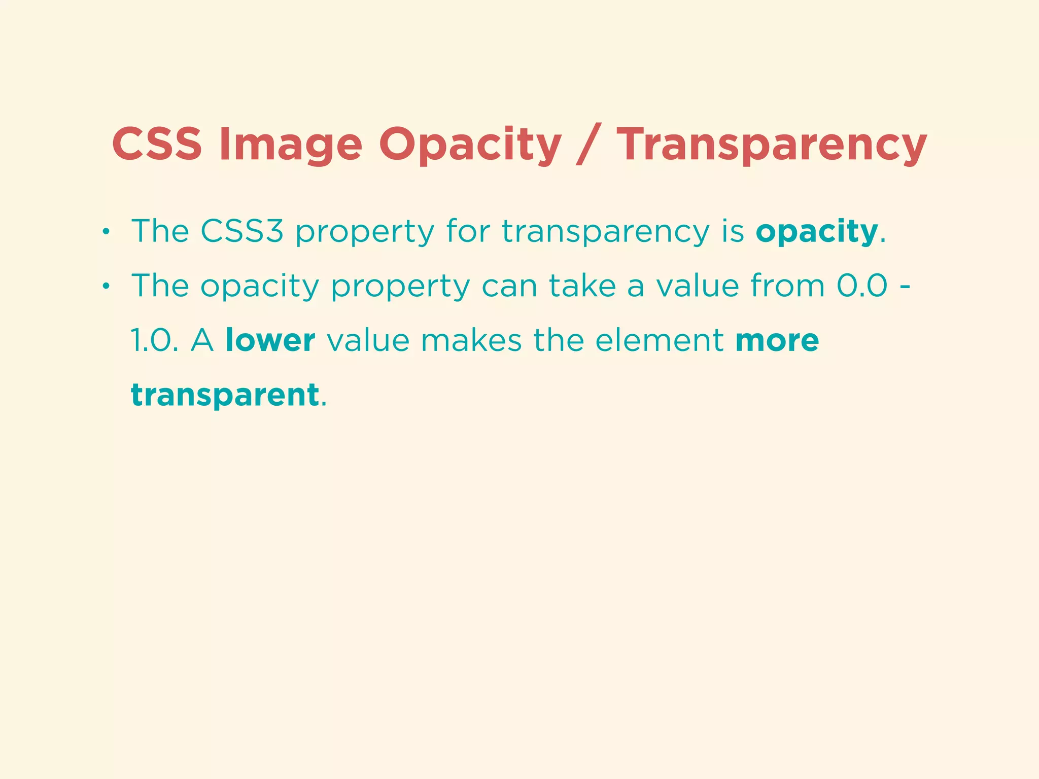
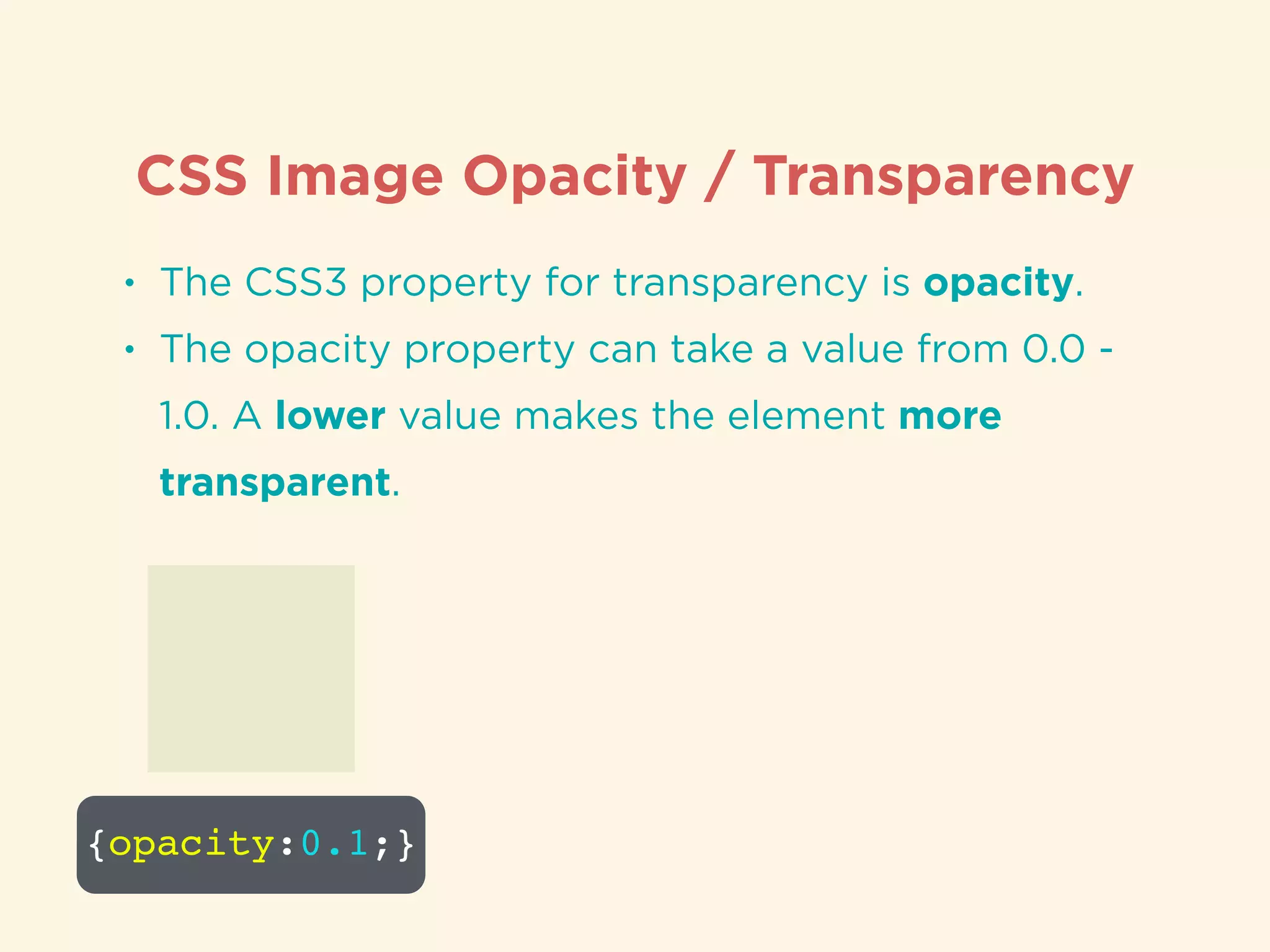
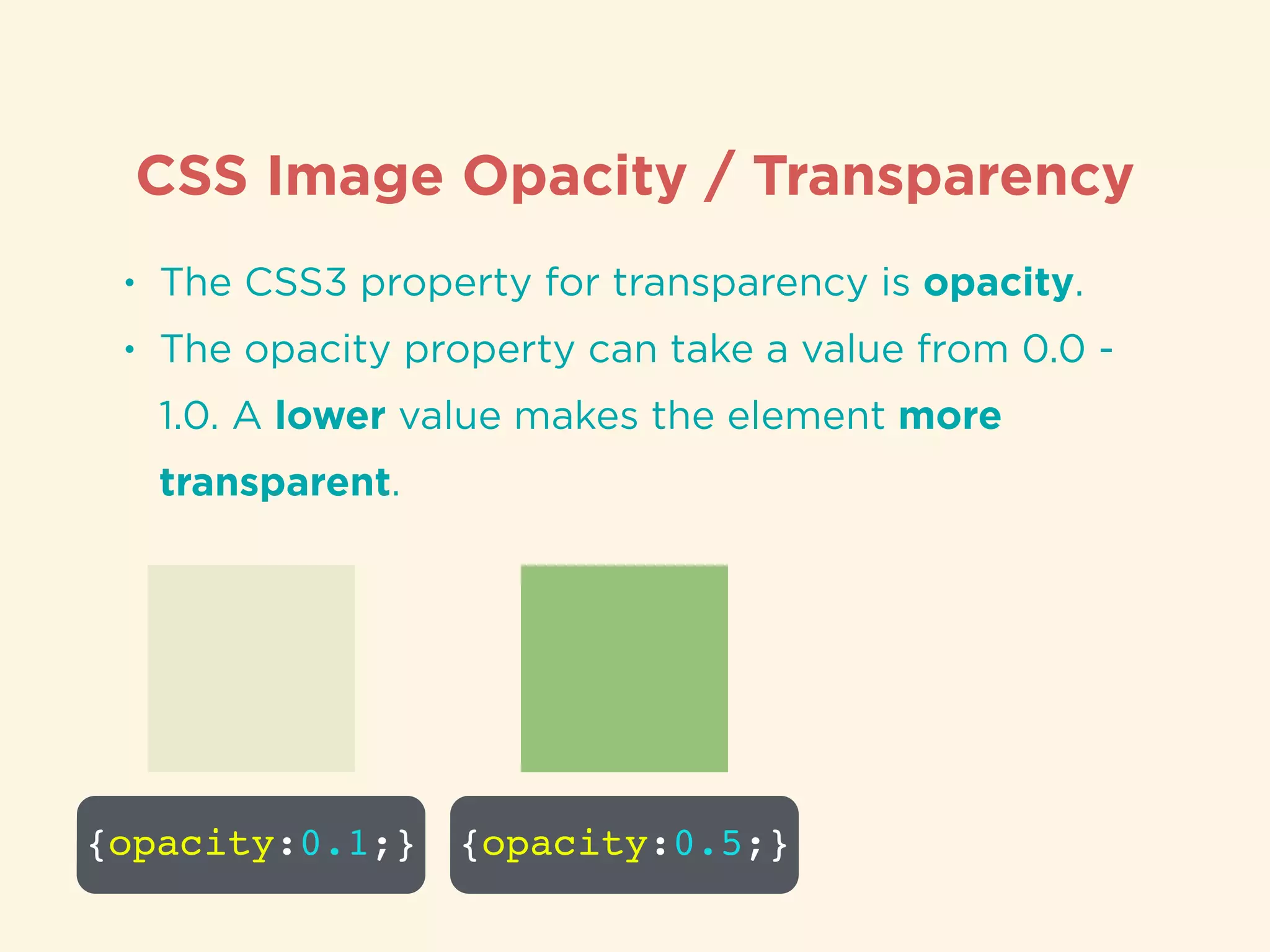
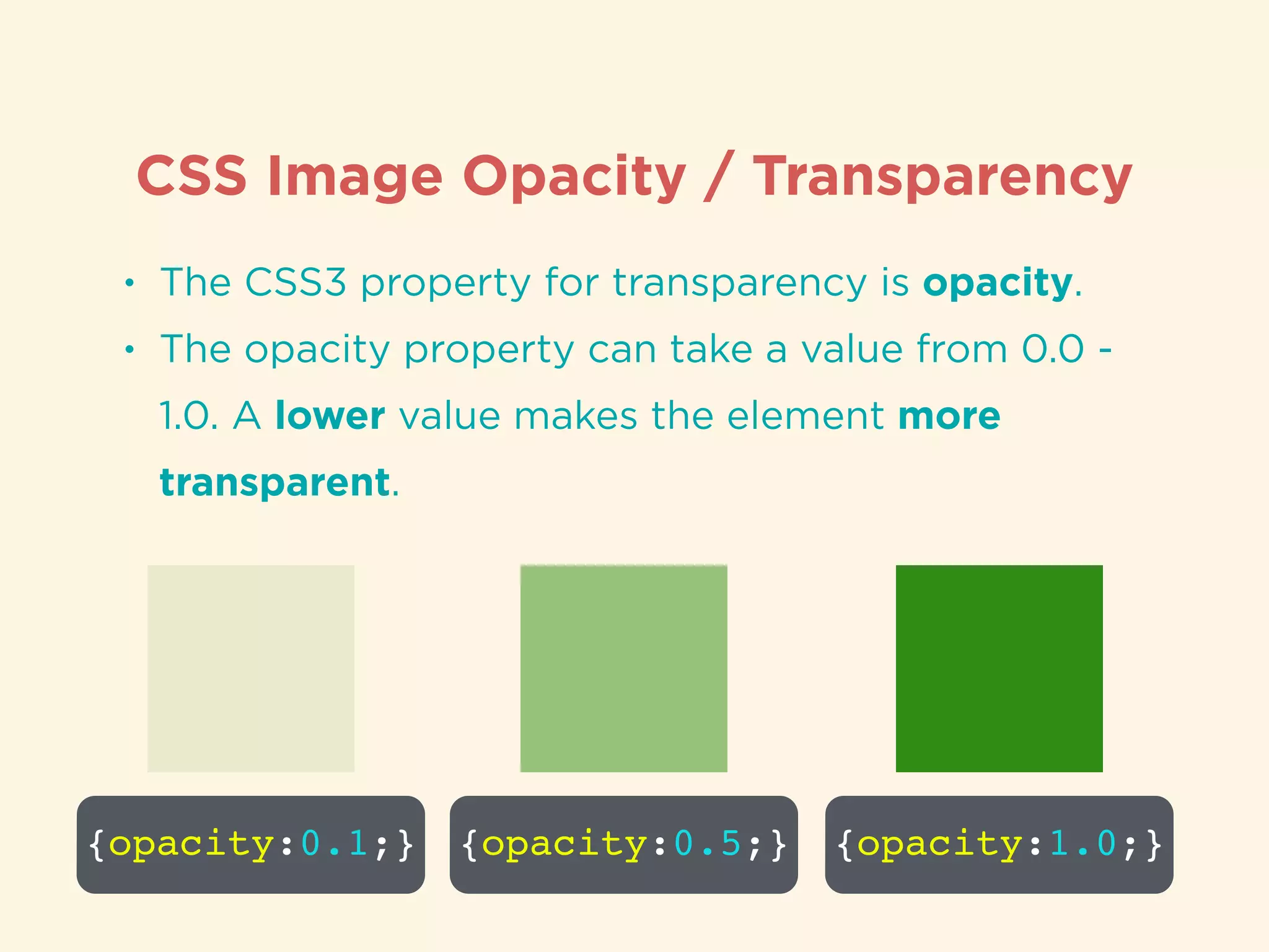
CSS opacity property to control transparency of images and elements.
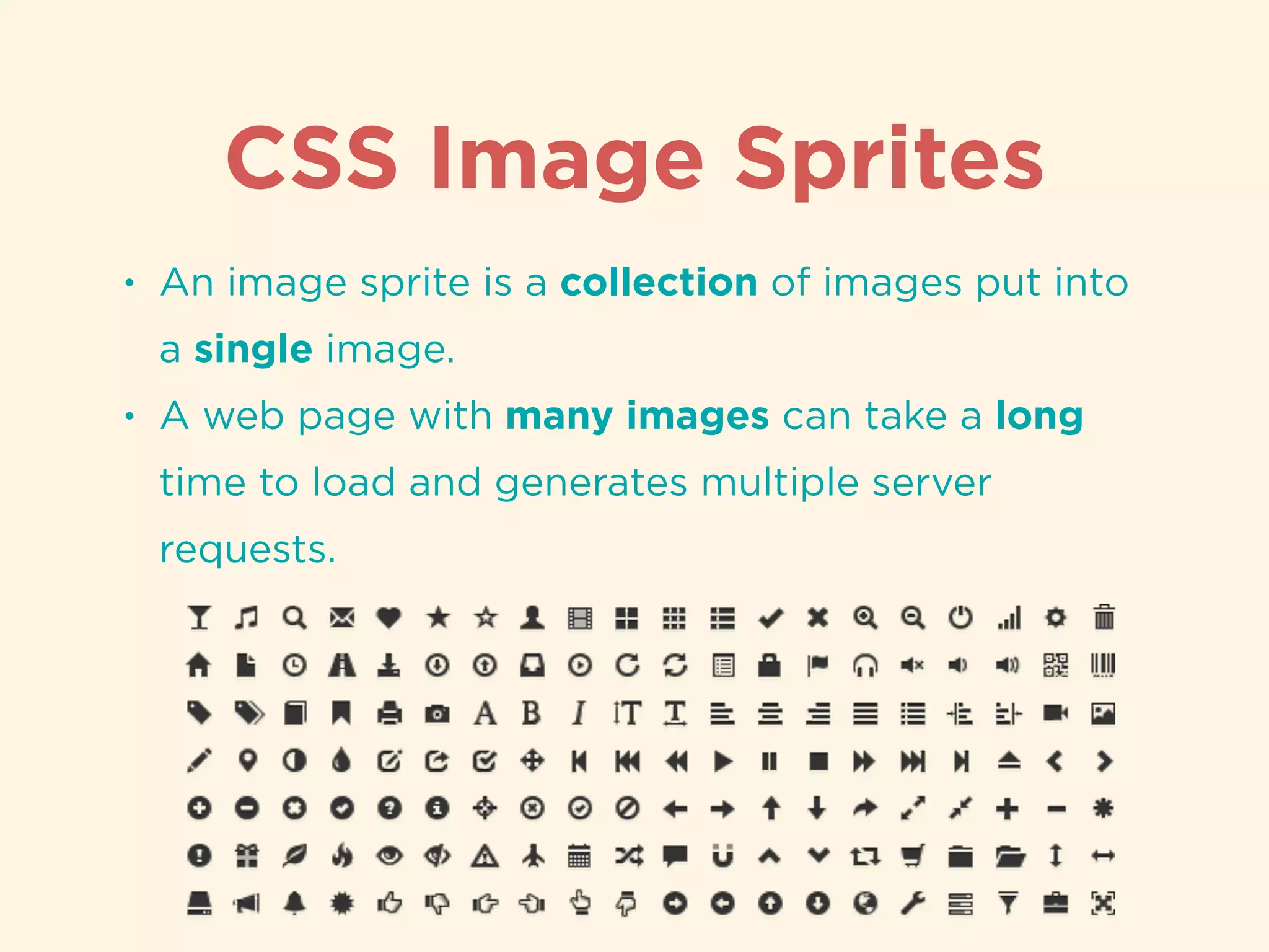
Explanation of image sprites and their benefits in reducing server requests for images.
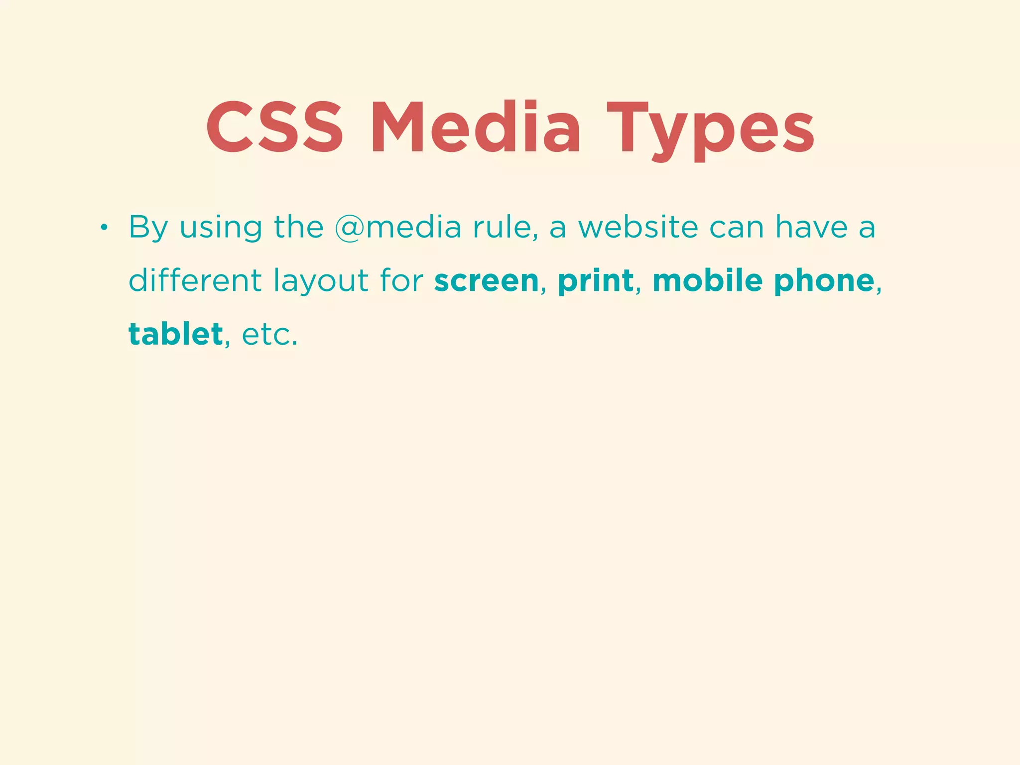
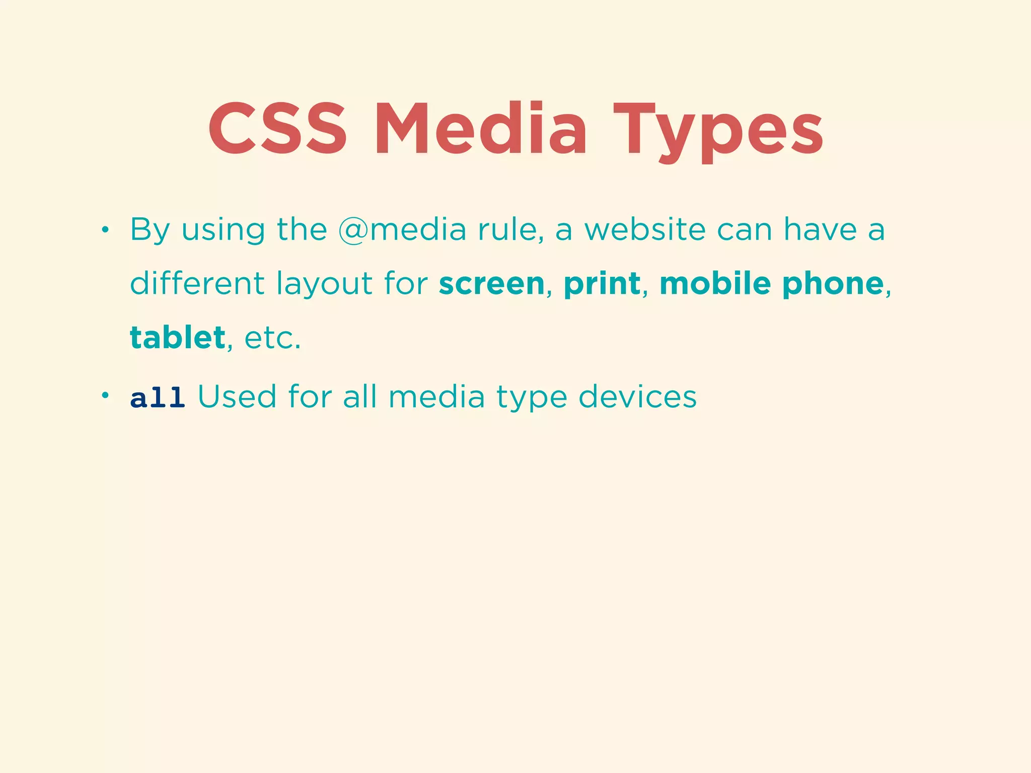
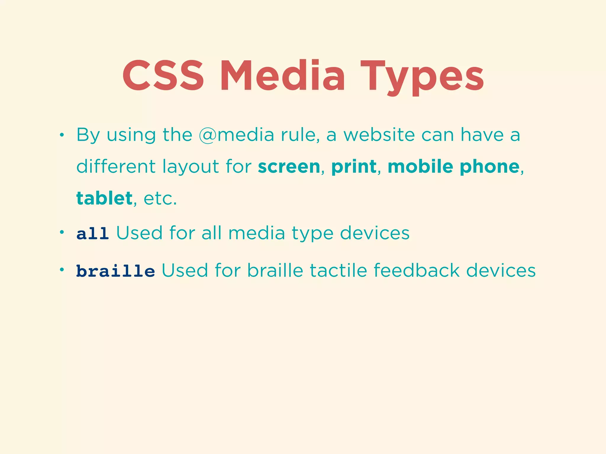
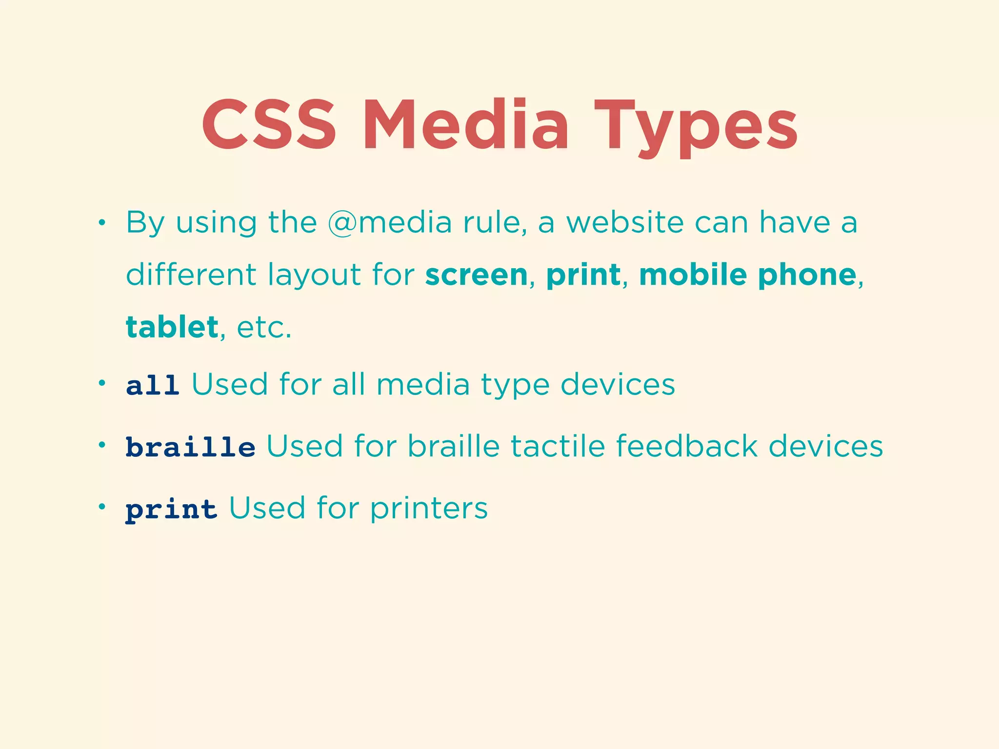
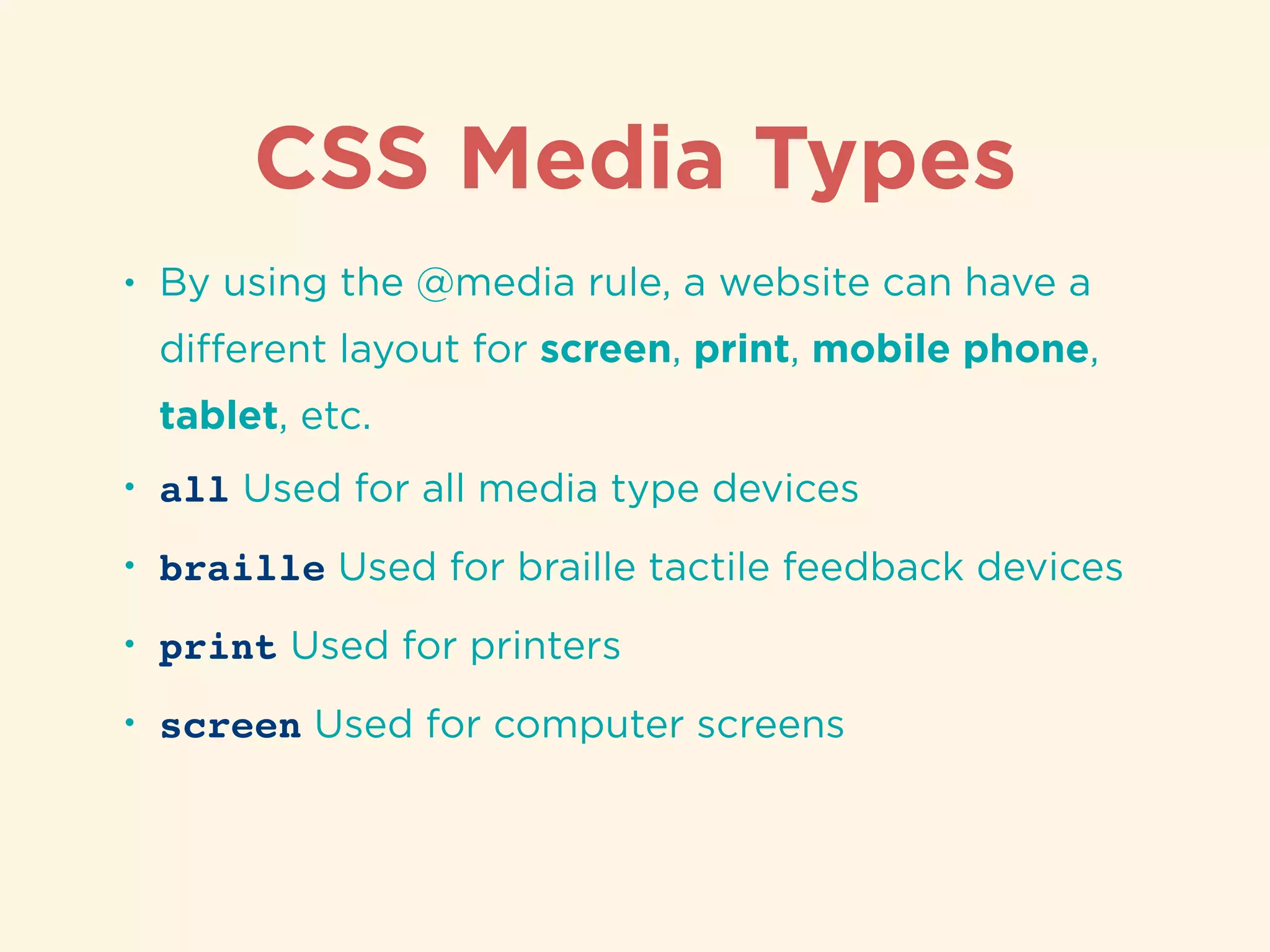
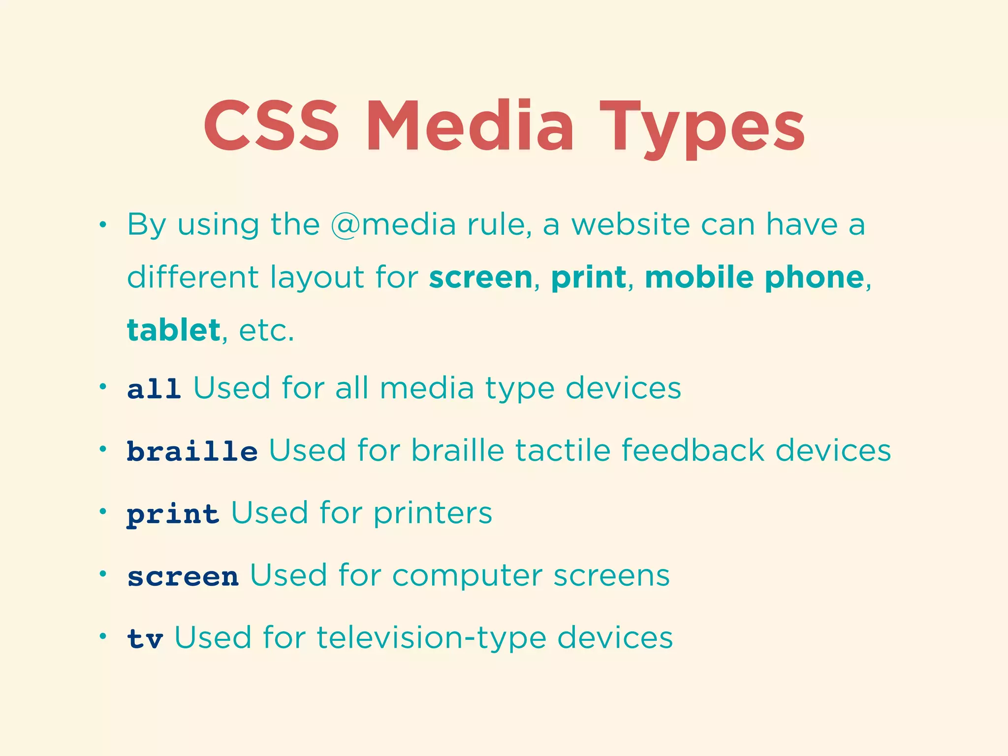
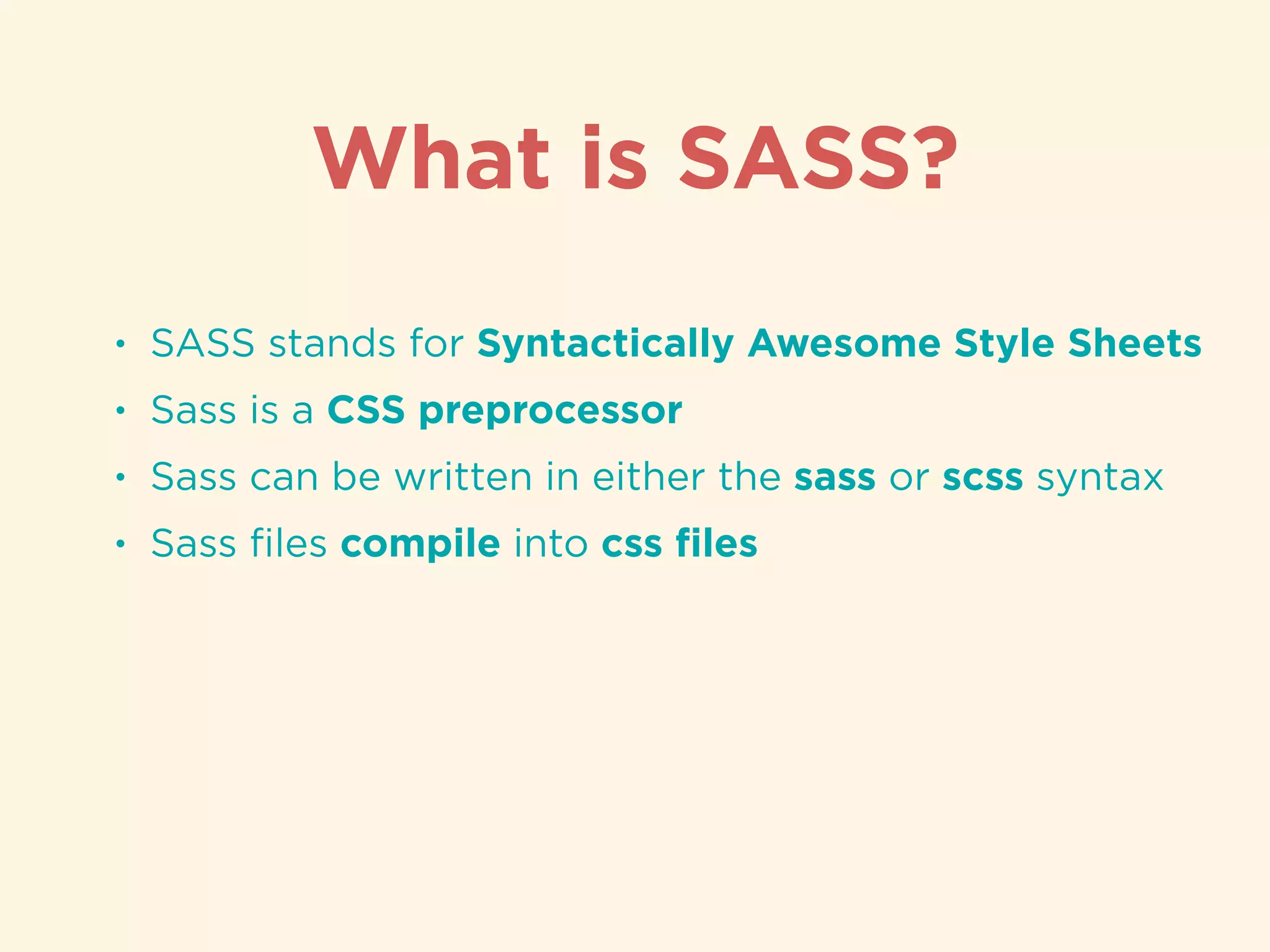
Usage of @media rule for responsive design tailored for different devices.Overview of SASS as a CSS preprocessor, its syntax, and compilation into CSS.
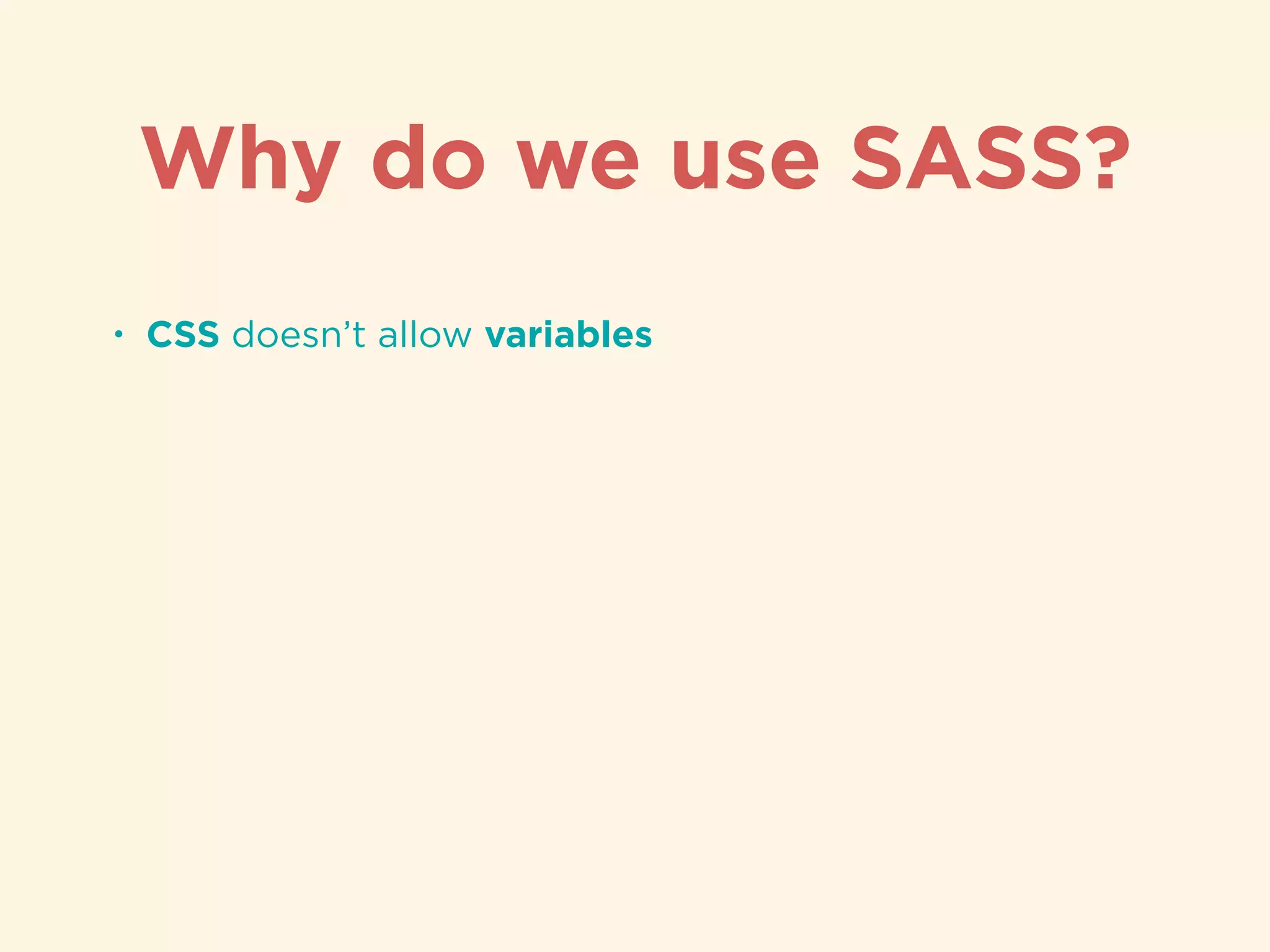
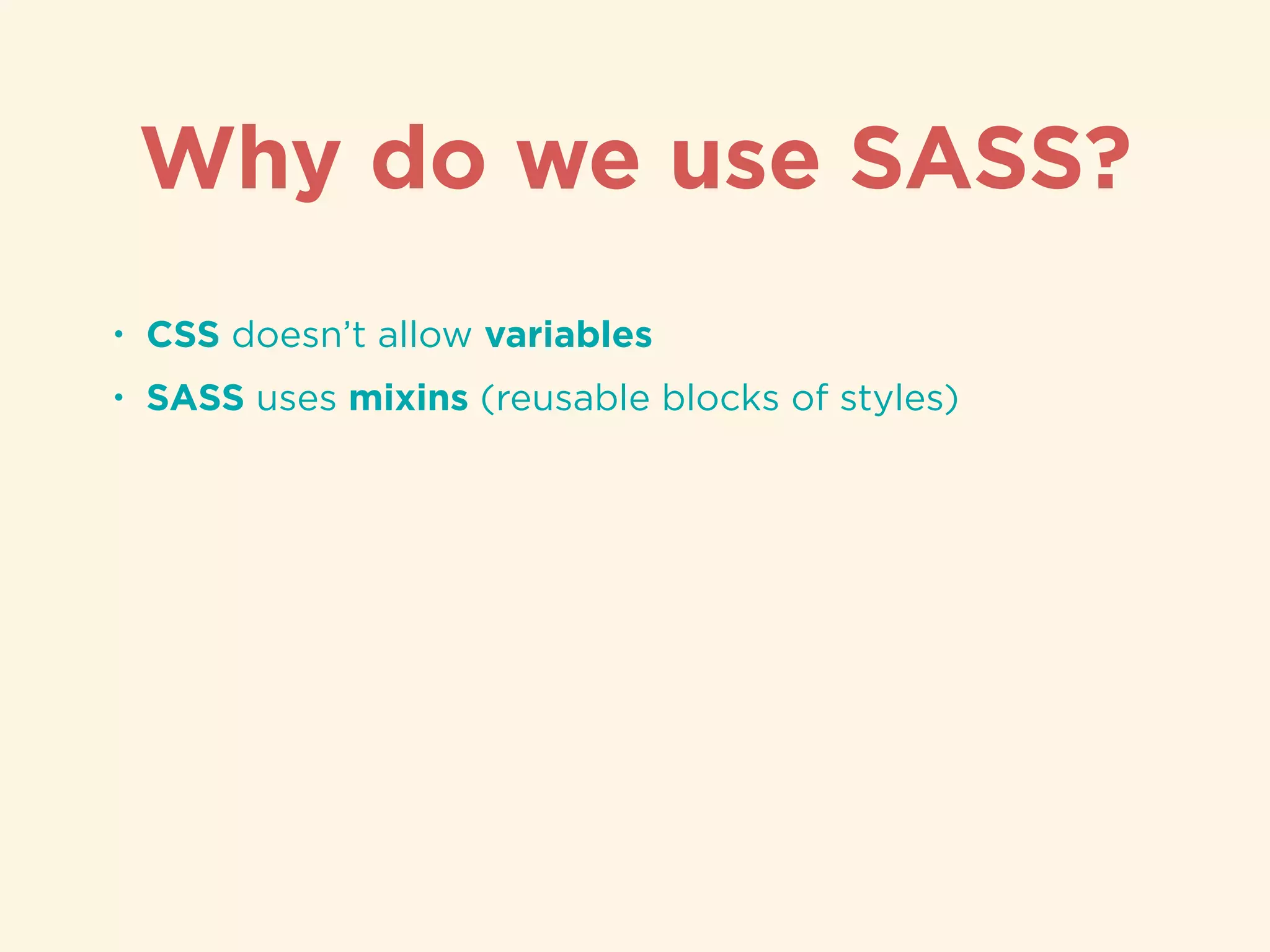
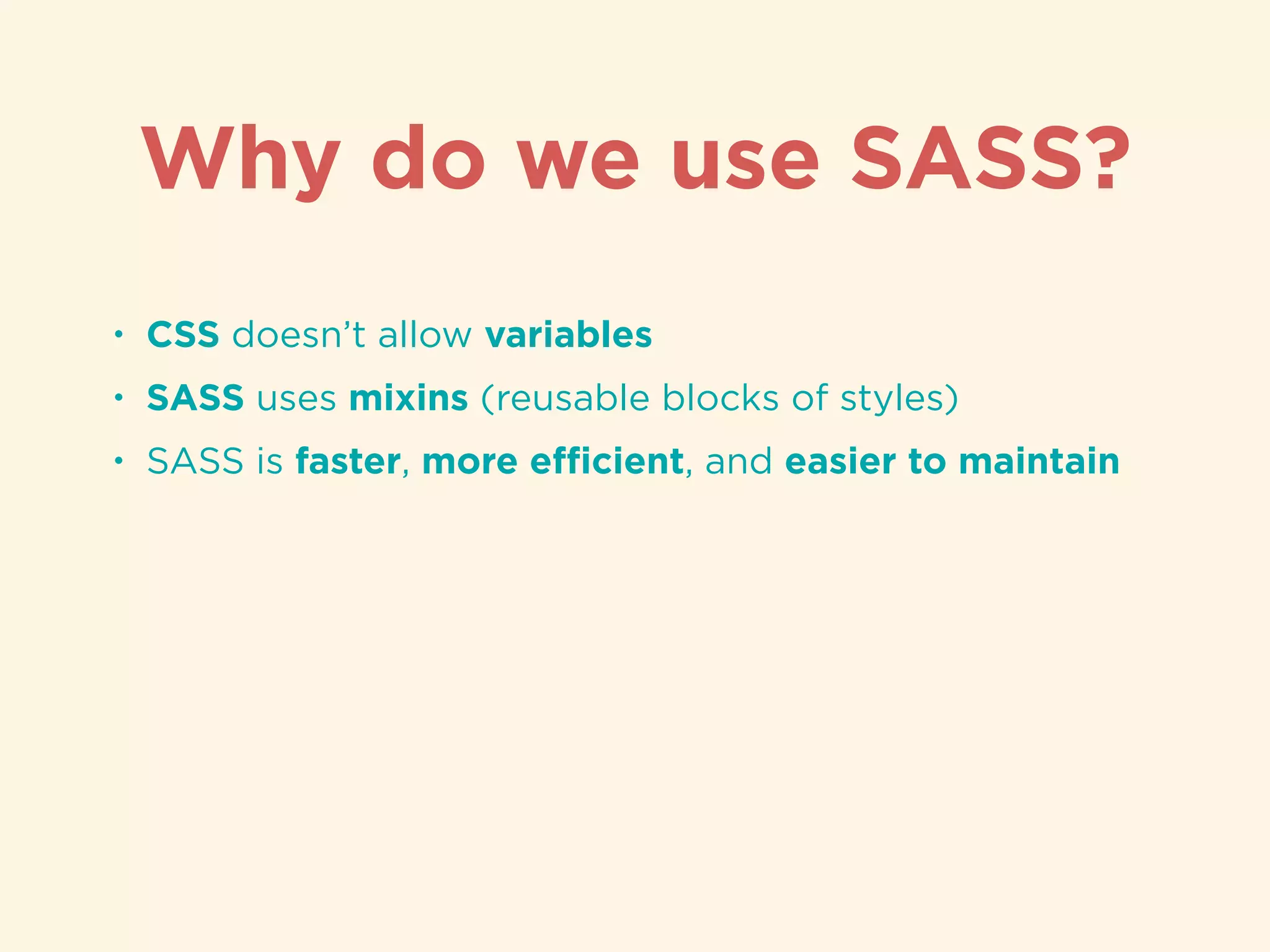
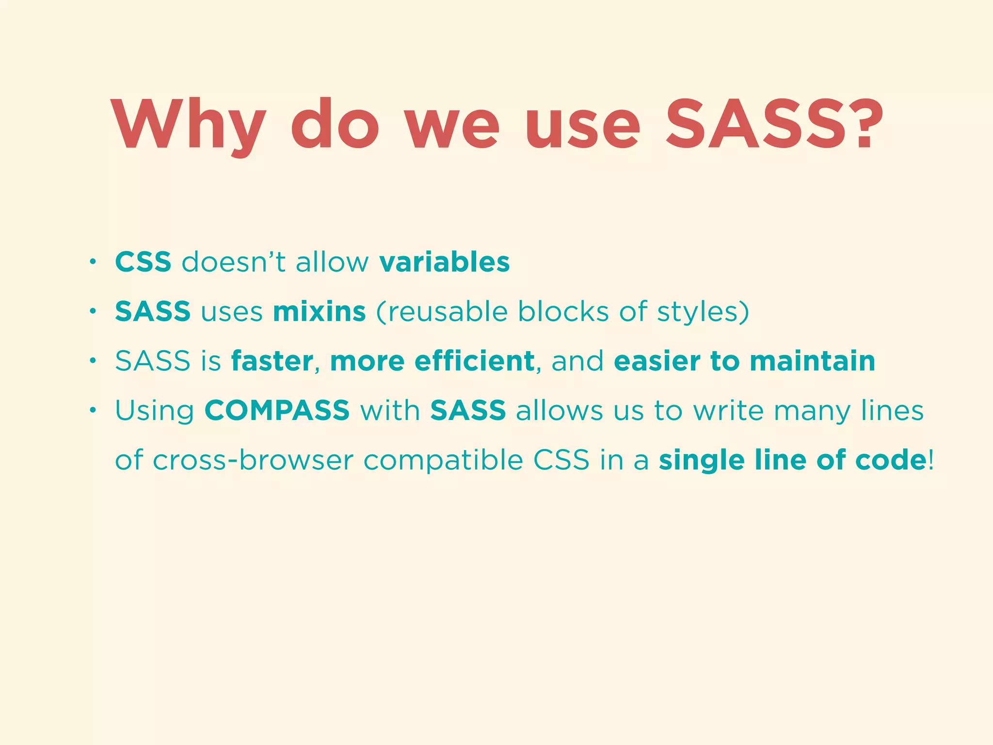
Advantages of using SASS such as variables, mixins, and efficient styling practices.
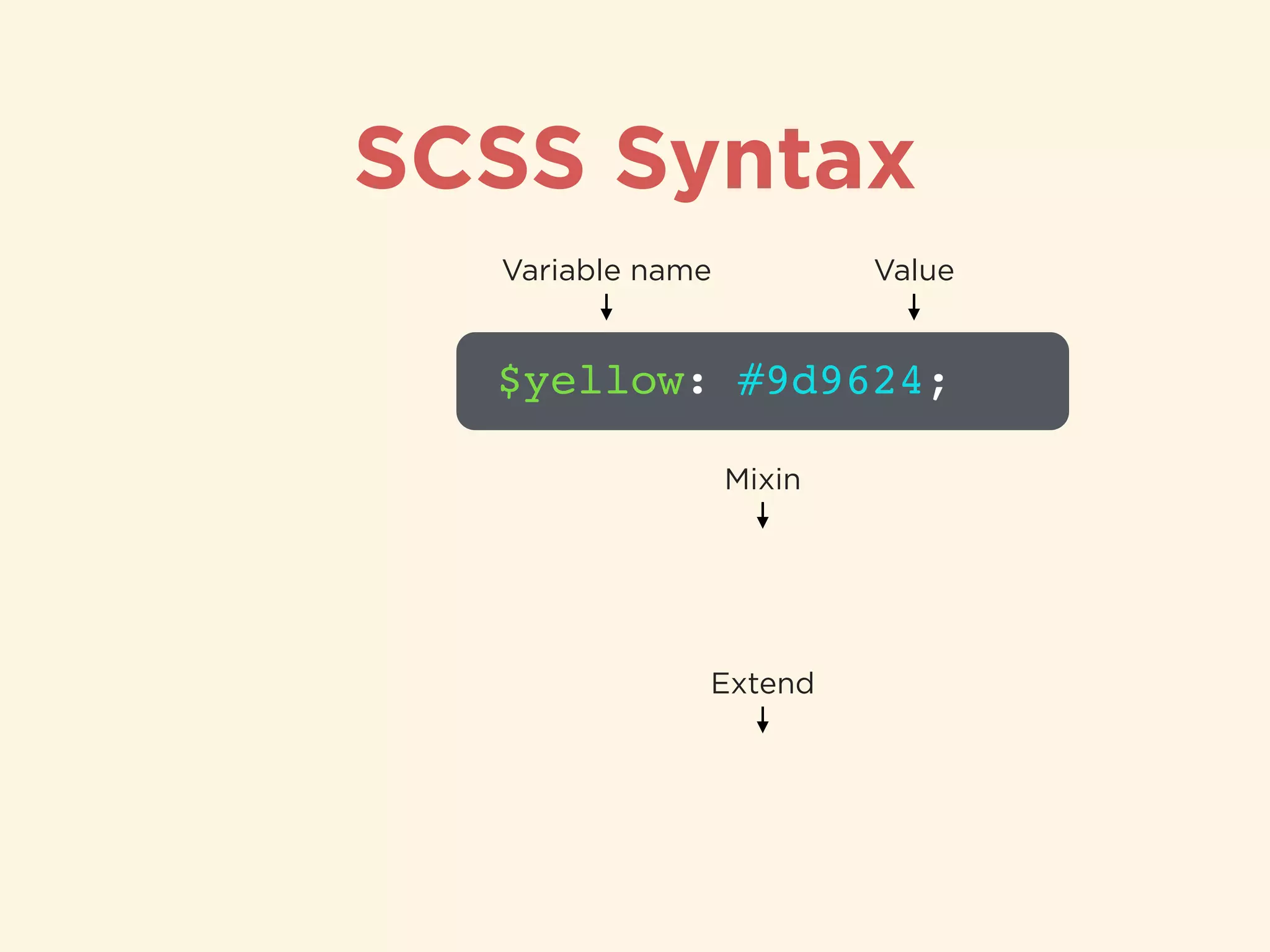
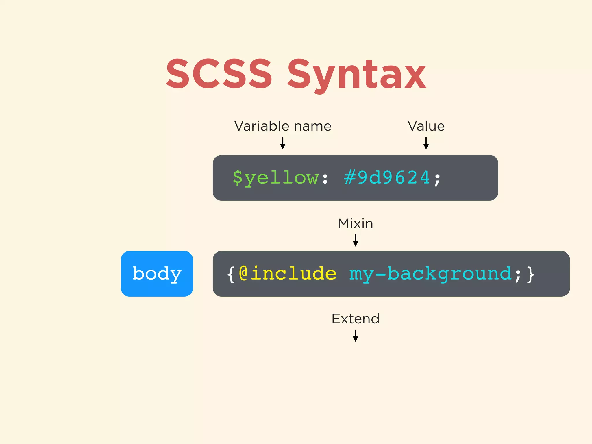
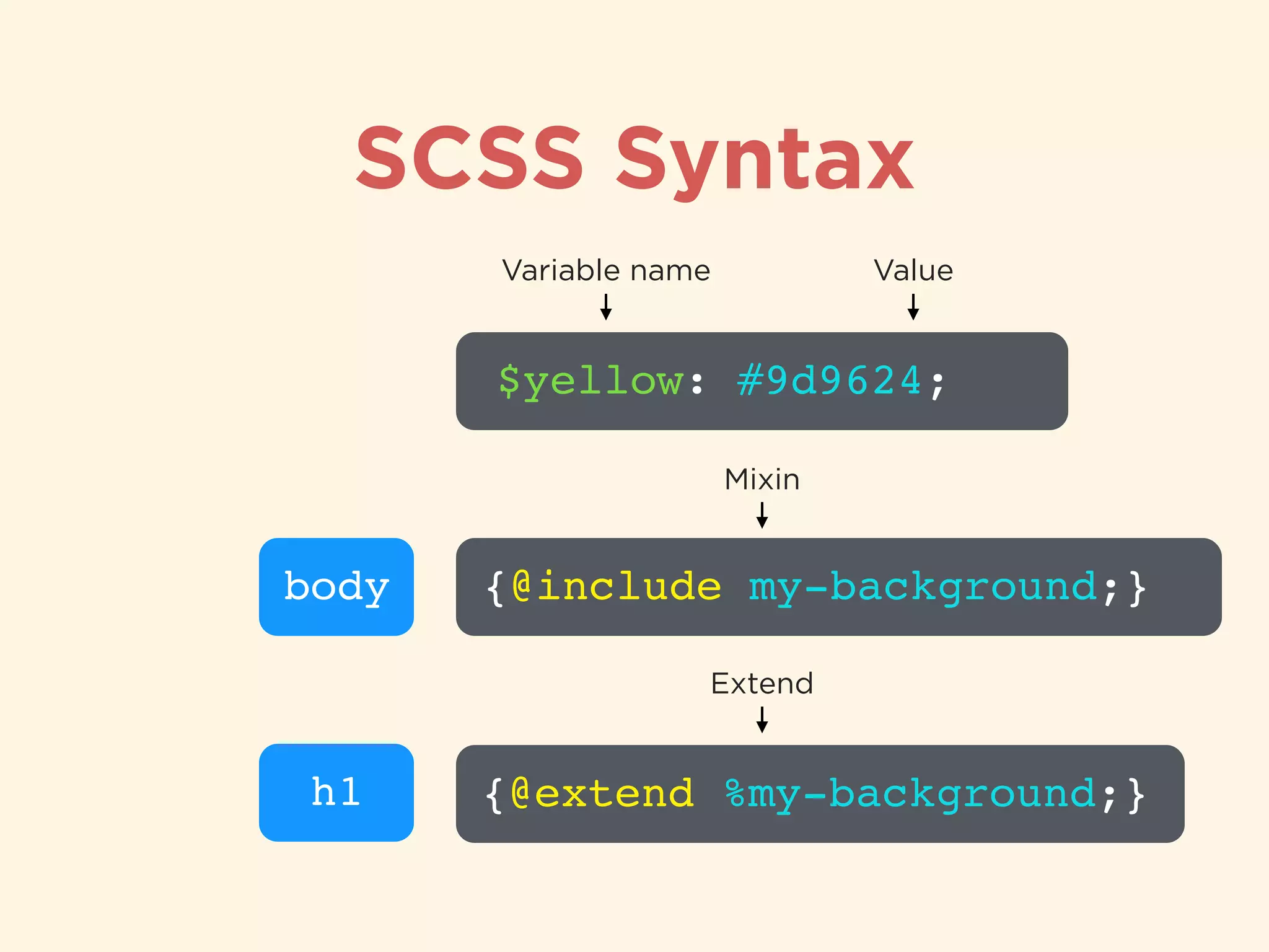
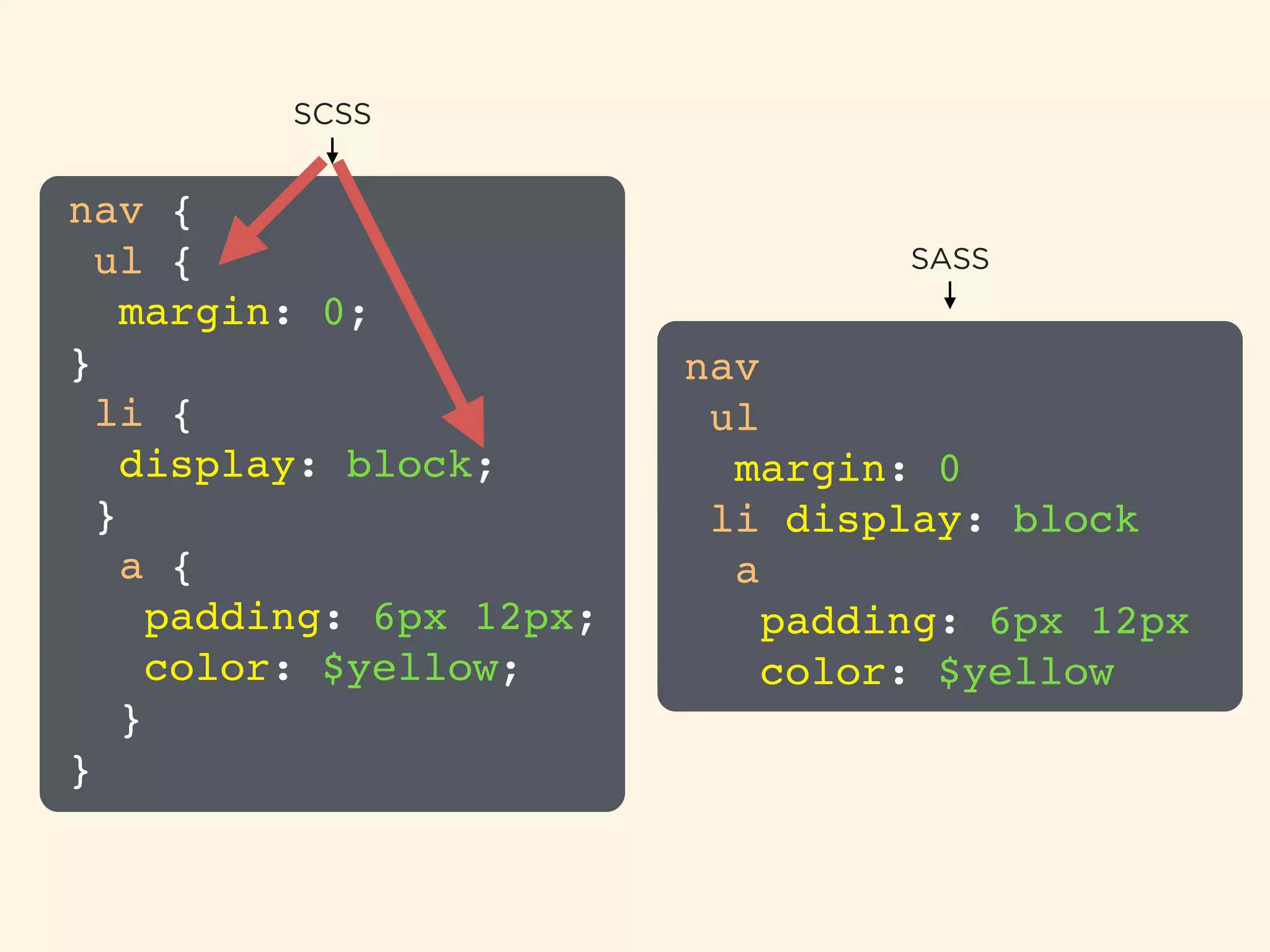
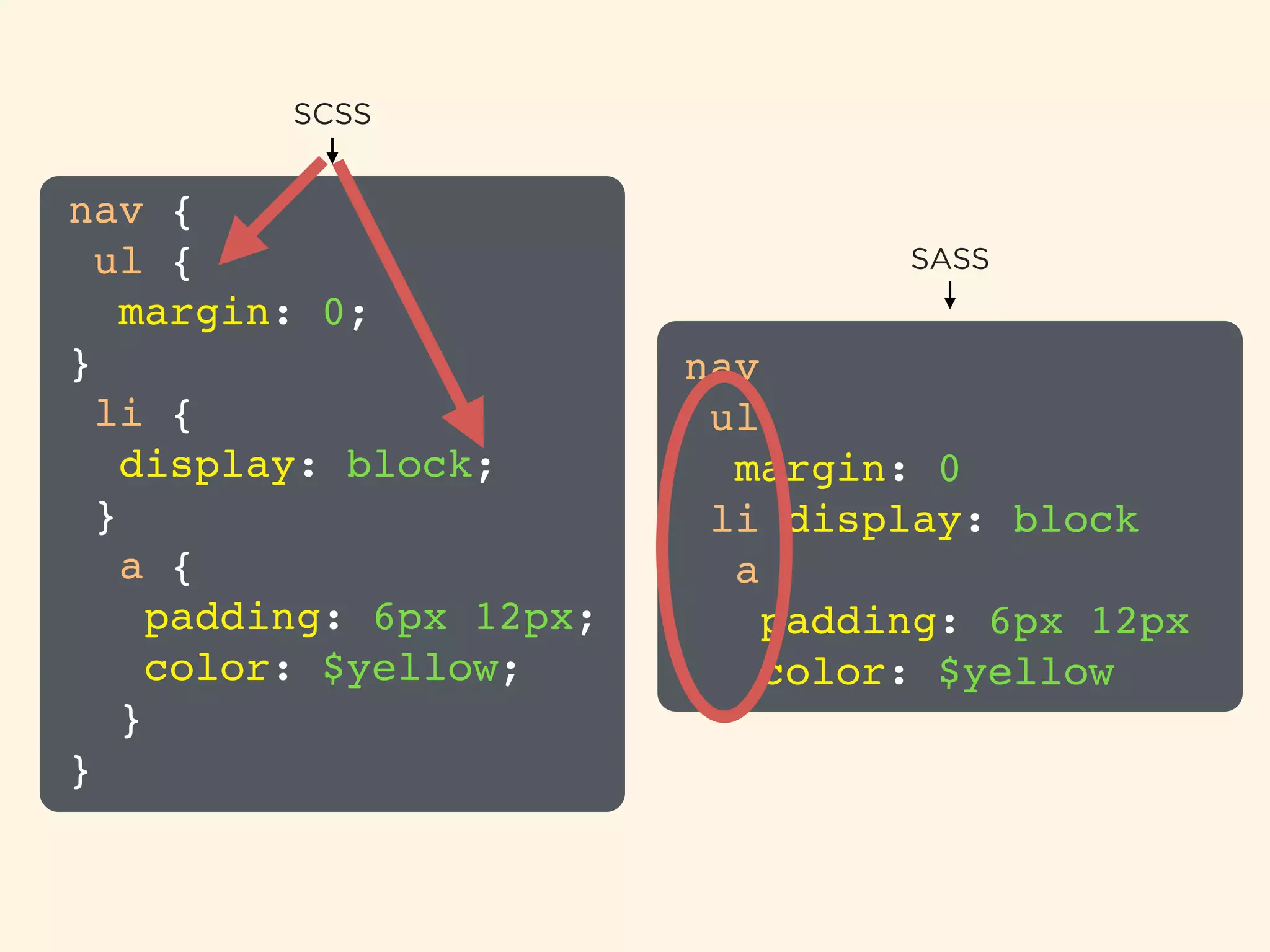
Explanation of SCSS syntax structure and definitions with visual examples.
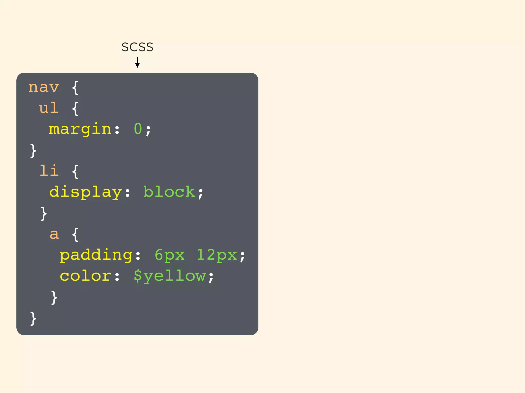
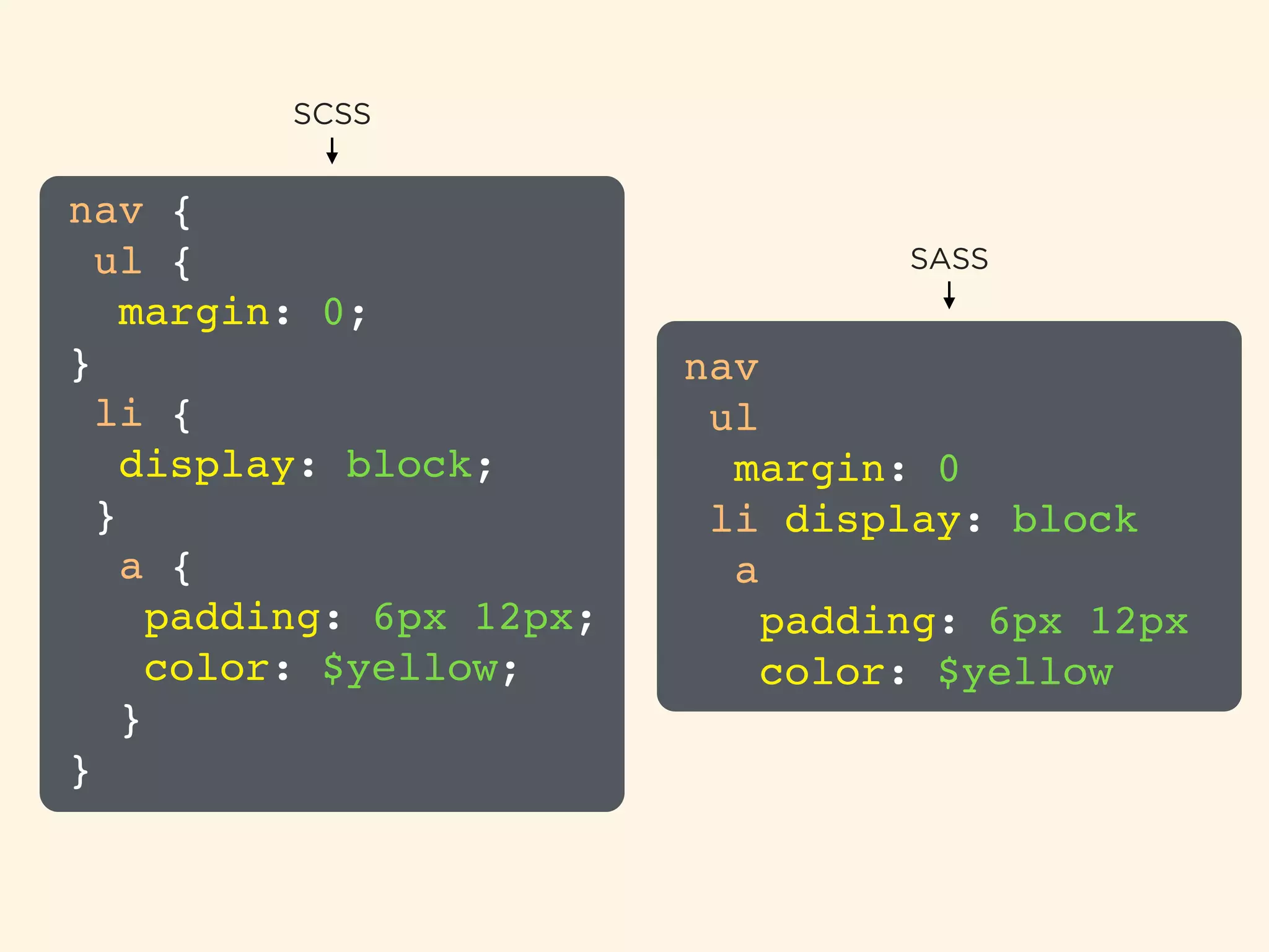
Comparative overview of SCSS and SASS with practical coding examples.
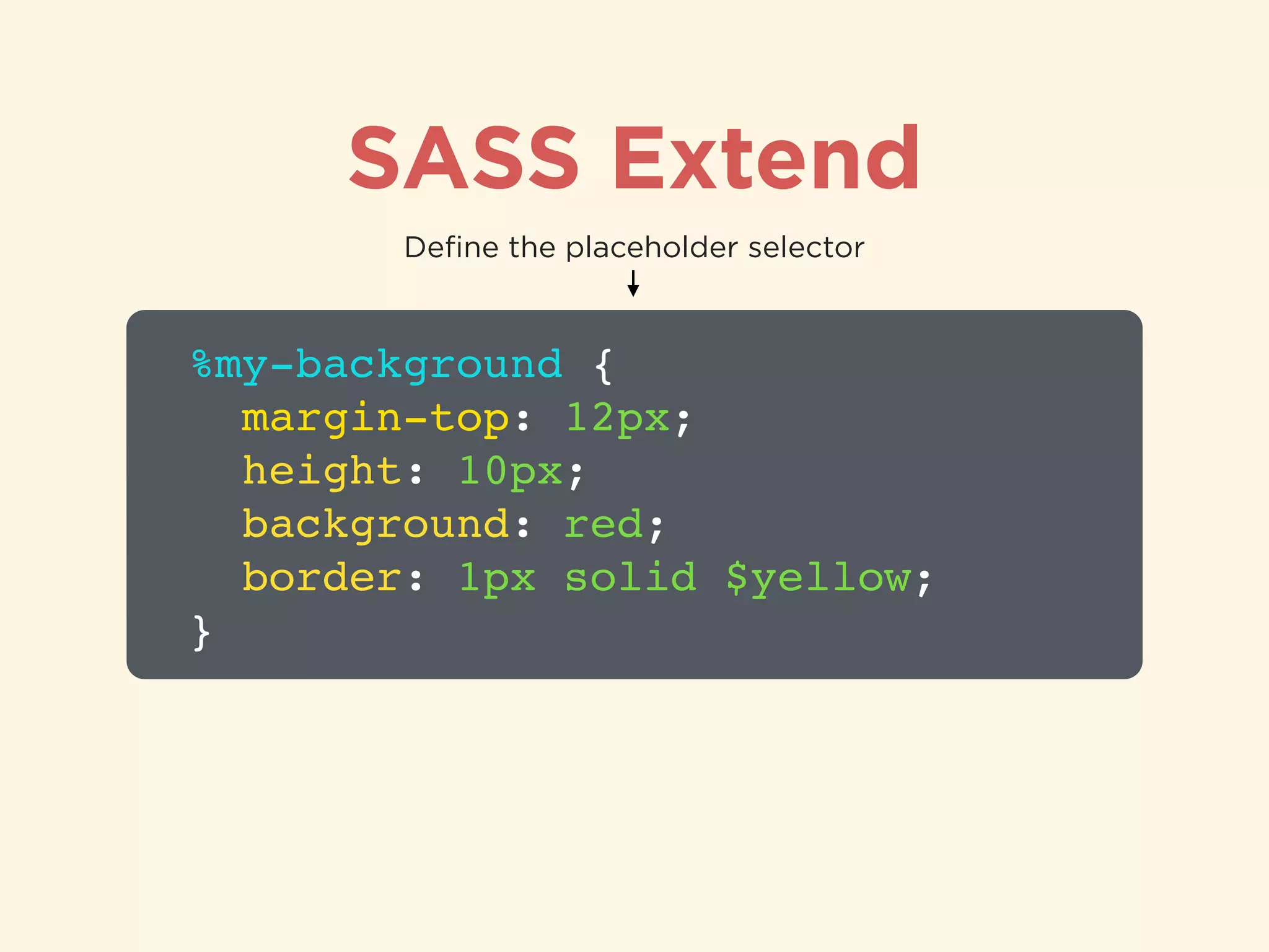
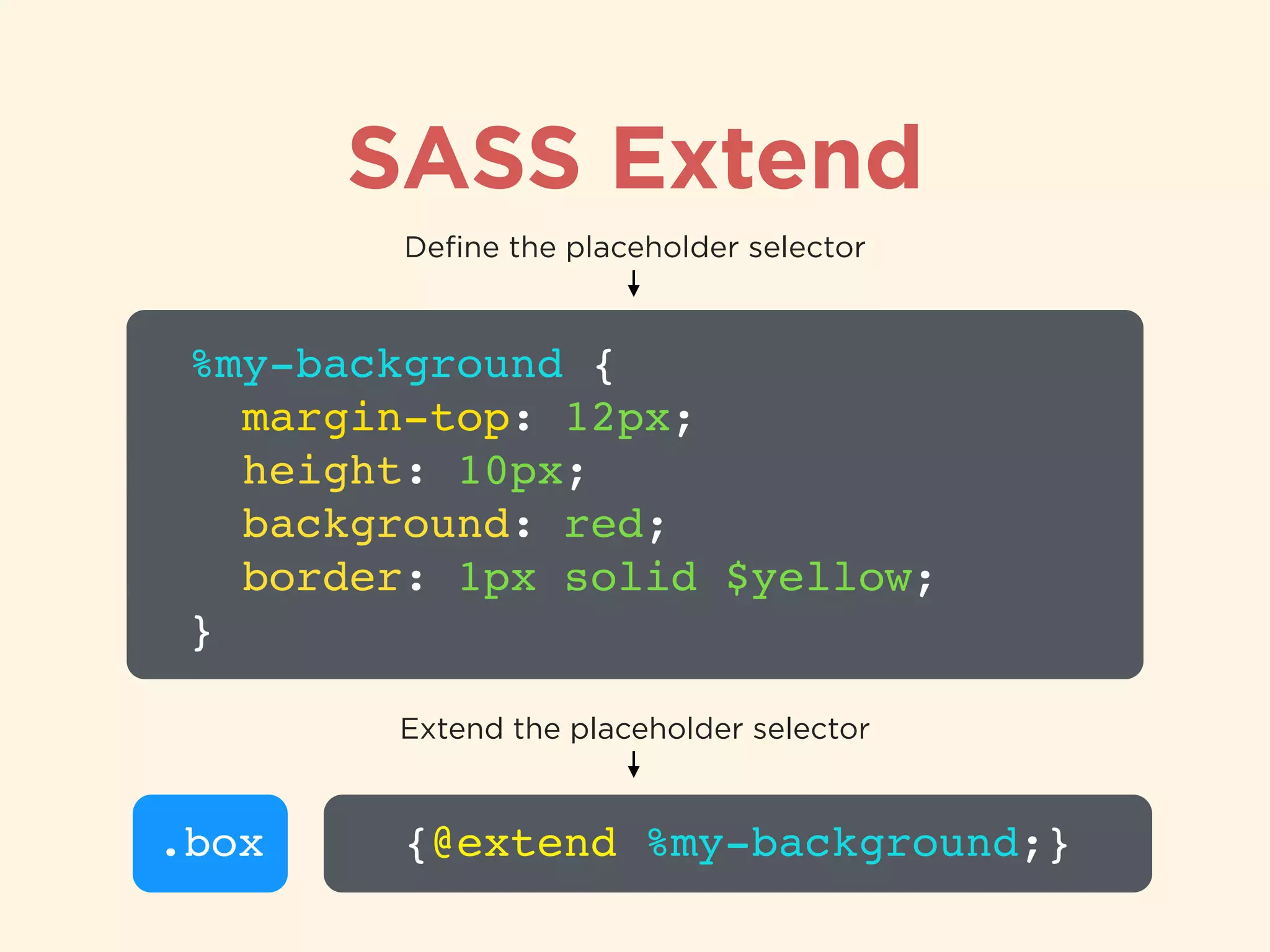
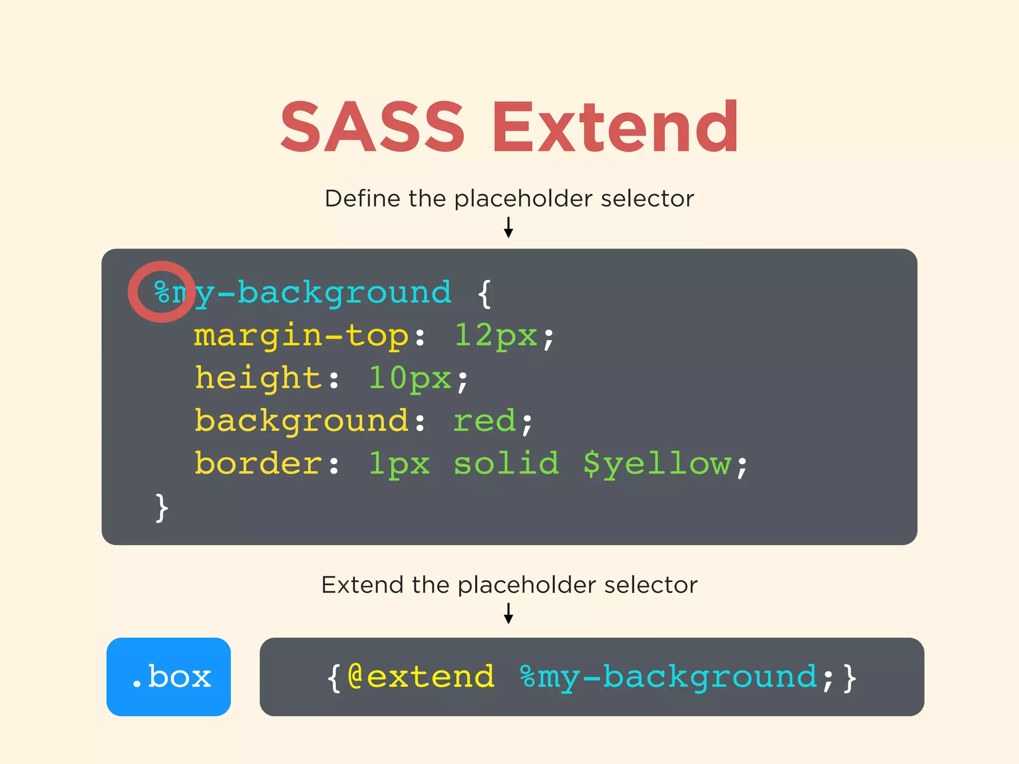
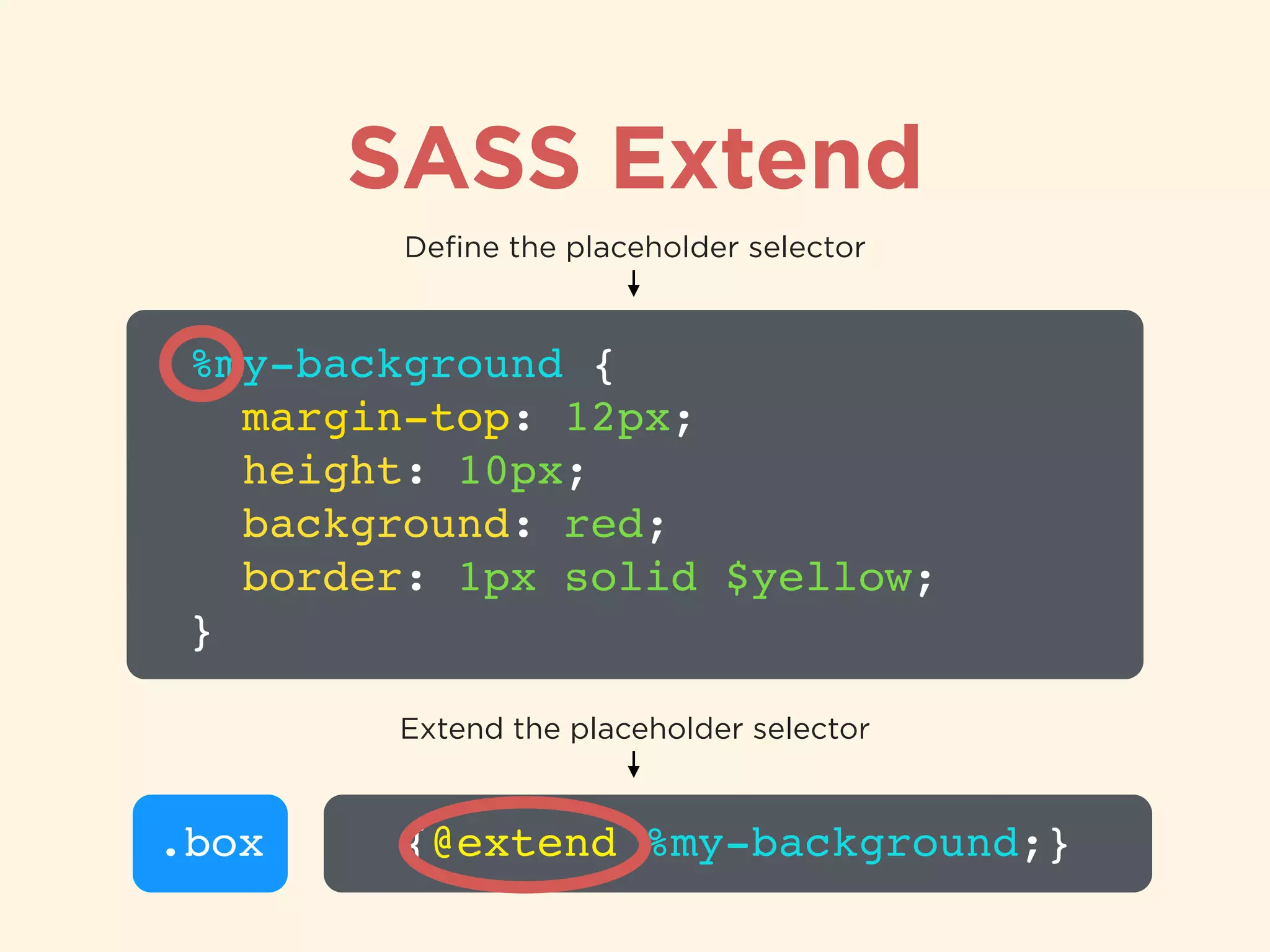
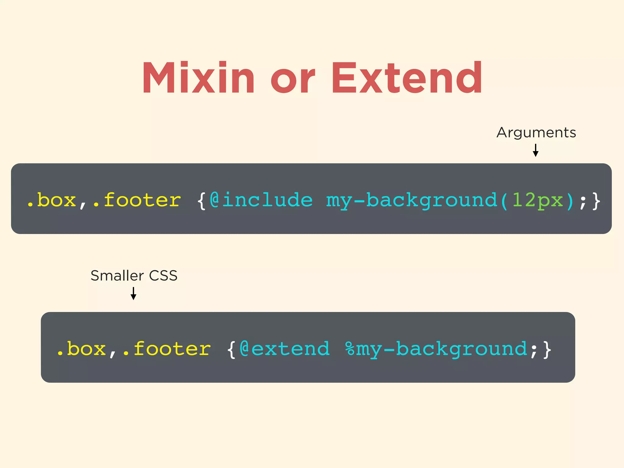
Usage of SASS extend to reduce redundant CSS with placeholder selectors.
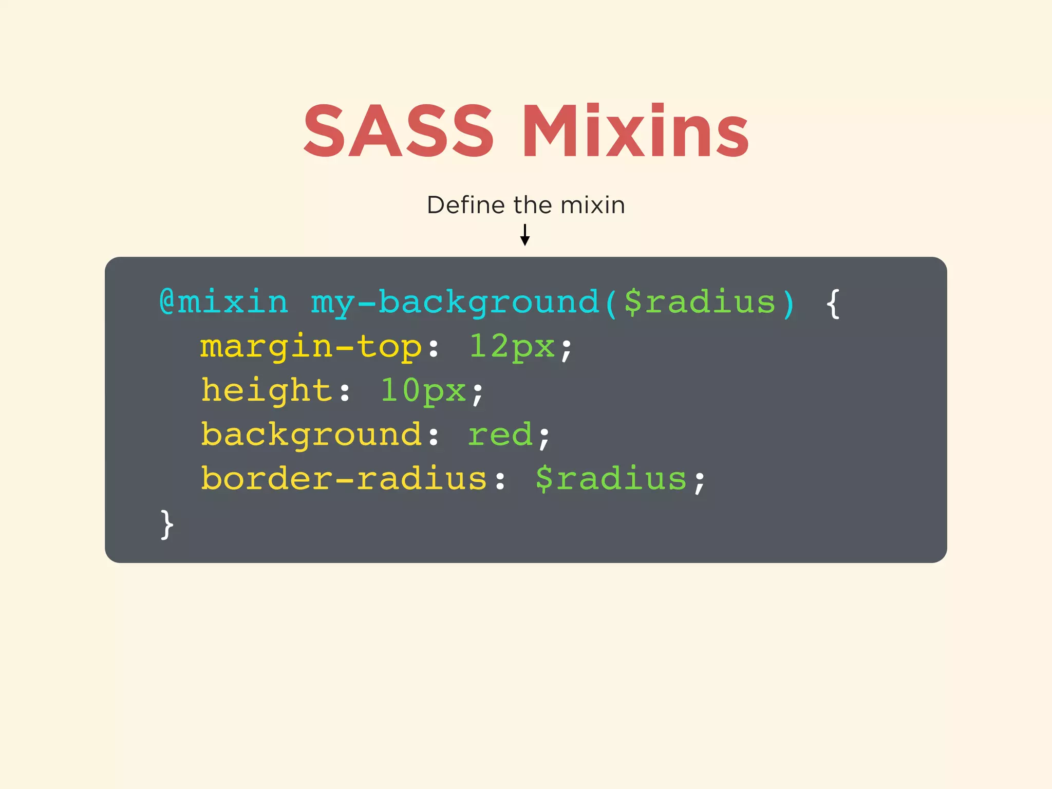
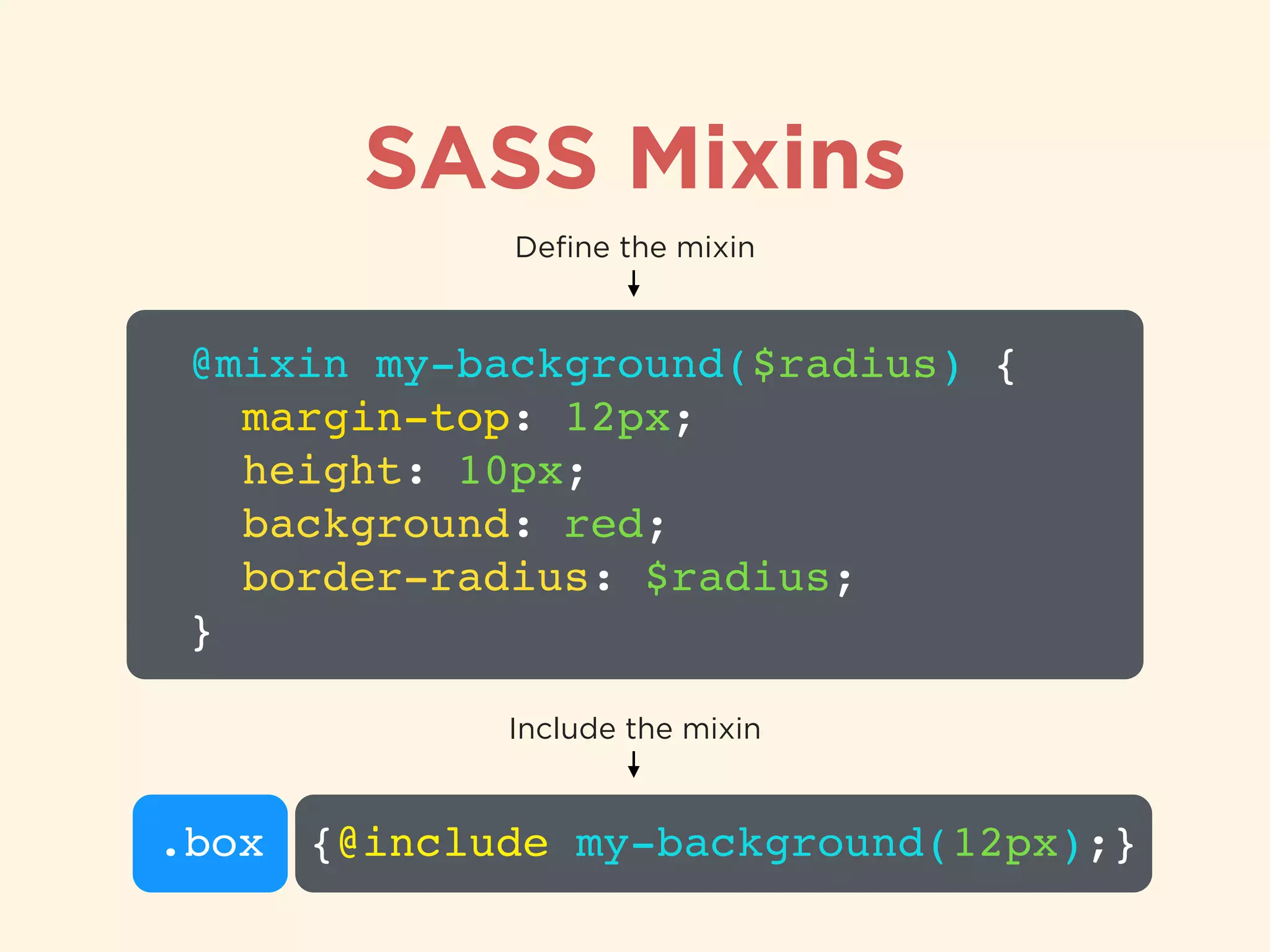
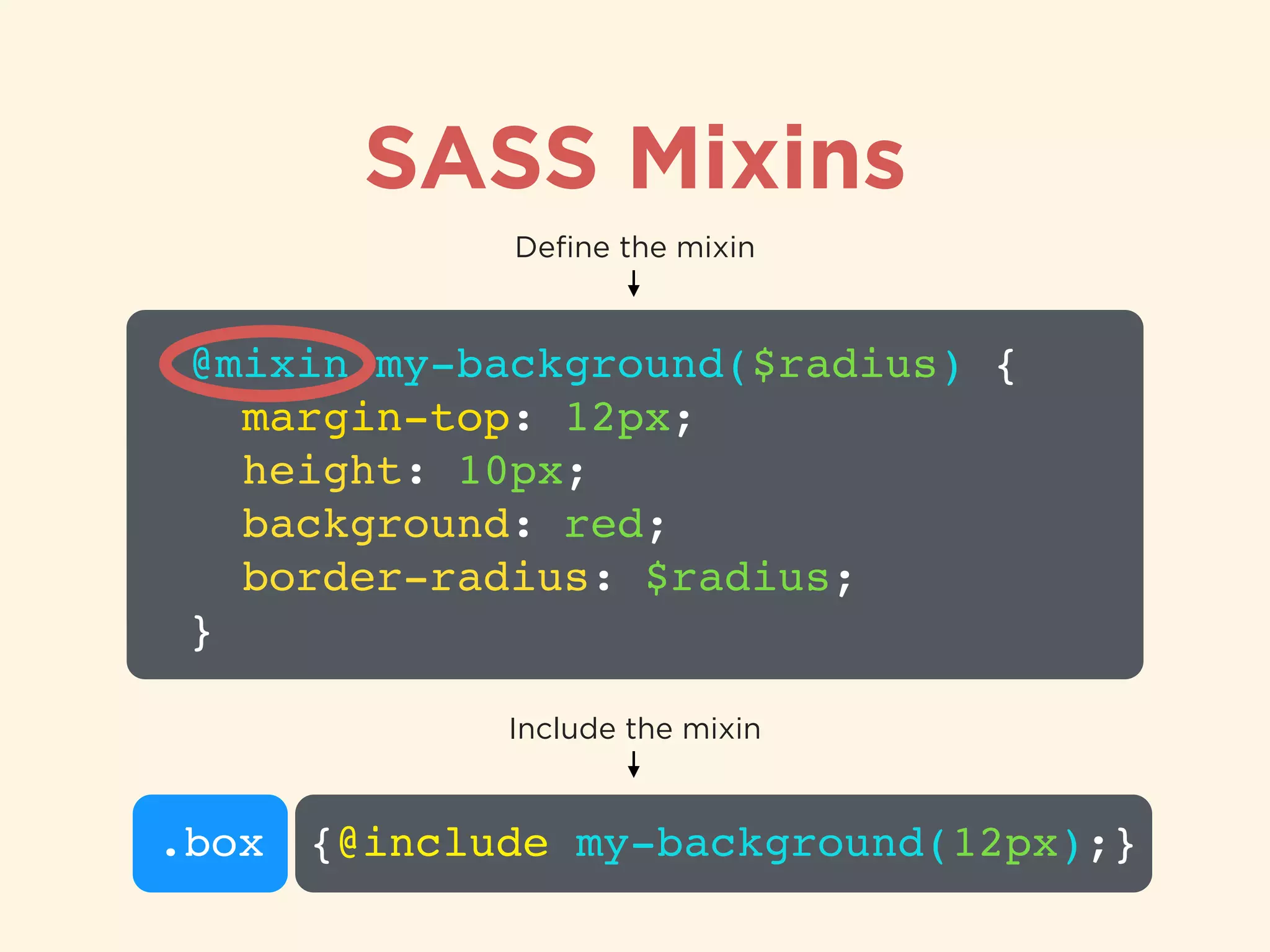
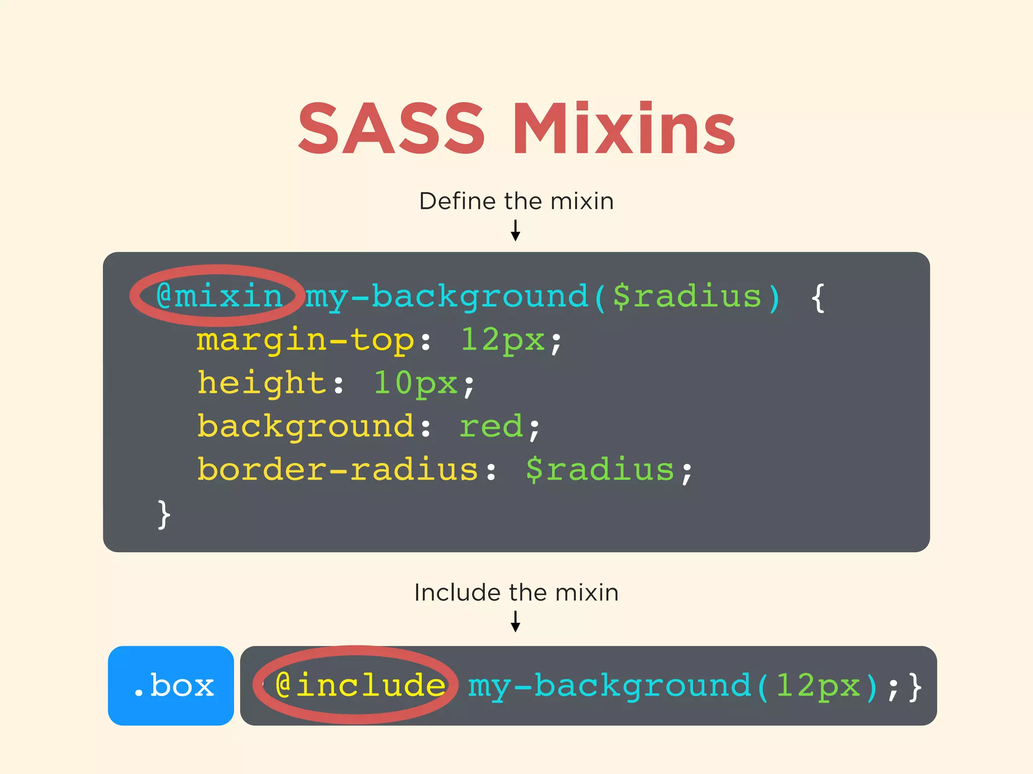
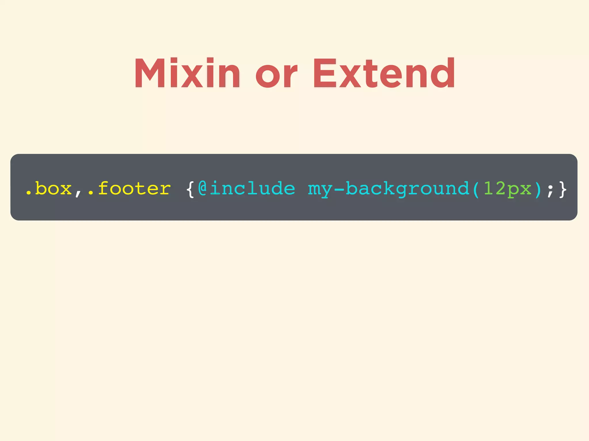
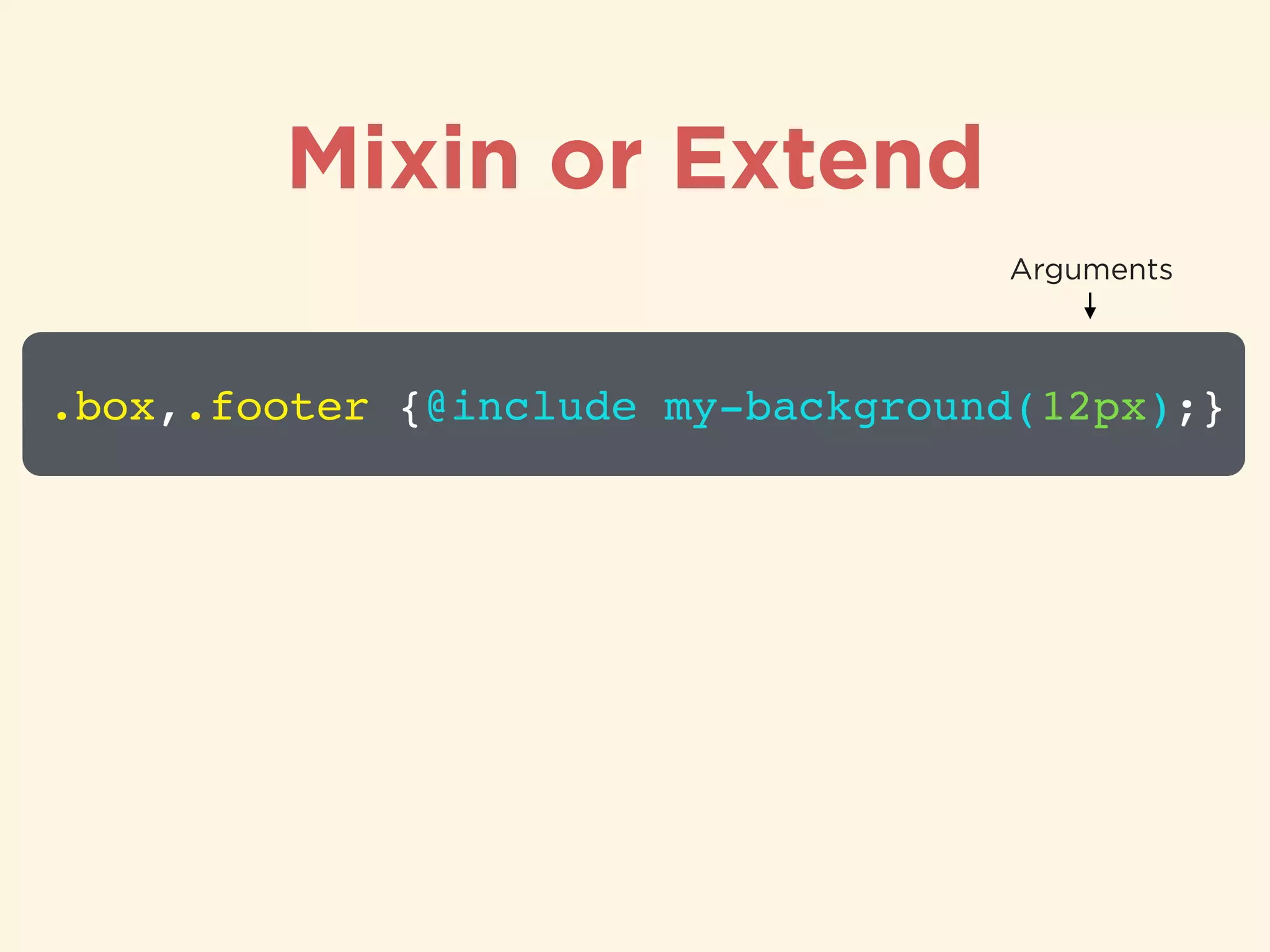
Definition and examples of SASS mixins for reusable styles and parameters.
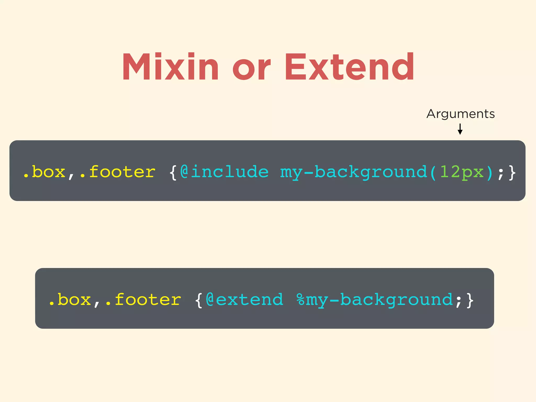
Comparison and application of mixins vs extend in organizing styles.
Recommendations for CSS and SASS resources, including websites and tutorials.
Thank you note and invitation for questions, providing contact information.


![[WhaTap DevOps Day] 세션 5 : 금융 Public 클라우드/ Devops 구축 여정](https://cdn.slidesharecdn.com/ss_thumbnails/whatapdevopsdaydevops-220705054116-6ce35c67-thumbnail.jpg?width=640&height=640&fit=bounds)


![[Cordova] Empezando con Ionic](https://cdn.slidesharecdn.com/ss_thumbnails/cordovaempezandoconionic-160713033101-thumbnail.jpg?width=640&height=640&fit=bounds)