Title: CSS Inline Layout Module Level 3
Shortname: css-inline
Level: 3
Status: ED
Work Status: Revising
Group: csswg
TR: https://www.w3.org/TR/css-inline-3/
ED: https://drafts.csswg.org/css-inline-3/
Previous version: https://www.w3.org/TR/2018/WD-css-inline-3-20180808/
Previous version: https://www.w3.org/TR/2016/WD-css-inline-3-20160524/
Previous version: https://www.w3.org/TR/2015/WD-css-inline-3-20150917/
Previous version: https://www.w3.org/TR/2014/WD-css-inline-3-20141218/
Previous version: https://www.w3.org/TR/2002/WD-css3-linebox-20020515/
!Issues list: CSS3 Line Layout issues in GitHub
Editor: Dave Cramer, Hachette Livre, dauwhe@gmail.com, w3cid 65283
Editor: Elika J. Etemad / fantasai, Invited Expert, http://fantasai.inkedblade.net/contact, w3cid 35400
Editor: Steve Zilles, Adobe, szilles@adobe.com, w3cid 3129
Abstract: The CSS formatting model provides for a flow of elements and text inside of a container to be wrapped into lines.  The formatting of elements and text within a line, its positioning in the inline progression direction, and the breaking of lines are described in [[CSS-TEXT-3]].  This module describes the positioning in the block progression direction both of elements and text within lines and of the lines themselves.  This positioning is often relative to a baseline.  It also describes special features for formatting of first lines and drop caps.  It extends on the model in [[CSS2]].
Ignored Terms: line-height-shift-adjustment, text-script, after, before, alignment subtree
Link Defaults: css-fonts-3 (property) font-family, css-color-3 (property) color
At Risk: the 'initial-letters-wrap' property
This module defines the CSS Inline Layout model,
replacing and extending the model as defined in CSS2.1.
It is very much a work-in-progress, and implementers should reference CSS2.1 for now.
The root inline box is an anonymous inline box
which is automatically generated to hold
all of the inline-level contents of a block container
(if it has any).
It inherits from its parent block container,
but is otherwise unstyleable.
Note: Line boxes, like column boxes [[css-multicol-1]],
are fragmentation containers generated by their formatting context
and are not part of the CSS box tree.
ISSUE: Many aspects of layout here depend on font metrics.
While the relevant metrics exist in OpenType for Latin/Cyrillic/Greek and for CJK,
they are missing for many other writing systems.
For example, the visual top metric for Hebrew has no metric in the OpenType tables.
For this module to work well for the world,
we need fonts to provide the relevant metrics for all writing systems,
and that means both that OpenType needs to allow such metrics
and font designers need to provide accurate numbers.
Line Heights and Baseline Alignment
This section is being rewritten. Refer to section 10.8 of [[CSS2]] for the normative CSS definition or the 2002 Working Draft if you want pretty pictures. (But ignore the old text, half of it's wrong. We're not specifying which half, that's to be determined.)
The CSS2 specification should be used as the guideline for implementation.
Issue: The CSSWG would like to know which baseline values are necessary: if any can be dropped, or any need to be added. See GitHub issue 859.
Dominant Baselines: the 'dominant-baseline' property
	Name: dominant-baseline
	Value: auto | text-bottom | alphabetic | ideographic | middle | central | mathematical | hanging | text-top
	Initial: normal
	Applies to: block containers, inline boxes, table rows, table columns, grid containers, and flex containers
	Inherited: yes
	Percentages: N/A
	Computed value: specified keyword
	Animation type: discrete
This property specifies the dominant baseline,
which is the baseline used to align the box's text and inline-level contents.
It is also indicates the default alignment baseline
of any boxes participating in baseline alignment
in the box’s alignment context.
Values have the following meanings:
auto
Equivalent to ''dominant-baseline/alphabetic'' in horizontal writing modes
and in vertical writing modes
when 'text-orientation' is ''sideways'', ''sideways-right'', or ''sideways-left''.
Equivalent to ''dominant-baseline/central'' in vertical writing modes
when 'text-orientation' is ''mixed'' or ''upright''.
However, in SVG text, the origin point of glyphs
(used for coordinate-based glyph positioning)
is always handled as for ''dominant-baseline/central''
in vertical writing modes.
text-bottom
Use the bottom of the em box as the baseline.
alphabetic
Use the alphabetic baseline.
ideographic
Match the box's ideographic under-side baseline to that of its parent.
This corresponds to the ideo baseline in OpenType.
middle
Use the “middle” baseline: halfway between the alphabetic baseline and the ex-height.
central
Use the central baseline
(halfway between the ascent and descent).
mathematical
Use the mathematical baseline.
hanging
Use the hanging baseline.
text-top
Use the top of the em box as the baseline.
See [[CSS-WRITING-MODES-3]] for an introduction to dominant baselines.
Issue: Should be text-over and text-under instead of text-top and text-bottom,
but maybe it's better not to use those terms for consistency with legacy 'vertical-align'.
See GitHub issue 860.
Issue: Add first and last values.
Note, in this property, these are combinatorial,
whereas in the align/justify-self/content properties, it's singular.
Do we want to align the syntaxes wrt hyphens vs. spaces or what?
See GitHub issue 861.
Transverse Box Alignment: the 'vertical-align' property
	Name: vertical-align
	Value: <<'baseline-source'>> || <<'baseline-shift'>> || <<'alignment-baseline'>>
	Initial: baseline
	Applies to: inline-level boxes
	Inherited: no
	Percentages: N/A
This shorthand property specifies
how an inline-level box is aligned within the line.
Values are the same as for its longhand properties, see below.
Authors should use this property ('vertical-align') instead of its longhands
(unless it is specifically needed to cascade its longhands independently).
Alignment Baseline Source: the 'baseline-source' longhand
	Name: baseline-source
	Value: auto | first | last
	Initial: auto
	Applies to: inline-level boxes
	Inherited: no
	Percentages: N/A
	Computed value: specified keyword
	Animation type: discrete
ISSUE: This is a rough draft, not ready for implementation. Also might rename stuff.
When an inline-level box
has more than one possible source for baseline information
(such as for a multi-line inline block or inline flex container)
this property specifies whether the first baseline set or last baseline set
is preferred for alignment.
Values have the following meanings:
Alignment Baseline Type: the 'alignment-baseline' longhand
	Name: alignment-baseline
	Value: baseline | text-bottom | alphabetic | ideographic | middle | central | mathematical | text-top | bottom | center | top
	Initial: baseline
	Applies to: inline-level boxes, flex items, grid items, table cells
	Inherited: no
	Percentages: N/A
	Computed value: specified keyword
	Animation type: discrete
Specifies what point of an inline-level box is aligned to what point in the parent.
Also selects the alignment baseline of boxes aligned with 'align-self'/'justify-self'.
ISSUE: Clean up this prose to correctly handle alignment contexts other than inline formatting contexts.
Values are defined below:
For the following definitions,
the margin box is used for atomic inlines,
the leading box for non-replaced inlines,
and the baselines of the box are synthesized if missing in the line-box's inline axis:
baseline
Use the dominant baseline choice of the parent.
Match the box's corresponding baseline to that of its parent.
text-bottom
Match the bottom of the box to the bottom of the parent's content area.
alphabetic
Match the box's alphabetic baseline to that of its parent.
ideographic
Match the box's ideographic character face under-side baseline to that of its parent.
middle
Align the vertical midpoint of the box with
the baseline of the parent box plus half the x-height of the parent.
central
Match the box's central baseline to the central baseline of its parent.
mathematical
Match the box's mathematical baseline to that of its parent.
text-top
Match the top of the box to the top of the parent's content area.
For the following definitions, the alignment subtree
is as defined in [[!CSS2]].
top
Align the top of the aligned subtree with the top of the line box.
center
Align the center of the aligned subtree with the center of the line box.
bottom
Align the bottom of the aligned subtree with the bottom of the line box.
SVG implementations may support the following aliases
in order to support legacy content:
These values are not allowed in the 'vertical-align' shorthand.
Alignment Shift: the 'baseline-shift' longhand
	Name: baseline-shift
	Value: <> | sub | super
	Initial: 0
	Applies to: inline-level boxes, flex items, grid items

	Inherited: no
	Percentages: refer to the used value of 'line-height'
	Computed value: the specified keyword and/or a computed <> value
This property specifies by how much the box is shifted up
from its alignment point.
It does not apply when 'alignment-baseline' is ''alignment-baseline/top'' or ''alignment-baseline/bottom''.
Authors should use the 'vertical-align' shorthand instead of this property.
Values have the following meanings:
<>
Raise (positive value) or lower (negative value) by the specified length.
<>
Raise (positive value) or lower (negative value) by the specified percentage of the 'line-height'.
sub
Lower by the offset appropriate for subscripts of the parent’s box.
(The UA should use the parent’s font data to find this offset whenever possible.)
super
Raise by the offset appropriate for superscripts of the parent’s box.
(The UA should use the parent’s font data to find this offset whenever possible.)
User agents may additionally support the keyword baseline
as computing to ''0''
if is necessary for them to support legacy SVG content.
Issue: We would prefer to remove this, and are looking for feedback from SVG user agents as to whether it's necessary.
Line Spacing: the 'line-height' property
	Name: line-height
	Value: normal | <> || <>
	Initial: normal
	Applies to: inline boxes
	Inherited: yes
	Percentages: computed relative to ''1em''
	Computed value: the specified keyword, a number, or a computed <> value
ISSUE: Fill out this definition so that it fully replaces CSS2.
ISSUE: The fact that percentages compute to lengths is annoying.
See also href="https://github.com/w3c/csswg-drafts/issues/3118">Issue 3118
and Issue 2165.
Line Sizing Containment: the 'line-sizing' property
	Name: line-sizing
	Value: legacy | normal
	Initial: legacy
	Applies to: inline boxes
	Inherited: yes
	Percentages: N/A
	Computed value: the specified keyword
ISSUE: This is a rought draft of a proposal, and has not yet been approved by the CSSWG.
See discussion in Issue 3199, Hyatt's message, and dbaron's proposal.
This property controls the method by which line boxes are sized,
and thus the spacing between lines of text.
Values have the following meanings:
legacy
The inline box contributes to the sizing of its line box
based on its 'line-height',
rather than based on its box edges,
as defined in [[!CSS2]].
In Quirks Mode [[!QUIRKS]],
any inline boxfragment
that has zero borders and padding and
that does not directly contain text or preserved white space [[!CSS-TEXT-3]]
is ignored when sizing the line box.
Note: In this model, vertical rhythm is broken
any time there is a change in font metrics within a paragraph.
normal
The inline box contributes to the sizing of its line box
based on its margin box,
rather than its 'line-height'.
Half-leading is inserted inside the content box edges,
rather than overlapping the padding/border/margin areas.
However, positive half-leading is only applied to the root inline box.
Negative half-leading is applied to all inline boxes,-
reducing the size of the content box as needed.
Note: This will give consistent line spacing
as long as there is some amount of leading added,
such that the half-leading on the root inline
is large enough to accommodate the unleaded ascent/descent of its descendants.
The line box will grow, however, to accommodate
content that would otherwise overflow,
to avoid overlap between lines.
ISSUE: Should this property apply to block containers or to inline boxes?
In the latter case, an individual inline could say "pay attention to me"
or "don't pay attention to me".
Leading Control: the 'leading-trim-over' and 'leading-trim-under' properties and 'leading-trim' shorthand
ISSUE: This is a rought draft of a proposal,
and is likely to change significantly
as design critiques and use cases are registered.
Values and property names may be added, dropped, and/or renamed,
and the overall syntax or behavior may change.
Do not implement (yet).
The CSSWG particularly invites feedback on
which font metrics need corresponding keyword values.
To ensure consistent spacing in the basic case of running text,
CSS line layout introduces leading both above and below
the text content of each line.
In addition, the ascend and descent font metrics themselves
include extra space above and below the most common glyph sizes
in order to accommodate occasional characters and diacritics
which ascend or descend beyond the typical bounds.
This prevents subsequent lines of text from overlapping each other.
However, all this extra spacing interferes with visual alignment
and with control over effective (visually-apparent) spacing.
The 'leading-trim' properties allow controlling the spacing above and below
the first and last lines of a block.
It allows precise control over spacing;
moreover, by relying on font metrics rather than hard-coded lengths,
it allows content to be resized, rewrapped, and rendered in a variety of fonts
while maintaining that spacing.
A common problem is vertical centering.
It's easy to vertically center the text container to an icon,
but because the visual boundaries of Latin text
are the cap height and the alphabetic baseline,
rather than the ascent and descent,
this often doesn't yield the intended visual effect.
Measuring to the top/bottom of the text may yield equal results,
but measuring to the visual bounds shows that it is not visually centered.
To center the text visually,
it's necessary to asume the cap height and alphabetic baseline
as the top and bottom edges of the text,
respectively.
Measuring to the cap height / alphabetic baseline
instead of the ascent / descent
and equalizing those distances
visually centers the text.
By using 'leading-trim' to strip out the spacing above the cap height
and below the alphabetic baseline,
centering the box actually centers the text;
and does so reliably, regardless of what font is used to render it.
Even though different fonts have different cap heights,
by using the font's metric rather than a magic number,
the layout intention is met even as the font is changed.
	Name: leading-trim-over
	Value: normal | text | cap | ex | ideographic | ideographic-ink
	Initial: normal
	Applies to: block containers
	Inherited: no
	Percentages: N/A
	Computed value: the specified keyword
The 'leading-trim-over' property trims
the line-over side of the first line box in the block container
to better match the box’s content edge to its text content.
The property affects only the first formatted line of the block container;
if there is no such line, it has no effect.
Values have the following meanings:
normal
Half-leading is applied over the first line,
just as for every other line.
text
Half-leading is not applied over the first line;
the top of the line box is set to
the text-top metric
of the root inline box.
cap
Half-leading is not applied over the first line;
the top of the line box is set to
the cap-height metric
of the root inline box.
ex
Half-leading is not applied over the first line;
the top of the line box is set to
the ex-height metric
of the root inline box.
ideographic
Half-leading is not applied over the first line;
the top of the line box is set to
the ideographic top (idtp) metric
of the root inline box.
ideographic-ink
Half-leading is not applied over the first line;
the top of the line box is set to
the ideographic character face top (icft) metric
of the root inline box.
	Name: leading-trim-under
	Value: normal | text | alphabetic | ideographic | ideographic-ink
	Initial: normal
	Applies to: block containers
	Inherited: yes
	Percentages: N/A
	Computed value: the specified keyword
The 'leading-trim-over' property trims
the line-over side of the first line box in the block container
to better match the box’s content edge to its text content.
The property affects only the first formatted line of the block container;
if there is no such line, it has no effect.
Values have the following meanings:
normal
Half-leading is applied over the first line,
just as for every other line.
text
Half-leading is not applied over the first line;
the top of the line box is set to
the text-top metric
of the root inline box.
alphabetic
Half-leading is not applied over the first line;
the top of the line box is set to
the alphabetic baseline metric
of the root inline box.
ideographic
Half-leading is not applied over the first line;
the top of the line box is set to
the ideographic bottom (ideo) metric
of the root inline box.
ideographic-ink
Half-leading is not applied over the first line;
the top of the line box is set to
the ideographic character face top (icfb) metric
of the root inline box.
	Name: leading-trim
	Value: normal | text | cap | ex | ideographic | ideographic-ink
	Initial: normal
	Applies to: block containers
	Inherited: no
	Percentages: N/A
	Computed value: the specified keyword
This property is a shorthand of 'leading-trim-over' and 'leading-trim-under'.
If ''leading-trim/cap'' or ''leading-trim/ex'' is specified,
'leading-trim-over' is set to that value
and 'leading-trim-under' is set to ''leading-trim-under/alphabetic'';
otherwise both longhands are set to the specified keyword.
Drawing Inline Boxes
Inline Box Heights: the 'inline-sizing' property
	Name: inline-sizing
	Value: normal | stretch
	Initial: normal
	Applies to: inline boxes
	Inherited: no
	Percentages: n/a
	Computed value: specified keyword
	Animation type: discrete
This property specifies how the logical height
of the content area of an inline box
is measured
and how it is aligned with its contents.
(It has no effect on the size or position of the box’s contents.)
Values have the following meanings:
Issue: We might want to use this opportunity to more precisely define ''inline-sizing/normal'',
rename it to match,
and possibly introduce any other values that may seem necessary.
Initial Letters
The editors would appreciate any examples of drop initials in non-western scripts, especially Arabic and Indic scripts.
An Introduction to Initial Letters
This section is non-normative.
Large, decorative letters have been used to start new sections of text since before the invention of printing.
In fact, their use predates lowercase letters entirely.
Drop Initial
A dropped initial (or “drop cap”)
is a larger-than-usual letter at the start of a paragraph,
with a baseline at least one line lower than the first baseline of the paragraph.
The size of the drop initial is usually indicated by how many lines it occupies.
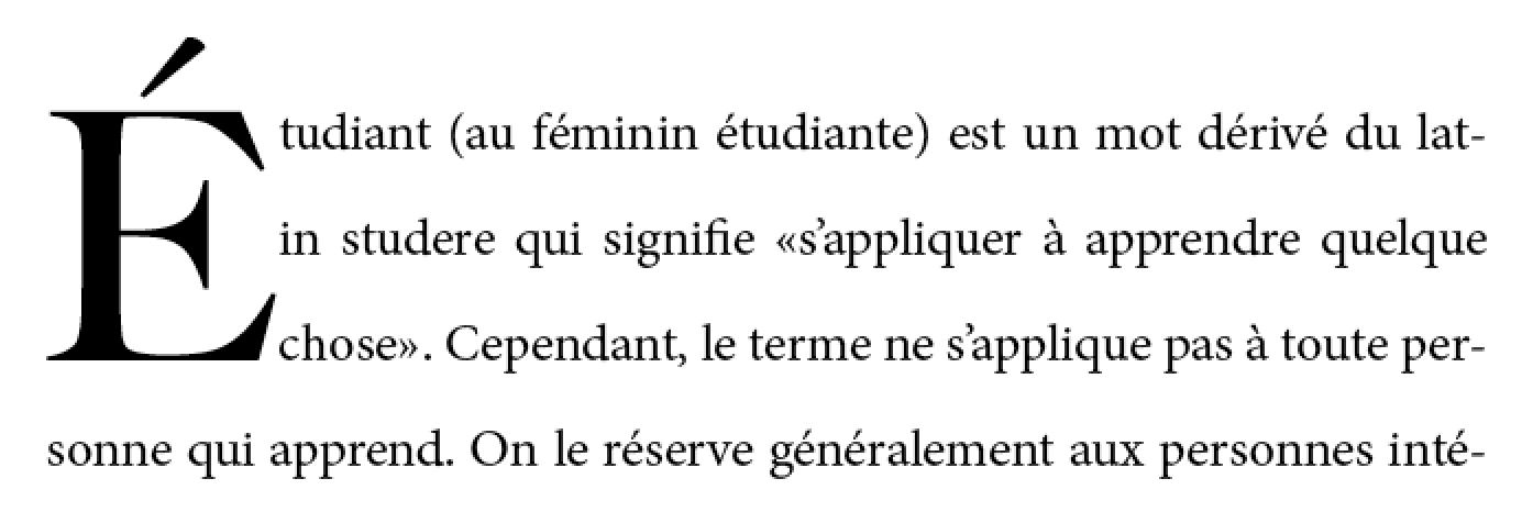
Two- and three-line drop initials are very common.
Three-line drop initial with E acute.
Since the cap-height of the drop initial aligns with the cap-height of the main text,
the accent extends above the paragraph.
The exact size and position of a dropped initial
depends on the alignment of its glyph.
Reference points on the drop cap must align precisely
with reference points in the text.
The alignment constraints for drop initials depend on the writing system.
In Western scripts, the top reference points are
the cap height of the initial letter and of the first line of text.
The bottom reference points are
the alphabetic baseline of the initial letter
and the baseline of the Nth line of text.
Figure 2 shows a simple two-line drop cap, with the relevant reference lines marked.
Two-line drop cap showing baselines (green lines), cap-height (red line), and ascender (cyan line).
In Han-derived scripts, the initial letter extends
from the block-start edge of the glyphs on the first line
to the block-end edge of the glyphs on the Nth line.
Two-line drop initial in vertical writing mode
In certain Indic scripts,
the top alignment point is the hanging baseline,
and the bottom alignment point is the text-after-edge.
Devangari initial letter aligned with hanging baseline. Alignment points shown in red.
Sunken Initial Letters
Some styles of drop initials do not align with the first line of text.
A sunken initial (or “sunken cap”)
both sinks below the first baseline,
and extends above the first line of text.
Sunken cap. The letter drops two lines, but is the size of a three-line initial letter.
Raised Initial Letters
A raised initial (often called a “raised cap” or “stick-up cap”) “sinks” to the first text baseline.
Note: A proper raised initial has several advantages over
simply increasing the font size of a first letter.
The line spacing in the rest of the paragraph will not be altered,
but text will still be excluded around large descenders.
And if the size of raised initial is defined to be an integral number of lines,
implicit baseline grids can be maintained.
Raised cap. The initial letter is the size of a 3-line initial, but does not drop.
Selecting Initial Letters
This section is non-normative.
Initial letters are typically a single letter, although
they may include punctuation or a sequence of characters which
are perceived by the user to be a single typographic unit.
The ''::first-letter'' pseudo-element,
defined in [[SELECT]] and [[CSS-PSEUDO-4]],
can be used to select the character(s) to be formatted as initial letters.
Authors who need more control over which characters are included in an initial letter,
or who want to apply initial-letters formatting to replaced elements or multiple words
can alternately apply the 'initial-letters' property to the first inline-level child of a block container.
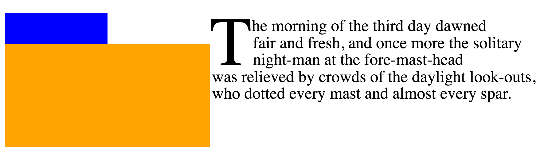
		<p>This paragraph has a dropped “T”.
		<p><img alt="H" src="illuminated-h.svg">ere we have an illuminated “H”.
		<p><span>Words may also</span> be given initial letter styling at the beginning of a paragraph.
		::first-letter, /* style first paragraph's T */
		img, /* style illuminated H */
		span /* style phrase inside span */
		{ initial-letters: 2; }
Note that
since ''::first-letter'' selects punctuation before or after the first letter,
these characters are included in the initial-letters when ''::first-letter'' is used.
The ''::first-letter'' pseudo-element selects the quotation mark as well as the “M”.
Issue: Should there be a way to opt out of this behavior? See Github Issue 310.
Creating Initial Letters: the 'initial-letters' property
	Name: initial-letters
	Value: normal | <> <> | <> && [ drop | raise ]?
	Initial: normal
	Applies to: certain inline-level boxes and ::first-letter and inside ::marker boxes (see prose)
	Inherited: no
	Percentages: N/A
	Computed value: the keyword ''initial-letters/normal'' or a number paired with an integer
	Animation type: by computed value type
ISSUE: Renaming this property (and the others in this section)
is currently under discussion.
This property specifies
the size and sink
for dropped, raised, and sunken initial letters
as the number of lines spanned.
For example, the following code will create
a 2-line dropped initial letter
at the beginning of each paragraph
that immediately follows a second-level heading:
h2 + p::first-letter { initial-letters: 2; }
It takes the following values:
normal
No special initial-letters effect. Text behaves as normal.
<>
This first argument defines the size
of the initial letter
in terms of how many lines it occupies.
Values less than one are invalid.
<>
This optional second argument
defines the number of lines the initial letter should
sink.
A value of ''1'' indicates a raised initial;
values greater than ''1'' indiciate a sunken initial.
Values less than one are invalid.
If the initial letter sink value is omitted,
''drop'' is assumed.
Values other than ''initial-letters/normal''
cause the affected box to become an
initial letter box,
which is an in-flowinline-level box
with special layout behavior.
Here are some examples of 'initial-letters' usage:
The size of the initial letter does not have to be an integral number of lines.
In this case only the bottom aligns.
In conjunction with other CSS properties, ''initial-letters'' can be used to create
“adjacent initial letters,” where the initial letter is adjacent to the text:
To give authors more control over which characters can be styled as an initial letter
and to allow the possibility of multi-character initial letters
(such as for first word or first phrase styling),
the 'initial-letters' property applies not just
to the CSS-defined ''::first-letter'' pseudo-element,
but also to
''list-style-position/inside''-positioned ''::marker'' pseudo-elements and
inline-level boxes
that are placed at the start of the first line.
Specifically, 'initial-letters' applies to
any inline-level box--
including any such ''::first-letter'' or ''::marker'' box--
that is the first child of its parent box
and whose ancestors (if any) that are descendants of its containing block
are all first-child inline boxes
that have a computed 'initial-letters' value
of ''initial-letters/normal''.
For example,
the <span>, <em>, and <b> elements
in the following example are
"first-most inline-level descendants" of the <p>,
but the <strong> element
is not:
<p><span><em><b>This</b> phrase</em> is styled
<strong>specially</strong>.</span> …
If we apply the following rules:
The 'initial-letters' property will take effect only on the <em>.
The styling on <b>
is ignored,
as it has an ancestor already styled as an initial letter;
and the styling on <strong> is ignored
because it is a second sibling.
The result might be rendered as
If 'initial-letters' is applied to an inline-level box
that is not positioned at the start of the line due to bidi reordering
or which is otherwise preceded by other inline-level content,
its used value is ''initial-letters/normal'',
and it is not formatted as an initial letter.
The effect of the 'initial-letters' property is undefined
on children of ruby base container boxes
and on ruby container boxes.
Note: The 'initial-letters' property cannot apply to any element
whose 'float' is not ''float/none'' or 'position' is not ''static'',
because these values cause its 'display' to compute to ''display/block''.
Alignment of Initial Letters: the 'initial-letters-align' property
As mentioned earlier, the alignment of initial letters
depends on the script used.
The 'initial-letters-align' property can be used to specify the proper alignment.
	Name: initial-letters-align
	Value: border-box? [ alphabetic | ideographic | hebrew | hanging ] | border-box
	Initial: alphabetic
	Applies to: certain inline-level boxes and ::first-letter and inside ::marker boxes (see prose)
	Inherited: yes
	Percentages: N/A
	Computed value: specified keyword(s)
	Animation type: discrete
This property specifies the alignment points
used to size and position an initial letter.
Two sets of alignment points are necessary:
the over and under alignment points of the initial letter
are matched to corresponding over and under points of the surrounding text.
Values have the following meanings:
alphabetic
Use the alphabetic and cap-height baselines of the surrounding text
to align the initial letter.
ideographic
Use the ideographic character face bottom and top edge baselines of the surrounding text
to align the initial letter.
hebrew
Use the alphabetic and Hebrew top baseline of the surrounding text
to align the initial letter.
hanging
Use the alphabetic and hanging baselines of the surrounding text
to align the initial letter.
Else if the initial letter
contains any character from the Han, Hangul, Kana, or Yi Unicode scripts,
use the ideographic character face bottom and top edge baselines.
Else if the initial letter
contains any character from the Devanagari, Bengali, and Gurmukhi Unicode scripts,
use the hanging and alphabetic baselines.
Else if the initial letter
contains any character from the Hebrew Unicode scripts,
use the ideographic character face bottom and top edge baselines.
Else use the alphabetic and cap-height baselines.
Issue: What is the proper alignment for South Asian scripts
that do not have the explicit hanging baseline, such as Tamil or Telugu?
See GitHub issue 864
Note: The ordering of keywords in this property is fixed in case ''border-box''
is expanded to ''[ border-box | alphabetic | ideographic | hebrew | hanging ]''
to allow explicitly specifying the initial letter’s alignment points.
UA Default Stylesheet for 'initial-letters-align'
In order to provide the better behavior by default,
UAs must include in their default UA style sheet the following rules:
Issue: This only covers the most common cross-linguistic transcription systems.
Should we include any other / all script tags in the UA style sheet?
Initial Letter Layout
There are two types of initial letter boxes:
those that arise from non-replaced inline boxes
and those that arise from atomic inlines.
For the non-atomic inline initial letter,
the box and its contents
participate in the same inline formatting context
as the line on which it occurs,
and a lot of special rules apply
to give the expected sizing and alignment.
For an atomic initial letter,
however,
which is either a replaced element
or which establishes an independent formatting context for its contents,
the sizing of the box
(aside from its automatic size in the block axis)
and layout of the contents within the box
follows the usual rules:
it is primarily the positioning of the box
which is special.
Initial letters can be styled with margins, padding, and borders
just like any other box.
Unless 'initial-letters-align' is ''initial-letters-align/border-box'',
its vertical alignment and sizing are not affected;
however the effective exclusion area is
(and corresponds to the margin area).
ISSUE: Reword that to handle 'box-sizing' correctly.
When padding and borders are zero,
the initial letter may be kerned;
see below.
Font Sizing of Initial Letters
For an inline initial letter,
the font size used for sizing the initial letter contents
is calculated to fulfill its specified size (see 'initial-letters')
as anchored by its specified alignment points (see 'initial-letters-align').
Note that no layout is required in this calculation:
it is based only on computed values and font metrics.
These used font size calculations
do not affect the computed 'font-size',
and therefore have no effect on the computation of ''em'' length values, etc.
ISSUE: What about inheritance to descendants?
For an atomic initial letter,
the used font size is the computed font size as usual.
The line height used in these calculations
is the 'line-height' of the containing block
(or, in the case where a baseline grid is in use,
the baseline-to-baseline spacing required by the baseline grid [[CSS-LINE-GRID-1]]).
The contents of the lines spanned,
and therefore any variation in their heights and positions,
is not accounted for.
For an N-line drop initial in a Western script,
the cap-height of the letter needs to be (N – 1) times the line-height,
plus the cap-height of the surrounding text.
Note this height is not the font size of the drop initial.
Actually calculating this font size is tricky.
For an N-line drop initial,
we find the drop initial font size to be:
ISSUE: Update this calculation to be a) generic across writing systems / alignment points and b) handle non-integer sizes.
A three-line drop initial in Adobe Minion Pro
would have a font size of 61.2pt given
12pt text, 16pt line-height, and a cap-height of 651/1000 (from the font’s OS/2 table).
Shaping and Glyph Selection
When 'initial-letters' is not ''initial-letters/normal'',
shaping should still occur across
an inline initial letter box's boundaries.
(See [[css-text-3#boundary-shaping]].)
For example, if the first letter of the Farsi word “پس”
were styled with ''initial-letters: 2 1'',
both letters would be styled in their joined forms,
with initial-form “ﭘ” as the initial letter,
followed by the normally-styled final-form “ﺲ”.
Note that the two letters might not always graphically connect,
even when shaped in their joining forms.
Issue: Are there other things we need to consider here?
Sizing the Initial Letter Box
For an inline initial letter,
if the initial letter’s preferred width/preferred height
is definite,
use that value
(clamped as required by the min size and max size properties,
and handling 'box-sizing' as required)
for that dimension of the box.
Otherwise
it is considered to have an automatic size in that dimension
and is sized and positioned to coincide with
the smallest rectangle that would include
the bounding boxes of all its glyphs--
excluding any that hang
(see 'hanging-punctuation')--
as well as the margin boxes of any atomic inlines it contains.
ISSUE: Should the hanging punctuation be included in the box instead
(so that the box is drawn around the punctuation when it is made visible through borders/background),
but rather only excluded when positioning the box
(so that the initial letter remains flush,
with the hanging punctuation properly hanging)?
See discussion.
For atomic initial letters,
sizing follows the usual rules for that type of atomic inline.
However, if the box has an [=automatic size|automatic=] [=block size=] (''height/auto''),
then its block size is determined
as for an inline initial letter
with ''initial-letter-align/border-box'' alignment,
and is definite.
Alignment Within an Initial Letter Box
By default (i.e. under automatic sizing),
the content box of an inline initial letter
is fitted exactly to its content,
and alignment properties like 'text-align' or 'align-content' do not apply.
However, if the box is not sized automatically:
If the inline size is definite,
'text-align' is honored
for aligning the contents of the initial letter
within its box in the inline axis
(using its inline-axis bearings as usual,
not the bounding box of its glyph outlines).
If the block size is definite,
'align-content' is honored
for aligning its contents in the block axis
(using its block-axis bearings,
synthesizing them if needed).
Initial Letter Positioning and Spacing
Space Below Initial Letters
The glyph(s) of an initial letter do not always fit within the specified sink.
For example, if an initial letter has a descender,
it could crash into the (n+1)th line of text.
This is not desirable.
Incorrect: three-line initial letter with descender.
In this font, the capital “J” extends well below the baseline (shown in red).
Therefore all line boxes impacted by the glyph bounding boxes
of an initial letter are excluded,
not just those within range of the initial letter sink.
Specifically, for non-atomic initial letters,
the content box of the element is sized to fit:
The specified amount of sink
(i.e the distance from the top alignment point to the bottom alignment point).
The actual ascent and descent and side bearings of all the glyphs it contains
that are part of its inline formatting context,
even if they leak outside their em boxes.
The margin boxes of all the atomic inlines it contains
that are part of its inline formatting context,
even if they leak outside its own line-height.
The initial letter is then made an exclusion area,
the same as if it were a float.
See 'initial-letters-wrap' for details.
Correct: text excluded around glyph bounding box
Block-axis Positioning
In the block axis, the initial letter is positioned
as required to satisfy its under alignment point ('initial-letters-align')
at its specified [=initial letter sink|sink=] ('initial-letters'),
i.e. it is positioned
such that it would sink the number of lines
specified by 'initial-letters'’s second argument
and align to the requisite under alignment point
if it was assumed that its containing block held only
the initial letter itself
followed by an infinite sequence of plain text
as the direct contents of its root inline box.
Its position is anchored with respect to the line on which it occurs.
Inline Positioning and Kerning
In the inline axis, the position of the inline letter
is given by matching its inline-startmargin edge
with the inline-start edge of the line box.
However, if the initial letter is a non-atomic inline
with an [=automatic size|automatic=] [=inline size=] and
zero padding and borders,
it is negatively offset
by the distance from the start edge of its content box
to the point in the content that would have been placed
at the start edge of the containing block
if it were not an initial letter
(i.e. the distance between its glyph bounding box
and its start side bearing).
Initial Letter Wrapping: the 'initial-letters-wrap' property
Note: 'initial-letters-wrap' is at risk.
	Name: initial-letters-wrap
	Value: none | first | all | grid | <>
	Initial: none
	Applies to: certain inline-level boxes and ::first-letter and inside ::marker boxes (see prose)
	Inherited: yes
	Percentages: relative to logical width of (last fragment of) initial letter
	Computed value: specified keyword or computed <> value
	Animation type: by computed value type
This property specifies whether lines impacted by an initial letter
are shortened to fit the rectangular shape of the initial letter box
or follow the contour of its end-edge glyph outline.
none
No contour-fitting is performed:
each impacted line is aligned flush to the end margin edge of the initial letter.
first
Behaves as ''initial-letters-wrap/none''
if the first typographic character unit after the initial letter
belongs to Unicode General Category Zs.
Otherwise behaves as for ''all''
on the first line of the block containing the initial letter
and as ''initial-letters-wrap/none'' on the rest.
This example shows why contour-fitting the first line is necessary,
and why it is dropped when the initial letter is followed by a space:
In the top paragraph, the initial letter "A" has a word space after it:
the gap between the top of the "A" and the next letter
provides the necessary word separation.
In the next paragraph, the initial letter "A"
is part of the first word,
and leaving a gap between the top of the "A" and the next letter
would create a jarring visual break within the word.
In this case, the first line of text
should be kerned into the initial letter's area,
as shown in the bottom paragraph.
Issue: Do we need an unconditional ''initial-letters-wrap/first''?
(I.e. Should we rename this value to ''initial-letters-wrap/auto'' and add a ''initial-letters-wrap/first'' value
that does not check for spaces?) See GitHub issue
410
all
For each line of text impacted by the initial letter,
the line box adjacent to the initial letter starts
at the start-most point that touches the ink of the initial letter,
plus the amount of the initial letter’s end-side border+padding+margin.
If the value of ''shape-outside'' is not ''none'',
''shape-outside'' is used instead of the glyph outline.
Note: This value is at-risk.
grid
This value is the same as ''initial-letters-wrap/none'',
except that the exclusion area of the impacted lines
is increased as necessary for its end-edge to land on the character grid,
i.e. to be a multiple of (''1ic'' + 'letter-spacing')
as computed on the containing block.
The 'justify-self' property can then be used to align
the initial letter box within the exclusion area.
Diagram of Japanese initial letter in vertical writing mode
Note: In this example, the exclusion area for the drop initial
is larger than its glyph in order to preserve inline-axis alignment.
Note: This value is also at-risk.
<>
<>
This value behaves the same as ''initial-letters-wrap/first''
except that the adjustment to the first line is given explicitly
instead of being inferred from the glyph shape.
Issue: This really needs font-relative lengths to be relative to the used size.
Note: This value exists because it is easier to implement.
Authors are encouraged to use the ''initial-letters-wrap/first'' value
and to set margins to control spacing,
and to use this as a fallback for glyph detection if necessary.
In the following example, UAs that support ''initial-letters-wrap/first''
will use the glyph outline
plus the specified margin in order to place the first line,
whereas UAs that only support <> or <> values
will pull in the first line by 40% of the initial letter's width
(and then add the margin to that point).
					h1 + p:first-letter {
						initial-letters: 3; /* 3-line drop-cap */
						initial-letters-wrap: first;
						margin-right: 0.1em;
					}
					@supports (not (initial-letters-wrap: first)) {
						/* Classes auto-generated on paragraphs to match first letter. */
						p.A:first-letter {
							initial-letters-wrap: -40%; /* Start of glyph outline, assuming correct font. */
						}
					}
Issue: These values and related annoyance is likely unnecessary if someone submits a patch to Blink to support ''initial-letters-wrap/first''.
Issue: Edit figure to show how auto behaves in varying contexts
An initial letter box is considered in-flow in its block formatting context,
and is part of the contents of the line box in which it originates.
Aside from vertical alignment,
its interaction with the rest of the contents of the line is as normal,
except in a few specific circumstances…
Inline Flow Layout: Alignment and Justification
For a raised initial
no special consideration is given for alignment and justification:
it is treated similar to any other inline-level content.
However, for a sunken initial
its inline-start edge is anchored to the inline-start edge
of the line box (after indentation)
and text alignment affects the remaining content of the line
in the remaining space,
without moving the initial letter box itself.
Note: The CSSWG was not aware of any reasonable use cases
for mixing non-start text alignment with dropped initial letters,
and this was the most sensible behavior proposed.
This behavior may be reconsidered if use cases require otherwise.
In addition, to ensure consistent alignment of all the impacted lines,
any 'letter-spacing' or justification opportunity
that would normally be introduced by
the juxtaposition of the contents of a sunken initial
and the subsequent contents of the line
is suppressed.
(Note that this does not affect 'word-spacing' or
the justification opportunity introduced by a word separator
because that space is provided by the typographic character unit alone
and not by its juxtaposition with an adjacent character.)
Edge Effects: Indentation and Hanging Punctuation
'text-indent' and 'hanging-punctuation'
apply to the first line of text as normal in the presence of initial letters.
Lines affected by the exclusion are shortened, as in the presence of floats,
and are affected the same way.
Initial letter with text indent.
ISSUE: The interaction of 'initial-letters' and 'hanging-punctuation'
is under discussion.
Ancestor Inlines
If the initial letter box is contained by inline box ancestors,
the boundaries of those inline boxes are drawn
to exclude the initial letter box,
as if it were outside their startmost margin edge.
This is a purely geometric operation:
it does not affect e.g.
property inheritance or
the effective 'letter-spacing' between the initial letter box
and subsequent content.
Multi-line Initial Letters
Drop cap extends to two lines.
Clearing Initial Letters
Raised and sunken caps
The margin box of an initial letter contributes to the size
of its containing element.
Initial letters that extend above the first line of text,
known as “raised caps” or “sunken caps,”
do not extend up into previous elements.
Since the content box for an initial letter includes all glyph ink,
this also means that accents or other ink
above the cap height of an initial letter
will not impinge on previous elements.
Raised cap (initial-letters: 3 1) on right;
note that the position of the “C” is the same in both cases,
but on the right all text is moved down relative to the initial letter.
Issue: Handle glyph ink above cap height of font.
Proposal: Make it an exclusion area for line boxes and border boxes. Include margin specified on initial-letters as part of exclusion area in order to control spacing.
Issue: Draw a box model diagram here. Does the margin of the initial letter collapse with its container?
Short paragraphs with initial letters
A paragraph with an initial letter can have fewer lines of text
than the initial letter occupies.
In this case, the initial letter’s top alignment is still honored,
and its exclusion area continues into any subsequent blocks.
This forces the subsequent inline-level content to wrap around the initial letter--
exactly as if that block's text were part of its own containing block.
(This is similar to how floats exclude content in subsequent block boxes.)
The red text is a short paragraph with an initial letter.
Note the subsequent paragraph wraps around the initial letter
just as text in the paragraph with the initial letter does.
If the subsequent block starts with an initial letter,
establishes an [=independent formatting context=],
or specifies 'clear' in the initial letter’s containing block’s start direction,
then it must clear the previous block’s initial letter.
The red text is a short paragraph with an initial letter.
The subsequent paragraph clears because it also has an initial letter.
If a line box’s start edge shifts or moves down to clear a float,
an initial letter originating in it moves with it;
likewise if an initial letter shifts inward or moves downward
to clear a float,
its originating line box and subsequent line boxes
shorten and/or move accordingly.
If an inline-start float
originates in the first line of content
adjacent to an initial letter,
then it moves past the initial letter
towards the containing block edge,
exactly as if the initial letter were any other inline-level content.
However, if such a float originates
in subsequent lines of content adjacent to a (sunk) initial letter,
then that float must clear the initial letter.
In the absence of an initial letter, the first line of text could abut the blue float.
But the presence of the initial letter requires that the text move over.
See CSS2§9.5
for more information about the layout of floats
and adjacent content.
[[!CSS2]]
ISSUE: Whether an inline-end float originating in subsequent lines
must clear the initial letter (as inline-start floats do)
is still under discussion.
There is no aesthetic reason to require it;
however it’s yet unclear how the underlying layout model
would distinguish between the two cases.
A.1: Synthesizing Baselines (and Other Font Metrics) for Text
Some fonts might not contain the metrics information necessary
to align text properly as described in this module.
User agents may use the following strategies
in the absence of a required metric:
Measure the font
Metrics may be derived from the glyph shapes.
For example,
The center of the minus sign (U+2212)
can be taken as the mathematical baseline.
The amount by which the lowercase “o”
descends below the alphabetic baseline
can be subtracted from its highest point
to measure the x-height.
Measuring the x height.
The amount by which the uppercase “O”
descends below the alphabetic baseline
can be subtracted from its highest point
to measure the cap-height.
The bounding box of 永 (U+6C38) can be used to find
the ideographic character face edges.
The top edge of the center of the Hebrew maqaf (U+05B3 “־”)
can be taken as the Hebrew hanging baseline.
The top edge of the center of the letter Ka
can be taken as the hanging baseline.
Which Ka is used should depend on the content language:
Language
Script
Letter
Devanagari
क U+0915 KA
Bengali
ক U+0995
Gurmukhi
ਕ U+0A15
Tibetan
ཀ U+0F40
Issue: Pick a default.
The hanging baseline is at the top edge of the character ink.
Issue: Add more notes here?
Issue: Somebody sanity-check these heuristics please.
Use a heuristic for the script
Issue: What does this mean?
Use fallback values
The following fallback values
x-height: .5em;
cap-height: .66em;
hanging baseline: .6em;
Hebrew hanging baseline: ???
A.2: Synthesizing Baselines for Replaced Content
Issue: Copy over text from CSS Writing Modes
and expand for additional baseline values.
Note: Authors can use margins (positive or negative)
to adjust the alignment of replaced content within a line.
In this example, the author is using a set of images
to display characters that don't exist.
			img[src^="/text/"] {
				height: 1em; /* Size to match adjacent text */
				margin-bottom: -0.2em; /* Baseline at 20% above bottom */
			}
			...
			<p>This is some text with words written in an unencoded script:
			<img src="/text/ch3439.png" alt="...">
				<img src="/text/ch3440.png" alt="...">
				<img src="/text/ch3442.png" alt="...">
Note: A future level of CSS may include a way of specifying a full baseline table for replaced elements.
(This will probably look like a baseline-table property
that accepts ''[<baseline-keyword> <>]+''.)
Sketched out property to control the logical height of inline boxes.
(Issue 1974)
Better defined handling of initial letters
that are descendants of other inline boxes
and clarified applicability in the presence of
''::marker'', bidi reordering, and other complications.
(Issue 2184,
Issue 2705)
Defined interaction of initial letters and 'text-align', 'letter-spacing', and justification.
(Issue 884)
Renamed initial-letter to 'initial-letters'.
(Issue 862)
Better defined interaction of initial letters and floats.
(Issue 360,
Issue 689)
Improved recommended default UA style sheet rules for initial letters.
Changed applicability of properties to initial letters
from explicit list to reference to properties applying to inline boxes (with a few exceptions).
(Issue 2700)
Defined 'shape-outside' to apply to initial letters
with ''initial-letter-wrap: all''.
(Issue 885)
Specified that Arabic shaping applies between an initial letter and subsequent text.
(Issue 2399)
Defined interaction of initial letters and fragmentation.
(Issue 2404)
Fixed math errors in definition of ''initial-letter-wrap: grid''.
(Issue 947)
Acknowledgments
Special thanks goes to the initial authors,
Eric A. Meyer and Michel Suignard.
In additions to the authors, this specification would not have been possible without the help from:
David Baron,
David M Brown,
Oriol Brufau,
John Daggett,
Stephen Deach,
Sylvain Galineau,
David Hyatt,
Myles Maxfield,
Shinyu Murakami,
Jan Nicklas,
Tess O’Connor,
Sujal Parikh,
Florian Rivoal,
Alan Stearns,
Weston Thayer,
Bobby Tung,
Chris Wilson,
Grzegorz Zygmunt.


![Font size of drop cap = ((N-1) * line-height + [cap-height of para] * [font size of paragraph])/[cap-height ratio of drop initial font]](/prx/000/https/raw.githubusercontent.com/w3c/csswg-drafts/32bdb2d1afb975989fa441fccf957227eed02ef2/css-inline-3/images/InitialCapEquation.png,_ANDesc=img,)


 Text follows shape of initial letter.
Each line box should just touch the ink of the letter,
with some offset (represented by the shaded box).
Text follows shape of initial letter.
Each line box should just touch the ink of the letter,
with some offset (represented by the shaded box).
 Only the first line is moved up against the ink of the initial letter.