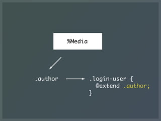
The document is a slideshow presentation about CSS architecture techniques. It discusses object-oriented CSS (OOCSS), block element modifier (BEM), CSS preprocessor extensions of BEM, responsive design patterns, style guide generators, specificity graphs, critical path CSS extraction, and the potential of web components. The presentation emphasizes building modular, reusable CSS components and establishing consistent CSS methodologies and architectures.
The document summarizes Hiroki Tani's presentation at the QCon Tokyo 2014 conference on modern CSS architecture. Some key points discussed include:
- Adopting modular approaches like OOCSS and SMACSS to separate structure from skin/style and improve maintainability.
- Using techniques like BEM naming to further decouple CSS from HTML.
- Developing reusable CSS modules and components with flexible modifiers.
- Maintaining styleguides and pattern libraries for consistent front-end development.
This document discusses modern CSS architecture patterns. It introduces concepts like OOCSS, SMACSS, and BEM for organizing CSS in a modular, scalable and maintainable way. It provides examples of how to build reusable CSS modules and maintain them through techniques like naming conventions, categorization and decoupling CSS from HTML. The presentation emphasizes goals of building predictable, reusable, maintainable and scalable CSS architecture.
The document introduces Web Components and promotes trying them. It provides examples of Web Components like <x-calendar> and <x-flipbox> that can be used to build reusable custom elements. It also describes how to create a Web Component using Polymer and shows an example <x-like> component for liking posts. The document encourages developing with Web Components as it makes front-end development more fun and modular.
The document discusses CSS preprocessors like Sass, LESS, and Stylus. It explains that preprocessors allow for features not available in regular CSS like variables, nesting, mixins and more. It provides examples of how preprocessors make CSS more modular and reusable by allowing things like defining colors as variables and creating mixins for common CSS properties. The document is intended to teach developers how to use preprocessors to write more efficient CSS code.
This document provides an overview of Object Oriented CSS (OOCSS), HTML5, and web performance. It discusses what OOCSS is, how to implement it, and why it is useful. It also briefly covers some HTML5 forms and communication features. Finally, it examines how to improve website speed. The goal is to look at these topics and discuss elegant and lean CSS as opposed to "fat sack of crap" code.
Rapid and Responsive - UX to Prototype with BootstrapJosh Jeffryes
The document discusses how to rapidly prototype user interfaces using Bootstrap, a popular front-end framework. It outlines the benefits of prototyping with Bootstrap over traditional wireframing or jumping straight to development. Prototyping with Bootstrap allows building interactive prototypes quickly in hours using responsive design principles. The prototypes can then be used as the basis for the final site design rather than being discarded. The document introduces key concepts like responsive design, prototyping, and frameworks. It also provides an overview of features in Bootstrap like grids, components, and how they can be combined for prototyping.
This document discusses progressive prototyping as a design process. It emphasizes that prototyping allows designers to fail in a low-cost environment and iterate on their designs through testing. Different levels of prototyping fidelity are presented, from simple sketches to higher-fidelity visual prototypes. The document recommends starting with simple sketches and adding more details in subsequent rounds of graybox prototyping. It also provides examples of HTML5 and CSS3 techniques that can be used to create interactive prototypes, including new HTML5 input types, CSS3 selectors, and properties for styling buttons. Overall, the document promotes prototyping as a better way to validate designs through an iterative process of testing and refining ideas.
Progressive Prototyping w/HTML5, CSS3 and jQueryTodd Zaki Warfel
The document discusses using HTML and CSS for prototyping. It provides guidance on setting expectations and only prototyping necessary features. HTML5 semantic tags and structures are covered, along with tips for styling buttons and forms with CSS3 features like gradients, shadows and rounded corners. The document also addresses browser compatibility issues and includes resources for further information.
The document discusses using HTML and CSS for prototyping. It covers HTML5 elements and structures, CSS3 features like gradients and shadows, and integrating HTML5 shiv and Modernizer to support older browsers. Recommendations include using semantic HTML5 elements instead of divs, updating reset styles, and simple jQuery examples. The goal is to leverage modern web standards for interactive prototyping.
This hands-on session will introduce you to Bootstrap, a powerful HTML/CSS framework for developing responsive web sites. Learn how to leverage the various capabilities of this framework to quickly generate HTML prototypes.
Attendees will work through creating a basic consumer web site. We will look at the new layout framework introduced in Bootstrap 3, a variety of web components, and some basic CSS styling.
Don’t worry if writing HTML is outside your comfort zone, this session will take you from the basics to creating impressive web prototypes in no time.
The document discusses best practices for developing high quality JavaScript applications. It recommends leveraging build tools like Grunt and integrating tools for linting, testing, minification and concatenation. Continuous integration with Jenkins is also suggested, as well as using IDEs and editors that support JavaScript. Architectural patterns like modules and design principles are important.
Marc Grabanski gave a whirlwind tour of Scalable Vector Graphics (SVG), covering the basics of SVG including elements, embedding SVG, features like DOM structure and filters, demos of transformations and animation, and tools like RaphaelJS. The presentation provided an overview of SVG and highlighted its advantages like scalability, accessibility, and use of HTML and CSS. Examples of various SVG elements, embedding methods, and features like filters and transformations were demonstrated.
iPhone Web Applications: HTML5, CSS3 & dev tips for iPhone developmentEstelle Weyl
Wouldn't it be cool to be able to use CSS3 and HTML5 unfettered by the lack of support in IE? Mobile developers for smart phones get to do just that!
When developing for iPhones, iPods, iPads and Android devices—mobile devices using webkit browsers—we can use CSS animations, transforms, multiple background images, rounded corners, text and box shadows, CSS columns, and HTML5 form elements.
In this session we'll use some CSS3 features learned in earlier session to create a native looking iPhone web app. We'll also cover some CSS UI and HTML5 form elements that will help you get up to speed on developing for mobile webkit. You don't have to wait any longer to use CSS3!
This document discusses different approaches for using CSS in React applications. It begins by outlining some of the issues with plain CSS, including lack of encapsulation and global namespace pollution. It then examines different methodologies for organizing CSS, including OOCSS, BEM, and SUIT CSS. Next, it covers pre/post-processors like Sass, LESS, and PostCSS. The document dives into examples of implementing styles in React using inline styles, CSS modules, Radium, and Styled Components. For each approach, it highlights the syntax and notes advantages and limitations. Finally, it closes with a brief look at emerging technologies that may impact future CSS practices.
The document provides an overview of current technologies for creating interfaces, discussing:
1. HTML, CSS and JavaScript have evolved significantly and are excellent options, supported by specifications, responsive design, CSS writing systems, and accessibility standards.
2. JavaScript has also evolved greatly since its origins, with modern features, specifications, libraries, frameworks and component-based approaches improving its capabilities and usage.
3. Most native capabilities are available to web technologies through APIs, allowing access to inputs, audio/video, location, notifications and more, narrowing the gap with native apps.
CSS in React - The Good, The Bad, and The UglyJoe Seifi
Overview of 5 frameworks to style JavaScript applications written in React including Radium, Aphrodite, CSS Modules, Styletron, and Styled Components with a Cheat Sheet of their features
This document introduces several CSS3 features including CSS3 PIE, @font-face, border-radius, border-image, rgba, box-shadow, text-shadow, linear-gradient, and columns. For each feature, it provides a brief description, examples of CSS code to implement the feature, and the browsers that support it. It also includes links to additional CSS3 resources.
Basics of Front End Web Dev PowerPointSahil Gandhi
Here are some tips for hands-on part 2:
- Add a class like .paragraph to the <p> tags containing your sentences
- Add an ID like #image to the <img> tag
- In an internal or external CSS file:
.paragraph {
color: blue;
font-size: 20px;
}
#image {
padding: 10px;
display: block;
margin: 0 auto;
}
- For background:
body {
background-color: lightgray;
}
- Play around with other CSS properties like text-align, font-family etc.
WordPress-Templates mit Twig erstellen - PHPUGFFMWalter Ebert
This document provides information about using Twig as a templating language for WordPress projects. It discusses advantages of Twig like separation of HTML and PHP. It also covers how to install and configure Twig, use Twig syntax in templates, integrate Twig with plugins like Timber, extend Twig functionality, and lists some WordPress projects that use Twig. Finally, it provides some resources for getting started with WordPress development using Composer and Twig.
The document discusses using jQuery to map database columns to DOM elements to allow easy manipulation of data in the DOM. It recommends making the DOM represent data semantics, abstracting DOM interaction, and using JSON for data transfer. Key aspects are mapping database columns to getter and setter functions for corresponding DOM elements, and using this mapping to build plugins for common operations like getting, setting, adding and deleting data in the DOM.
The document provides an overview of web development. It discusses the objectives of the workshop which are to understand the differences between web designers and developers, and gain knowledge of front-end technologies like HTML, CSS, and JavaScript. It also explains why the web is popular due to being cross-platform, writable once and usable everywhere. Key topics covered include the history of the web, definitions of web designers versus developers, front-end versus back-end development, and an overview of HTML, CSS, and JavaScript.
Scott Gledhill presents at Web Directions South Government 2008 in Canberra. You have sold the concepts of web standards to your company or boss, so what next? How do you make this work in the real workplace and what problems are you likely to encounter?
Highly Maintainable, Efficient, and Optimized CSSZoe Gillenwater
The document discusses organizing CSS for maintainability and readability. It recommends dividing CSS into separate style sheets for different media types, rule types, or site sections. Within style sheets, related rules should be indented and grouped with comments. Declarations should be formatted consistently, either each on its own line or all on one line. Class and ID names should be meaningful. Informational comments can provide context. The goal is to structure CSS so it is easily understood by anyone viewing it.
Guia de Sobrevivência JS no mundo Open SourceLeonardo Balter
The document discusses some of the challenges of using third-party JavaScript from open source libraries. It notes that JS must work across different environments like mobile, desktop and browsers, and across many browser versions. It also discusses issues like the same-origin policy and how to work around it using techniques like JSONP, CORS and postMessage. It provides tips on optimizing Google Analytics and avoiding common antipatterns like global pollution, modifying native objects and inline JavaScript. Finally, it outlines the process for publishing a jQuery plugin to the jQuery plugin registry, including creating a GitHub repository, adding a webhook and creating a manifest file.
The document discusses HTML5 and CSS3 techniques including semantic markup, document structure, CSS selectors, positioning, gradients, and data attributes. It provides examples of using HTML5 elements like <header>, <nav>, <section>, <article>, and <aside> to structure a page semantically. It also demonstrates CSS techniques like resets, floats, positioning, gradients, and encoding data in HTML5 data attributes to style and enhance pages.
The document contains information about BEM (Block Element Modifier), a methodology for structuring CSS and JavaScript code in a modular way. It discusses how blocks, elements, and modifiers are used to build user interfaces in a semantic and reusable way. Blocks represent independent components, elements are parts of blocks, and modifiers are used to change the style or behavior of blocks and elements. The document provides examples of HTML code structured according to BEM and how CSS and JavaScript can be mapped to this structure.
Bilder einbinden ist kein Thema, oder?Walter Ebert
This document discusses best practices for optimizing images on websites. It covers image formats like JPG, PNG and SVG and techniques such as lazy loading, responsive images using srcset, and optimizing tools. It also discusses alternatives to icon fonts like using SVG sprites. The overall message is on improving page performance by choosing the right image format and implementing optimization strategies.
The document discusses various HTML form elements and their proper semantic use. It begins by explaining why standards-compliant elements like buttons and anchors are preferable to custom elements for accessibility and cross-browser compatibility. Examples are given of using anchor tags and checkbox inputs semantically. Styling challenges are discussed for different browsers, with screenshots showing output. The conclusion debates whether appearance or functionality should take priority in design decisions.
A presentation that was held by Aleksandra Hristov as a guest lecturer during the class of "Advanced Web Design" at the Faculty of computer science and engineering. The presentation was held as part of the regular studies during the faculty program of computer science. The point was to give an overview on responsive design: what it is, how it can be used and how it applies in the industry.
This document discusses CSS best practices and tips. It covers topics such as CSS selectors, properties, units, responsive design, animations, and creating shapes with CSS. Code examples are provided to demonstrate CSS techniques like creating fluid layouts, using media queries, properly formatting CSS rules, and perfectly centering elements.
If you are new to CSS or have been using it for years this presentation should give you more insight into how to write and use CSS to make your web sites better.
Class 4 handout two column layout w mobile web designErin M. Kidwell
The document discusses building a two-column website layout using HTML and CSS, and making it responsive for mobile devices. It includes code for the HTML page structure with two columns, content, and navigation, as well as CSS code for styling. It then covers adding CSS media queries to modify the layout and styles at smaller screen sizes to optimize the design for mobile.
This document discusses using CSS preprocessors like Less to organize complex CSS for modern web apps. It outlines problems with traditional CSS like repetition and lack of variables/nesting. CSS preprocessors allow features like variables, mixins, nested rules and operations to organize CSS into logical, reusable components. This improves maintainability by reducing repetition and separating structure from skin. The document gives examples of how preprocessor features can be combined to build a robust CSS architecture.
The document discusses an agenda for a class on CSS (Cascading Style Sheets). The agenda includes learning what CSS is and its importance, understanding CSS grammar and syntax, linking a CSS file to HTML, creating a designer's toolbox, designing a basic webpage with CSS, and commenting in CSS. It also provides examples of CSS code, instructions on adding CSS to HTML pages, and homework of creating a basic webpage and CSS file.
This document discusses accelerated CSS techniques using tools like CSS frameworks, JavaScript, and CSS preprocessors. It introduces concepts like nested rules, variables, mixins, extends, imports, and powerful functions in CSS preprocessors that allow generating complex CSS from simpler code. CSS frameworks like Blueprint and modules for CSS3 properties are demonstrated. Image sprites are also mentioned briefly.
The document provides an overview of new features in CSS3, including new selectors, pseudo-elements, properties, and property groups. Some key points include:
- New selectors allow selecting elements based on attributes, relationships, and positions.
- New pseudo-elements and classes allow selecting elements based on their position or status.
- New properties control features like animation, transitions, transforms, backgrounds, borders, boxes, color, font, text and multi-column layouts.
- Property groups organize related properties for areas like animation, transitions, transforms and user interface.
- The document lists examples and resources for learning about each new CSS3 module.
The document discusses a scalable and modular architecture for CSS that involves categorizing styles into base, layout, module, and state categories. This approach helps make CSS more flexible, maintainable, and avoids overly specific selectors. Key aspects include naming conventions, limiting the depth of styles, and using child selectors. An example of a "media object" pattern is provided to demonstrate how abstracting styles into reusable modules can significantly reduce code. While this approach goes against some conventional wisdom, it separates structure and skin while promoting reusability.
CSS3 introduces many new features for styling web pages including selectors, RGBA color values, multi-column layouts, multiple backgrounds, word wrap, text shadows, @font-face fonts, border radii, border images, box shadows, and media queries. Browser vendors prefix new CSS properties for cross-browser support during development before the properties become standards. Common prefixes include -webkit for Chrome and Safari, -moz for Firefox, and -ms for Internet Explorer. Using vendor prefixes provides support for experimental CSS3 features across different browsers.
Front End Best Practices: A Selection of Best Practices, Tips, Tricks & Good Advice For Today’s Front End Development. Practices mentioned in this presentation range from basic principles to more advanced tools and techniques. By Holger Bartel for WomenWhoCodeHK 23/07/2014
This document provides information on creating a landing page, including recommendations for code editors, browsers, HTML tags and structures, CSS styling and selectors, responsive design, file organization, and tutorials. It recommends Sublime Text or WebStorm as code editors, Google Chrome as the browser, and covers basic HTML tags, CSS properties, Bootstrap framework, responsive design techniques, and file organization practices like splitting CSS into modules and categories. It also provides links to tutorials and resources for going further in frontend development.
This document discusses using OOScss architecture for Rails applications. It proposes dividing CSS into components, modules, and layouts. Placeholder selectors from Sass can be used to create reusable CSS modules without code bloat. Examples show issues with directly using Bootstrap for complex designs. Following OOScss principles like identifying reusable objects, using semantic HTML, and separating styles from content can help build custom designs on top of frameworks like Bootstrap more effectively.
The document provides examples of using CSS transitions and filters to add interactive effects to links and elements on web pages. Some key examples include:
1. Adding link transitions with CSS properties like color, background, and padding to change the appearance of links on hover.
2. Using CSS transitions on height, width, opacity and other properties to reveal or hide additional content on hover over various page elements like navigation items, buttons and product listings.
3. Applying CSS filters like grayscale, sepia, hue-rotate, contrast and invert to images and blocks of content and changing the filter on hover for interactive effects.
4. Demonstrating the use of CSS transitions and filters through code snippets and examples on
This document provides an introduction to using CSS to customize Omeka websites. It explains that CSS allows customization of visual elements like colors, fonts, text formatting, and positioning of items without modifying HTML. The document outlines common CSS selectors that can target elements, and provides examples of CSS properties that can be used to modify text, fonts, links, margins, padding and more. It also describes tools for identifying element IDs and classes to target elements with CSS. The overall purpose is to demonstrate how CSS can be leveraged to make Omeka sites visually appealing.
The document discusses responsive web design and some best practices. It notes that responsive design is more than just fluid grids, flexible images, and media queries - it also requires considering architecture, performance, font sizing, breakpoints, image optimization, and more. The document provides tips on using relative units like ems and rems for font sizing, organizing media queries, selecting classes, and testing responsive sites.
The document discusses CSS3 and its modular structure which allows browsers to implement features on a module-by-module basis. It outlines several new CSS3 modules including selectors, multi-column layout, borders, backgrounds, gradients, shadows, transformations and animations. The document also covers browser compatibility and implementation of CSS3 features which often require vendor prefixes.
The document discusses various techniques designers can use to improve website performance, including optimizing images, using CSS sprites, icon fonts, data URI schemes, and maintaining consistency with styles and rules. It provides examples of how to optimize images, create CSS sprites, use icon fonts, embed images via data URIs, and improve consistency. It also includes links to resources about gzip compression and gradient button styles.
Secure and Simplify IT Management with ManageEngine Endpoint Central.pdfNorthwind Technologies
ManageEngine Endpoint Central (formerly known as Desktop Central) is an all-in-one endpoint management solution designed for managing a diverse and distributed IT environment. It supports Windows, macOS, Linux, iOS, Android, and Chrome OS devices, offering a centralized approach to managing endpoints — whether they’re on-premise, remote, or hybrid.
Scalefusion Remote Access for Apple DevicesScalefusion
🔌Tried restarting.
🔁Then updating.
🔎Then Googled a fix.
And then it crashed.
Guess who has to fix it? You. And who’ll help you? - Scalefusion.
Scalefusion steps in with real-time access, not just remote hope. Support for Apple devices that support you (and them) to do more.
For more: https://scalefusion.com/remote-access-software-mac
https://scalefusion.com/es/remote-access-software-mac
https://scalefusion.com/fr/remote-access-software-mac
https://scalefusion.com/pt-br/remote-access-software-mac
https://scalefusion.com/nl/remote-access-software-mac
https://scalefusion.com/de/remote-access-software-mac
https://scalefusion.com/ru/remote-access-software-mac
Alt-lenders are scaling fast, but manual loan reconciliation is cracking under pressure. See how automation solves revenue leakage and compliance chaos.
https://www.taxilla.com/loan-repayment-reconciliation
Unlock the full potential of cloud computing with BoxLang! Discover how BoxLang’s modern, JVM-based language streamlines development, enhances productivity and simplifies scaling in a serverless environment.
How AI Can Improve Media Quality Testing Across Platforms (1).pptxkalichargn70th171
Media platforms, from video streaming to OTT and Smart TV apps, face unprecedented pressure to deliver seamless, high-quality experiences across diverse devices and networks. Ensuring top-notch Quality of Experience (QoE) is critical for user satisfaction and retention.
In today’s workplace, staying connected is more important than ever. Whether teams are remote, hybrid, or back in the office, communication and collaboration are at the heart of getting things done. But here’s the truth — outdated intranets just don’t cut it anymore.
How John started to like TDD (instead of hating it) (ViennaJUG, June'25)Nacho Cougil
Let me share a story about how John (a developer like any other) started to understand (and enjoy) writing Tests before the Production code.
We've all felt an inevitable "tedium" when writing tests, haven't we? If it's boring, if it's complicated or unnecessary? Isn't it? John thought so too, and, as much as he had heard about writing tests before production code, he had never managed to put it into practice, and even when he had tried, John had become even more frustrated at not understanding how to put it into practice outside of a few examples katas 🤷♂️
Listen to this story in which I will explain how John went from not understanding Test Driven Development (TDD) to being passionate about it... so much that now he doesn't want to work any other way 😅 ! He must have found some benefits in practising it, right? He says he has more advantages than working in any other way (e.g., you'll find defects earlier, you'll have a faster feedback loop or your code will be easier to refactor), but I'd better explain it to you in the session, right?
PS: Think of John as a random person, as if he was even the speaker of this talk 😉 !
---
Presentation shared at ViennaJUG, June'25
Feedback form:
https://bit.ly/john-like-tdd-feedback
Build enterprise-ready applications using skills you already have!PhilMeredith3
Process Tempo is a rapid application development (RAD) environment that empowers data teams to create enterprise-ready applications using skills they already have.
With Process Tempo, data teams can craft beautiful, pixel-perfect applications the business will love.
Process Tempo combines features found in business intelligence tools, graphic design tools and workflow solutions - all in a single platform.
Process Tempo works with all major databases such as Databricks, Snowflake, Postgres and MySQL. It also works with leading graph database technologies such as Neo4j, Puppy Graph and Memgraph.
It is the perfect platform to accelerate the delivery of data-driven solutions.
For more information, you can find us at www.processtempo.com
Design by Contract - Building Robust Software with Contract-First DevelopmentPar-Tec S.p.A.
In the fast-paced world of software development, code quality and reliability are paramount. This SlideShare deck, presented at PyCon Italia 2025 by Antonio Spadaro, DevOps Engineer at Par-Tec, introduces the “Design by Contract” (DbC) philosophy and demonstrates how a Contract-First Development approach can elevate your projects.
Beginning with core DbC principles—preconditions, postconditions, and invariants—these slides define how formal “contracts” between classes and components lead to clearer, more maintainable code. You’ll explore:
The fundamental concepts of Design by Contract and why they matter.
How to write and enforce interface contracts to catch errors early.
Real-world examples showcasing how Contract-First Development improves error handling, documentation, and testability.
Practical Python demonstrations using libraries and tools that streamline DbC adoption in your workflow.
How to Generate Financial Statements in QuickBooks Like a Pro (1).pdfQuickBooks Training
Are you preparing your budget for the next year, applying for a business credit card or loan, or opening a company bank account? If so, you may find QuickBooks financial statements to be a very useful tool.
These statements offer a brief, well-structured overview of your company’s finances, facilitating goal-setting and money management.
Don’t worry if you’re not knowledgeable about QuickBooks financial statements. These statements are complete reports from QuickBooks that provide an overview of your company’s financial procedures.
They thoroughly view your financial situation by including important features: income, expenses, investments, and disadvantages. QuickBooks financial statements facilitate your financial management and assist you in making wise determinations, regardless of your experience as a business owner.
Autoposting.ai Sales Deck - Skyrocket your LinkedIn's ROIUdit Goenka
1billion people scroll, only 1 % post…
That’s your opening to hijack LinkedIn—and Autoposting.ai is the unfair weapon Slideshare readers are hunting for…
LinkedIn drives 80 % of social B2B leads, converts 2× better than every other network, yet 87 % of pros still choke on the content hamster-wheel…
They burn 25 h a month writing beige posts, miss hot trends, then watch rivals scoop the deals…
Enter Autoposting.ai, the first agentic-AI engine built only for LinkedIn domination…
It spies on fresh feed data, cracks trending angles before they peak, and spins voice-perfect thought-leadership that sounds like you—not a robot…
Slides in play:
• 78 % average engagement lift in 90 days…
• 3.2× qualified-lead surge over manual posting…
• 42 % marketing time clawed back, week after week…
Real users report 5-8× ROI inside the first quarter, some crossing $1 M ARR six months faster…
Why does it hit harder than Taplio, Supergrow, generic AI writers?
• Taplio locks key features behind $149+ tiers… Autoposting gives you everything at $29…
• Supergrow churns at 20 % because “everyone” is no-one… Autoposting laser-targets • • LinkedIn’s gold-vein ICPs and keeps them glued…
• ChatGPT needs prompts, edits, scheduling hacks… Autoposting researches, writes, schedules—and optimizes send-time in one sweep…
Need social proof?
G2 reviews scream “game-changer”… Agencies slash content production 80 % and triple client capacity… CXOs snag PR invites and investor DMs after a single week of daily posts… Employee advocates hit 8× reach versus company pages and pump 25 % more SQLs into the funnel…
Feature bullets for the skim-reader:
• Agentic Research Engine—tracks 27+ data points, finds gaps your rivals ignore…
• Real Voice Match—your tone, slang, micro-jokes, intact…
• One-click Multiplatform—echo winning posts to Twitter, Insta, Facebook…
• Team Workspaces—spin up 10 seats without enterprise red tape…
• AI Timing—drops content when your buyers actually scroll, boosting first-hour velocity by up to 4×…
Risk? Zero…
Free 7-day trial, 90-day results guarantee—hit 300 % ROI or walk away… but the clock is ticking while competitors scoop your feed…
So here’s the ask:
Swipe down, smash the “Download” or “Try Now” button, and let Autoposting.ai turn Slideshare insights into pipeline—before today’s trending topic vanishes…
The window is open… How loud do you want your LinkedIn megaphone?
List Unfolding - 'unfold' as the Computational Dual of 'fold', and how 'unfol...Philip Schwarz
In this deck we look at the following:
* how unfolding lists is the computational dual of folding lists
* different variants of the function for unfolding lists
* how they relate to the iterate function
How to purchase, license and subscribe to Microsoft Azure_PDF.pdfvictordsane
Microsoft Azure is a cloud platform that empowers businesses with scalable computing, data analytics, artificial intelligence, and cybersecurity capabilities.
Arguably the biggest hurdle for most organizations is understanding how to get started.
Microsoft Azure is a consumption-based cloud service. This means you pay for what you use. Unlike traditional software, Azure resources (e.g., VMs, databases, storage) are billed based on usage time, storage size, data transfer, or resource configurations.
There are three primary Azure purchasing models:
• Pay-As-You-Go (PAYG): Ideal for flexibility. Billed monthly based on actual usage.
• Azure Reserved Instances (RI): Commit to 1- or 3-year terms for predictable workloads. This model offers up to 72% cost savings.
• Enterprise Agreements (EA): Best suited for large organizations needing comprehensive Azure solutions and custom pricing.
Licensing Azure: What You Need to Know
Azure doesn’t follow the traditional “per seat” licensing model. Instead, you pay for:
• Compute Hours (e.g., Virtual Machines)
• Storage Used (e.g., Blob, File, Disk)
• Database Transactions
• Data Transfer (Outbound)
Purchasing and subscribing to Microsoft Azure is more than a transactional step, it’s a strategic move.
Get in touch with our team of licensing experts via info@q-advise.com to further understand the purchasing paths, licensing options, and cost management tools, to optimize your investment.
AI-ASSISTED METAMORPHIC TESTING FOR DOMAIN-SPECIFIC MODELLING AND SIMULATIONmiso_uam
AI-ASSISTED METAMORPHIC TESTING FOR DOMAIN-SPECIFIC MODELLING AND SIMULATION (plenary talk at ANNSIM'2025)
Testing is essential to improve the correctness of software systems. Metamorphic testing (MT) is an approach especially suited when the system under test lacks oracles, or they are expensive to compute. However, building an MT environment for a particular domain (e.g., cloud simulation, automated driving simulation, production system simulation, etc) requires substantial effort.
To alleviate this problem, we propose a model-driven engineering approach to automate the construction of MT environments, which is especially useful to test domain-specific modelling and simulation systems. Starting from a meta-model capturing the domain concepts, and a description of the domain execution environment, our approach produces an MT environment featuring comprehensive support for the MT process. This includes the definition of domain-specific metamorphic relations, their evaluation, detailed reporting of the testing results, and the automated search-based generation of follow-up test cases.
In this talk, I presented the approach, along with ongoing work and perspectives for integrating intelligence assistance based on large language models in the MT process. The work is a joint collaboration with Pablo Gómez-Abajo, Pablo C. Cañizares and Esther Guerra from the miso research group and Alberto Núñez from UCM.
31. “
”Not all semantics need to be content-derived. Class names cannot be “unsemantic”.
Whatever names are being used: they have meaning, they have purpose.
Nicolas Gallagher
http://nicolasgallagher.com/about-html-semantics-front-end-architecture/
45. .mod_listType1 section,.mod_listType3 section,.mod_listType4
section,.mod_listType5 section,.mod_listType7 section,.mod_listType8
section{margin-bottom:1em}.mod_listType1 h1,.mod_listType3
h1,.mod_listType4 h1,.mod_listType5 h1,.mod_listType7 h1,.mod_listType8
h1{margin:0 0 .5em .5em;font-size:15px;-webkit-text-shadow:0 1px 0
rgba(255,255,255,.75);text-shadow:0 1px 0
rgba(255,255,255,.75)}.mod_listType1 ul,.mod_listType3
ul,.mod_listType4 ul,.mod_listType5 ul,.mod_listType7 ul,.mod_listType8
ul{background-color:#fff;border:1px solid
#c3c3c3;overflow:hidden;border-radius:12px}.mod_listType1 ul
li,.mod_listType3 ul li,.mod_listType4 ul li,.mod_listType5 ul
li,.mod_listType7 ul li,.mod_listType8 ul li{border-top:#C3C3C2 1px
solid;margin-top:-1px;margin-bottom:1px;font-size:16px}.mod_listType1
ul li:first-child a.disable,.mod_listType1 ul li:last-child
a.disable,.mod_listType3 ul li:first-child a.disable,.mod_listType3 ul
li:last-child a.disable,.mod_listType4 ul li:first-child
a.disable,.mod_listType4 ul li:last-child a.disable,.mod_listType5 ul
46. .mod_listType1 section,.mod_listType3 section,.mod_listType4
section,.mod_listType5 section,.mod_listType7 section,.mod_listType8
section{margin-bottom:1em}.mod_listType1 h1,.mod_listType3
h1,.mod_listType4 h1,.mod_listType5 h1,.mod_listType7 h1,.mod_listType8
h1{margin:0 0 .5em .5em;font-size:15px;-webkit-text-shadow:0 1px 0
rgba(255,255,255,.75);text-shadow:0 1px 0
rgba(255,255,255,.75)}.mod_listType1 ul,.mod_listType3
ul,.mod_listType4 ul,.mod_listType5 ul,.mod_listType7 ul,.mod_listType8
ul{background-color:#fff;border:1px solid
#c3c3c3;overflow:hidden;border-radius:12px}.mod_listType1 ul
li,.mod_listType3 ul li,.mod_listType4 ul li,.mod_listType5 ul
li,.mod_listType7 ul li,.mod_listType8 ul li{border-top:#C3C3C2 1px
solid;margin-top:-1px;margin-bottom:1px;font-size:16px}.mod_listType1
ul li:first-child a.disable,.mod_listType1 ul li:last-child
a.disable,.mod_listType3 ul li:first-child a.disable,.mod_listType3 ul
li:last-child a.disable,.mod_listType4 ul li:first-child
a.disable,.mod_listType4 ul li:last-child a.disable,.mod_listType5 ul
440kbgziped
50. See also:
CSS: Using every declaration just once
YACP
https://developers.google.com/speed/articles/optimizing-css
http://morishitter.hatenablog.com/entry/2014/12/02/000135
http://hail2u.net/blog/webdesign/oocss-drawbacks-and-gifts-of-every-declaration-just-once.html
72. /*doc
---
title: Buttons
name: button
category: Base CSS
---
Button styles can be applied to any element. Typically you'll
want to
use either a `<button>` or an `<a>` element:
```html_example
<button class="btn btnDefault">Click</button>
<a class="btn btnPrimary" href="http://trulia.com">Trulia!</a>
```
*/
73. /*doc
---
title: Buttons
name: button
category: Base CSS
---
Button styles can be applied to any element. Typically you'll
want to
use either a `<button>` or an `<a>` element:
```html_example
<button class="btn btnDefault">Click</button>
<a class="btn btnPrimary" href="http://trulia.com">Trulia!</a>
```
*/