This document summarizes a presentation about MongoDB given by Sean Laurent of StudyBlue, Inc. It introduces MongoDB and its features, including its document-oriented data model, flexible schemas, querying and updating capabilities, indexing, drivers, replication and sharding for scalability. Useful MongoDB tools are also discussed like the mongo shell, mongostat, mongotop and MMS monitoring. The document concludes with MongoDB's strengths like horizontal scaling and rapidly evolving schemas, and weaknesses like not being a drop-in replacement for SQL and limitations around transactions.
StudyBlue provides an online service for students to store, study, and share course materials. They implemented MongoDB to address scaling issues with their PostgreSQL database as usage and data grew rapidly. MongoDB allowed for horizontal scaling across shards for improved write performance and high availability. Key challenges included adjusting to the document model versus relational, sharding and rebalancing data, and managing replication lag in an eventually consistent system.
The document discusses different database types including relational (MySQL, PostgreSQL), NoSQL (MongoDB, Redis, Couchbase, Apache Solr), and caching (Memcached) databases. It provides an overview of their properties and usage tips, as well as important concepts like CAP theorem, ACID, BASE, and NewSQL. The document encourages using the right database for the job and embracing failure when building distributed systems.
This document introduces CSS Grid Layout and provides examples of how to implement a grid using CSS Grid properties. Key points include:
- CSS Grid Layout allows positioning of elements within a grid system defined entirely through CSS. This avoids layout hacks and redundant markup needed with previous methods.
- Grid properties like grid-template-columns, grid-template-rows define the structure of the grid. grid-column, grid-row position elements within the grid.
- Named lines, grid areas, and media queries allow defining different grid layouts for different screen sizes without changing markup order.
- Repeating tracks, flexible track sizes (fr units), and line spanning provide powerful grid configuration options.
This document discusses the 960 Grid System, a CSS framework that utilizes a 12-column grid layout with widths of 60px each and gutters of 20px. It can be used for rapid prototyping and integrated into production environments. The document provides code examples of typical grid layouts and nested grids. It also discusses related topics like fixed-width grids, grid generators, and myths around CSS best practices.
Accelerated grid theming using NineSixty (Dallas Drupal Days 2011)Four Kitchens
Grid systems provide a standardized approach to web layout using a series of columns. The 960 Grid System is a popular grid framework that uses 12 or 16 columns that are each 60 or 40 pixels wide respectively. It provides CSS classes to define grid widths and positions. The NineSixty Drupal theme ported the 960 Grid System to Drupal and added features like dynamic grid widths, debugging tools, and content-first layout capabilities.
Accelerated grid theming using NineSixty (DrupalCamp Dallas)Four Kitchens
Nathan Smith and Todd Nienkerk presented on using grid systems to accelerate website theming in Drupal. Grid systems have been used in design for nearly a century to bring order and flexibility to page layouts. In web design, grid systems take the form of CSS frameworks that provide standard rules and shortcuts for building layouts through a column-based structure. The 960 grid system, which was created to streamline web development, works on a 12- or 16-column structure within a 960px wide container, allowing designers to quickly prototype and develop responsive, production-ready layouts.
Accelerated grid theming using NineSixty (Drupal Design Camp Boston 2009)Four Kitchens
The document summarizes the NineSixty grid theming system for Drupal. It discusses how NineSixty builds upon the existing 960.gs grid framework by adding improvements like content-first layout, dynamic grid widths based on context, debugging tools, and right-to-left language support. It also provides an overview of how grid systems work in general, including the use of columns, gutters, containers, and classes to define grid widths and positions.
Accelerated grid theming using NineSixty (Drupal Design Camp Boston 2010)Four Kitchens
This document discusses accelerated theming using the NineSixty grid system. It provides an overview of grid systems and their history, explains how grid systems work by dividing content into columns and gutters, and provides examples of layouts that can be created using a 12-column grid. It specifically examines the 960 grid system, how it divides content into 60px columns, centers content at 960px wide, and can be used with both 12-column and 16-column layouts simultaneously.
Accelerated grid theming using NineSixty (DrupalCon San Francisco 2010)Four Kitchens
NineSixty is a Drupal theme based on the 960 grid system that provides accelerated theming. It includes improvements such as content-first layout using "push" and "pull" classes, dynamic grid widths using the ns() function, debugging tools, and RTL language support. NineSixty's grid-based approach helps designers achieve consistency while saving time through reusable code.
Accelerated grid theming using NineSixty (DrupalCamp LA 2011)Four Kitchens
This document summarizes the Accelerated grid theming using NineSixty presentation given by Todd Nienkerk at DrupalCamp LA. It discusses the history of grid systems in design and their adoption on the web. Grid systems use columns, gutters, and nested divs to create flexible, standardized page layouts. The document then explains how the popular 960.gs grid framework works, including its 12- and 16- column options, CSS classes, and markup.
This document provides an overview and comparison of various CSS grid frameworks and responsive grid systems. It discusses the history and evolution of grids from early non-responsive grids like Blueprint and 960 Grid to modern responsive frameworks like Bootstrap, Foundation and UI Kit. Each framework is briefly described, including its approach to responsive design, included features like SASS/LESS support and columns, and typical breakpoint sizes. The document also mentions some lesser known grids like Skeleton, Neat, Susy, Simple Grid and 996 Grid.
MW2011 Grid-based Web Design presentationCharlie Moad
This document discusses the benefits of using grid-based web design. It provides a brief history of grid design and influential designers like Emil Ruder and Josef Müller-Brockmann. Grids offer benefits to designers, developers, and content authors by providing structure and consistency. A case study of redesigning the Indianapolis Museum of Art's website using a grid is presented. Tools for implementing grids are also reviewed. The document argues that grids will remain a relevant design approach as new devices emerge.
Drupal theming using the 960.gs grid systemFour Kitchens
This document summarizes a presentation on using the 960 grid system for Drupal theming. It discusses the history of grid systems in design, how grid systems work on the web using CSS frameworks, and provides specific details on how the popular 960 grid system can be implemented in Drupal themes using its grid classes and layout options.
The document discusses a 5-step process for using a CSS grid framework called the 960 Grid System to design a website. Step 1 involves paper prototyping to define expectations. Step 2 is creating an unstyled semantic structure using the 960 Grid. Step 3 adds graphical elements in Photoshop. Step 4 finalizes production by slicing images and applying CSS. Step 5 focuses on testing across browsers before client delivery. Using this process and a CSS framework provides benefits like visual consistency and reduced cross-browser issues.
The document provides an overview of CSS Grid Layout, a new two-dimensional layout system for CSS. It discusses the evolution of web layout techniques, basics of the CSS Grid model including grid lines, tracks, cells and areas. It covers grid properties for defining templates, placing items, and alignment. Examples demonstrate common layout patterns like holy grail, nested grids, and named lines. Resources for further learning about CSS Grid are also included.
The document discusses Nathan Smith's presentation on the 960 Grid System. Some key points:
- Nathan Smith is the principal UI architect at projekt202 and advocates for understanding frameworks as tools rather than "black boxes".
- The 960 Grid System provides commonly used dimensions based on a 960 pixel width with 12 or 16 column variants that can be used separately or together.
- Code examples show how the grid system divides pages into columns and allows for nested grids and column rearranging with CSS classes.
CSS3 for web designer - How to design a visually appealing websiteMario Hernandez
This document provides an introduction to visually appealing web design using CSS3. It discusses the 960 grid system as a framework for streamlining web development workflow. Key elements of great design such as color, texture, white space and typography are covered. The document also outlines supported CSS3 properties that are widely adopted like border-radius, text-shadow and box-shadow. Hands-on practice with these techniques is encouraged along with additional resources for further learning.
CSS Frameworks: Faster Layout, Consistent ResultsSteve Hong
CSS frameworks allow developers to quickly prototype table-less CSS layouts using pre-made solutions to common problems. This presentation reviews some of the major CSS frameworks and how they can be used to save time and effort in the website development workflow. The discussion will touch on grid design with 960gs, table-less forms with Formy and resetting browser default CSS with YUI, among other topics.
Drupal Theming with CSS Frameworks (960grid)Ryan Cross
The document discusses CSS frameworks and grid-based design. It introduces CSS frameworks as sets of tools and best practices that abstract routine tasks into reusable modules. Grid-based design uses a grid system to organize content spatially on a page in a clear, meaningful way for users. The document examines specific CSS frameworks, Blueprint and 960gs, and discusses advantages and disadvantages of working with grids, including how grids can facilitate creativity but also impose restrictions. It also explores using the 960gs framework with the Drupal CMS.
There is often a vocabulary gap between designers an developers, who should aim towards a ubiquitous way of conversing about colours, typography, viewport sizes, or the responsive grid system of a digital product… To bridge this gap at the Guardian, we use a CSS pre-processor as a communication enabler through the abstractions it allows us to put in place.
Talk given at re:revelop 2014 in Bournemouth on 22/08/2014: http://redevelop.io/
This document discusses CSS Grid Layout and provides an introduction to its key concepts and terminology. It explains how CSS Grid allows for two-dimensional page layouts with precise positioning of elements. Examples are given to demonstrate how to define a grid, position elements, use grid areas, gaps, repeats, and responsive design. CSS Grid is positioned as a better solution than older methods for complex page layouts, while Flexbox remains useful for small components.
Mario Hernandez presented on CSS frameworks and progressive enhancements with CSS3. The presentation covered choosing the right CSS framework based on factors like project requirements, fluid grid systems, responsiveness, documentation, and maintenance. Frameworks like Foundation and 960 Grid System were showcased. Grid systems use rows and columns to layout content. Progressive enhancements with CSS3 focus on widely supported properties to enhance the user experience without sacrificing functionality. Additional resources on grids, CSS3, and responsive design were provided.
Grid systems provide standardized rules and shortcuts for building a website's layout using CSS frameworks. They use a column-based structure where page regions like headers and sidebars are defined by their column width. Common grid systems include 960.gs and Blueprint, which use 12 or 16 column layouts. Grid systems help save time and reduce frustration by providing reusable code for common layout tasks and avoiding the need to continually reinvent layout solutions.
Adtran’s SDG 9000 Series brings high-performance, cloud-managed Wi-Fi 7 to homes, businesses and public spaces. Built on a unified SmartOS platform, the portfolio includes outdoor access points, ceiling-mount APs and a 10G PoE router. Intellifi and Mosaic One simplify deployment, deliver AI-driven insights and unlock powerful new revenue streams for service providers.
Cyber Security Legal Framework in Nepal.pptxGhimire B.R.
The presentation is about the review of existing legal framework on Cyber Security in Nepal. The strength and weakness highlights of the major acts and policies so far. Further it highlights the needs of data protection act .
Droidal: AI Agents Revolutionizing HealthcareDroidal LLC
Droidal’s AI Agents are transforming healthcare by bringing intelligence, speed, and efficiency to key areas such as Revenue Cycle Management (RCM), clinical operations, and patient engagement. Built specifically for the needs of U.S. hospitals and clinics, Droidal's solutions are designed to improve outcomes and reduce administrative burden.
Through simple visuals and clear examples, the presentation explains how AI Agents can support medical coding, streamline claims processing, manage denials, ensure compliance, and enhance communication between providers and patients. By integrating seamlessly with existing systems, these agents act as digital coworkers that deliver faster reimbursements, reduce errors, and enable teams to focus more on patient care.
Droidal's AI technology is more than just automation — it's a shift toward intelligent healthcare operations that are scalable, secure, and cost-effective. The presentation also offers insights into future developments in AI-driven healthcare, including how continuous learning and agent autonomy will redefine daily workflows.
Whether you're a healthcare administrator, a tech leader, or a provider looking for smarter solutions, this presentation offers a compelling overview of how Droidal’s AI Agents can help your organization achieve operational excellence and better patient outcomes.
A free demo trial is available for those interested in experiencing Droidal’s AI Agents firsthand. Our team will walk you through a live demo tailored to your specific workflows, helping you understand the immediate value and long-term impact of adopting AI in your healthcare environment.
To request a free trial or learn more:
https://droidal.com/
UiPath Community Zurich: Release Management and Build PipelinesUiPathCommunity
Ensuring robust, reliable, and repeatable delivery processes is more critical than ever - it's a success factor for your automations and for automation programmes as a whole. In this session, we’ll dive into modern best practices for release management and explore how tools like the UiPathCLI can streamline your CI/CD pipelines. Whether you’re just starting with automation or scaling enterprise-grade deployments, our event promises to deliver helpful insights to you. This topic is relevant for both on-premise and cloud users - as well as for automation developers and software testers alike.
📕 Agenda:
- Best Practices for Release Management
- What it is and why it matters
- UiPath Build Pipelines Deep Dive
- Exploring CI/CD workflows, the UiPathCLI and showcasing scenarios for both on-premise and cloud
- Discussion, Q&A
👨🏫 Speakers
Roman Tobler, CEO@ Routinuum
Johans Brink, CTO@ MvR Digital Workforce
We look forward to bringing best practices and showcasing build pipelines to you - and to having interesting discussions on this important topic!
If you have any questions or inputs prior to the event, don't hesitate to reach out to us.
This event streamed live on May 27, 16:00 pm CET.
Check out all our upcoming UiPath Community sessions at:
👉 https://community.uipath.com/events/
Join UiPath Community Zurich chapter:
👉 https://community.uipath.com/zurich/
Dev Dives: System-to-system integration with UiPath API WorkflowsUiPathCommunity
Join the next Dev Dives webinar on May 29 for a first contact with UiPath API Workflows, a powerful tool purpose-fit for API integration and data manipulation!
This session will guide you through the technical aspects of automating communication between applications, systems and data sources using API workflows.
📕 We'll delve into:
- How this feature delivers API integration as a first-party concept of the UiPath Platform.
- How to design, implement, and debug API workflows to integrate with your existing systems seamlessly and securely.
- How to optimize your API integrations with runtime built for speed and scalability.
This session is ideal for developers looking to solve API integration use cases with the power of the UiPath Platform.
👨🏫 Speakers:
Gunter De Souter, Sr. Director, Product Manager @UiPath
Ramsay Grove, Product Manager @UiPath
This session streamed live on May 29, 2025, 16:00 CET.
Check out all our upcoming UiPath Dev Dives sessions:
👉 https://community.uipath.com/dev-dives-automation-developer-2025/
Adtran’s new Ensemble Cloudlet vRouter solution gives service providers a smarter way to replace aging edge routers. With virtual routing, cloud-hosted management and optional design services, the platform makes it easy to deliver high-performance Layer 3 services at lower cost. Discover how this turnkey, subscription-based solution accelerates deployment, supports hosted VNFs and helps boost enterprise ARPU.
With Claude 4, Anthropic redefines AI capabilities, effectively unleashing a ...SOFTTECHHUB
With the introduction of Claude Opus 4 and Sonnet 4, Anthropic's newest generation of AI models is not just an incremental step but a pivotal moment, fundamentally reshaping what's possible in software development, complex problem-solving, and intelligent business automation.
AI in Java - MCP in Action, Langchain4J-CDI, SmallRye-LLM, Spring AIBuhake Sindi
This is the presentation I gave with regards to AI in Java, and the work that I have been working on. I've showcased Model Context Protocol (MCP) in Java, creating server-side MCP server in Java. I've also introduced Langchain4J-CDI, previously known as SmallRye-LLM, a CDI managed too to inject AI services in enterprise Java applications. Also, honourable mention: Spring AI.
As data privacy regulations become more pervasive across the globe and organizations increasingly handle and transfer (including across borders) meaningful volumes of personal and confidential information, the need for robust contracts to be in place is more important than ever.
This webinar will provide a deep dive into privacy contracting, covering essential terms and concepts, negotiation strategies, and key practices for managing data privacy risks.
Whether you're in legal, privacy, security, compliance, GRC, procurement, or otherwise, this session will include actionable insights and practical strategies to help you enhance your agreements, reduce risk, and enable your business to move fast while protecting itself.
This webinar will review key aspects and considerations in privacy contracting, including:
- Data processing addenda, cross-border transfer terms including EU Model Clauses/Standard Contractual Clauses, etc.
- Certain legally-required provisions (as well as how to ensure compliance with those provisions)
- Negotiation tactics and common issues
- Recent lessons from recent regulatory actions and disputes
Protecting Your Sensitive Data with Microsoft Purview - IRMS 2025Nikki Chapple
Session | Protecting Your Sensitive Data with Microsoft Purview: Practical Information Protection and DLP Strategies
Presenter | Nikki Chapple (MVP| Principal Cloud Architect CloudWay) & Ryan John Murphy (Microsoft)
Event | IRMS Conference 2025
Format | Birmingham UK
Date | 18-20 May 2025
In this closing keynote session from the IRMS Conference 2025, Nikki Chapple and Ryan John Murphy deliver a compelling and practical guide to data protection, compliance, and information governance using Microsoft Purview. As organizations generate over 2 billion pieces of content daily in Microsoft 365, the need for robust data classification, sensitivity labeling, and Data Loss Prevention (DLP) has never been more urgent.
This session addresses the growing challenge of managing unstructured data, with 73% of sensitive content remaining undiscovered and unclassified. Using a mountaineering metaphor, the speakers introduce the “Secure by Default” blueprint—a four-phase maturity model designed to help organizations scale their data security journey with confidence, clarity, and control.
🔐 Key Topics and Microsoft 365 Security Features Covered:
Microsoft Purview Information Protection and DLP
Sensitivity labels, auto-labeling, and adaptive protection
Data discovery, classification, and content labeling
DLP for both labeled and unlabeled content
SharePoint Advanced Management for workspace governance
Microsoft 365 compliance center best practices
Real-world case study: reducing 42 sensitivity labels to 4 parent labels
Empowering users through training, change management, and adoption strategies
🧭 The Secure by Default Path – Microsoft Purview Maturity Model:
Foundational – Apply default sensitivity labels at content creation; train users to manage exceptions; implement DLP for labeled content.
Managed – Focus on crown jewel data; use client-side auto-labeling; apply DLP to unlabeled content; enable adaptive protection.
Optimized – Auto-label historical content; simulate and test policies; use advanced classifiers to identify sensitive data at scale.
Strategic – Conduct operational reviews; identify new labeling scenarios; implement workspace governance using SharePoint Advanced Management.
🎒 Top Takeaways for Information Management Professionals:
Start secure. Stay protected. Expand with purpose.
Simplify your sensitivity label taxonomy for better adoption.
Train your users—they are your first line of defense.
Don’t wait for perfection—start small and iterate fast.
Align your data protection strategy with business goals and regulatory requirements.
💡 Who Should Watch This Presentation?
This session is ideal for compliance officers, IT administrators, records managers, data protection officers (DPOs), security architects, and Microsoft 365 governance leads. Whether you're in the public sector, financial services, healthcare, or education.
🔗 Read the blog: https://nikkichapple.com/irms-conference-2025/
Content and eLearning Standards: Finding the Best Fit for Your-TrainingRustici Software
Tammy Rutherford, Managing Director of Rustici Software, walks through the pros and cons of different standards to better understand which standard is best for your content and chosen technologies.
cloudgenesis cloud workshop , gdg on campus mitasiyaldhande02
Step into the future of cloud computing with CloudGenesis, a power-packed workshop curated by GDG on Campus MITA, designed to equip students and aspiring cloud professionals with hands-on experience in Google Cloud Platform (GCP), Microsoft Azure, and Azure Al services.
This workshop offers a rare opportunity to explore real-world multi-cloud strategies, dive deep into cloud deployment practices, and harness the potential of Al-powered cloud solutions. Through guided labs and live demonstrations, participants will gain valuable exposure to both platforms- enabling them to think beyond silos and embrace a cross-cloud approach to
development and innovation.
SAP Sapphire 2025 ERP1612 Enhancing User Experience with SAP Fiori and AIPeter Spielvogel
Explore how AI in SAP Fiori apps enhances productivity and collaboration. Learn best practices for SAPUI5, Fiori elements, and tools to build enterprise-grade apps efficiently. Discover practical tips to deploy apps quickly, leveraging AI, and bring your questions for a deep dive into innovative solutions.
Master tester AI toolbox - Kari Kakkonen at Testaus ja AI 2025 ProfessioKari Kakkonen
My slides at Professio Testaus ja AI 2025 seminar in Espoo, Finland.
Deck in English, even though I talked in Finnish this time, in addition to chairing the event.
I discuss the different motivations for testing to use AI tools to help in testing, and give several examples in each categories, some open source, some commercial.
DePIN = Real-World Infra + Blockchain
DePIN stands for Decentralized Physical Infrastructure Networks.
It connects physical devices to Web3 using token incentives.
How Does It Work?
Individuals contribute to infrastructure like:
Wireless networks (e.g., Helium)
Storage (e.g., Filecoin)
Sensors, compute, and energy
They earn tokens for their participation.
Introducing the OSA 3200 SP and OSA 3250 ePRCAdtran
Adtran's latest Oscilloquartz solutions make optical pumping cesium timing more accessible than ever. Discover how the new OSA 3200 SP and OSA 3250 ePRC deliver superior stability, simplified deployment and lower total cost of ownership. Built on a shared platform and engineered for scalable, future-ready networks, these models are ideal for telecom, defense, metrology and more.
3. what is a grid?“…they’re an invisible foundation used to achieve visual cohesion in magazine and newspaper page design and layout. They essentially amount to a lattice that divides horizontal and vertical space in consistent units where text, headlines, images, and advertising can be placed.- Raj Dashtutsplus.com
4. come again?“…a “grid” is a set number of “columns” and intervening “gutters” inside a “container” of any width and flexibility. The container can have optional “side-gutters” that pad the grid from the surrounding “document”.…” – OddBirds - oddbird.nettaken from http://susy.oddbird.net/
5. why use one?Rapid developmentCross-browserCohesionSEO ImpactUX is using them!
10. blueprint-csspros:open sourcecustom grid-ablea lot of tutorials to start off with (even some in spanish)dash based class namesruby based (plugin ready)cons:960 != 1000px, needs to be customizedbloated (forms, typography)?
11. blueprint-css@github:last commit on: 06/06/11Watched by: 4,365 peopleforked: 385 timesHNR grid:2,43kb – base framework (compressed)3,75kb – html, 81 lines (includes content and css)6,18kb total (on page css can be externalized and compressed)
12. 960.gspros:open sourcecustom grid-ablevery well documentedwidely used: drupal, sony music, twitter (blog), woothemes, etc.pre-made templates availablealfa/omegacons:960 != 1000px, needs to be customizednot widely used as blueprintunderscore based class names
13. 960.gs@github:last commit on: 06/24/11Watched by: 1,397 peopleforked: 105 timesHNR grid:2,52kb – base framework (compressed)3,79kb – html, 81 lines (includes content and css)6,31kb total (on page css can be externalized and compressed)
14. YAMLprosstable (more than 5+ years)form styles readytemplates availableconsold (supports IE 5.5+)shady CSS techniqueshtml * {font-size:100.01% }* html body * { overflow:visible }BIG learning curveawful naming conventionnot straightforward at alllicensing issuesrequires additional css files for IEdiv order can’t be changednot very usedrequires heavy nesting of divs
15. YAMLNot in githubSingle developerSelf hostedLast Update 3.3.1 in 06/2011HNR GridDiscarted due to complexity and weight.23,7kb – base framework (can’t be compressed due to hacks)
16. StackLayoutPros:Lightweight (1,1kb when compressed)Based on inline-block, instead of floats (no clearfix)Elements won’t have more than 1 grid class at the timeWhen properly used, content can clear inner floats and have full widthConsVirtually unusedp.firstChild>a:StackLayoutPercentage Based (not column based), so we only have ‘columns’ of: {50%}, {33%, 66%}, {25%, 75%}, {20%, 40%, 60%, 80%}Adds extra element to wrap contentNo gutter.No whitespaced columns
17. StackLayout@github:last commit on: 07/06/11Watched by: 127 peopleforked: 11 timesHNR GridImpossible to get the same layout only using the framework.1,1kb – base framework (compressed)4,04kb – html, 88lines (includes content and css)5,14kb total (on page css can be externalized and compressed)
18. GGSPros:Responsive (pseudo)Golden griletConsDisconnect between the frameworks column count and mockups (16 cols based).Works only with pair multiplesMedia-query dependent, doesn’t provide reliable IE7/IE8 fallback.Can’t be called a full-time grid framework.
19. GGS@githublast commit on: 08/27/11Watched by: 463 peopleforked: 31 timesHNR GridImpossible to get the same layout only using the framework.6kb – base framework (compressed)3,4kb – html, 67lines (includes content and css)9,4kb total (on page css can be externalized and compressed)
20. 1140pxPros:Responsive (uses JS/CSS for IE)Uses concept of ‘rows’.Cons12 Column based.Not customizable.Lacks pull/push and empty columns.
21. 1140px@githublast commit on: 08/27/11Watched by: 463 peopleforked: 31 timesHNR GridImpossible to get the same layout only using the framework.3,89kb – base framework (externalizing media queries)4,23kb – html, 89 lines (includes content and css)8,12kb total (on page css can be externalized and compressed)
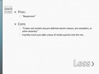
22. LessPros:“Responsive”Cons“It does not contain any predefined column classes, pre-compilers, or other wizardry.”It pretty much just adds a base of media queries into the mix.
23. Less@githublast commit on: 08/27/11Watched by: 463 peopleforked: 31 timesHNR GridImpossible to get the same layout only using the framework.3,89kb – base framework (externalizing media queries)4,23kb – html, 89 lines (includes content and css)8,12kb total (on page css can be externalized and compressed)
25. columnal!githubSingle developerSelf hostedLast version: 0.85, no changelogHNR GridGot close of achieving the same layout but not quite.13,53kb – base framework (compressed)4,24kb – html, 98 lines (includes content and css)17,77kb total (on page css can be externalized and compressed)
27. inuitcss@githublast commit on: 06/30/11Watched by: 331 peopleforked: 27 timesHNR Grid0,5kb – base framework (compressed)3,83kb – html, 89 lines (includes content and css)4,13kb total (on page css can be externalized and compressed)
28. SusyPros:Made for CompassCustomizableBuilt-in grillet!Adds new elements into standard grids (ie pads)More ‘semantic’.ConsLack of cols classes can make debugging hard.Contextis tricky.All elements must be declared inside the gridNo pull/push
29. Susy@githublast commit on: 06/14/11Watched by: 269 peopleforked: 16 timesHNR Grid8kb – base framework (compressed)*3,2kb – html, 66 lines (includes content and css)*11,2kb total* Susy requires that all CSS is contained in SASS files,thus the framework includes some styling.