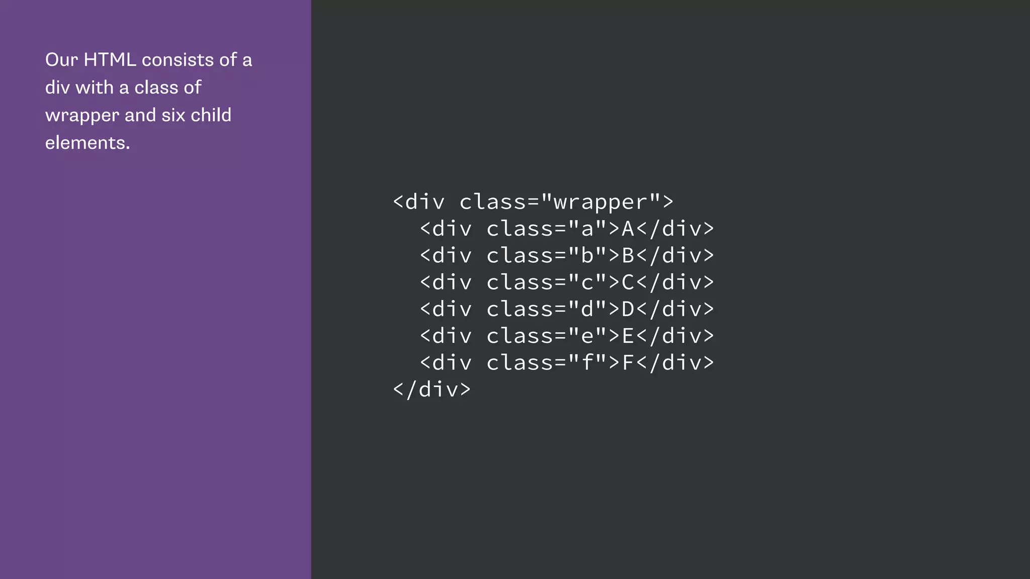
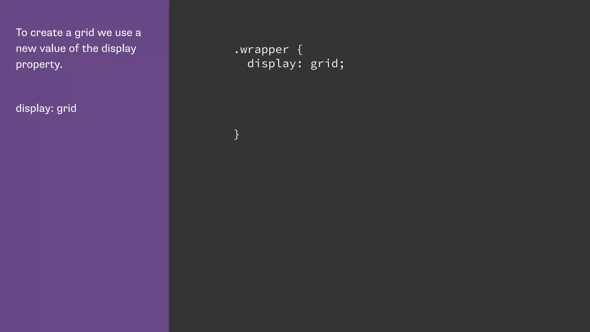
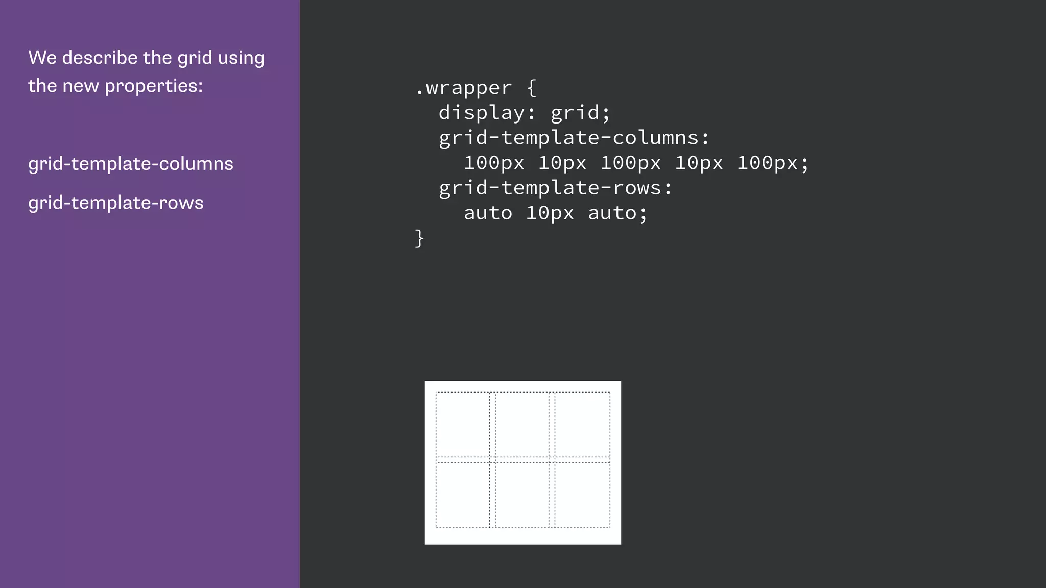
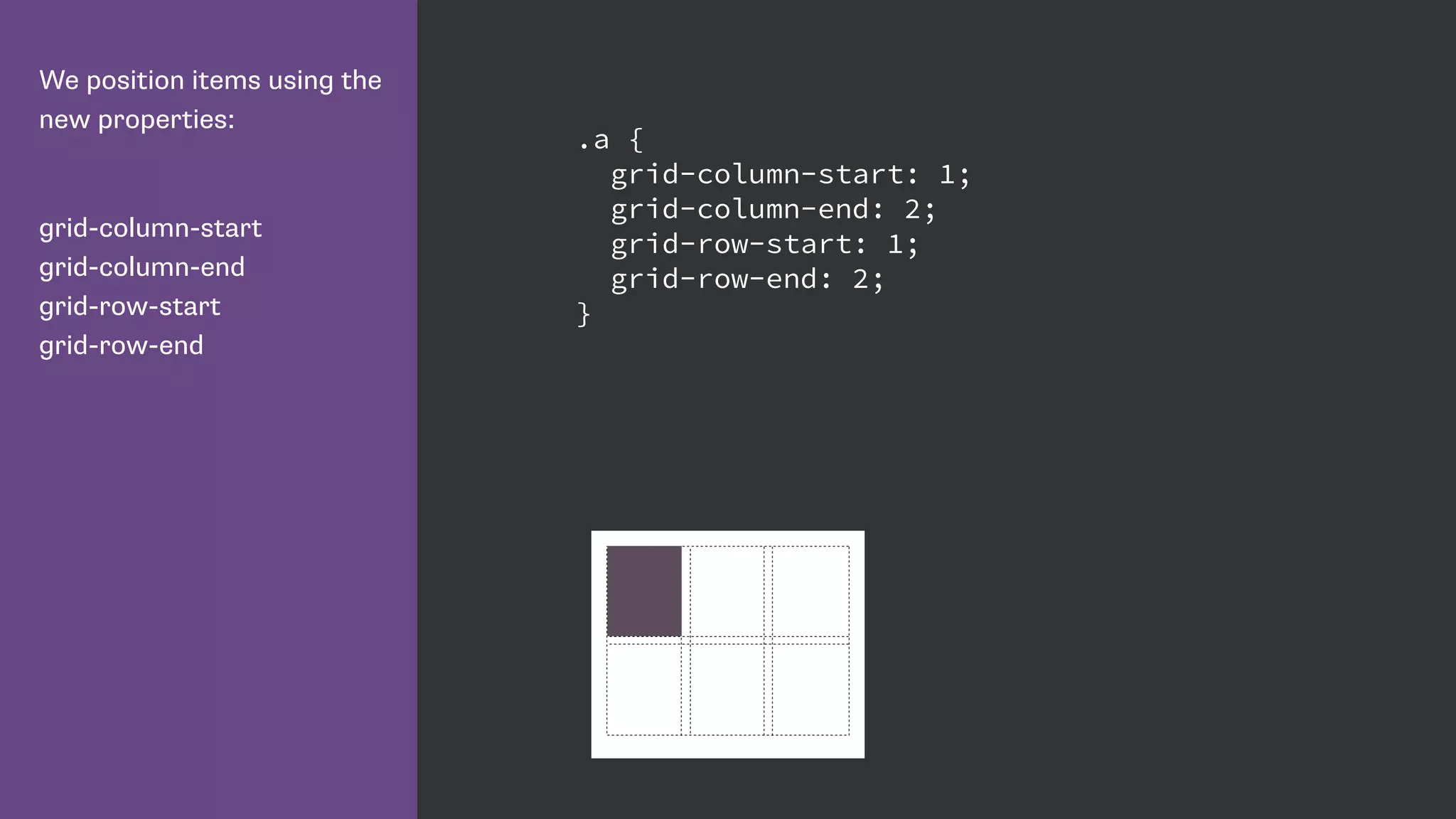
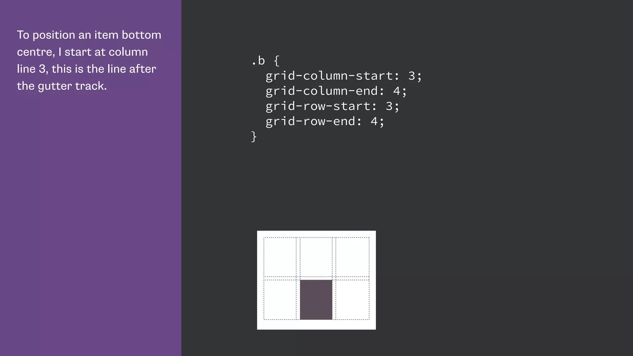
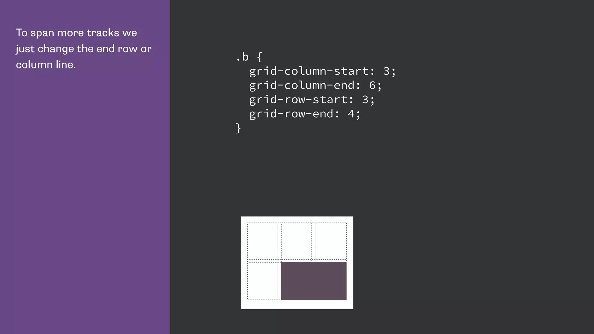
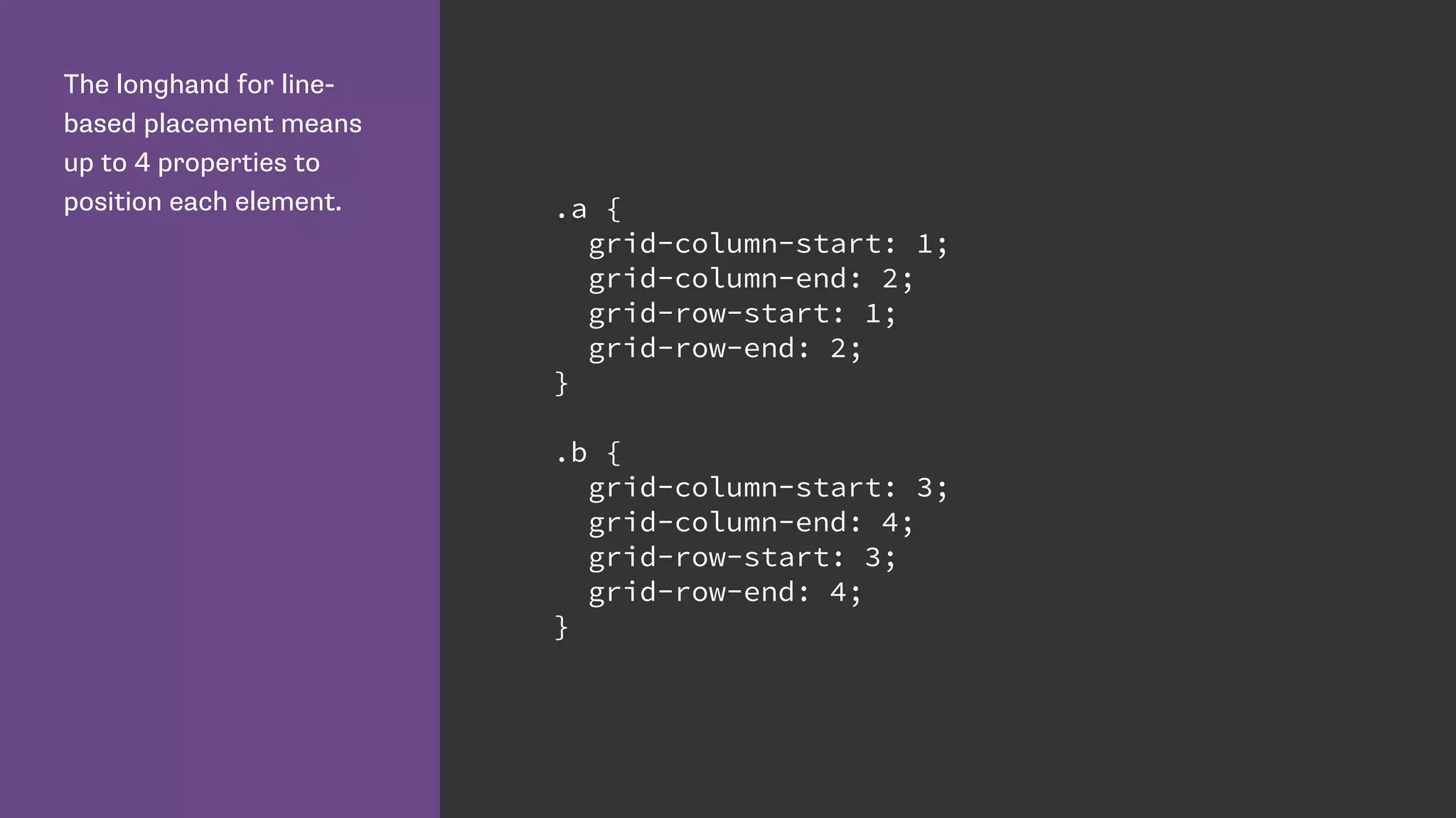
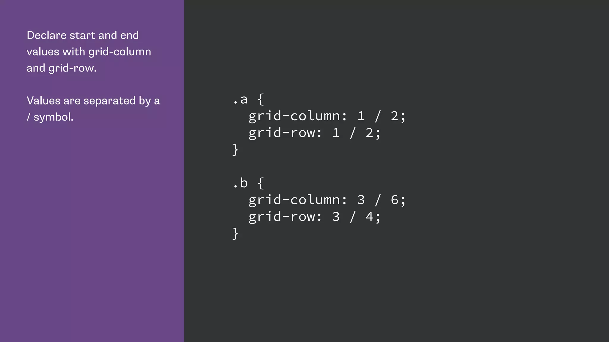
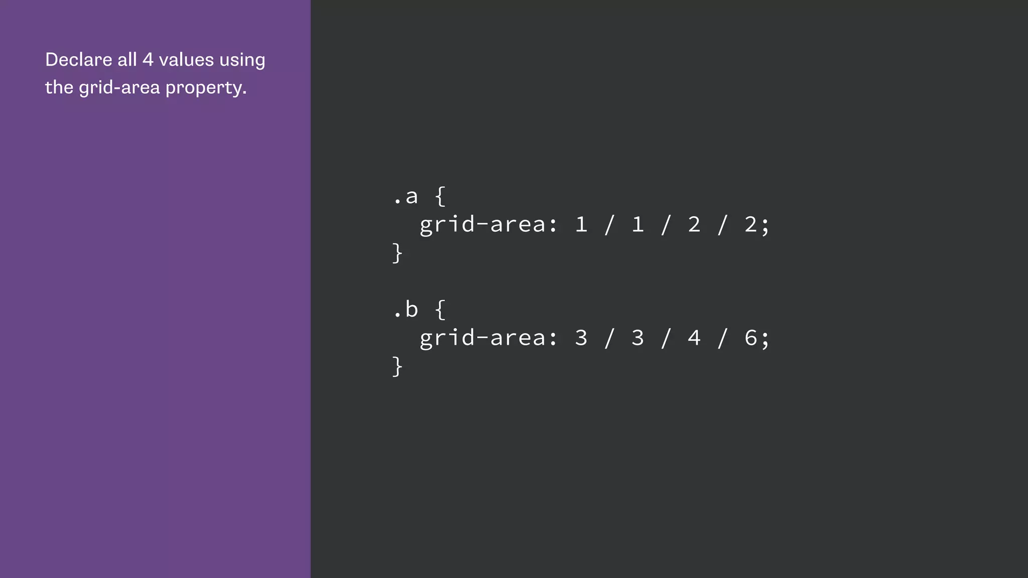
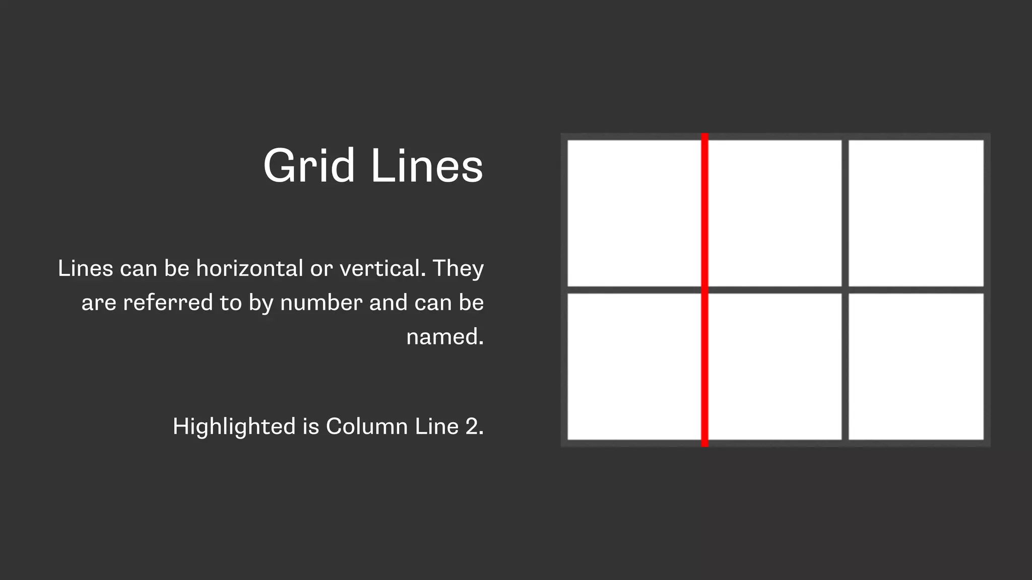
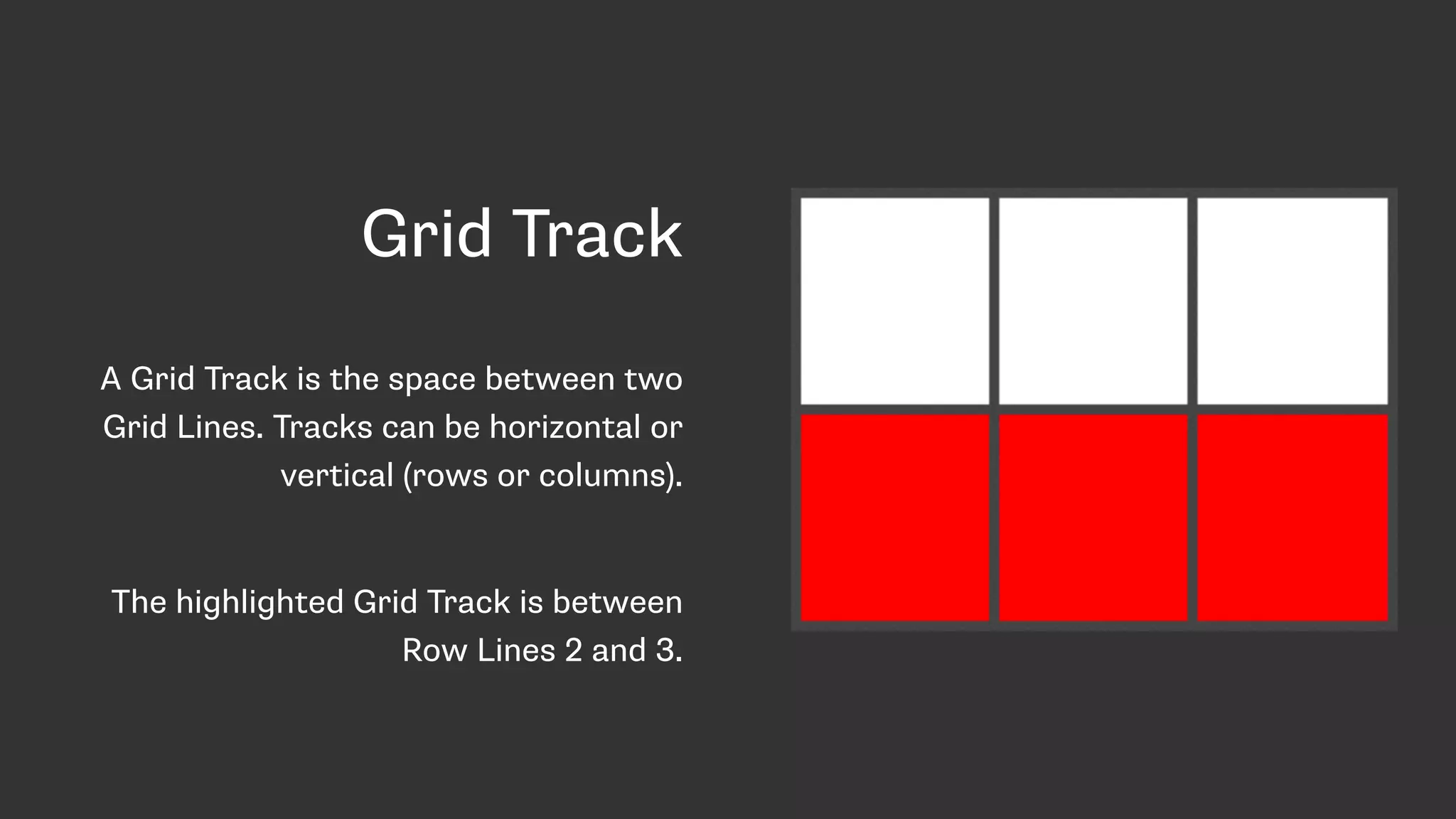
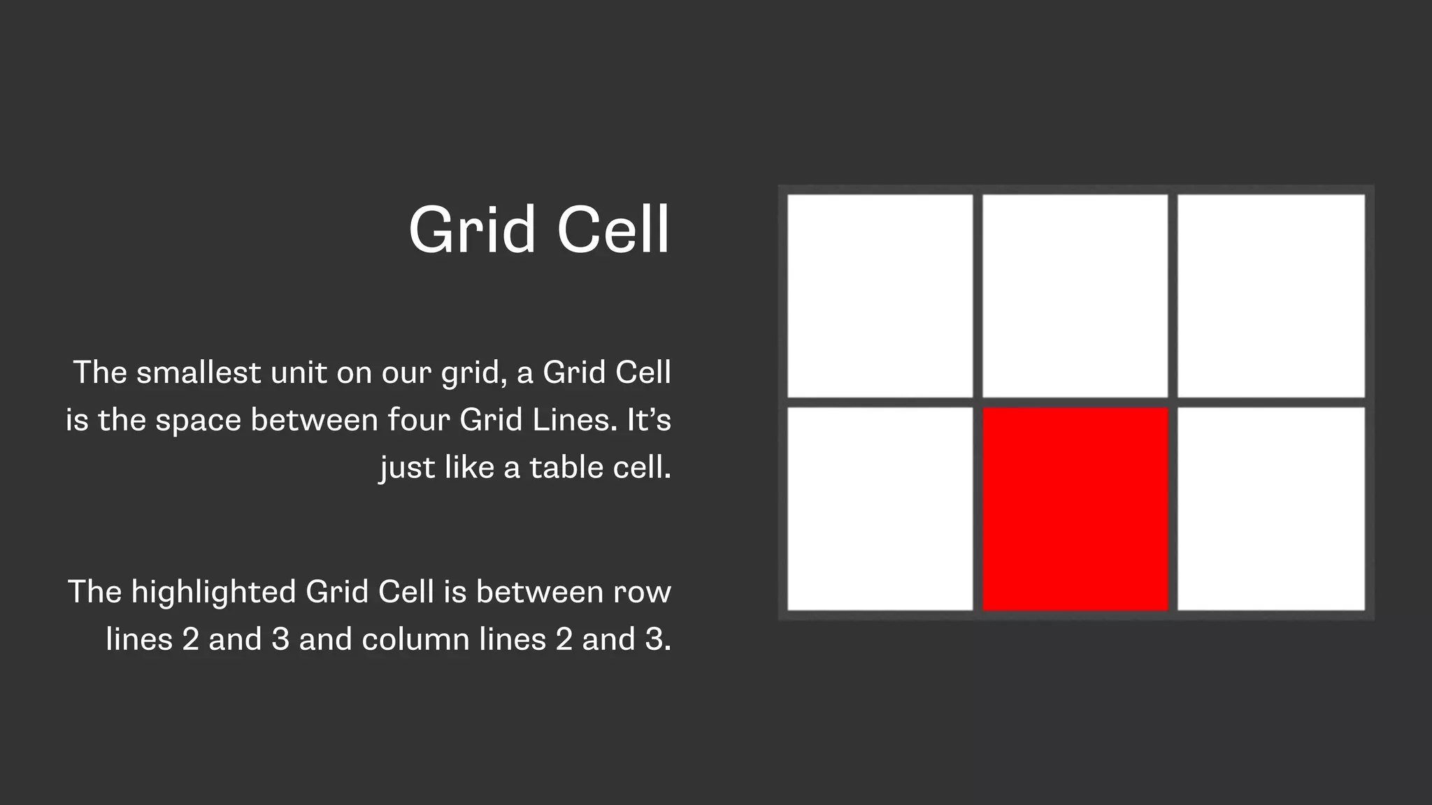
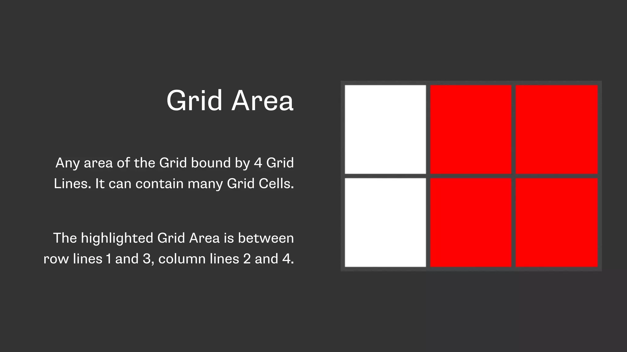
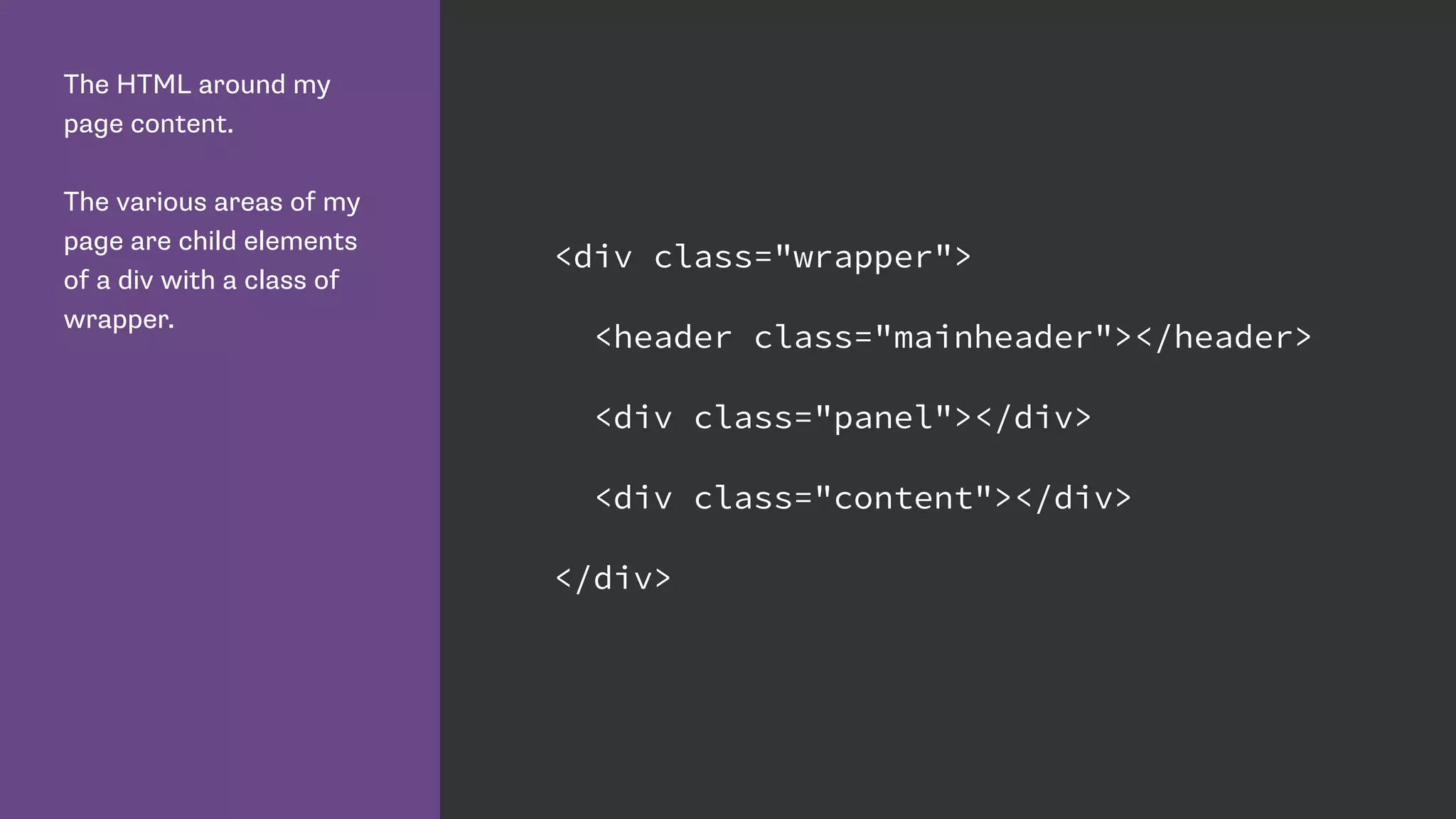
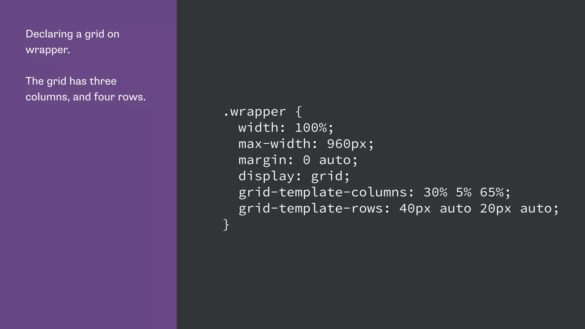
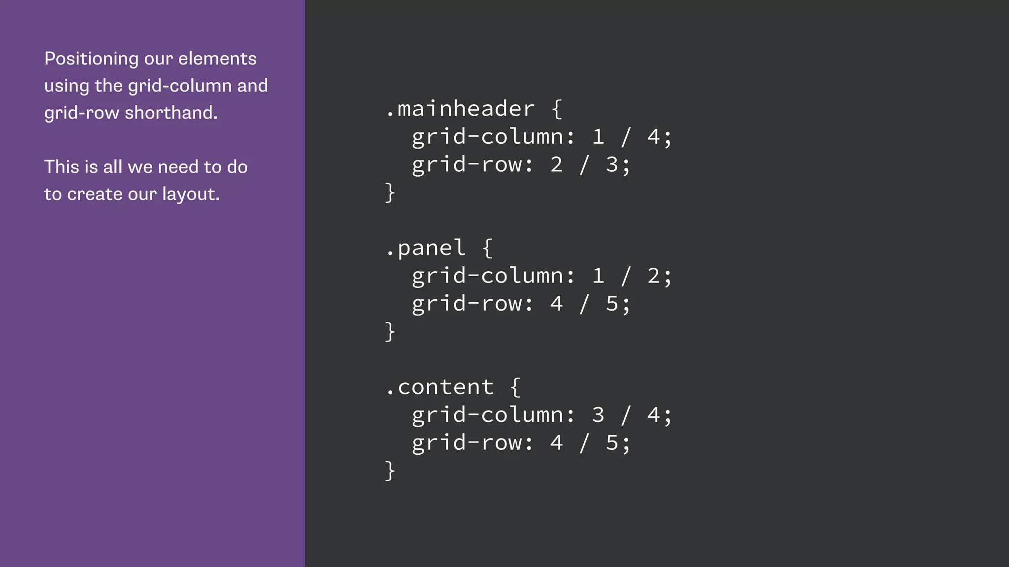
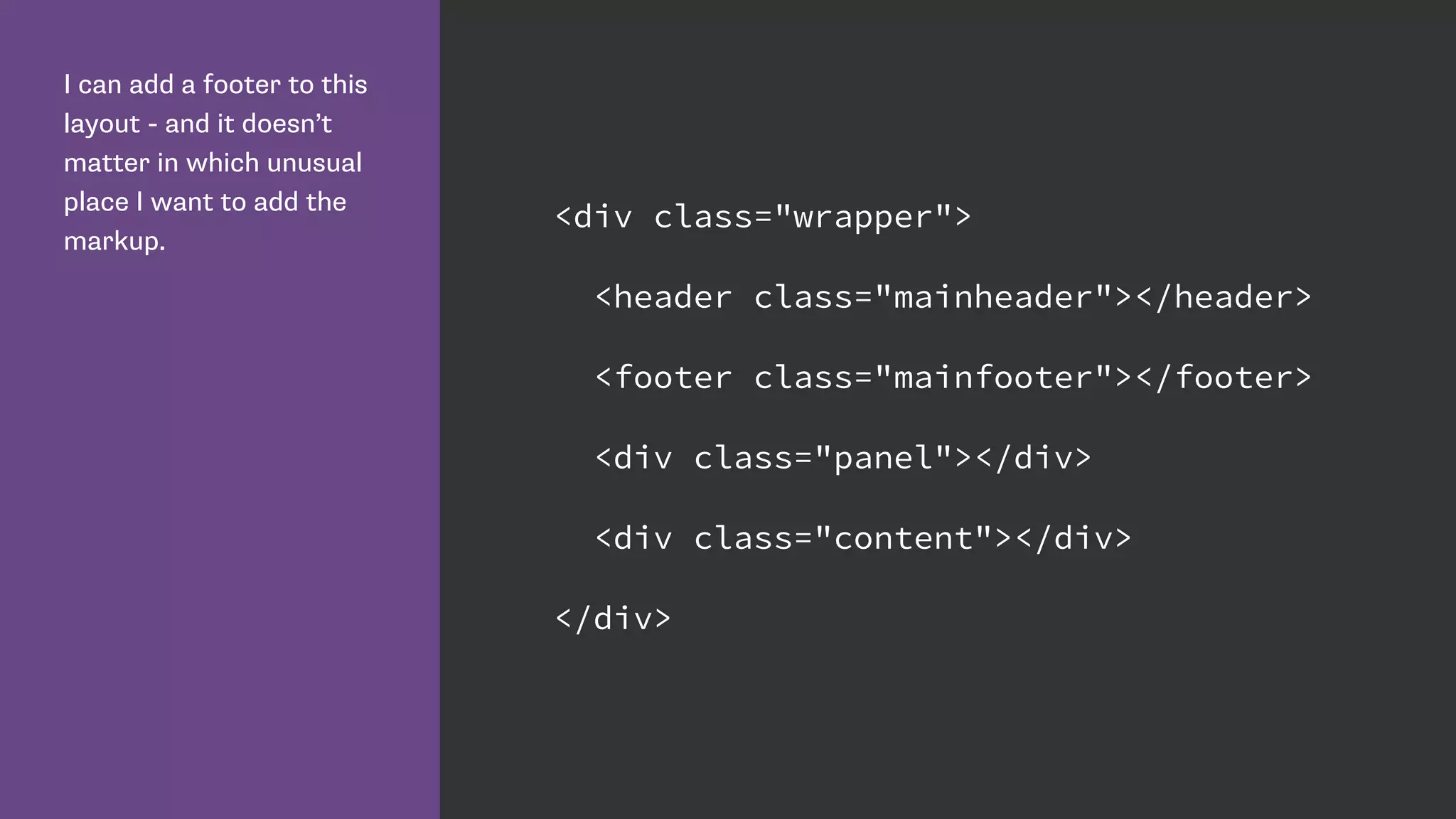
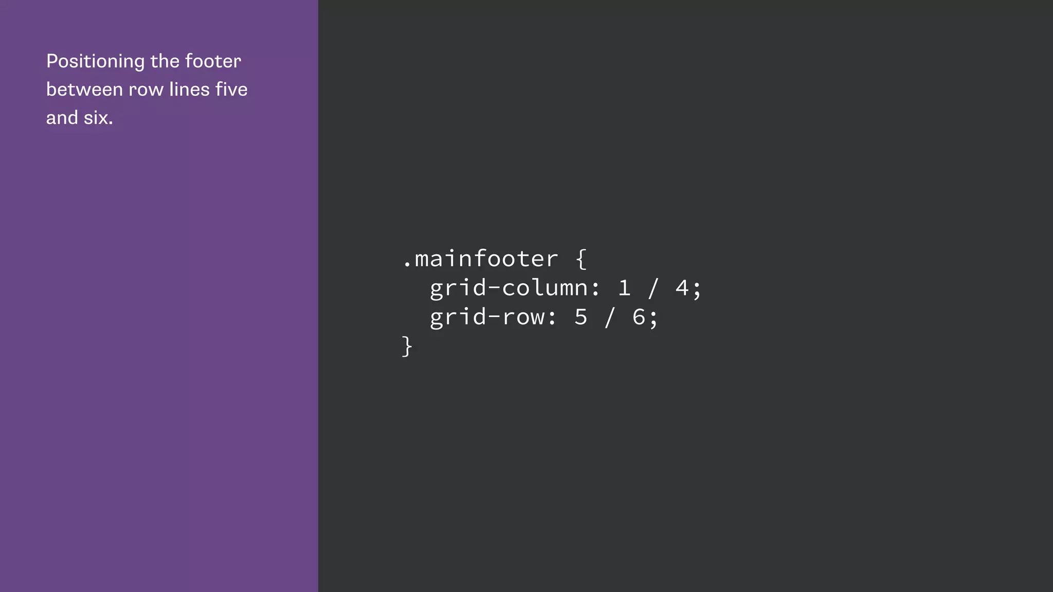
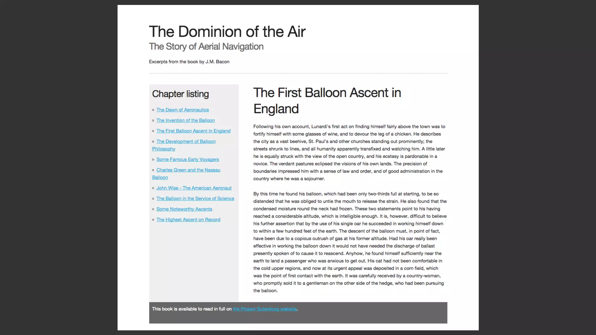
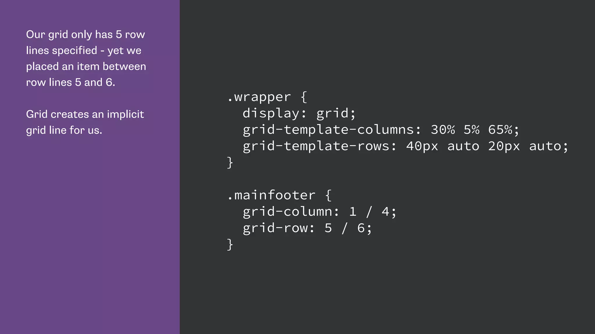
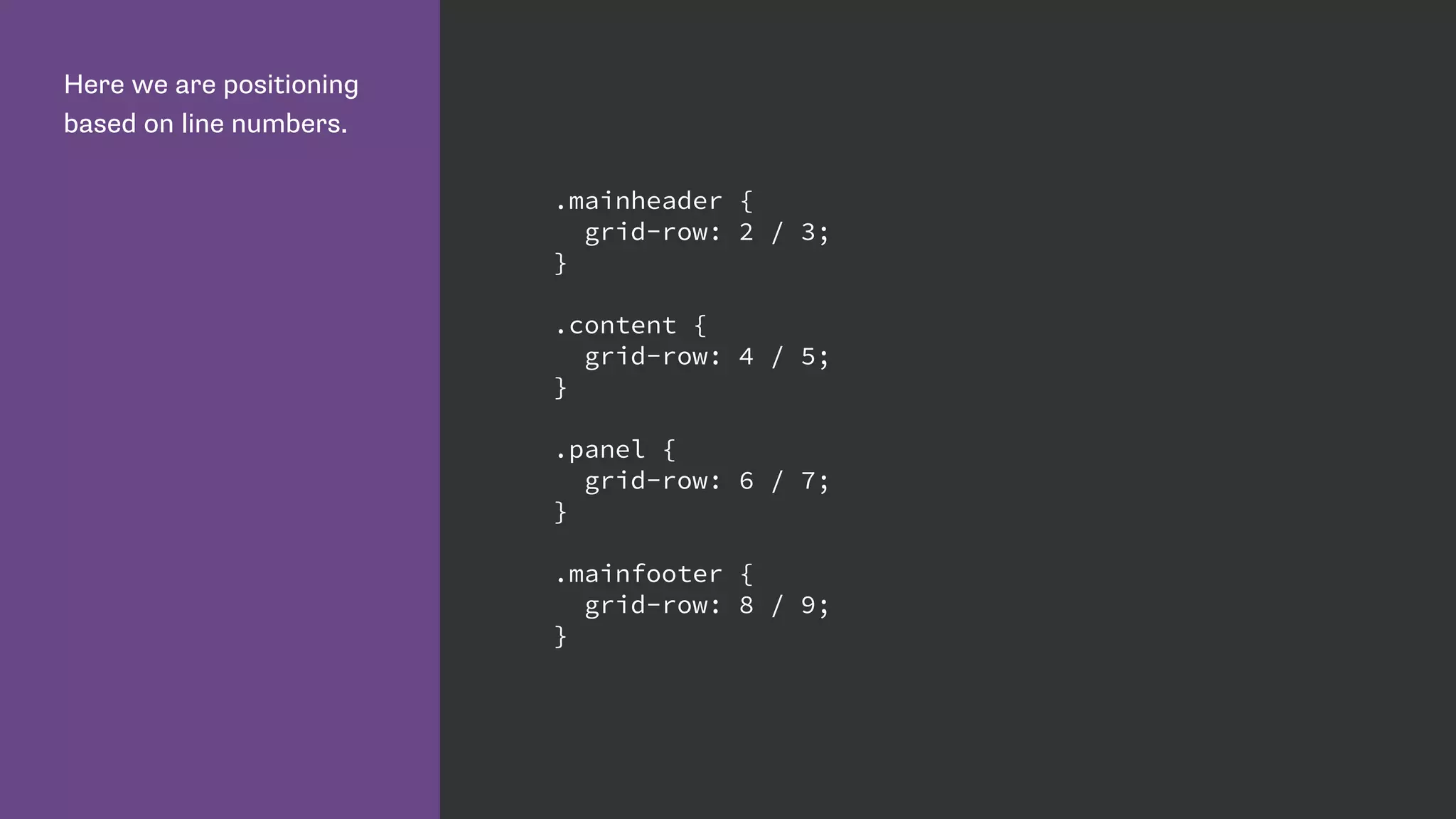
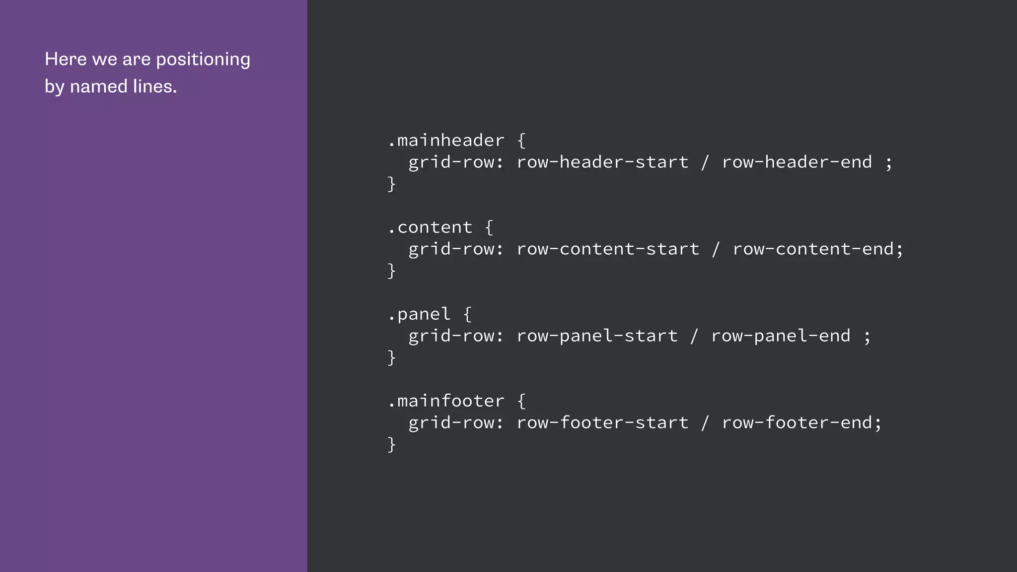
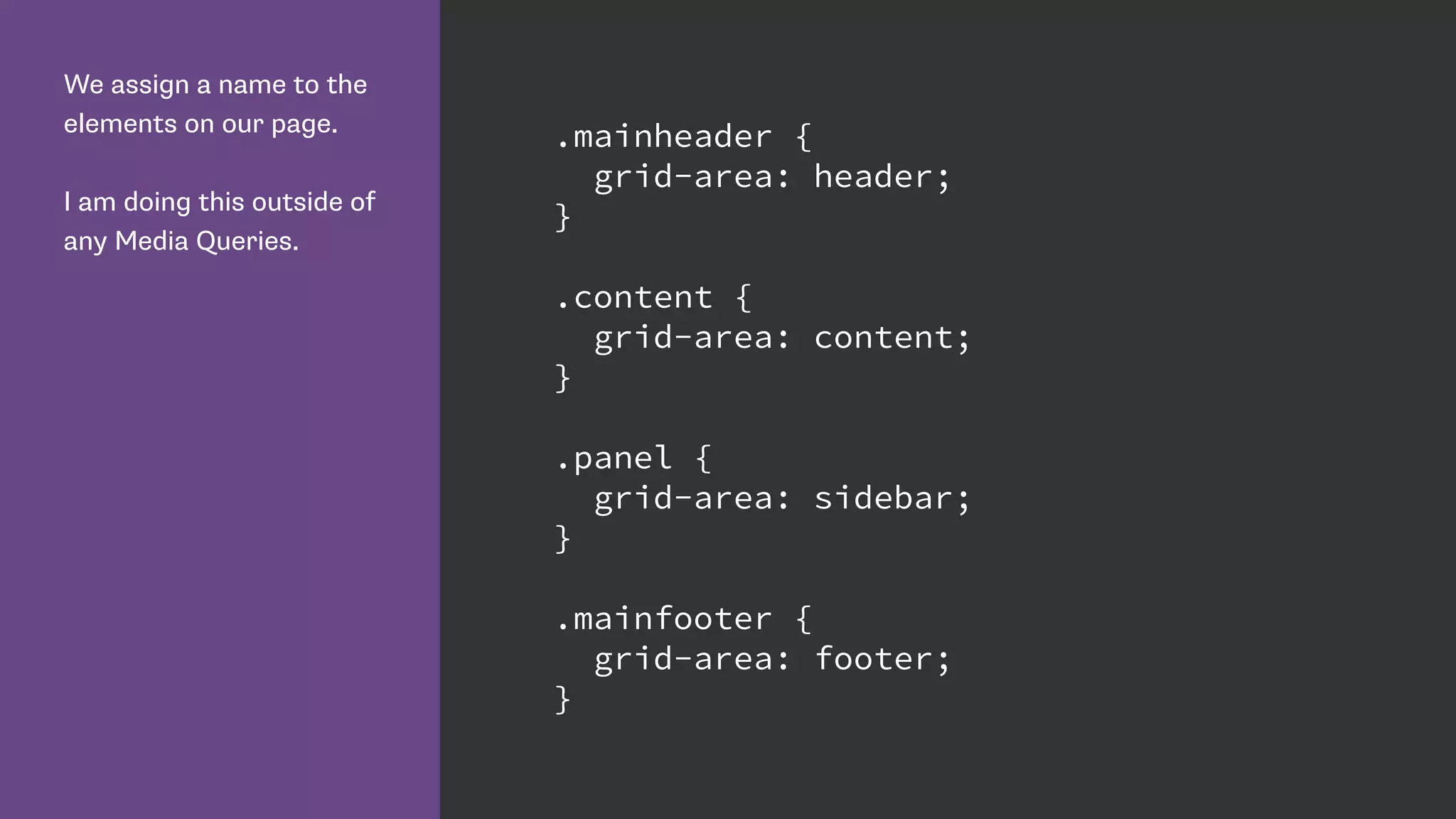
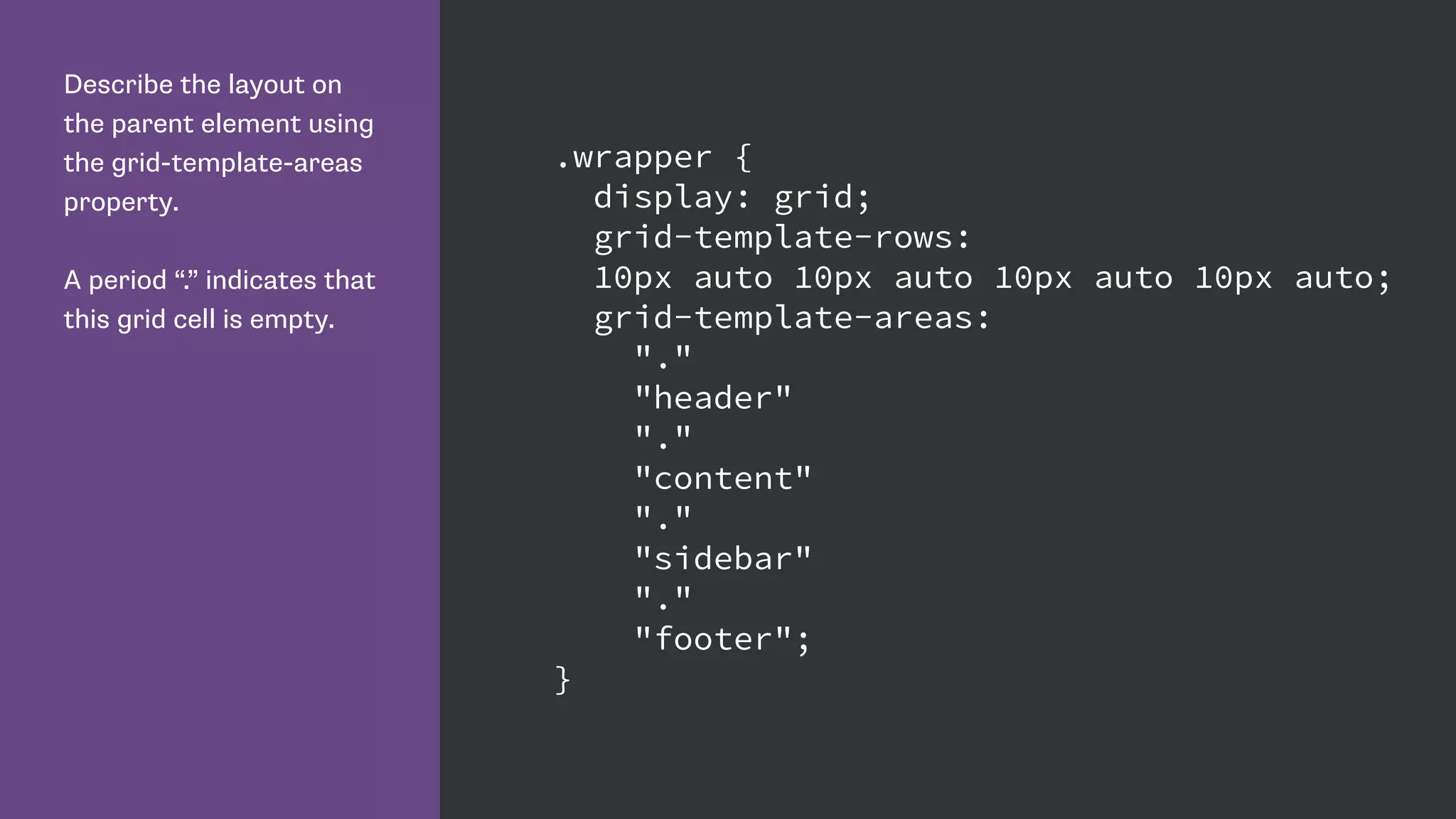
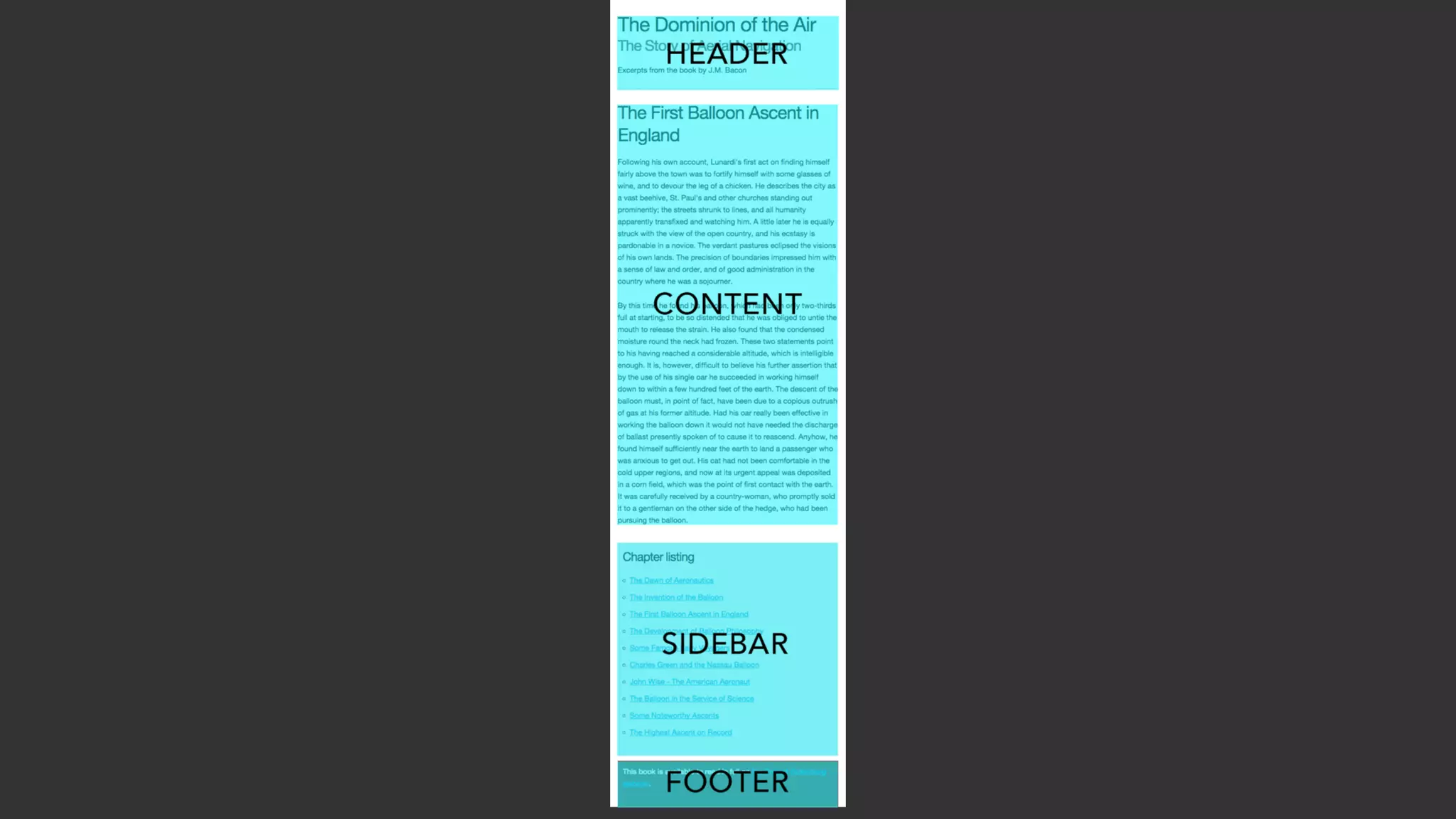
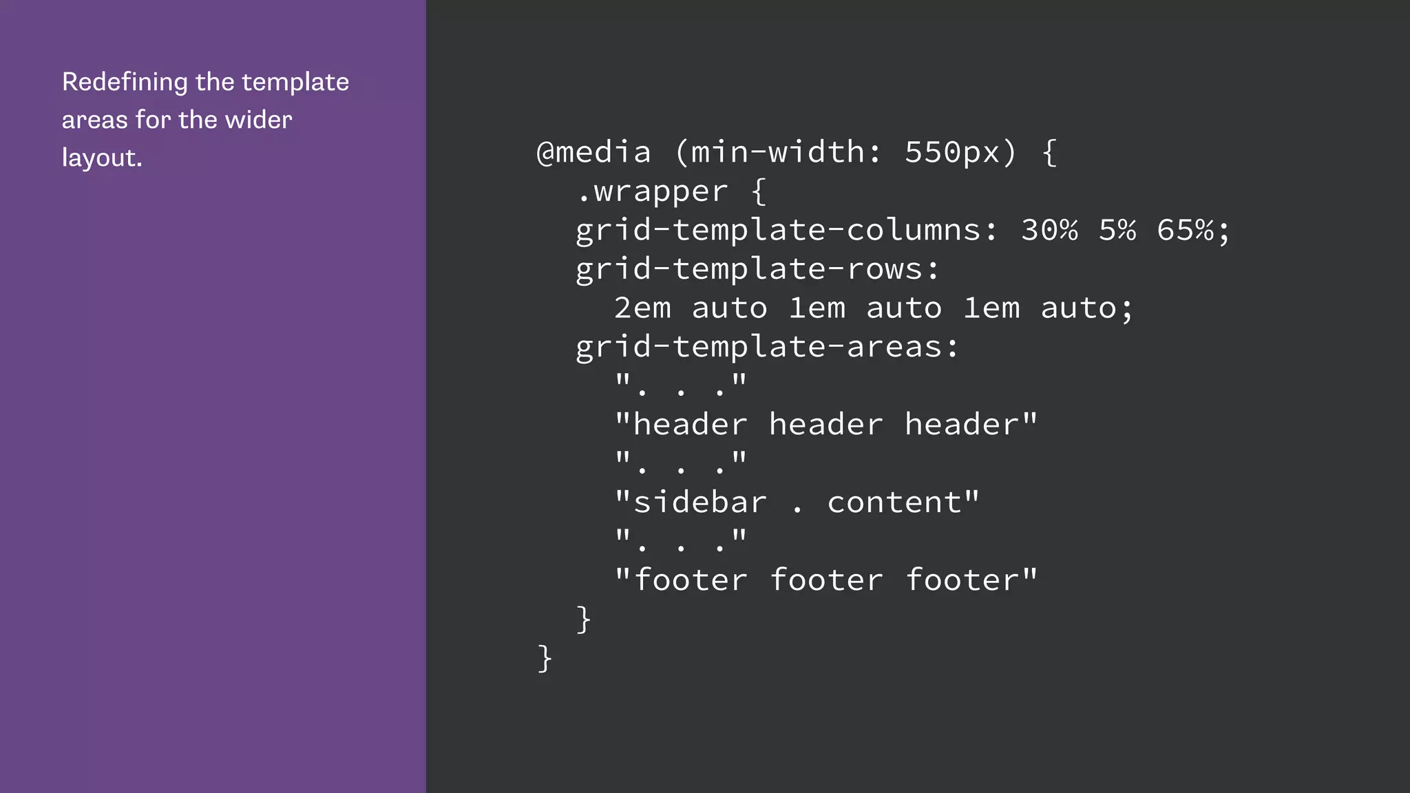
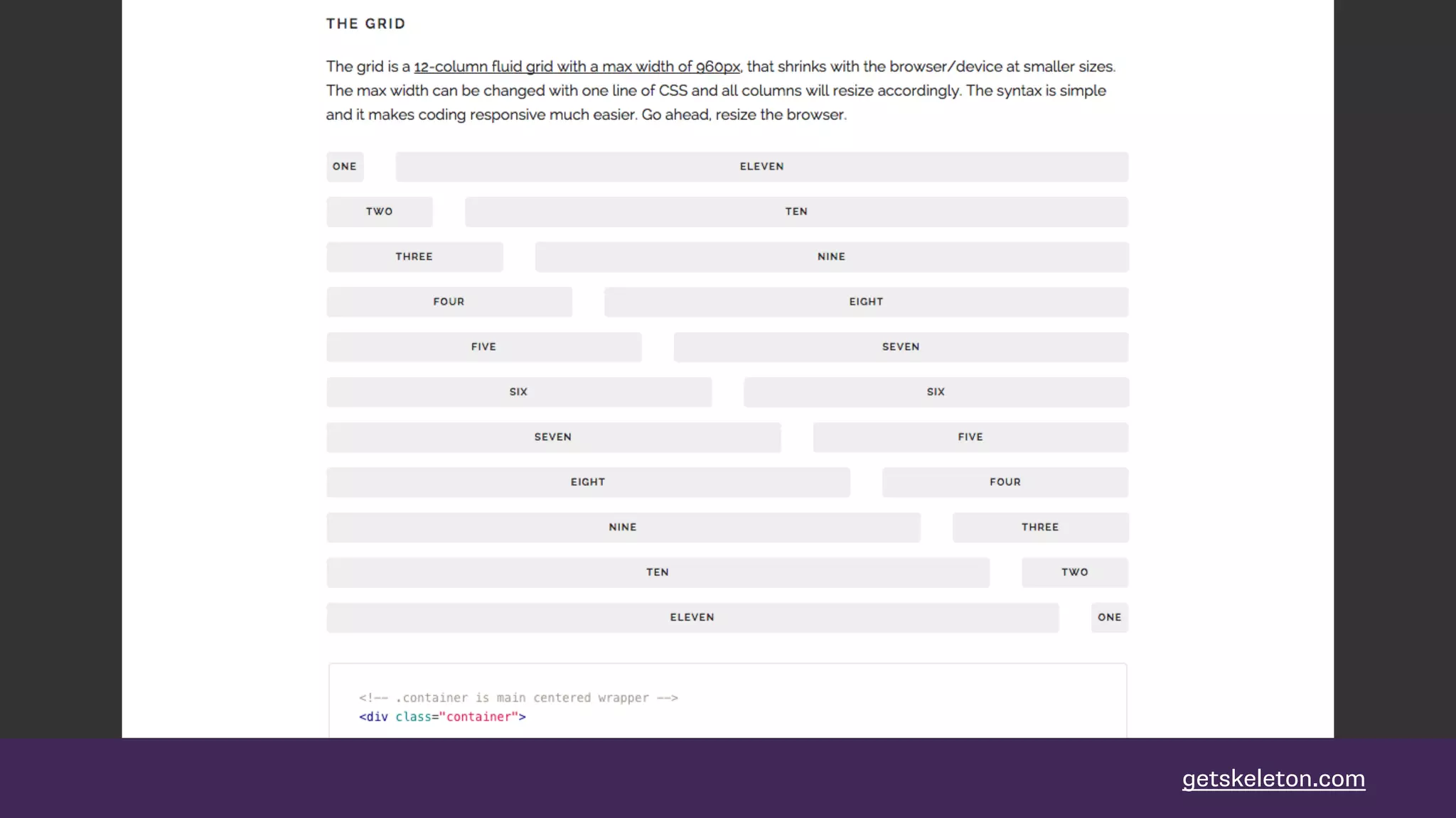
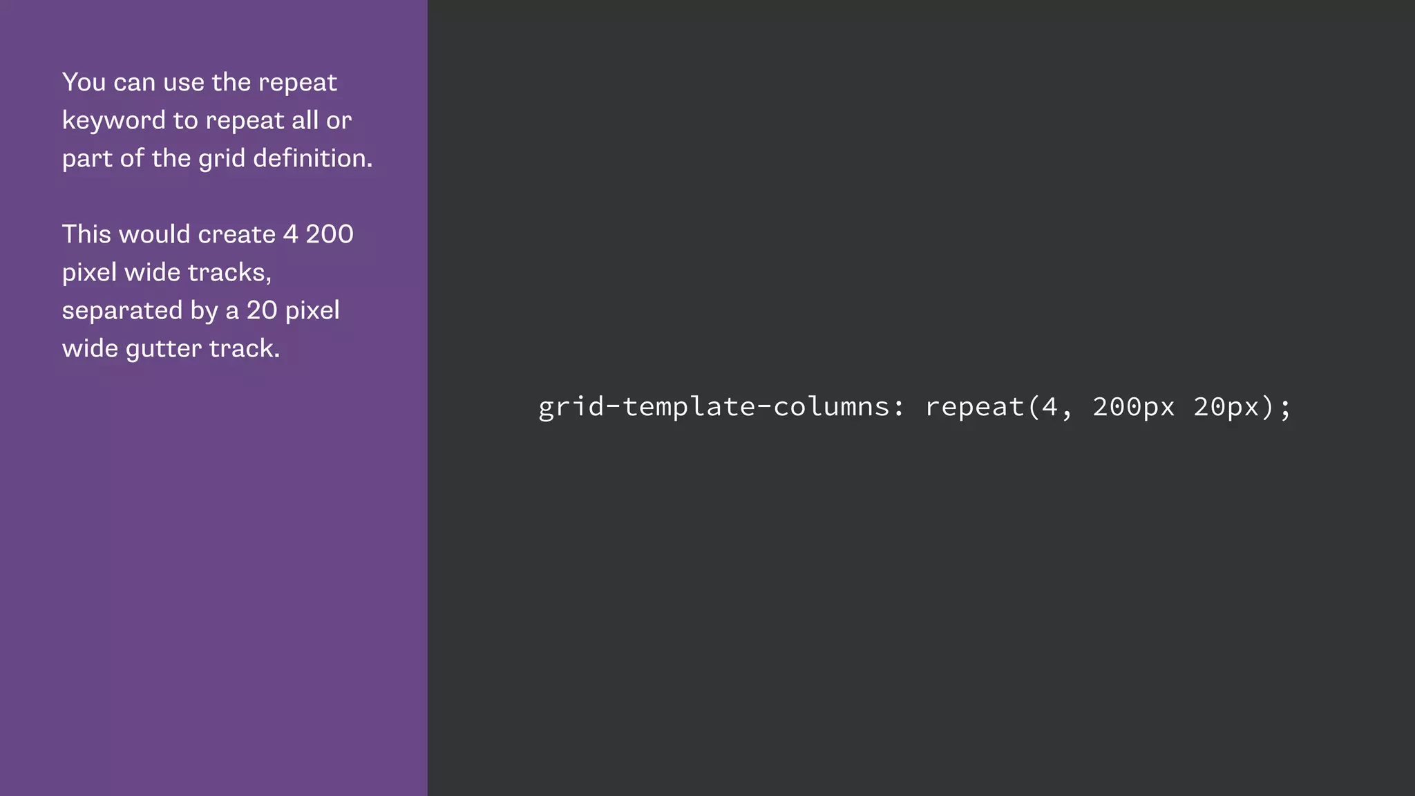
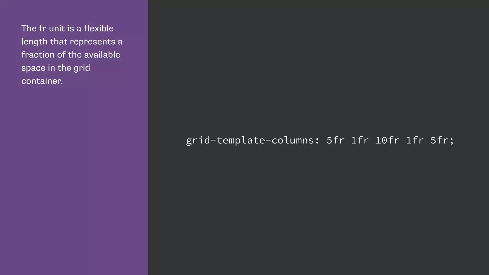
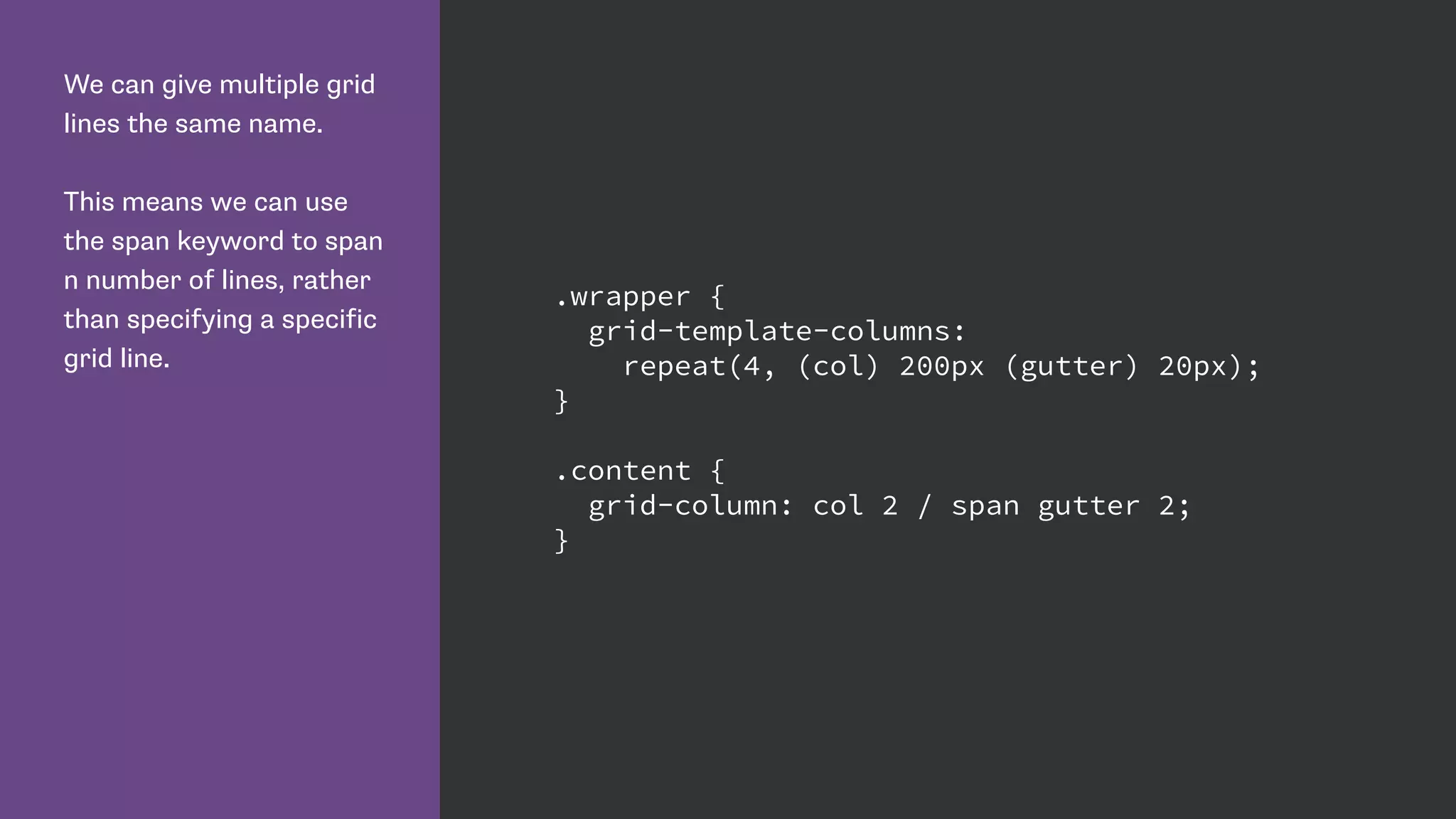
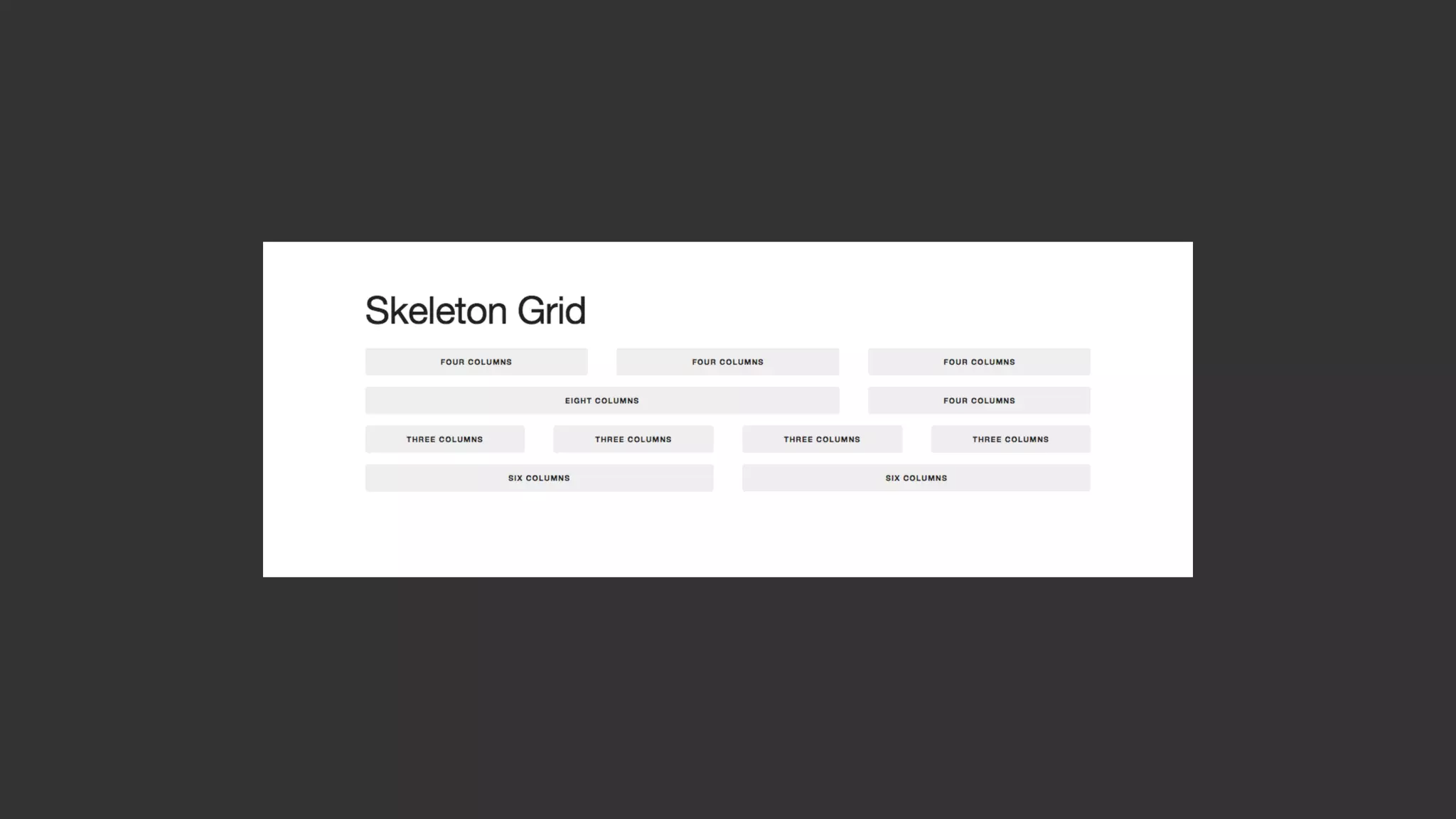
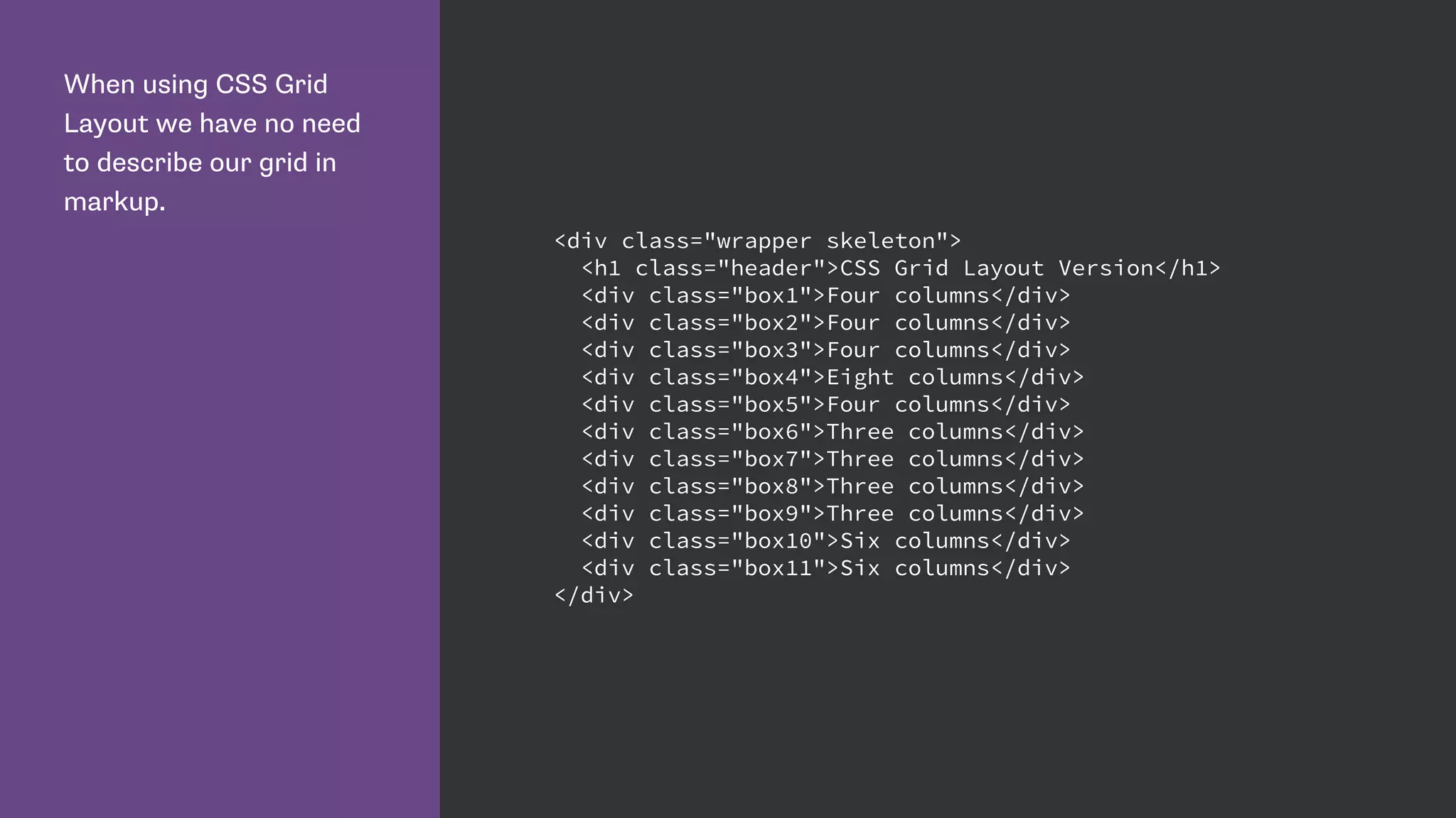
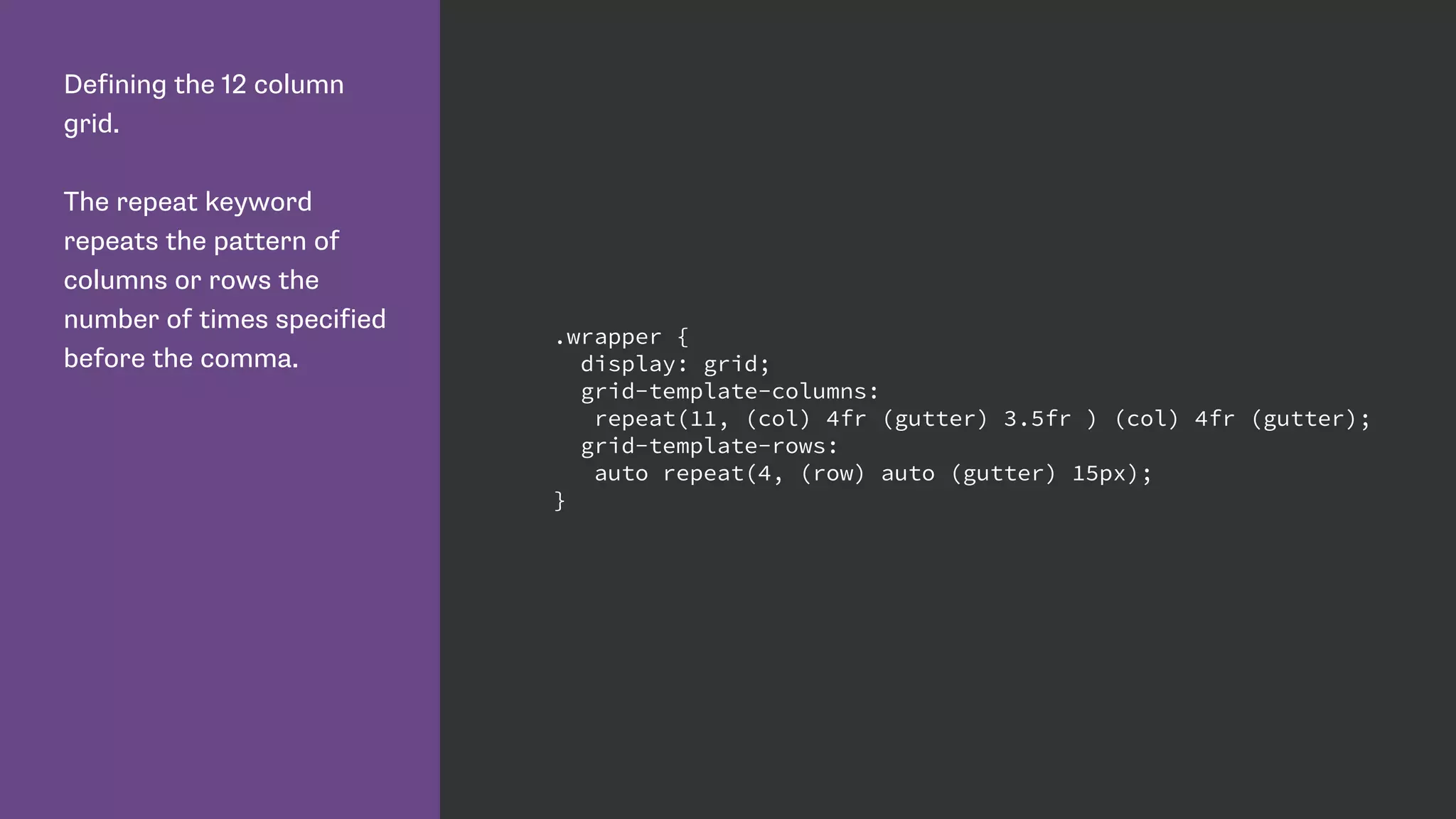
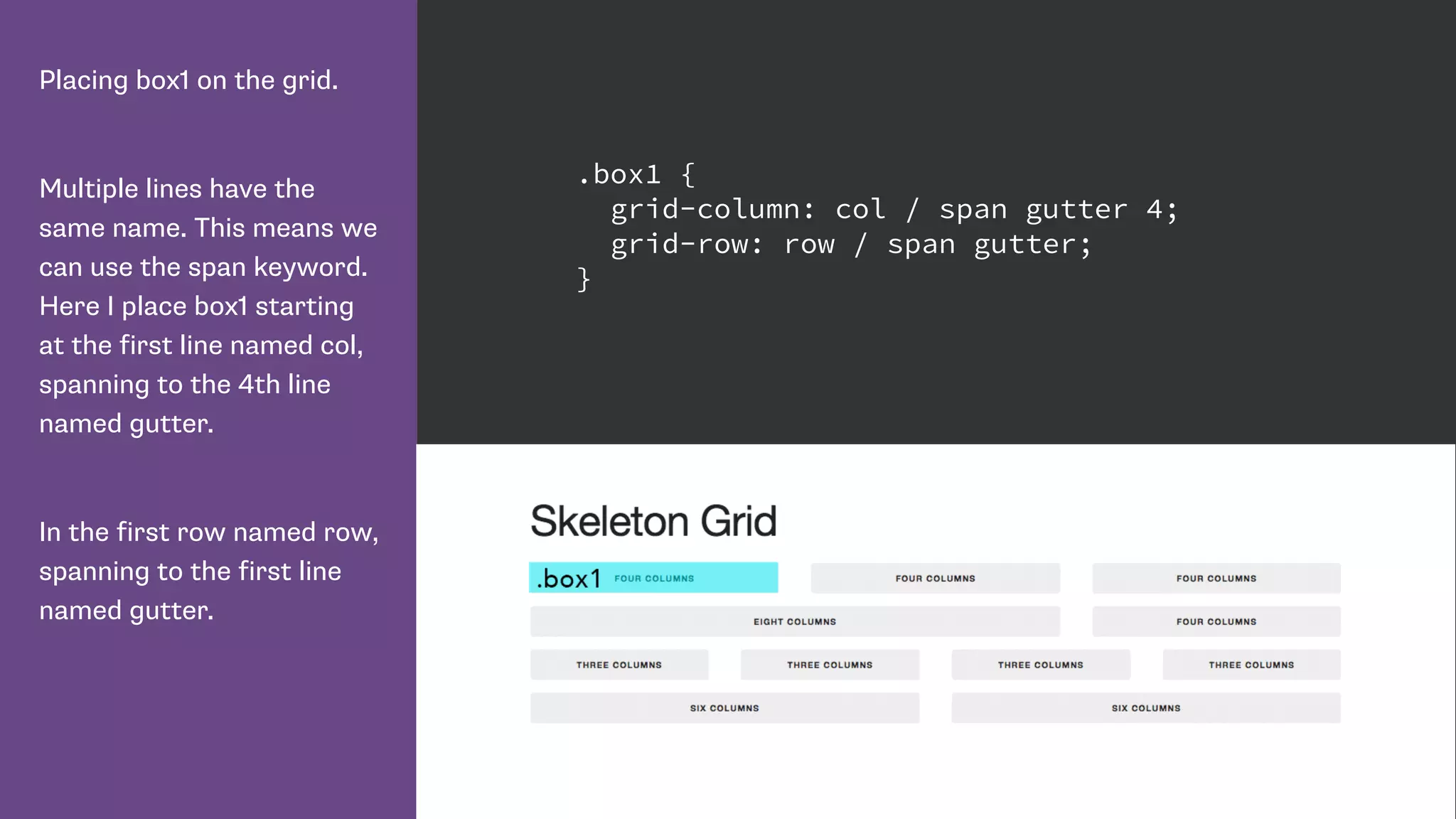
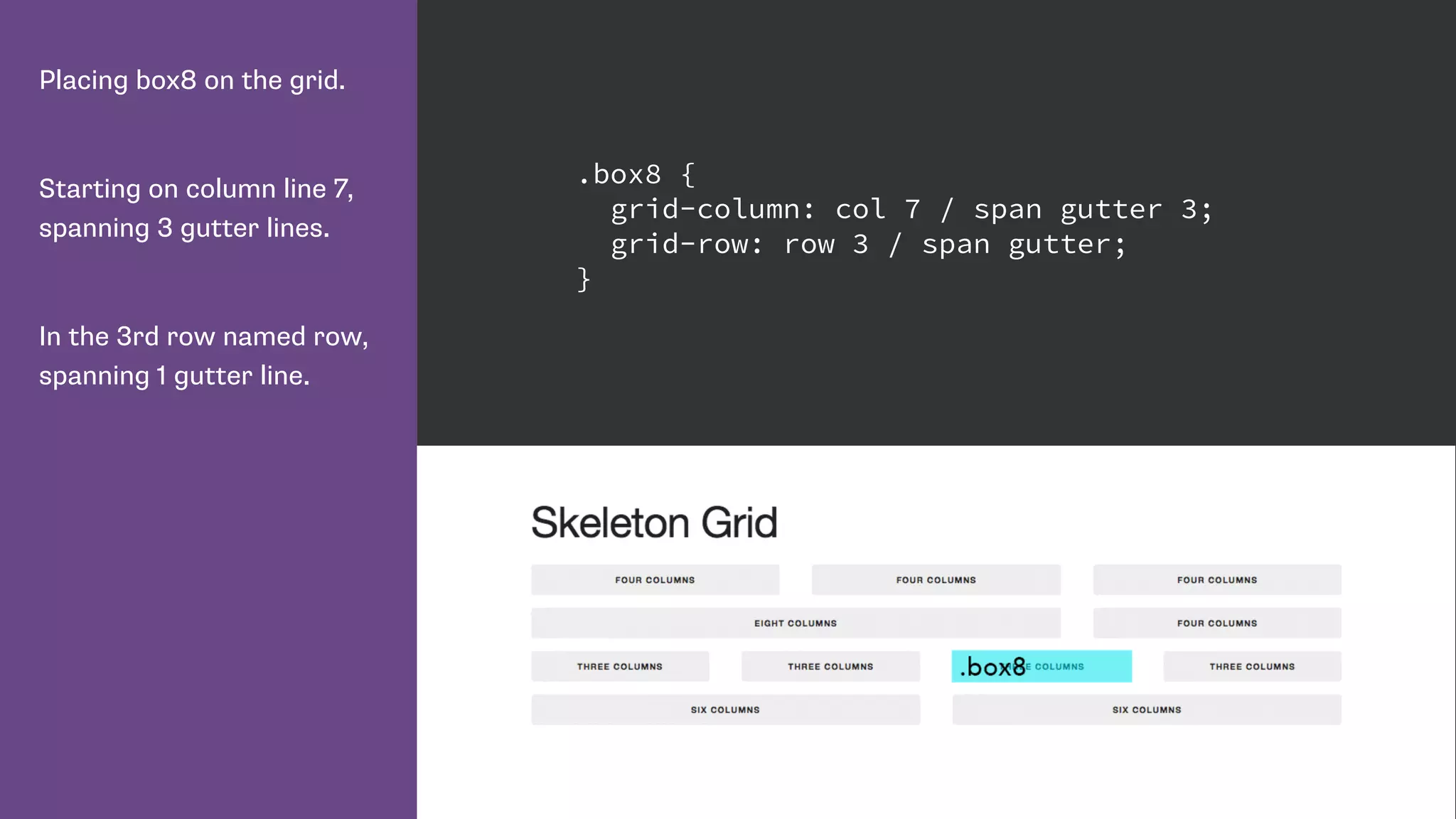
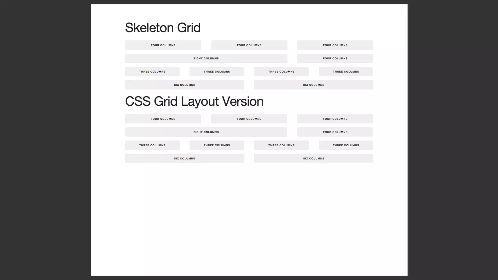
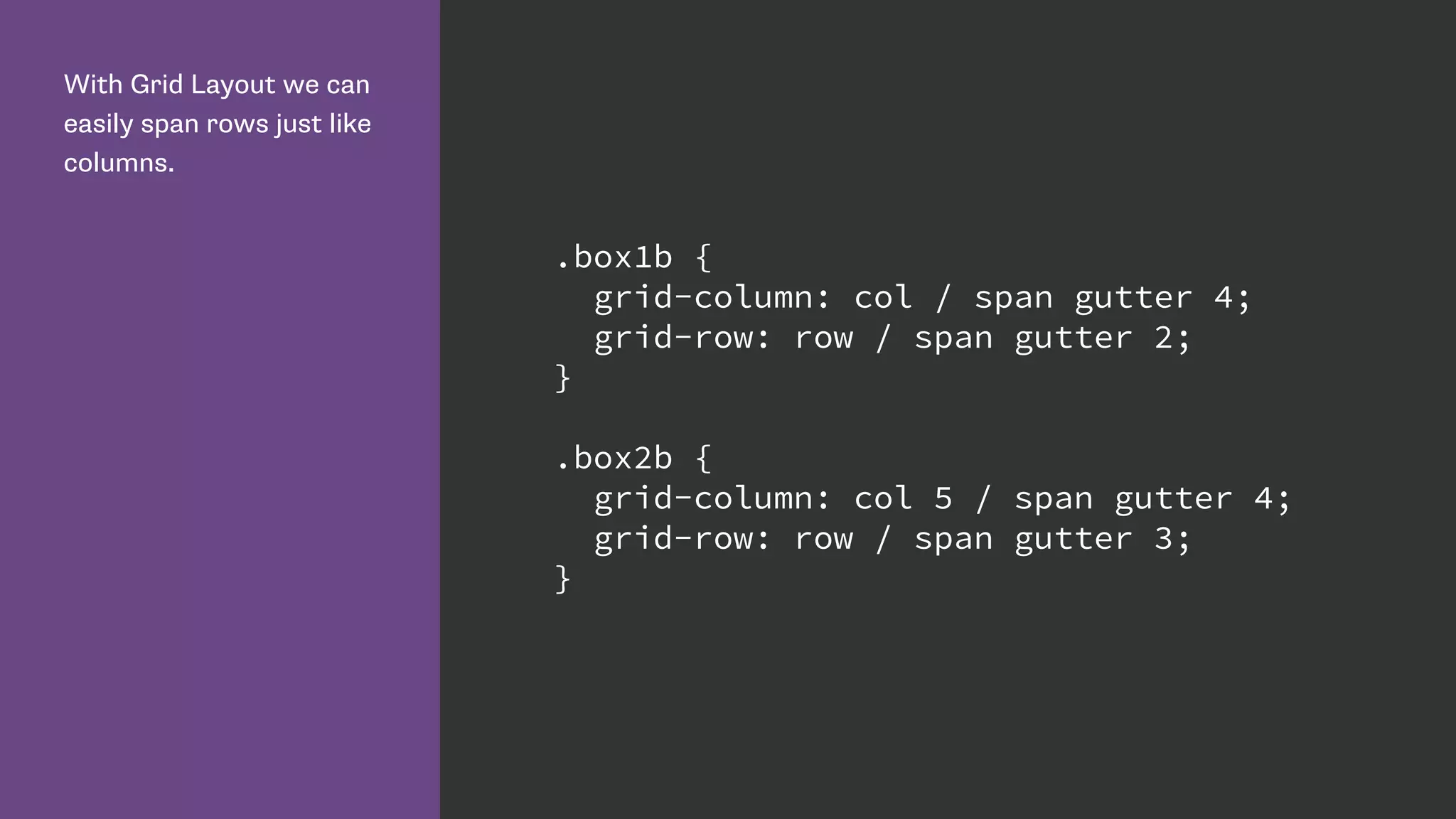
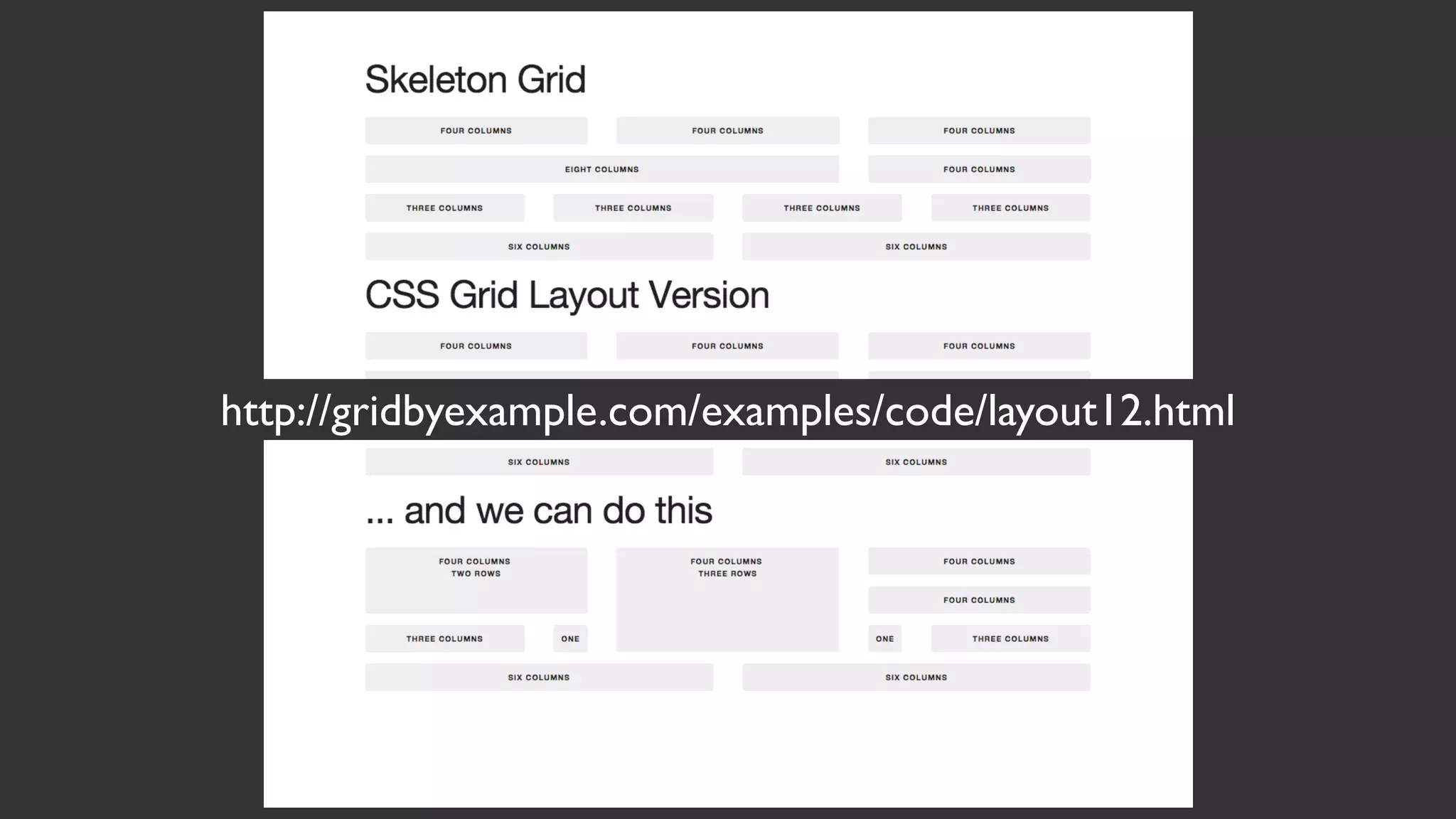
This document introduces CSS Grid Layout and provides examples of how to implement a grid using CSS Grid properties. Key points include:
- CSS Grid Layout allows positioning of elements within a grid system defined entirely through CSS. This avoids layout hacks and redundant markup needed with previous methods.
- Grid properties like grid-template-columns, grid-template-rows define the structure of the grid. grid-column, grid-row position elements within the grid.
- Named lines, grid areas, and media queries allow defining different grid layouts for different screen sizes without changing markup order.
- Repeating tracks, flexible track sizes (fr units), and line spanning provide powerful grid configuration options.
This document provides an overview of CSS Grid layout and its properties for creating grid-based page layouts. CSS Grid allows dividing available space into columns and rows, and placing elements into specific areas. Key properties include display: grid;, grid-template-columns/rows to define the grid structure, and grid-column/row to position items. Grid provides a two-dimensional layout system as opposed to the one-dimensional Flexbox, and is well-suited for page-level layouts rather than component-level layouts.
CSS Grid provides a two-dimensional grid system for page layout, allowing elements to be positioned in rows and columns. Some key advantages of CSS Grid include having full control over page layout without needing additional HTML containers, and the ability to easily create complex column-based and row-based layouts. CSS Grid terminology includes grid container, grid items, grid lines, grid cells, tracks and areas. Properties like grid-template-columns, grid-template-rows and grid-area can be used to define the grid structure and position items.
This document introduces CSS Grid Layout and provides examples of how to define a grid, place items on the grid using line numbers and names, create named grid areas, and redefine the grid at different breakpoints. Key aspects covered include defining grid columns and rows using fractional units and repeat functions, creating gaps between rows and columns, positioning items on the grid using line-based placement properties, and describing layouts using grid-template-areas.
This document provides an overview and examples of CSS Grids and Flexbox layout techniques. It discusses how Flexbox allows items to be laid out in a single direction row or column, and how CSS Grids enable two-dimensional page layouts using rows and columns. Examples are given for creating navigation menus, image galleries, and multi-column page designs using these new CSS properties. Media queries are also used to redefine grid layouts at different screen sizes.
This complete guide explains everything about flexbox, focusing on all the different possible properties for the parent element (the flex container) and the child elements (the flex items).
This document summarizes CSS Grid Layout, a new two-dimensional grid system being added to CSS. It discusses some of the limitations of existing CSS layout methods and how Grid Layout addresses them. Key points include: Grid Layout uses line-based placement to position items, grid tracks can be flexible or fixed widths, areas can be explicitly or implicitly named, and the system avoids hacks and limitations of previous methods.
Introduction to Cascading Style Sheets (CSS)Chris Poteet
This document provides an introduction to Cascading Style Sheets (CSS) including definitions, why CSS is used, the cascade, inheritance, using style sheets, CSS syntax, selectors, the box model, CSS and the semantic web, browser acceptance, fonts, units, colors, layouts, text formatting, backgrounds, lists, shorthand properties, accessibility, and resources for further information.
Advanced CSS
by: Alexandra Vlachakis
Sandy Creek High School, Fayette County Schools
Slide Show correlates Georgia Deparment of Edcuation Career and Technology PATHWAY: Interactive Media
COURSE: Advanced Web Design
UNIT 6: BCS-AWD-6 Advanced CSS
This document provides tips for best practices when writing CSS code. It recommends avoiding inline styles, header styles, multiple CSS files, and !important. It also recommends using shorthand properties, avoiding universal selectors and IDs when possible, optimizing images, and using CSS3 properties instead of images. In summary, the document outlines techniques for writing efficient, well-structured CSS code to improve performance and maintainability.
This document discusses Cascading Style Sheets (CSS) and how they can be used to control the style and layout of web documents. CSS allows for a consistent look across multiple platforms, division of labor between design and coding teams, and user control over formatting. CSS rules use selectors to target specific elements and properties to set styles like colors, fonts, sizes, and positioning. CSS handles inheritance of styles and prioritizes rules based on specificity. Styles can position elements outside of normal flow using relative, float, and absolute positioning.
Here is a small presentation on an important css3 layout property -flexbox, which renders a sense of predictability to the items assigned this property across all screen size.
CSS3 Flexbox allows elements to be laid out in a flexible manner to fully fill available space or adapt to different screen sizes and devices. It improves on floats and eliminates some layout problems. Flexbox uses flex items within a flex container, with properties like flex-direction, justify-content, align-items and flex-wrap controlling item alignment along the main and cross axes. Common uses include navigation bars, image galleries, and responsive layouts. Browser support is good with prefixes in older browsers.
Media queries allow CSS styles to be applied conditionally based on characteristics of the device viewing the content, like screen width. They provide a way to target specific devices and change layouts without changing the HTML. The document discusses the syntax of media queries, including using media types, features, expressions, and keywords. It provides examples of using media queries to load different style sheets or apply different CSS rules for different screen widths.
Cascading Style Sheets (CSS) allow separation of document content from document presentation, including elements like fonts, colors, and layout. CSS rules include selectors that point to specific HTML elements and declarations that define properties like color and font for those elements. Common CSS properties include font properties, color properties, box properties like width, padding, and margin, and background properties. CSS provides benefits like easier maintenance of web page styling across multiple pages.
This document provides an introduction to cascading style sheets (CSS) and covers several key concepts:
CSS is used to style and lay out web pages and defines how HTML elements are displayed. Styles are normally saved in external CSS files so the appearance of an entire website can be changed by editing one file. A CSS rule has a selector that specifies which element the rule applies to and declarations that define properties for that element. Comments can be added to CSS code to explain it. Different selectors like ID, class, and inline styles allow targeting specific elements. The order of style precedence determines which styles get applied when multiple styles conflict. Background properties are used to define and customize element backgrounds.
Pseudo-classes are used to define special states of CSS elements. They allow styling elements when a user mouses over, focuses on, visits, or activates them. Common pseudo-classes include :hover, :focus, :visited, and :active. Pseudo-classes can be used with CSS classes and selectors like :first-child to style specific elements, such as styling the first <p> element or changing the color of a link on hover. Pseudo-elements like ::before and ::after allow inserting content before or after elements.
This document provides an overview of various CSS topics including comments, colors, text formatting, positioning, and cross-browser compatibility. It explains concepts like using hexadecimal color codes, text properties like alignment and decoration, positioning elements with static, relative, absolute and fixed positioning, and strategies for aligning elements and dealing with browser inconsistencies.
This document provides descriptions and examples of common CSS properties for text formatting, lists, borders, and fonts. It lists properties like color, line-height, and text-align for text styling, list-style-type and list-style-position for lists, border-width and border-style for borders, and font-family, font-size, and font-weight for fonts. The document notes that browser support for some CSS properties may be limited.
The document defines CSS (Cascading Style Sheets) and its advantages over HTML. CSS describes how HTML elements are displayed, controls layout, and saves work by allowing styles to be reused across pages. There are three ways to add CSS - inline using the style attribute, internally using the <style> tag, or externally using a separate .css file which is most common. CSS rules have selectors, properties, and values to style elements.
Setelah di slide sebelumnya kita mempelajari tentang bagaimana memberi style pada font, di slide kali ini yang akan kita bahas adalah memberikan style pada text seperti pengaturan paragraf, pengaturan warna, dll
slide bantuan untuk video youtube:
https://youtu.be/xih8giA7S3Q
9- Learn CSS Fundamentals / Pseudo-classesIn a Rocket
This document provides information about CSS pseudo-classes. It defines several types of pseudo-classes including dynamic, structural, and others. Dynamic pseudo-classes like :hover and :active select elements when a user interacts with them. Structural pseudo-classes select elements based on their position in a document tree, such as :first-child to select the first child element. The document provides examples of how to use different pseudo-class selectors in CSS code to style elements.
Presented at Webstock '08 on February 15th in Wellington, New Zealand. Social networks are an unavoidable part of life on the Web today, but most exist as walled gardens with interactions and identities trapped in a silo. OpenID is one of a number of initiatives that are trying to break down these walls and enable new social applications to bootstrap off each other.
Code driven development: using Features effectively in Drupal 6 and 7Nuvole
This document discusses using code-driven development with features in Drupal 6 and 7. Key points include:
- Storing configuration and content in code via features allows for version control and easier deployment to production.
- A "controller feature" can be used to manage other features and site-wide configuration through hook updates and installation tasks.
- Features follow code conventions like logical namespaces to organize functionality.
- In Drupal 7, installation profiles are like modules and use similar hooks to manage updates and configuration.
The document summarizes Rachel Andrew's presentation on CSS Grid Layout. Some key points:
- CSS Grid Layout provides a new display value and properties to create grid-based layouts, addressing issues with floats, tables, flexbox.
- Grid uses line-based placement, with grid-template-columns/rows to define the grid, and grid-column/row to position.
- The fr unit distributes space proportionally. Implicit tracks are created when content is placed outside defined lines.
- Grid allows redefining layouts responsively by changing templates with media queries.
An Event Apart Nashville: CSS Grid LayoutRachel Andrew
The document summarizes Rachel Andrew's presentation on CSS Grid Layout. Some key points:
- CSS Grid Layout provides a new two-dimensional grid system for CSS layout, addressing limitations of floats and flexbox.
- Grid uses line-based placement, with grid tracks defined by grid-template-columns/rows and items placed using grid-column/row properties.
- Common layouts like Holy Grail can be easily created with Grid. Grid also allows rearranging layouts responsively.
- Grid introduces concepts like implicit and explicit grid lines, fr units, and named grid areas to semantically define layout structures.
This document summarizes a talk given by Rachel Andrew on new CSS layout methods Flexbox and Grid Layout. It discusses some of the challenges with traditional layout techniques and how Flexbox and Grid Layout allow for more semantic, flexible and responsive layouts by treating items as parts of a complete layout. Key features covered include separation of document structure from visual presentation, precise control of horizontal and vertical alignment, and responsive design being built into the new specifications.
CSS Grid Layout - An Event Apart OrlandoRachel Andrew
My slides from An Event Apart Orlando. Also take a look at the code examples and resources at https://rachelandrew.co.uk/speaking/event/an-event-apart-orlando-special-edition-2016
CSS Grid Layout allows for two-dimensional page layouts using rows and columns to position elements. It offers several methods for defining the grid including explicit definition with grid-template-columns/rows, implicit definition by letting grid create tracks automatically, and using fractional units and repeat functions for flexible layouts. Elements can then be placed on the grid using line-based positioning with grid-column/row or named grid areas. Media queries allow the grid definition and element placement to adapt at different breakpoints.
This document discusses CSS Grid Layout and provides examples of how to define grids and place items on grids. Some key points:
- CSS Grid Layout allows dividing available space into columns and rows to position elements.
- Grids are defined on parent elements using properties like grid-template-columns, grid-template-rows, and grid-template-areas.
- Child elements can be placed on the grid using line-based placement with properties like grid-column and grid-row, or by targeting named lines and areas.
- Grids can be redefined at different breakpoints to create responsive layouts without changing HTML structure.
This document summarizes Rachel Andrew's presentation on CSS Grid Layout. Some key points include:
- CSS Grid Layout provides a two-dimensional grid system for CSS layout, as an alternative to floats and positioning.
- Grid uses line-based placement rather than block/inline flows, allowing items to be placed precisely on the grid.
- Defining a grid involves setting grid-template-columns, grid-template-rows and other properties to establish the structure and tracks.
- Items can then be placed on the grid using grid-row and grid-column to position them across specific row and column lines.
Talk Web Design: Get Ready For CSS Grid LayoutRachel Andrew
- CSS Grid Layout provides a new two-dimensional grid-based layout system for CSS. It allows developers to divide available space on a page into columns and rows, and place elements into those areas.
- The document discusses defining a CSS grid with properties like grid-template-columns, grid-template-rows, and grid-template-areas. It also covers positioning items onto the grid using line-based placement with grid-column, grid-row etc. or named grid areas.
- CSS Grid Layout offers developers greater control over page layout compared to older methods and allows the layout to be redefined responsively with media queries.
This document is a lecture on grid systems and modular design. It discusses the history and uses of grid systems in graphic design, architecture, and page layout. Some key points include:
- Grid systems provide order, consistency and flexibility in design by establishing a set of guidelines.
- Early uses of grids can be seen in manuscripts and Greek temples, while graphic designers like Wim Crouwel and Josef Müller-Brockmann popularized grids in the mid-20th century.
- Effective grids divide space into columns and rows to form a modular structure. Common module sizes are based on factors of 12 to allow for flexibility.
- Negative space and variation within the grid help make designs visually
Rockin Responsive Content with Panels LayoutsMatt Glaman
Site-builders love Panels because it unleashes content, and clients love Panels for the In Place Editor (IPE). There is just one problem: no content is the same (and generic layouts do not always make the grade). The Panels Layout Builder partially solves the issue. But, what if your site is responsive? Your 30% column width will be just that, from mobile to desktop.
This session will cover how to add custom Panels layouts to your theme, utilize Sass, and responsive methods.
To get the most out of this session, you should be familiar with basic Panels functionality, responsive web design, and Sass.
The document discusses CSS Grid Layout as a new method for controlling page layout with CSS. It provides examples of using Grid Layout properties like grid-template-columns, grid-template-rows, and grid-column to define a grid structure and position elements within that grid. Key benefits highlighted include describing the layout solely in CSS, ability to redefine the layout at different breakpoints, and eliminating the need for layout hacks or non-semantic markup used by older methods.
This document summarizes Rachel Andrew's presentation on CSS Grid Layout. Some key points:
- CSS Grid Layout provides a new two-dimensional layout system for CSS that solves many of the problems of previous methods like floats and flexbox.
- Grid uses line-based placement, with grid lines that can be explicit or implicit, to position items on the page. Properties like grid-column and grid-row position items within the grid.
- The grid template establishes the structure of rows and columns. Items can span multiple tracks. Fraction units like fr distribute space proportionally.
- Common layouts like Holy Grail are easily achieved with Grid. The structure can also adapt at breakpoints by redefining
This document discusses CSS Grid Layout and how it provides a designed-for-purpose layout system. It describes how grid is defined using CSS properties like display: grid and grid-template-columns. Elements can then be precisely positioned on the grid using line-based placement with properties like grid-column and grid-row. The document provides examples of common layout patterns like the holy grail layout implemented with grid. It also covers topics like implicit and explicit grid lines, named lines and areas, and redefining the grid at different breakpoints.
Rachel Andrew
Co-founder of Perch CMS
Find more by Rachel Andrew: http://www.slideshare.net/rachelandrew
All Things Open
October 26-27, 2016
Raleigh, North Carolina
DevFest Nantes - Start Using CSS Grid Layout todayRachel Andrew
The document discusses using CSS Grid Layout for page layout. It provides examples of how to create a grid with multiple equal columns using grid-template-columns, position elements within the grid using grid-column and grid-row, and make the layout responsive by redefining grid placements in media queries. It also addresses backwards compatibility by providing flexbox fallbacks and using feature queries.
What I discovered about layout vis CSS GridRachel Andrew
The document summarizes key concepts the author learned about CSS Grid layout. Some key points include:
- CSS Grid handles box alignment and positioning in a logical way based on writing direction rather than physical positioning.
- The display property controls how elements generate boxes and formatting contexts for child elements. Grid items are always blockified.
- Features like subgrid, display: contents, and logical properties give more control over layout.
- Understanding how CSS Grid handles boxes and positioning provides tools to build flexible and accessible layouts.
Start Using CSS Grid Layout Today - RuhrJSRachel Andrew
This document provides an introduction and overview of CSS Grid Layout. It explains the differences between Grid and other layout methods like Flexbox. It provides examples of how to implement common layout patterns using Grid and addresses concerns about browser support and fallbacks. Key topics covered include grid template areas, responsive design with Grid, and ways for developers to get involved in advancing browser support for new CSS features.
Rachel Andrew gives a presentation on modern CSS layout techniques including Flexbox and CSS Grid Layout. She discusses how these techniques allow for flexible and responsive design that separates layout from the semantic structure of the content. Flexbox is well-suited for one-dimensional layouts while Grid Layout enables two-dimensional positioning. Feature queries can help support these new techniques for browsers that do not yet support them.
Frontend United: Start using CSS Grid Layout today!Rachel Andrew
Grid Layout is here! What is it? Why is it different to flexbox? How do I get started? What about old browsers? All these questions and more in a high speed tour of the spec.
Evergreen websites for Evergreen browsersRachel Andrew
Grid is for two-dimensional layout, while flexbox is for one-dimensional layout. Grid allows control of layout from the parent container by defining column and row tracks on the container, rather than adding properties to child items. This allows child items to be positioned and overlap in the grid space without adding widths or heights to them directly. Feature queries can be used to provide an enhanced grid-based layout for supporting browsers while avoiding conflicts with non-supporting browsers.
Rachel Andrew presented on CSS Grid Layout and Flexbox at Smashing Conf SF. She began by explaining the differences between Grid and Flexbox - Grid is for two-dimensional layout while Flexbox is for one-dimensional. She demonstrated examples of layouts using Grid and why it may be preferable to Flexbox in certain cases. Rachel then covered using Grid in production, responsive design with Grid, fallback options for older browsers, and ways for developers to encourage browser vendors to support new features. She provided several resources for learning more about Grid.
This document discusses CSS Grid Layout and provides examples of how to define grids and place items on grids using CSS Grid properties. Some key points:
- CSS Grid allows defining a grid on any element using display: grid and then placing child elements into the grid with grid-column, grid-row and other properties.
- Grids can be defined explicitly with grid-template-columns/rows or implicitly with auto-placement of items.
- Fraction units (fr), minmax(), repeat() and auto-fill can create flexible and responsive grid layouts.
- Items can be placed on grids by line number, named lines, or named grid areas.
- Grid layout can be redefined
CSS Grid Layout: An Event Apart Boston 2016Rachel Andrew
This document provides an overview and introduction to CSS Grid Layout. It discusses defining a grid with properties like display: grid, grid-template-columns, grid-template-rows, and fr units. It covers placing items on the grid using line numbers, line names, and grid areas. It also demonstrates rearranging the layout at different breakpoints and using implicit rows.
The document provides an overview of CSS Grid Layout, a new two-dimensional layout system for CSS. It discusses the evolution of web layout techniques, basics of the CSS Grid model including grid lines, tracks, cells and areas. It covers grid properties for defining templates, placing items, and alignment. Examples demonstrate common layout patterns like holy grail, nested grids, and named lines. Resources for further learning about CSS Grid are also included.
This document introduces CSS Grid Layout and provides an overview of its key concepts and features, including:
- Defining a grid with display: grid and grid-template properties
- Placing grid items on the grid using line numbers, line names, and grid-area
- Automatic placement of grid items with grid-auto-flow
- Accessibility considerations for maintaining source order
- When to use Grid versus Flexbox for layout needs
- Animating grid properties and using feature queries for fallback support
Grid layout with CSS allows you to divide available space into columns and rows to position content. You define the grid with properties like grid-template-columns and grid-template-rows. Items are placed onto the grid with grid-column, grid-row, or grid-area. Additional properties control spacing, alignment, and automatic placement of items.
The document provides a summary of a WordPress Meetup on CSS Grid Layout. It discusses various grid sizing techniques like intrinsic sizing with auto, min-content, max-content, and fit-content. It also covers flexible sizing with fr units and minimum and maximum sizing with minmax(). Other topics include alignment of tracks with align-content and justify-content, alignment of items with align-items and justify-items, and writing modes. Throughout it provides code examples and links to further resources.
The document summarizes Rachel Andrew's presentation on modern CSS layout techniques including Flexbox and CSS Grid Layout. Some key points include:
- Flexbox and CSS Grid Layout provide improved tools for page layout compared to older methods like floats.
- These techniques separate logical structure from visual presentation, allow responsive design, and give more control over alignment.
- Features like grid-auto-flow can automatically position items but authors must be careful not to compromise accessibility or semantics.
- Flexbox is well-suited for one-dimensional layouts while Grid excels at two-dimensional layouts like pages with columns.
404.ie: Solving Layout Problems with CSS Grid & FriendsRachel Andrew
Rachel Andrew presented on solving layout problems with CSS Grid and friends. CSS Grid allows for two-dimensional page layouts directly in the markup, without needing additional wrapper elements. Grid items can be placed into rows and columns precisely without needing to set widths. Older techniques like floats and flexbox can be used as fallbacks for browsers without Grid support. Subgrids and masonry layouts may be added to Grid in the future. Grid is a native part of CSS with good browser support.
All Day Hey! Unlocking The Power of CSS Grid LayoutRachel Andrew
- The document provides an overview and examples of CSS Grid Layout features such as grid-template-columns, grid-template-rows, grid-gap, grid-column, grid-row, and more.
- It demonstrates how to size grid tracks using fixed, intrinsic, and flexible sizing functions like fr units, minmax(), auto, fit-content(), and others.
- Examples are given for aligning and aligning content within grids using properties like justify-content, align-content, justify-items, align-items and more.
SmashingConf SF: Unlocking the Power of CSS Grid LayoutRachel Andrew
UNLOCKING THE POWER OF CSS GRID LAYOUT
Once you have grasped the basics of CSS Grid, you quickly discover how it enables many existing design patterns in a streamlined, elegant way. However, we shouldn’t see Grid in isolation. Understanding how other parts of CSS work together with Grid is key, in order to get the most out of our new abilities.
In this talk Rachel will be concentrating on a couple of these areas, CSS Box Alignment and CSS Sizing. Rachel will show you practical ways in which a little bit of knowledge in these areas can unlock the full potential of the Grid Specification. You’ll learn how to create useful components and to start thinking of ways in which you can solve design and interface problems in more creative ways.
The document provides a summary of Rachel Andrew's presentation on CSS layout at Smashing Conf London. It includes links to various CSS specifications and code examples demonstrating different CSS layout techniques like grid sizing, intrinsic sizing, flexible lengths with fr units, minimum and maximum sizing, and responsive design patterns using media queries and feature queries.
Solving Layout Problems with CSS Grid & Friends - DevFest17Rachel Andrew
This document summarizes Rachel Andrew's presentation on solving layout problems with CSS Grid and friends. It discusses how CSS Grid creates an actual grid structure, unlike float-based or flexbox grids which only mimic a grid. Key features of CSS Grid like grid-template-columns, repeat, minmax, and fr units for column sizing are explained. The document also covers using features like float or flexbox as fallbacks for older browsers, and potential future additions to grid like subgrids and masonry layouts.
Grid layout has now landed in all of the mainstream desktop browsers. It's exciting but how do we start to move to using grid layout, and why should we?
View Source London: Solving Layout Problems with CSS Grid & FriendsRachel Andrew
This document provides an overview of solving layout problems with CSS Grid and related technologies. It discusses when to use Flexbox versus Grid, how Grid works from the container out compared to other frameworks, tracks sizing with fractions and minmax, nested grids, new sizing keywords, and dealing with older browsers. It also covers subgrids and potential future directions like masonry layouts.
Solving Layout Problems with CSS Grid & Friends - NordicJSRachel Andrew
I explain some of the common layout problems that CSS Grid and related specifications attempt to solve - while answering some of the common questions I am asked about Grid Layout.
This document discusses the evolving nature of front-end development over time. It notes that in the past, skills like knowing HTML and CSS were highly marketable on their own. However, the field has grown increasingly complex with many new techniques and tools. The document encourages focusing on core fundamentals first before jumping to new tools, and stresses the importance of contributing to standards and open web platforms through techniques like filing issues to improve interoperability.
The document discusses using CSS grid layout to create magazine-style page layouts and fancy headers. It provides examples of creating a flexible "media object" with images and text that can stack on mobile. It also demonstrates making a "half-border box" and positioning elements in a "magazine-style layout" with multiple images and a caption. Finally, it shows how to style a run header with the distance in a circular shape and background image.
An Event Apart DC - New CSS Layout meets the Real WorldRachel Andrew
The document discusses using CSS Grid Layout and other modern CSS techniques to create magazine-style layouts and interfaces. Some key points:
- The Media Object pattern is demonstrated using CSS Grid Layout, with images and text arranged in columns and rows.
- Flexbox and minmax() are used to create flexible layouts with auto-sizing elements.
- Feature queries allow applying styles conditionally based on browser support for CSS features.
- Techniques like shape-outside and grid areas are used to create magazine-style layouts with images, captions, and floating elements. Fancy headers with circular elements are also demonstrated.
The document discusses the origins and development process of CSS specifications. It explains that specs originate from browser vendors, other software companies, and the CSS working group. New specs are developed through a multi-stage process involving drafts, implementations, feedback, and standardization. The community can influence this process by testing experimental implementations, providing feedback, and reporting issues.
An Event Apart Seattle - New CSS Layout Meets the Real WorldRachel Andrew
The document discusses several new CSS layout techniques including the media object, magazine-style layouts, and fancy headers.
[1] The media object pattern is demonstrated using CSS Grid Layout, with an image and text wrapping around it. Flexbox is also used to make the object flexible. [2] Magazine-style multi-column layouts are created with grid areas, minmax rows, and object-fit for images. [3] Fancy headers are made with circles and curved text using border-radius, shape-outside, and flexbox alignment. Feature queries allow fallback styles for older browsers.
Supercharge Your AI Development with Local LLMsFrancesco Corti
In today's AI development landscape, developers face significant challenges when building applications that leverage powerful large language models (LLMs) through SaaS platforms like ChatGPT, Gemini, and others. While these services offer impressive capabilities, they come with substantial costs that can quickly escalate especially during the development lifecycle. Additionally, the inherent latency of web-based APIs creates frustrating bottlenecks during the critical testing and iteration phases of development, slowing down innovation and frustrating developers.
This talk will introduce the transformative approach of integrating local LLMs directly into their development environments. By bringing these models closer to where the code lives, developers can dramatically accelerate development lifecycles while maintaining complete control over model selection and configuration. This methodology effectively reduces costs to zero by eliminating dependency on pay-per-use SaaS services, while opening new possibilities for comprehensive integration testing, rapid prototyping, and specialized use cases.
Adtran’s new Ensemble Cloudlet vRouter solution gives service providers a smarter way to replace aging edge routers. With virtual routing, cloud-hosted management and optional design services, the platform makes it easy to deliver high-performance Layer 3 services at lower cost. Discover how this turnkey, subscription-based solution accelerates deployment, supports hosted VNFs and helps boost enterprise ARPU.
Multistream in SIP and NoSIP @ OpenSIPS Summit 2025Lorenzo Miniero
Slides for my "Multistream support in the Janus SIP and NoSIP plugins" presentation at the OpenSIPS Summit 2025 event.
They describe my efforts refactoring the Janus SIP and NoSIP plugins to allow for the gatewaying of an arbitrary number of audio/video streams per call (thus breaking the current 1-audio/1-video limitation), plus some additional considerations on what this could mean when dealing with application protocols negotiated via SIP as well.
MuleSoft RTF & Flex Gateway on AKS – Setup, Insights & Real-World TipsPatryk Bandurski
This presentation was delivered during the Warsaw MuleSoft Meetup in April 2025.
Paulina Uhman (PwC Polska) shared her hands-on experience running MuleSoft Runtime Fabric (RTF) and Flex Gateway on Azure Kubernetes Service (AKS).
The deck covers:
What happens after installation (pods, services, and artifacts demystified)
Shared responsibility model: MuleSoft vs Kubernetes
Real-world tips for configuring connectivity
Key Kubernetes commands for troubleshooting
Lessons learned from practical use cases
🎙️ Hosted by: Patryk Bandurski, MuleSoft Ambassador & Meetup Leader
💡 Presented by: Paulina Uhman, Integration Specialist @ PwC Polska
The fundamental misunderstanding in Team TopologiesPatricia Aas
In this talk I will break down the argument presented in the book and argue that it is fundamentally ill-conceived, building on weak and erroneous assumptions. And that this leads to a "solution" that is not only flawed, but outright wrong, and might cost your organization vast sums of money for far inferior results.
Offshore IT Support: Balancing In-House and Offshore Help Desk Techniciansjohn823664
In today's always-on digital environment, businesses must deliver seamless IT support across time zones, devices, and departments. This SlideShare explores how companies can strategically combine in-house expertise with offshore talent to build a high-performing, cost-efficient help desk operation.
From the benefits and challenges of offshore support to practical models for integrating global teams, this presentation offers insights, real-world examples, and key metrics for success. Whether you're scaling a startup or optimizing enterprise support, discover how to balance cost, quality, and responsiveness with a hybrid IT support strategy.
Perfect for IT managers, operations leads, and business owners considering global help desk solutions.
Master tester AI toolbox - Kari Kakkonen at Testaus ja AI 2025 ProfessioKari Kakkonen
My slides at Professio Testaus ja AI 2025 seminar in Espoo, Finland.
Deck in English, even though I talked in Finnish this time, in addition to chairing the event.
I discuss the different motivations for testing to use AI tools to help in testing, and give several examples in each categories, some open source, some commercial.
UiPath Community Zurich: Release Management and Build PipelinesUiPathCommunity
Ensuring robust, reliable, and repeatable delivery processes is more critical than ever - it's a success factor for your automations and for automation programmes as a whole. In this session, we’ll dive into modern best practices for release management and explore how tools like the UiPathCLI can streamline your CI/CD pipelines. Whether you’re just starting with automation or scaling enterprise-grade deployments, our event promises to deliver helpful insights to you. This topic is relevant for both on-premise and cloud users - as well as for automation developers and software testers alike.
📕 Agenda:
- Best Practices for Release Management
- What it is and why it matters
- UiPath Build Pipelines Deep Dive
- Exploring CI/CD workflows, the UiPathCLI and showcasing scenarios for both on-premise and cloud
- Discussion, Q&A
👨🏫 Speakers
Roman Tobler, CEO@ Routinuum
Johans Brink, CTO@ MvR Digital Workforce
We look forward to bringing best practices and showcasing build pipelines to you - and to having interesting discussions on this important topic!
If you have any questions or inputs prior to the event, don't hesitate to reach out to us.
This event streamed live on May 27, 16:00 pm CET.
Check out all our upcoming UiPath Community sessions at:
👉 https://community.uipath.com/events/
Join UiPath Community Zurich chapter:
👉 https://community.uipath.com/zurich/
In recent years, the proliferation of generative AI technology has revolutionized the landscape of media content creation, enabling even the average user to fabricate convincing videos, images, text, and audio. However, this advancement has also exacerbated the issue of online disinformation, which is spiraling out of control due to the vast reach of social media platforms, sophisticated campaigns, and the proliferation of deepfakes. After an introduction including the significant impact on key societal values such as Democracy, Public Health and Peace, the talk focuses on techniques to detect visual disinformation, manipulated photos/video, deepfakes and visuals out of context. While AI technologies offer promising avenues for addressing disinformation, it is clear that they alone are not sufficient to address this complex and multifaceted problem. Limitations of current AI approaches will be discussed, along with broader human behaviour, societal and financial challenges that must be addressed to effectively combat online disinformation. A holistic approach that encompasses technological, regulatory, and educational interventions, developing critical thought will be finally presented.
Optimize IBM i with Consulting Services HelpAlice Gray
We offers a comprehensive overview of legacy system modernization, integration, and support services. It highlights key challenges businesses face with IBM i systems and presents tailored solutions such as modernization strategies, application development, and managed services. Ideal for IT leaders and enterprises relying on AS400, the deck includes real-world case studies, engagement models, and the benefits of expert consulting. Perfect for showcasing capabilities to clients or internal stakeholders.
SAP Sapphire 2025 ERP1612 Enhancing User Experience with SAP Fiori and AIPeter Spielvogel
Explore how AI in SAP Fiori apps enhances productivity and collaboration. Learn best practices for SAPUI5, Fiori elements, and tools to build enterprise-grade apps efficiently. Discover practical tips to deploy apps quickly, leveraging AI, and bring your questions for a deep dive into innovative solutions.
Big Data Analytics Quick Research Guide by Arthur MorganArthur Morgan
This is a Quick Research Guide (QRG).
QRGs include the following:
- A brief, high-level overview of the QRG topic.
- A milestone timeline for the QRG topic.
- Links to various free online resource materials to provide a deeper dive into the QRG topic.
- Conclusion and a recommendation for at least two books available in the SJPL system on the QRG topic.
QRGs planned for the series:
- Artificial Intelligence QRG
- Quantum Computing QRG
- Big Data Analytics QRG
- Spacecraft Guidance, Navigation & Control QRG (coming 2026)
- UK Home Computing & The Birth of ARM QRG (coming 2027)
Any questions or comments?
- Please contact Arthur Morgan at art_morgan@att.net.
100% human made.
What’s New in Web3 Development Trends to Watch in 2025.pptxLisa ward
Emerging Web3 development trends in 2025 include AI integration, enhanced scalability, decentralized identity, and increased enterprise adoption of blockchain technologies.
4. The trouble with CSS layout
• Floats and clearfix hacks
• Absolute positioning means elements are taken
out of document flow and risk overlaps
• Redundant markup and positioning oddities with
display: table
• White space issues with inline-block
6. Seeing Flexbox as the silver bullet for
layout issues is likely to lead us down
another path of layout hacks.
7. The cost of taming layout methods
• Developer hours spent learning non-obvious
concepts.
• Compromises in terms of document semantics in
order to achieve responsive layouts.
• Needing to lean on frameworks to help with
complex math.
• Adding markup to create grids
• Using preprocessors to abstract layout hacks
8. We need a designed for purpose
layout system for the sites and
applications we develop today.
10. Our HTML consists of a
div with a class of
wrapper and six child
elements.
<div class="wrapper">
<div class="a">A</div>
<div class="b">B</div>
<div class="c">C</div>
<div class="d">D</div>
<div class="e">E</div>
<div class="f">F</div>
</div>
11. To create a grid we use a
new value of the display
property.
display: grid
.wrapper {
display: grid;
}
12. We describe the grid using
the new properties:
grid-template-columns
grid-template-rows
.wrapper {
display: grid;
grid-template-columns:
100px 10px 100px 10px 100px;
grid-template-rows:
auto 10px auto;
}
13. We position items using the
new properties:
grid-column-start
grid-column-end
grid-row-start
grid-row-end
.a {
grid-column-start: 1;
grid-column-end: 2;
grid-row-start: 1;
grid-row-end: 2;
}
14. To position an item bottom
centre, I start at column
line 3, this is the line after
the gutter track.
.b {
grid-column-start: 3;
grid-column-end: 4;
grid-row-start: 3;
grid-row-end: 4;
}
15. To span more tracks we
just change the end row or
column line.
.b {
grid-column-start: 3;
grid-column-end: 6;
grid-row-start: 3;
grid-row-end: 4;
}
16. The longhand for line-
based placement means
up to 4 properties to
position each element. .a {
grid-column-start: 1;
grid-column-end: 2;
grid-row-start: 1;
grid-row-end: 2;
}
.b {
grid-column-start: 3;
grid-column-end: 4;
grid-row-start: 3;
grid-row-end: 4;
}
17. Declare start and end
values with grid-column
and grid-row.
Values are separated by a
/ symbol.
.a {
grid-column: 1 / 2;
grid-row: 1 / 2;
}
.b {
grid-column: 3 / 6;
grid-row: 3 / 4;
}
20. Grid Lines
Lines can be horizontal or vertical. They
are referred to by number and can be
named.
Highlighted is Column Line 2.
21. Grid Track
A Grid Track is the space between two
Grid Lines. Tracks can be horizontal or
vertical (rows or columns).
The highlighted Grid Track is between
Row Lines 2 and 3.
22. Grid Cell
The smallest unit on our grid, a Grid Cell
is the space between four Grid Lines. It’s
just like a table cell.
The highlighted Grid Cell is between row
lines 2 and 3 and column lines 2 and 3.
23. Grid Area
Any area of the Grid bound by 4 Grid
Lines. It can contain many Grid Cells.
The highlighted Grid Area is between
row lines 1 and 3, column lines 2 and 4.
24. All examples can be found at http://gridbyexample.com. Use Chrome. Enable “Experimental Web Platform Features” flag.
27. The HTML around my
page content.
The various areas of my
page are child elements
of a div with a class of
wrapper.
<div class="wrapper">
<header class="mainheader"></header>
<div class="panel"></div>
<div class="content"></div>
</div>
29. Declaring a grid on
wrapper.
The grid has three
columns, and four rows.
.wrapper {
width: 100%;
max-width: 960px;
margin: 0 auto;
display: grid;
grid-template-columns: 30% 5% 65%;
grid-template-rows: 40px auto 20px auto;
}
31. Positioning our elements
using the grid-column and
grid-row shorthand.
This is all we need to do
to create our layout.
.mainheader {
grid-column: 1 / 4;
grid-row: 2 / 3;
}
.panel {
grid-column: 1 / 2;
grid-row: 4 / 5;
}
.content {
grid-column: 3 / 4;
grid-row: 4 / 5;
}
34. I can add a footer to this
layout - and it doesn’t
matter in which unusual
place I want to add the
markup.
<div class="wrapper">
<header class="mainheader"></header>
<footer class="mainfooter"></footer>
<div class="panel"></div>
<div class="content"></div>
</div>
37. Our grid only has 5 row
lines specified - yet we
placed an item between
row lines 5 and 6.
Grid creates an implicit
grid line for us.
.wrapper {
display: grid;
grid-template-columns: 30% 5% 65%;
grid-template-rows: 40px auto 20px auto;
}
.mainfooter {
grid-column: 1 / 4;
grid-row: 5 / 6;
}
38. Grid lines can be explicit or implicit
• Explicit grid lines are those that you specify and
give sizing information.
• Implicit lines are created when you place
something into a row or column you have not
specified with grid-template-rows or grid-
template-columns
39. Grid is “table like” however …
• Unlike a table for layout Grid does not rely on
your content being a particular order in the
source.
• Being entirely described in CSS we can move
things around the Grid at different breakpoints,
introduce or redefine a Grid for any breakpoint.
40. Using Grid to order the
page elements in a single
column for narrow screen
widths.
.wrapper {
display: grid;
grid-template-rows:
10px auto 10px auto 10px auto 10px auto;
}
.mainheader {
grid-row: 2 / 3;
}
.content {
grid-row: 4 / 5;
}
.panel {
grid-row: 6 / 7;
}
.mainfooter {
grid-row: 8 / 9;
}
42. Redefine the Grid at min-
width 550 pixels.
Position items as in the
earlier example.
@media (min-width: 550px) {
.wrapper {
grid-template-columns: 30% 5% 65%;
grid-template-rows: 40px auto 20px auto 20px auto;
}
.mainheader {
grid-column: 1 / 4;
grid-row: 2 / 3;
}
.panel {
grid-column: 1 / 2;
grid-row: 4 / 5;
}
.content {
grid-column: 3 / 4;
grid-row: 4 / 5;
}
.mainfooter {
grid-column: 1 / 4;
grid-row: 6 / 7;
}
}
45. Name lines with the name
in parenthesis.
Remember we name grid
lines and not grid tracks.
.wrapper {
display: grid;
grid-template-rows:
10px (row-header-start) auto (row-header-end)
10px (row-content-start) auto (row-content-end)
10px (row-panel-start) auto (row-panel-end)
10px (row-footer-start) auto (row-footer-end);
}
46. Here we are positioning
based on line numbers.
.mainheader {
grid-row: 2 / 3;
}
.content {
grid-row: 4 / 5;
}
.panel {
grid-row: 6 / 7;
}
.mainfooter {
grid-row: 8 / 9;
}
47. Here we are positioning
by named lines.
.mainheader {
grid-row: row-header-start / row-header-end ;
}
.content {
grid-row: row-content-start / row-content-end;
}
.panel {
grid-row: row-panel-start / row-panel-end ;
}
.mainfooter {
grid-row: row-footer-start / row-footer-end;
}
50. We assign a name to the
elements on our page.
I am doing this outside of
any Media Queries.
.mainheader {
grid-area: header;
}
.content {
grid-area: content;
}
.panel {
grid-area: sidebar;
}
.mainfooter {
grid-area: footer;
}
51. Describe the layout on
the parent element using
the grid-template-areas
property.
A period “.” indicates that
this grid cell is empty.
.wrapper {
display: grid;
grid-template-rows:
10px auto 10px auto 10px auto 10px auto;
grid-template-areas:
"."
"header"
"."
"content"
"."
"sidebar"
"."
"footer";
}
54. Redefining the template
areas for the wider
layout. @media (min-width: 550px) {
.wrapper {
grid-template-columns: 30% 5% 65%;
grid-template-rows:
2em auto 1em auto 1em auto;
grid-template-areas:
". . ."
"header header header"
". . ."
"sidebar . content"
". . ."
"footer footer footer"
}
}
59. You can use the repeat
keyword to repeat all or
part of the grid definition.
This would create 4 200
pixel wide tracks,
separated by a 20 pixel
wide gutter track.
grid-template-columns: repeat(4, 200px 20px);
60. The fr unit is a flexible
length that represents a
fraction of the available
space in the grid
container.
grid-template-columns: 5fr 1fr 10fr 1fr 5fr;
61. We can give multiple grid
lines the same name.
This means we can use
the span keyword to span
n number of lines, rather
than specifying a specific
grid line.
.wrapper {
grid-template-columns:
repeat(4, (col) 200px (gutter) 20px);
}
.content {
grid-column: col 2 / span gutter 2;
}
62. The markup used to
create the Grid using the
Skeleton framework.
Like the Bootstrap Grid
and other similar
frameworks it requires
classes that describe the
grid to be added to the
markup.
<div class="container">
<h1>Skeleton Grid</h1>
<div class="example-grid">
<div class="row">
<div class="four columns">Four columns</div>
</div>
<div class="row">
<div class="eight columns">Eight columns</div>
<div class="four columns">Four columns</div>
</div>
<div class="row">
<div class="three columns">Three columns</div>
</div>
<div class="row">
<div class="six columns">Six columns</div>
</div>
</div>
64. When using CSS Grid
Layout we have no need
to describe our grid in
markup.
<div class="wrapper skeleton">
<h1 class="header">CSS Grid Layout Version</h1>
<div class="box1">Four columns</div>
<div class="box2">Four columns</div>
<div class="box3">Four columns</div>
<div class="box4">Eight columns</div>
<div class="box5">Four columns</div>
<div class="box6">Three columns</div>
<div class="box7">Three columns</div>
<div class="box8">Three columns</div>
<div class="box9">Three columns</div>
<div class="box10">Six columns</div>
<div class="box11">Six columns</div>
</div>
65. Defining the 12 column
grid.
The repeat keyword
repeats the pattern of
columns or rows the
number of times specified
before the comma.
.wrapper {
display: grid;
grid-template-columns:
repeat(11, (col) 4fr (gutter) 3.5fr ) (col) 4fr (gutter);
grid-template-rows:
auto repeat(4, (row) auto (gutter) 15px);
}
66. Placing box1 on the grid.
Multiple lines have the
same name. This means we
can use the span keyword.
Here I place box1 starting
at the first line named col,
spanning to the 4th line
named gutter.
In the first row named row,
spanning to the first line
named gutter.
.box1 {
grid-column: col / span gutter 4;
grid-row: row / span gutter;
}
67. Placing box8 on the grid.
Starting on column line 7,
spanning 3 gutter lines.
In the 3rd row named row,
spanning 1 gutter line.
.box8 {
grid-column: col 7 / span gutter 3;
grid-row: row 3 / span gutter;
}
69. With Grid Layout we can
easily span rows just like
columns.
.box1b {
grid-column: col / span gutter 4;
grid-row: row / span gutter 2;
}
.box2b {
grid-column: col 5 / span gutter 4;
grid-row: row / span gutter 3;
}
71. Browser Support
All my examples work in Chrome and Opera unprefixed - you need
to enable the Experimental Web Platform Features flag.
You can also use Webkit nightlies, with the -webkit prefix.
The work in Blink and Webkit is being done by Igalia, sponsored by
Bloomberg.
IE10 and up has support for the old syntax, with an -ms prefix.
Mozilla are currently implementing Grid in Firefox.
There is a Polyfill under active development: https://github.com/
FremyCompany/css-grid-polyfill/