SlideShare a Scribd company logo
Introducing

CSS Grid Layout
Rachel Andrew
HTML 5j Web Platform Division, Tokyo
Rachel Andrew
CSS Working Group Invited Expert
Google Developer Expert for Web Technologies
Co-founder Perch CMS: https://grabaperch.com
Contact: me@rachelandrew.co.uk
rachelandrew.co.uk
@rachelandrew
Defining a Grid
Defining a Grid
- display: grid;
- display: inline-grid;
With a grid defined on the
parent element, all direct
children become Grid
Items.
.cards {
display: grid;
}
Defining a Grid
- grid-template-columns
- grid-template-rows
With these properties we
define an explicit grid. This
one has 3 column tracks
and 3 row tracks.
http://cssgrid.me/05161
.cards {
display: grid;
grid-template-columns: 250px 250px 250px;
grid-template-rows: 200px 200px 200px;
}
Defining a Grid
- grid-column-gap
- grid-row-gap
- grid-gap
We can create a gap
between rows and
columns. This gap acts
much like column-gap in
multiple column layout.
http://cssgrid.me/05162
.cards {
display: grid;
grid-template-columns: 250px 250px 250px;
grid-template-rows: 200px 200px 200px;
grid-gap: 20px;
}
Defining a Grid
The fr unit is a fraction
unit, representing a
fraction of the available
space in the container.
I have created 3 equal
width columns, each 1
fraction of the available
space.
.cards {
display: grid;
grid-template-columns: 1fr 1fr 1fr;
grid-template-rows: 200px 200px 200px;
grid-gap: 20px;
}
Defining a Grid
The fr unit is a fraction
unit, representing a
fraction of the available
space in the container.
We have created 3
columns, the units add up
to 4. The space is spilt into
4 equal parts, the first 2
tracks are given 1 part, the
fine track 2 parts.
.cards {
display: grid;
grid-template-columns: 1fr 1fr 2fr;
grid-template-rows: 200px 200px 200px;
grid-gap: 20px;
}
Defining a Grid
The fr unit is a fraction
unit, representing a
fraction of the available
space in the container.
You can mix fraction units
with other length units.
Any tracks with a fraction
unit share the space left
after fixed size tracks and
the gaps have been
defined.
http://cssgrid.me/05164
.cards {
display: grid;
grid-template-columns: 500px 1fr 2fr;
grid-template-rows: 200px 200px 200px;
grid-gap: 20px;
}
Defining a Grid
The repeat syntax lets us
define a repeating pattern
of tracks.
Here we are creating 3 1fr
column tracks.
http://cssgrid.me/05165
.cards {
display: grid;
grid-template-columns: repeat(3, 1fr);
grid-template-rows: 200px 200px 200px;
grid-gap: 20px;
}
Defining a Grid
The explicit grid is the one
we define with rows and
columns. If we didn’t define
rows however grid would
great implicit row tracks
for us.
These will be auto sized by
default.
http://cssgrid.me/05166
.cards {
display: grid;
grid-template-columns: repeat(3, 1fr);
grid-gap: 20px;
}
Defining a Grid
We can define the size of
implicit rows and column
with the properties:
- grid-auto-rows
- grid-auto-columns
http://cssgrid.me/05167
.cards {
display: grid;
grid-template-columns: repeat(3, 1fr);
grid-auto-rows: 200px;
grid-gap: 20px;
}
Defining a Grid
Use the auto-fill keyword
and grid will create as
many tracks that will fit
into the container.
http://cssgrid.me/05168
.cards {
display: grid;
grid-template-columns: repeat(auto-fill, 200px);
grid-gap: 20px;
}
Defining a Grid
The minmax() function
enables the creation of
flexible grids. The first
value is the minimum size
of the Grid Track, the
second the max size - set
that to 1fr to allow the
track to take up remaining
space.
http://cssgrid.me/05169
.cards {
display: grid;
grid-template-columns: repeat(auto-fill, minmax(200px,1fr));
grid-gap: 20px;
}
Placing Items on the Grid
Grid Track
A Grid Track is the space between two
Grid Lines. Tracks can be horizontal or
vertical (rows or columns).
The highlighted Grid Track is between
Row Lines 2 and 3.
Grid Lines
Lines can be horizontal or vertical. They
are referred to by number and can be
named.
Highlighted is Column Line 2.
Grid lines relate to writing mode. In
a right to left language such as
Arabic the first column line is the
right-hand line.
Grid Cell
The smallest unit on our grid, a Grid Cell
is the space between four Grid Lines. It’s
just like a table cell.
The highlighted Grid Cell is between row
lines 2 and 3 and column lines 2 and 3.
Grid Area
Any area of the Grid bound by 4 Grid
Lines. It can contain many Grid Cells.
The highlighted Grid Area is between
row lines 1 and 3, column lines 2 and 4.
Using line numbers
I have created a grid with 3
column tracks and 2 row
tracks.
With no placement our
blocks lay out one per grid
cell.
.cards {
display: grid;
grid-gap: 20px;
grid-template-columns: repeat(3,1fr);
grid-auto-rows: 200px;
}
1 2 3
Using line numbers
To place an item on the grid
I specify start and end lines
using new properties:
- grid-column-start
- grid-column-end
- grid-row-start
- grid-row-end
.card:nth-child(1) {
grid-column-start: 2;
grid-column-end: 4;
grid-row-start: 1;
grid-row-end: 3;
}
1
2
3
Using line numbers
These can be expressed as
a shorthand:
- grid-column
- grid-row
http://cssgrid.me/051614
.card:nth-child(1) {
grid-column: 2 / 4;
grid-row: 1 / 3;
}
1
2
3
Using line numbers
They can be expressed as
one line using grid-area,
the order of the values is:
- grid-row-start
- grid-column-start
- grid-row-end
- grid-column-end
.card:nth-child(1) {
grid-area: 1 / 2 / 3 / 4;
}
1
2
3
Using line names
We name lines when
creating the grid. The name
goes in square brackets.
.cards {
display: grid;
grid-gap: 20px;
grid-template-columns: [side-start] 1fr
[main-start] 1fr 1fr
[main-end];
grid-template-rows: [main-start] 200px 200px
[main-end];
}
Using line names
Use the name instead of
the line number as the
value of the placement
properties.
http://cssgrid.me/051616
.card:nth-child(1) {
grid-column: main-start / main-end;
grid-row: main-start / main-end;
}
Lines define Grid Areas
By creating lines named
main-start and end for
rows and columns, grid has
created me a named grid
area called ‘main’.
I can use that to position
my element rather than the
line numbers or names.
http://cssgrid.me/051617
.cards {
display: grid;
grid-gap: 20px;
grid-template-columns: [side-start] 1fr
[main-start] 1fr 1fr
[main-end];
grid-template-rows: [main-start] 200px 200px
[main-end];
}
.card:nth-child(1) {
grid-area: main;
}
Defining Grid Areas
This time I haven’t named
my lines, I’ve just given
each element a name.
.card:nth-child(1) {
grid-area: main;
}
.card:nth-child(2) {
grid-area: side1;
}
.card:nth-child(3) {
grid-area: side2;
}
grid-template-areas
I then use these names to
describe my layout as the
value of grid-template-
areas.
http://cssgrid.me/051618
.cards {
display: grid;
grid-gap: 20px;
grid-template-columns: repeat(3, 1fr);
grid-template-rows: 200px 200px;
grid-template-areas: "side1 main main"
"side2 main main";
}
mainside1
side2
main
main main
Grid Item Placement Algorithm
http://dev.w3.org/csswg/css-grid/#grid-item-placement-algorithm
“The following grid item placement
algorithm resolves automatic positions of
grid items into definite positions, ensuring
that every grid item has a well-defined grid
area to lay out into.”
A list containing images.
The landscape images are
inside a list item with a
class of ‘landscape’.
<ul class="wrapper">
<li><h3>1.</h3>
<img src="gallery1.jpg" alt="Balloons"></li>
<li class="landscape"><h3>2.</h3>
<img src="gallery2.jpg" alt="Balloons"></li>
<li class="landscape"><h3>3.</h3>
<img src="gallery8.jpg" alt="Balloons"></li>
<li><h3>4.</h3>
<img src="gallery4.jpg" alt="Balloons"></li>
<li><h3>7.</h3>
<img src="gallery5.jpg" alt="Balloons"></li>
<li class="landscape"><h3>6.</h3>
<img src="gallery6.jpg" alt="Balloons"></li>
<li><h3>7.</h3>
<img src="gallery9.jpg" alt="Balloons"></li>
</ul>
I have created a grid of
four equal columns.
.wrapper {
display: grid;
grid-template-columns: 1fr 1fr 1fr 1fr;
}
CSS Grid for html5j
When using automatic
placement we can create
rules for items in our
document - for example
displaying portrait and
landscape images
differently.
.wrapper {
display: grid;
grid-template-columns: 1fr 1fr 1fr 1fr;
}
.landscape {
grid-column-end: span 2;
}
grid-auto-flow
The default value of grid-auto-flow is
sparse. Grid will move forward placing
items skipping cells if items do not fit .
With a dense packing
mode grid will move items
out of source order to
backfill spaces.
.wrapper {
display: grid;
grid-template-columns: 1fr 1fr 1fr 1fr;
grid-auto-flow: dense;
}
.landscape {
grid-column-end: span 2;
}
grid-auto-flow
With grid-auto-flow dense items are
displayed out of source order. Grid
backfills any suitable gaps.
http://cssgrid.me/051626
Grid and Accessibility
Power and responsibility
• Good = creating the most accessible source
order and using Grid or Flexbox to get the
optimal display for each device.
• Bad = using Grid or Flexbox as an excuse to
forget about the source.
• Terrible - stripping out semantic elements to
make everything a grid or flex item.
https://www.w3.org/TR/css-grid-1/#placement-a11y
Correct source order is important for
speech, for sequential navigation (such
as keyboard navigation), and non-CSS
UAs such as search engines, tactile
browsers, etc. Grid placement only
affects the visual presentation!
http://adrianroselli.com/2015/10/html-source-order-vs-css-display-order.html
Léonie Watson | On CSS accessibility
and drinking tea | CSS Day 2016
https://vimeo.com/180566024
Also see: 

http://tink.uk/flexbox-the-keyboard-navigation-disconnect/
Is Grid a competing specification to Flexbox?
When should we use Grid instead of
Flexbox?
Flexbox is for 1 dimensional layout -
a column OR a row.
Grid is for 2 dimensional layout -
both columns AND rows.
Wrapping list items using
flexbox.
.flex {
display: flex;
flex-wrap: wrap;
margin: 0 -10px;
}
.flex li {
flex: 1 1 200px;
margin: 10px;
}
CSS Grid for html5j
Wrapping list items with
Grid Layout.
http://cssgrid.me/051629
.grid {
display: grid;
grid-template-columns:
repeat(auto-fill, minmax(200px 1fr));
grid-gap: 20px;
}
CSS Grid for html5j
CSS Grid for html5j
https://cssgrid.me/051634
CSS Grid for html5j
Using the minmax()
function with grid-auto-
rows.
.home-hero {
display: grid;
grid-gap: 1px;
grid-auto-rows: minmax(150px, auto);
}
An item on the grid can
become a grid or flex
container itself.
In this case I am using
flexbox and auto margins
to push my content to the
bottom of the box.
.special {
display: flex;
flex-direction: column;
}
.special h3{
margin-top: auto;
}
CSS Grid for html5j
Animatable
• grid-template-columns
• grid-template-rows
• grid-gap
• grid-column-gap
• grid-row-gap
https://drafts.csswg.org/css-grid/#track-sizing
grid-template-* animatable as a simple list
of length, percentage, or calc, provided the
only differences are the values of the length,
percentage, or calc components in the list.
https://drafts.csswg.org/css-grid/#gutters
grid-gap, grid-column-gap, grid-row-gap
animatable as length, percentage, or calc.
CSS Grid for html5j
March 2017 March 2017 March 2017 March 2017 March 2017 Soon!
But, what about browsers with 

no support?
CSS Feature Queries
http://caniuse.com/#feat=css-featurequeries
A feature query looks like
a media query.
Test for a property and
value pair.
// code for non-grid browsers
@supports (display: grid) {
// grid layout code here
}
To use feature queries
• Write CSS for browsers without support
• Override those properties inside the feature
queries
• See https://hacks.mozilla.org/2016/08/using-
feature-queries-in-css/
https://cssgrid.me/051635
You don’t have to turn your entire layout
over to grid. Look at using it for small UI
elements, as an enhancement.
More code plus video tutorials!
I am creating a list of examples, video tutorials and information at:
http://gridbyexample.com
Think of a question later? AMA.
https://github.com/rachelandrew/cssgrid-ama
Thank you!
https://rachelandrew.co.uk/speaking/event/html5j-japan


@rachelandrew
Ad

Recommended

Grid and Flexbox - Smashing Conf SF
Rachel Andrew
 
Frontend United: Start using CSS Grid Layout today!
Rachel Andrew
 
Laying out the future
Rachel Andrew
 
CSSConf.asia - Laying out the future
Rachel Andrew
 
AEA Chicago CSS Grid Layout
Rachel Andrew
 
CSS Grid Layout - All Things Open
Rachel Andrew
 
CSS Grid Layout for Frontend NE
Rachel Andrew
 
Introducing CSS Grid Layout
Rachel Andrew
 
Render Conf: Start using CSS Grid Layout Today
Rachel Andrew
 
Talk Web Design: Get Ready For CSS Grid Layout
Rachel Andrew
 
Next-level CSS
Next-level CSS
Rachel Andrew
 
Laracon Online: Grid and Flexbox
Rachel Andrew
 
CSS Grid Layout - An Event Apart Orlando
Rachel Andrew
 
Confoo: The New CSS Layout
Rachel Andrew
 
CSS Grid Layout
CSS Grid Layout
Rachel Andrew
 
What I discovered about layout vis CSS Grid
Rachel Andrew
 
New CSS Meets the Real World
Rachel Andrew
 
Introduction to CSS Grid Layout
Rachel Andrew
 
Making the most of New CSS Layout
Rachel Andrew
 
CSS Day: CSS Grid Layout
Rachel Andrew
 
An Event Apart Seattle - New CSS Layout Meets the Real World
Rachel Andrew
 
CSS Grid
CSS Grid
Digital Surgeons
 
An Event Apart Nashville: CSS Grid Layout
Rachel Andrew
 
Introducing CSS Grid
Jason Yingling
 
CSS Grid Layout: An Event Apart Boston 2016
Rachel Andrew
 
CSS Grid Layout. Implementation status and roadmap (Webkit Contributors Meeti...
Igalia
 
The Right Layout Tool for the Job
Rachel Andrew
 
GOTO Berlin - You can use CSS for that
Rachel Andrew
 
CSS Grid Layout
CSS Grid Layout
All Things Open
 
17523630.ppt
17523630.ppt
ssusere2bc36
 

More Related Content

What's hot (20)

Render Conf: Start using CSS Grid Layout Today
Rachel Andrew
 
Talk Web Design: Get Ready For CSS Grid Layout
Rachel Andrew
 
Next-level CSS
Next-level CSS
Rachel Andrew
 
Laracon Online: Grid and Flexbox
Rachel Andrew
 
CSS Grid Layout - An Event Apart Orlando
Rachel Andrew
 
Confoo: The New CSS Layout
Rachel Andrew
 
CSS Grid Layout
CSS Grid Layout
Rachel Andrew
 
What I discovered about layout vis CSS Grid
Rachel Andrew
 
New CSS Meets the Real World
Rachel Andrew
 
Introduction to CSS Grid Layout
Rachel Andrew
 
Making the most of New CSS Layout
Rachel Andrew
 
CSS Day: CSS Grid Layout
Rachel Andrew
 
An Event Apart Seattle - New CSS Layout Meets the Real World
Rachel Andrew
 
CSS Grid
CSS Grid
Digital Surgeons
 
An Event Apart Nashville: CSS Grid Layout
Rachel Andrew
 
Introducing CSS Grid
Jason Yingling
 
CSS Grid Layout: An Event Apart Boston 2016
Rachel Andrew
 
CSS Grid Layout. Implementation status and roadmap (Webkit Contributors Meeti...
Igalia
 
The Right Layout Tool for the Job
Rachel Andrew
 
GOTO Berlin - You can use CSS for that
Rachel Andrew
 
Render Conf: Start using CSS Grid Layout Today
Rachel Andrew
 
Talk Web Design: Get Ready For CSS Grid Layout
Rachel Andrew
 
Laracon Online: Grid and Flexbox
Rachel Andrew
 
CSS Grid Layout - An Event Apart Orlando
Rachel Andrew
 
Confoo: The New CSS Layout
Rachel Andrew
 
What I discovered about layout vis CSS Grid
Rachel Andrew
 
New CSS Meets the Real World
Rachel Andrew
 
Introduction to CSS Grid Layout
Rachel Andrew
 
Making the most of New CSS Layout
Rachel Andrew
 
CSS Day: CSS Grid Layout
Rachel Andrew
 
An Event Apart Seattle - New CSS Layout Meets the Real World
Rachel Andrew
 
An Event Apart Nashville: CSS Grid Layout
Rachel Andrew
 
CSS Grid Layout: An Event Apart Boston 2016
Rachel Andrew
 
CSS Grid Layout. Implementation status and roadmap (Webkit Contributors Meeti...
Igalia
 
The Right Layout Tool for the Job
Rachel Andrew
 
GOTO Berlin - You can use CSS for that
Rachel Andrew
 

Similar to CSS Grid for html5j (20)

CSS Grid Layout
CSS Grid Layout
All Things Open
 
17523630.ppt
17523630.ppt
ssusere2bc36
 
CSS Grid Layout
CSS Grid Layout
Rachel Andrew
 
Evergreen websites for Evergreen browsers
Rachel Andrew
 
Devoxx Belgium: CSS Grid Layout
Rachel Andrew
 
CSS Grid Layout for Topconf, Linz
Rachel Andrew
 
Laying out the future with grid & flexbox - Smashing Conf Freiburg
Rachel Andrew
 
An Event Apart SF: CSS Grid Layout
Rachel Andrew
 
The Grid - The Future of CSS Layout
Ronny Siikaluoma
 
DevFest Nantes - Start Using CSS Grid Layout today
Rachel Andrew
 
Introduction to CSS Grid
Kara Luton
 
View Source London: Solving Layout Problems with CSS Grid & Friends
Rachel Andrew
 
Introduction to CSS Grid
Kara Luton
 
Start Using CSS Grid Layout Today - RuhrJS
Rachel Andrew
 
Solving Layout Problems with CSS Grid & Friends - DevFest17
Rachel Andrew
 
Introduction to CSS Grid
Kara Luton
 
Google Developers Experts Summit 2017 - CSS Layout
Rachel Andrew
 
Solving Layout Problems with CSS Grid & Friends - NordicJS
Rachel Andrew
 
404.ie: Solving Layout Problems with CSS Grid & Friends
Rachel Andrew
 
Solving Layout Problems with CSS Grid & Friends - WEBU17
Rachel Andrew
 
Ad

More from Rachel Andrew (12)

All Day Hey! Unlocking The Power of CSS Grid Layout
Rachel Andrew
 
SmashingConf SF: Unlocking the Power of CSS Grid Layout
Rachel Andrew
 
Unlocking the Power of CSS Grid Layout
Rachel Andrew
 
The Creative New World of CSS
Rachel Andrew
 
Into the Weeds of CSS Layout
Rachel Andrew
 
Graduating to Grid
Graduating to Grid
Rachel Andrew
 
Web Summer Camp Keynote
Rachel Andrew
 
New CSS Layout Meets the Real World
Rachel Andrew
 
An Event Apart DC - New CSS Layout meets the Real World
Rachel Andrew
 
Perch, Patterns and Old Browsers
Rachel Andrew
 
Where does CSS come from?
Rachel Andrew
 
Confoo: You can use CSS for that!
Rachel Andrew
 
All Day Hey! Unlocking The Power of CSS Grid Layout
Rachel Andrew
 
SmashingConf SF: Unlocking the Power of CSS Grid Layout
Rachel Andrew
 
Unlocking the Power of CSS Grid Layout
Rachel Andrew
 
The Creative New World of CSS
Rachel Andrew
 
Into the Weeds of CSS Layout
Rachel Andrew
 
Web Summer Camp Keynote
Rachel Andrew
 
New CSS Layout Meets the Real World
Rachel Andrew
 
An Event Apart DC - New CSS Layout meets the Real World
Rachel Andrew
 
Perch, Patterns and Old Browsers
Rachel Andrew
 
Where does CSS come from?
Rachel Andrew
 
Confoo: You can use CSS for that!
Rachel Andrew
 
Ad

Recently uploaded (20)

Using the SQLExecutor for Data Quality Management: aka One man's love for the...
Safe Software
 
Mastering AI Workflows with FME by Mark Döring
Safe Software
 
“MPU+: A Transformative Solution for Next-Gen AI at the Edge,” a Presentation...
Edge AI and Vision Alliance
 
ReSTIR [DI]: Spatiotemporal reservoir resampling for real-time ray tracing ...
revolcs10
 
AI vs Human Writing: Can You Tell the Difference?
Shashi Sathyanarayana, Ph.D
 
Tech-ASan: Two-stage check for Address Sanitizer - Yixuan Cao.pdf
caoyixuan2019
 
Hyderabad MuleSoft In-Person Meetup (June 21, 2025) Slides
Ravi Tamada
 
Smarter Aviation Data Management: Lessons from Swedavia Airports and Sweco
Safe Software
 
GenAI Opportunities and Challenges - Where 370 Enterprises Are Focusing Now.pdf
Priyanka Aash
 
Quantum AI Discoveries: Fractal Patterns Consciousness and Cyclical Universes
Saikat Basu
 
Techniques for Automatic Device Identification and Network Assignment.pdf
Priyanka Aash
 
Lessons Learned from Developing Secure AI Workflows.pdf
Priyanka Aash
 
The Growing Value and Application of FME & GenAI
Safe Software
 
Coordinated Disclosure for ML - What's Different and What's the Same.pdf
Priyanka Aash
 
Database Benchmarking for Performance Masterclass: Session 2 - Data Modeling ...
ScyllaDB
 
9-1-1 Addressing: End-to-End Automation Using FME
Safe Software
 
PyCon SG 25 - Firecracker Made Easy with Python.pdf
Muhammad Yuga Nugraha
 
EIS-Webinar-Engineering-Retail-Infrastructure-06-16-2025.pdf
Earley Information Science
 
Cracking the Code - Unveiling Synergies Between Open Source Security and AI.pdf
Priyanka Aash
 
2025_06_18 - OpenMetadata Community Meeting.pdf
OpenMetadata
 

CSS Grid for html5j

  • 1. Introducing
 CSS Grid Layout Rachel Andrew HTML 5j Web Platform Division, Tokyo
  • 2. Rachel Andrew CSS Working Group Invited Expert Google Developer Expert for Web Technologies Co-founder Perch CMS: https://grabaperch.com Contact: me@rachelandrew.co.uk rachelandrew.co.uk @rachelandrew
  • 4. Defining a Grid - display: grid; - display: inline-grid; With a grid defined on the parent element, all direct children become Grid Items. .cards { display: grid; }
  • 5. Defining a Grid - grid-template-columns - grid-template-rows With these properties we define an explicit grid. This one has 3 column tracks and 3 row tracks. http://cssgrid.me/05161 .cards { display: grid; grid-template-columns: 250px 250px 250px; grid-template-rows: 200px 200px 200px; }
  • 6. Defining a Grid - grid-column-gap - grid-row-gap - grid-gap We can create a gap between rows and columns. This gap acts much like column-gap in multiple column layout. http://cssgrid.me/05162 .cards { display: grid; grid-template-columns: 250px 250px 250px; grid-template-rows: 200px 200px 200px; grid-gap: 20px; }
  • 7. Defining a Grid The fr unit is a fraction unit, representing a fraction of the available space in the container. I have created 3 equal width columns, each 1 fraction of the available space. .cards { display: grid; grid-template-columns: 1fr 1fr 1fr; grid-template-rows: 200px 200px 200px; grid-gap: 20px; }
  • 8. Defining a Grid The fr unit is a fraction unit, representing a fraction of the available space in the container. We have created 3 columns, the units add up to 4. The space is spilt into 4 equal parts, the first 2 tracks are given 1 part, the fine track 2 parts. .cards { display: grid; grid-template-columns: 1fr 1fr 2fr; grid-template-rows: 200px 200px 200px; grid-gap: 20px; }
  • 9. Defining a Grid The fr unit is a fraction unit, representing a fraction of the available space in the container. You can mix fraction units with other length units. Any tracks with a fraction unit share the space left after fixed size tracks and the gaps have been defined. http://cssgrid.me/05164 .cards { display: grid; grid-template-columns: 500px 1fr 2fr; grid-template-rows: 200px 200px 200px; grid-gap: 20px; }
  • 10. Defining a Grid The repeat syntax lets us define a repeating pattern of tracks. Here we are creating 3 1fr column tracks. http://cssgrid.me/05165 .cards { display: grid; grid-template-columns: repeat(3, 1fr); grid-template-rows: 200px 200px 200px; grid-gap: 20px; }
  • 11. Defining a Grid The explicit grid is the one we define with rows and columns. If we didn’t define rows however grid would great implicit row tracks for us. These will be auto sized by default. http://cssgrid.me/05166 .cards { display: grid; grid-template-columns: repeat(3, 1fr); grid-gap: 20px; }
  • 12. Defining a Grid We can define the size of implicit rows and column with the properties: - grid-auto-rows - grid-auto-columns http://cssgrid.me/05167 .cards { display: grid; grid-template-columns: repeat(3, 1fr); grid-auto-rows: 200px; grid-gap: 20px; }
  • 13. Defining a Grid Use the auto-fill keyword and grid will create as many tracks that will fit into the container. http://cssgrid.me/05168 .cards { display: grid; grid-template-columns: repeat(auto-fill, 200px); grid-gap: 20px; }
  • 14. Defining a Grid The minmax() function enables the creation of flexible grids. The first value is the minimum size of the Grid Track, the second the max size - set that to 1fr to allow the track to take up remaining space. http://cssgrid.me/05169 .cards { display: grid; grid-template-columns: repeat(auto-fill, minmax(200px,1fr)); grid-gap: 20px; }
  • 15. Placing Items on the Grid
  • 16. Grid Track A Grid Track is the space between two Grid Lines. Tracks can be horizontal or vertical (rows or columns). The highlighted Grid Track is between Row Lines 2 and 3.
  • 17. Grid Lines Lines can be horizontal or vertical. They are referred to by number and can be named. Highlighted is Column Line 2.
  • 18. Grid lines relate to writing mode. In a right to left language such as Arabic the first column line is the right-hand line.
  • 19. Grid Cell The smallest unit on our grid, a Grid Cell is the space between four Grid Lines. It’s just like a table cell. The highlighted Grid Cell is between row lines 2 and 3 and column lines 2 and 3.
  • 20. Grid Area Any area of the Grid bound by 4 Grid Lines. It can contain many Grid Cells. The highlighted Grid Area is between row lines 1 and 3, column lines 2 and 4.
  • 21. Using line numbers I have created a grid with 3 column tracks and 2 row tracks. With no placement our blocks lay out one per grid cell. .cards { display: grid; grid-gap: 20px; grid-template-columns: repeat(3,1fr); grid-auto-rows: 200px; } 1 2 3
  • 22. Using line numbers To place an item on the grid I specify start and end lines using new properties: - grid-column-start - grid-column-end - grid-row-start - grid-row-end .card:nth-child(1) { grid-column-start: 2; grid-column-end: 4; grid-row-start: 1; grid-row-end: 3; } 1 2 3
  • 23. Using line numbers These can be expressed as a shorthand: - grid-column - grid-row http://cssgrid.me/051614 .card:nth-child(1) { grid-column: 2 / 4; grid-row: 1 / 3; } 1 2 3
  • 24. Using line numbers They can be expressed as one line using grid-area, the order of the values is: - grid-row-start - grid-column-start - grid-row-end - grid-column-end .card:nth-child(1) { grid-area: 1 / 2 / 3 / 4; } 1 2 3
  • 25. Using line names We name lines when creating the grid. The name goes in square brackets. .cards { display: grid; grid-gap: 20px; grid-template-columns: [side-start] 1fr [main-start] 1fr 1fr [main-end]; grid-template-rows: [main-start] 200px 200px [main-end]; }
  • 26. Using line names Use the name instead of the line number as the value of the placement properties. http://cssgrid.me/051616 .card:nth-child(1) { grid-column: main-start / main-end; grid-row: main-start / main-end; }
  • 27. Lines define Grid Areas By creating lines named main-start and end for rows and columns, grid has created me a named grid area called ‘main’. I can use that to position my element rather than the line numbers or names. http://cssgrid.me/051617 .cards { display: grid; grid-gap: 20px; grid-template-columns: [side-start] 1fr [main-start] 1fr 1fr [main-end]; grid-template-rows: [main-start] 200px 200px [main-end]; } .card:nth-child(1) { grid-area: main; }
  • 28. Defining Grid Areas This time I haven’t named my lines, I’ve just given each element a name. .card:nth-child(1) { grid-area: main; } .card:nth-child(2) { grid-area: side1; } .card:nth-child(3) { grid-area: side2; }
  • 29. grid-template-areas I then use these names to describe my layout as the value of grid-template- areas. http://cssgrid.me/051618 .cards { display: grid; grid-gap: 20px; grid-template-columns: repeat(3, 1fr); grid-template-rows: 200px 200px; grid-template-areas: "side1 main main" "side2 main main"; } mainside1 side2 main main main
  • 30. Grid Item Placement Algorithm
  • 31. http://dev.w3.org/csswg/css-grid/#grid-item-placement-algorithm “The following grid item placement algorithm resolves automatic positions of grid items into definite positions, ensuring that every grid item has a well-defined grid area to lay out into.”
  • 32. A list containing images. The landscape images are inside a list item with a class of ‘landscape’. <ul class="wrapper"> <li><h3>1.</h3> <img src="gallery1.jpg" alt="Balloons"></li> <li class="landscape"><h3>2.</h3> <img src="gallery2.jpg" alt="Balloons"></li> <li class="landscape"><h3>3.</h3> <img src="gallery8.jpg" alt="Balloons"></li> <li><h3>4.</h3> <img src="gallery4.jpg" alt="Balloons"></li> <li><h3>7.</h3> <img src="gallery5.jpg" alt="Balloons"></li> <li class="landscape"><h3>6.</h3> <img src="gallery6.jpg" alt="Balloons"></li> <li><h3>7.</h3> <img src="gallery9.jpg" alt="Balloons"></li> </ul>
  • 33. I have created a grid of four equal columns. .wrapper { display: grid; grid-template-columns: 1fr 1fr 1fr 1fr; }
  • 35. When using automatic placement we can create rules for items in our document - for example displaying portrait and landscape images differently. .wrapper { display: grid; grid-template-columns: 1fr 1fr 1fr 1fr; } .landscape { grid-column-end: span 2; }
  • 36. grid-auto-flow The default value of grid-auto-flow is sparse. Grid will move forward placing items skipping cells if items do not fit .
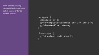
  • 37. With a dense packing mode grid will move items out of source order to backfill spaces. .wrapper { display: grid; grid-template-columns: 1fr 1fr 1fr 1fr; grid-auto-flow: dense; } .landscape { grid-column-end: span 2; }
  • 38. grid-auto-flow With grid-auto-flow dense items are displayed out of source order. Grid backfills any suitable gaps. http://cssgrid.me/051626
  • 40. Power and responsibility • Good = creating the most accessible source order and using Grid or Flexbox to get the optimal display for each device. • Bad = using Grid or Flexbox as an excuse to forget about the source. • Terrible - stripping out semantic elements to make everything a grid or flex item.
  • 41. https://www.w3.org/TR/css-grid-1/#placement-a11y Correct source order is important for speech, for sequential navigation (such as keyboard navigation), and non-CSS UAs such as search engines, tactile browsers, etc. Grid placement only affects the visual presentation!
  • 43. Léonie Watson | On CSS accessibility and drinking tea | CSS Day 2016 https://vimeo.com/180566024 Also see: 
 http://tink.uk/flexbox-the-keyboard-navigation-disconnect/
  • 44. Is Grid a competing specification to Flexbox?
  • 45. When should we use Grid instead of Flexbox?
  • 46. Flexbox is for 1 dimensional layout - a column OR a row. Grid is for 2 dimensional layout - both columns AND rows.
  • 47. Wrapping list items using flexbox. .flex { display: flex; flex-wrap: wrap; margin: 0 -10px; } .flex li { flex: 1 1 200px; margin: 10px; }
  • 49. Wrapping list items with Grid Layout. http://cssgrid.me/051629 .grid { display: grid; grid-template-columns: repeat(auto-fill, minmax(200px 1fr)); grid-gap: 20px; }
  • 54. Using the minmax() function with grid-auto- rows. .home-hero { display: grid; grid-gap: 1px; grid-auto-rows: minmax(150px, auto); }
  • 55. An item on the grid can become a grid or flex container itself. In this case I am using flexbox and auto margins to push my content to the bottom of the box. .special { display: flex; flex-direction: column; } .special h3{ margin-top: auto; }
  • 57. Animatable • grid-template-columns • grid-template-rows • grid-gap • grid-column-gap • grid-row-gap
  • 58. https://drafts.csswg.org/css-grid/#track-sizing grid-template-* animatable as a simple list of length, percentage, or calc, provided the only differences are the values of the length, percentage, or calc components in the list.
  • 61. March 2017 March 2017 March 2017 March 2017 March 2017 Soon!
  • 62. But, what about browsers with 
 no support?
  • 65. A feature query looks like a media query. Test for a property and value pair. // code for non-grid browsers @supports (display: grid) { // grid layout code here }
  • 66. To use feature queries • Write CSS for browsers without support • Override those properties inside the feature queries • See https://hacks.mozilla.org/2016/08/using- feature-queries-in-css/
  • 68. You don’t have to turn your entire layout over to grid. Look at using it for small UI elements, as an enhancement.
  • 69. More code plus video tutorials! I am creating a list of examples, video tutorials and information at: http://gridbyexample.com
  • 70. Think of a question later? AMA. https://github.com/rachelandrew/cssgrid-ama